-
Welcome to Smeargle's Studio! Please be sure to review the studio rules. Feel also free to check out our hub to learn more about this place!Welcome to Smogon! Take a moment to read the Introduction to Smogon for a run-down on everything Smogon, and make sure you take some time to read the global rules.Congrats to the winners of the 2023 Smog Awards!
smogon tshirts
- Thread starter chaos
- Start date
 well it kind of looks to me like "smogon" is a no-go?
although seriously if it isn't a registered trademark, then why the fuck don't we beat them to it?
really like the look of that fuzzberry. i'm not sure about the colour of the background re: the colour of the koffing, but i that was exactly what i had in mind design-wise when i made that post
We can worry about law stuff later. A number of us have discussed the legal implications on IRC and in private. I think what we need to do is just do basic Smogon/Smogon.com/Smogon University shirts, with no recognizable Pokemon.well it kind of looks to me like "smogon" is a no-go?
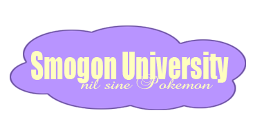
"nothing without pokemon". it's latinWhat does Nil Sine Pokemon mean?
Something to the effect of this?can someone make SMOGON text in arch type like the kentucky shirt so we can at least get one shirt up soon? (no shirt bg image needed... just a transparent bg)

I again apologize for the sloppiness, I'm working with....limited resources.
I can change the font face and remove the slight gradient if needed.
Also, a transparentized version of my initial design as an afterthought.

Fuzzberry beat me to the punch as I was working on my design, but I suppose it still couldn't hurt to post this:can someone make SMOGON text in arch type like the kentucky shirt so we can at least get one shirt up soon? (no shirt bg image needed... just a transparent bg)


Also, improved on my idea a bit (which I still think could work pretty well as a solution to how to get a nice looking Pokemon design on there without it breaking copyrights or anything), smoothing out the edges and such, and changing up the text:


andrea
/me cresselias
Okay, here are a couple things I did up really quick. It's a bit pixel-y right now, but I can edit them more if you like them. I just kinda imitated the University style t-shirt that's in the OP.
Here's black text with a white outline.

Here's the same thing with a blue background so you can see how it might look like on a shirt.

Here's white text with a black outline.

And here's the same thing with a blue background just for kicks. ^_^
 I toyed with different fonts here..

Bottom half of koffing, but it can easily bypass law issues by saying that its actually just part of a meteor.

another one I tried..
 Here's my submission in a font of my design:

Here it is again with an inline:

And one more time with a slight shadow:

I am worried that the angle is too steep in all of them, but they are an exact match for your Kentucky shirt.
If there is time, maybe I'll redo it with a more gentle arch.@chaos: I figured plenty of people were jumping to do the 'collegiate' design, and I was already near done putting this newest one together when you asked about getting some of those made.
@Zracknel: I like it. This is about as good as it gets for the style chaos requested.
@Jumpluff: Personally, I would take off the beveling to make them less cute. More of an issue on the second one, but if you just ran an outline on it, it should be no prob to change.
@le other people: Good gravy! If you're going to go ahead and make the 'standard' collegiate tee, then please put effort into making just this simple design. Go find an attractive athletic font, download it, install it, and use it. If you're going to constrain the path to a circle, give it a large radius. See: Jumpluff's. I've just been disappointed in the lack of effort put into something people will be expected to pay money for.
other tips:
-Limit 2-3 colors.
-Limit design to chest area. Printfection only allows 10" by 12," so no all over prints.
-Assume it will be printed on a solid color tee, and make sure your design works on several different colored tees, and not just the one you think it should be.
-Do quality control. Since this will be done via a website where you upload your own art, quality raster images are acceptable. Quality means not jaggy/pixelated and no artifacts.
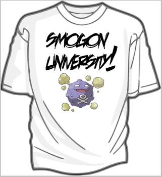
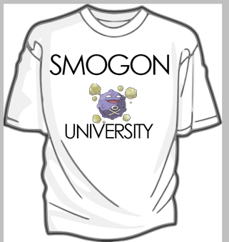
This is the v1 shirt, the design from v1, the v2 shirt, and the v2 design.


It is not necessary to have 'smogon.com' on the second shirt. I doubt you can be barred from using your domain name, but then again I know very little about ip law.
These are first draft mockups. If interest is expressed in either, I can make higher quality versions with more attention to detail.I like both of those, purple and gold i smy old High School colors and the secong looks retro, which I like. =)I agree with chaos, but a more Koffing-like purple might be nice :D Also, the angle is a little sharp imo, makes the letters look a little distorted. at least, that's how I see it. Amazing!
ETA: Headpunch, thanks for the advice! ^_^ There's no bevelling there though; perhaps you mean the extra stroke?@ Jumpluff: I'm sorry, when I refer to beveling, I'm talking about rounded corners (on 2D text.) I thought that the corners, especially on the second version, could stand to be sharper, which would lend a more serious, bold look to your design.
@ Arb: Well, it is Smogon University. 'Crew' comes from what some teams in game tournaments call themselves, i.e. Smash crews, Pokemon crews, etc. I needed something 'athletic' to go in the background, and that worked for me. Looking back at it, I could add "University" on the tail. I just wanted to show that there could be semi-attractive designs that didn't require the use of Pokemon.Users Who Are Viewing This Thread (Users: 1, Guests: 0)
- ... and 1 more.