CAP 6 CAP 6 - Art Submissions

Status
Not open for further replies.
First time really drawing something 100% on computer. Hopefully y'all like it. Not a greatest artist, but if someone else feel like coloring or changing the proportion a bit, such as the head, feel free; as long as you don't change the concept and gives me credit.

Program Used: Paint.NET
I edited the post I had earlier since I made slight changes. Just genuinely looks better now than then.
1zzi6u0.jpg

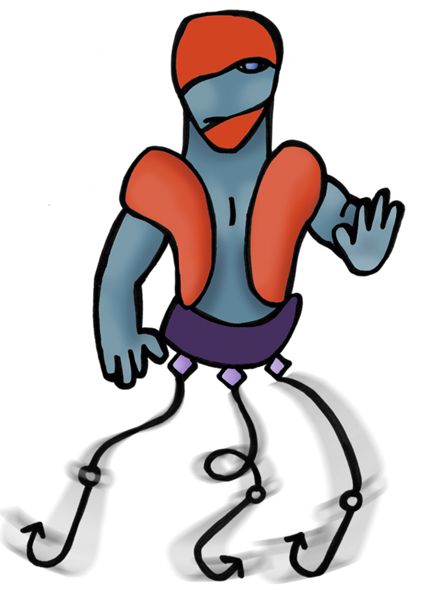
Its webbed feet makes it a great swimmer in the sea.
Its muscles are ready for combat.
The fin at the top of its head acts both as a Shock Absorber, as well as allow it to easily change directions when swimming.

Well, the face needs to more like an animals, it looks too human. And the way its standing doesnt look natural, the legs need knees and the body needs more shape.
 
yoda_starwars3.gif


He doesn't look that powerful. Celebi/Jirachi/Mew/Manaphy don't look that powerful. Azelf doesn't look that powerful. I think that the sensei jacket means its powerful enough.

Ok, maybe, but he still really does not portray the fighting type to me.he just looks like a octopus with karate stuff on.
 
Not really up to the standards of some of the other stuff being posted here, but just for fun. Kind of a goon/slugger you'd see in some old mobster movie that gets into brawls. His ability would be something to the likes of his low to mediocre attack being raised each time he was hit.
finslugah8.jpg
 
Ok, maybe, but he still really does not portray the fighting type to me.he just looks like a octopus with karate stuff on.

Hitmonchan just looks like a human with boxing gloves and a skirt on. However, the boxing gloves make it look fighting type.
 
Atyroki is really cool, but it looks so Digimonish (blaziken =/)

Caladbolg: If anyone beats your idea, ill give him 32597527 hurrays and 123590784 congratulations, because its REALLY cool... maybe a Lighting like tail, if they want to give it Volt Absorb

Again, congratulations darkie for the fast work
 
no, hitmonchan has a "don't mess with me" face, a more tan body, etc he just looks more like he is ready to get into a fight.
 
I have to say, I think that themantyke's design needs to look a little bit more powerful. it just does not look like something that could check most of the best Pokemon in the game.
Then again, neither does your standard 70 year old karate master. :P

I personally think that a karate master concept fits what we have (so far) as the new pokemon.

Let me explain

So far we know that the pokemon is to be slightly defensive. The reason many people in our day learn Karate is for self defense. When needed, there techniques can be called upon to take down a foe no matter how big they may be. A Karate master fits the concept of a defensive fighting type pokemon well.

Martial Arts in general usually call upon one's focus, so if we decide that the new pokemon will have better special then physical attack, we can draw on that concept. Of coarse, if it's just flat out physical attack, we've obviously have that covered too.
 
Here's a fully colored version of my submission, not my final though, still need to fiddle with it some.

Snapshot_20081207_1-1.jpg


It was taken on my webcam, so when I actually scan it it'll looks better.
 
FISHERART-1.jpg


Modeled after a fisherman. Though a bit ghostly, I think he perfectly fits the description of a Water/Fighting type, what with the life jacket, fishing hooks, and a strong physique. I can see any stat spread being applied to him, and obviously he has many options for a movepool, abilities, and other attributes.

i honestly see a lot more ghost than fighting in this guy

missing body parts = ghost
extra body parts = fighting
 
ok, your right Mantyke. you actually state your reasoning very well. I think you should give tennisace lessons.

With that said, i love your design, and when i think about it, a cute pokemon being able to do all that the concept polls have required of CAP 6, would be kinda cool.
 
I agree with Hyra, it looks nice and Im glad to see that it doesnt have Medicham pants, but there are two things holding back my absolute full support for this idea.

One - He looks a bit too offensive and scrony
And Two - Im not really feeling the shoes :P
 
-snip-

This or the old one?

Edit: @Solstice: I don't get how that's a water type :S

I like the old one's pose, torso, arms, and paddle better, but i like the legs and feet on this one the best. Maybe a combination of the two?
 
Well, the face needs to more like an animals, it looks too human. And the way its standing doesnt look natural, the legs need knees and the body needs more shape.

Looks too human? Look at Machoke/Hitmonchan.
It's just standing straight; it has knees.
 
Atyroki, I honestly preferred the first one. Although the coral mask is cool and all, I really loved the simplicity of the first one's body and paddle. The sandals are a bit of a turn off too =/.

LR.
 
Mmmh, I don't like the shoes... Try something like Shiftry.

Anyway... Why I think your submission is like a skinny Hariyama?
Maybe because they are too japanese.
 
Like the new one more than the old one. Now it's more like a Kappa/Mermen from Hong Kong ready to protect it's emperor. I can definitely say that you must keep the bigger shield and paddle now. You get no complain from me on it's feet, head, or body design.
 
I agree with Hyra, it looks nice and Im glad to see that it doesnt have Medicham pants, but there are two things holding back my absolute full support for this idea.

One - He looks a bit too offensive and scrony
And Two - Im not really feeling the shoes :P

Uhhh, it's covered in turtle shells, and I'm going to remove the shoes...

I like the old one's pose, torso, arms, and paddle better, but i like the legs and feet on this one the best. Maybe a combination of the two?

... the torso is exactly the same... only one of the arms is different, and not by much... the paddle is barely different, and the pose doesn't really change the design at all :S

Atyroki, I honestly preferred the first one. Although the coral mask is cool and all, I really loved the simplicity of the first one's body and paddle. The sandals are a bit of a turn off too =/.

LR.

Again, body is the same, and removing the sandals :S
 
Atyroki, I think what it is is that this version has a very vacant look, whereas the first one had a very badass look saying 'Bring it'. I preferred the first one's head because it was very compact and looked somewhat like a ninja. To me, the second one looks a bit like a goofy knight.

I think, instead of giving it a shell on each arm, you should give him a slightly larger shell shield on one arm. I preferred the 'wraparound' feel your first design's shield had, as compared to the 'stuck on top' feel the second one has.

Also, I think the thigh shell shields add more to the defensive feel of the pokemon than the second arm shell shield.

All just constructive criticism, your design is easily my favourite so far. Hope this helps.

LR.
 
Status
Not open for further replies.
Back
Top