
-
Follow our Instagram!
-
The moderators of this forum can be found in the CAP forum staff directory.
-
Welcome to Smogon! Take a moment to read the Introduction to Smogon for a run-down on everything Smogon, and make sure you take some time to read the global rules.
You are using an out of date browser. It may not display this or other websites correctly.
You should upgrade or use an alternative browser.
You should upgrade or use an alternative browser.
CAP 7 CAP 7 - Art Submissions
- Thread starter Magmortified
- Start date
- Status
- Not open for further replies.


Here's a clean version of Poke in a box. I quite like this colour scheme based on popular colours in jester outfits. I also wanted to keep the complexity of hands and other extremities down to make this easier to sprite.
I figure that how this is set up this design could have a good range of speeds from explosive to slow. I'll have to draw out some movement sketches to give you an idea of how this would fight and generally get around.
This got lost last post and I don't think I got much feedback so it would be appreciated this time. ;p
Edit: I think the hands are the weak point at the moment so i'll mess with those later on. Taking suggestions for anything.


I'm for either Cadablog's newest "Knightmon," or Vader's horse-thing.
I think this topic needs more chains, though.
The design I'm working on incorporates chains....and a lot of them. Just a teaser, to everyone....think a cross between an English Church Grim and the ghost of Jacob Marley. =D
Since nobody liked the Squirrelinator, anyway.

Geez, I'm gone for a couple of days and the Art Submissions thread is created and at 7 pages. :/
But anyways, I'm really liking Doug and Caladbolg~'s designs.
But anyways, I'm really liking Doug and Caladbolg~'s designs.

Caladbolg's pokemon is the best o_o
Perfect Scout.
Perfect Scout.

Cyzir's first design has something that make me think it's a little tricksters. Can't wait to see it in color also that has became my second choice within CAP7, following closely behind Atoyrki.

Ladies and gentlemen, Smogonites of all ages, coming to a theater near you...
I present: THE SQUIRRELINATOR!

This roadkill is back for revenge!
It started off as a joke drawing, a side bit from my first concept. But it turned out to be more interesting. Go figure.
So basically what we've got here is a Terminator Squirrel, complete with Acorn Bombs and, much to the recent fixation of the CAP community, a drill arm. Not to mention, those wheels let him go up to...uh...a high speed (provided it's under the speed limit)!
It's great for a scout, as one of the first animals that comes to mind at the word "scout" is a squirrel. Plus laser eyesight, satilite hearing, government funding, blah, blah, blah...
This can be treated as the joke art it is....but right now, it's unique.
Any suggestions for Squirrelinator 2.0?
EDIT: ALso, I'm aware it could be more ghost-y. Suggestions there would be appriciated too.
Maybe when you color it, you might want to give it grey'ish flesh instead of the brown. (to enhance the ghost) That's what I plan to do with mine when I color it. (mine will be amazing once I color it, but I have to wait untill after tennis today... ;_;) How long is this thread going to be open, btw?


Here's a clean version of Poke in a box. I quite like this colour scheme based on popular colours in jester outfits. I also wanted to keep the complexity of hands and other extremities down to make this easier to sprite.
I figure that how this is set up this design could have a good range of speeds from explosive to slow. I'll have to draw out some movement sketches to give you an idea of how this would fight and generally get around.
This got lost last post and I don't think I got much feedback so it would be appreciated this time. ;p
Edit: I think the hands are the weak point at the moment so i'll mess with those later on. Taking suggestions for anything.
Really cool design and think it does look like something out of pokemon. The hands could be fixed by making them mitten like or give it long ghostly hands.


Cadabolg's last one just stole my vote for dougs ^^


snip
I was going to tell you next time I saw you to literally think outside of the box, like an old toy, and you pretty much nailed it. Great job Wyv!
As for the hand, make it 4 fingers instead of 3. The last finger looks like it should be split.
WoW Caladbolg, you definitely got my vote no matter what else is entered in the thread.
New version of Knightmon. More fragile, faster-look, no legs, etc.

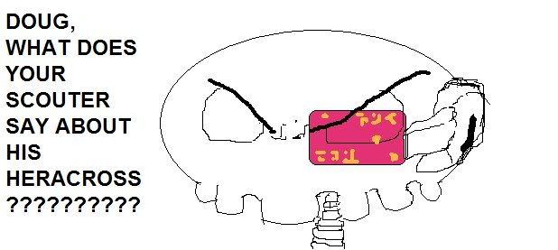
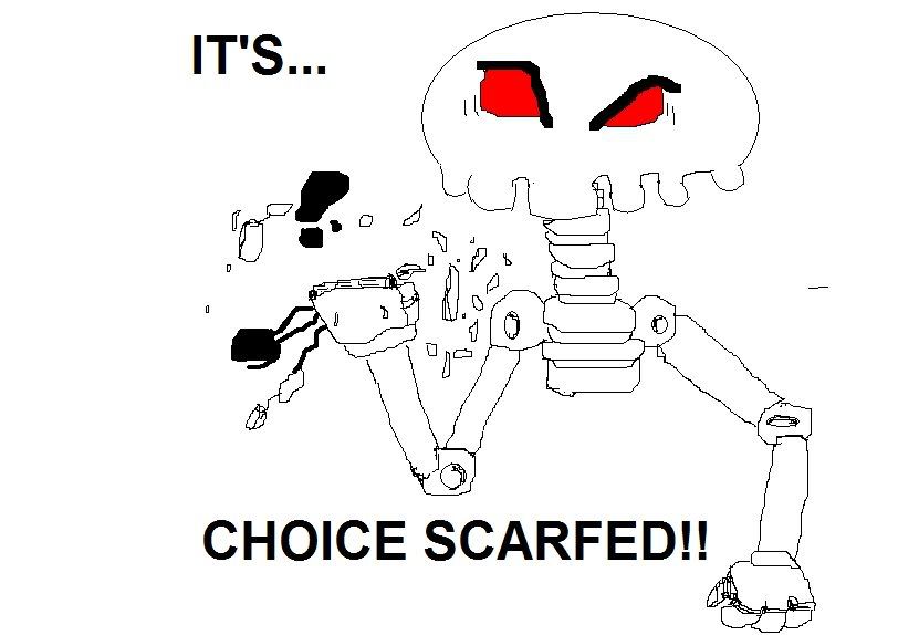
EVGETA WHAT DOES THE SCOUTER SAY ABOUT HIS ITEM
IT'S HOLDING A CHOICE SCAAARF
very original and cool in other words!

I actually like the eye set-up, as they remind me of binoculars/telescopes, which a good scouter would have. But that's just me.I also love Atyroki's one. The V.2 Colour scheme is better. It deinately looks like a ghost/steel and its skinny gangly look makes it seem like a "scout."
With the goggles though. To me they make him look more like a psychic and looks a little "Specs"y. More like a special attacker. Maybe change the eyes to a more "Steel" look, though its up to you, it looks awesome.
I'm getting that you think I made that, but I didn't. It's Vader's. I seriously still think Vader should try modifying it into a centaur (man-horse) headless horseman.Though I do like the post by Black_Dranzer because it is different. It is a VERY cool looking poke, it instantly stood out for me. The horse thing adds its 'scout'ness and it definately looks like a ghost/steel.
I think the stems/hair/pointy-things (lol) on the back make it seem a bit too solid. I think it'd look better either stream-lined or sort of blown-back ethereal look.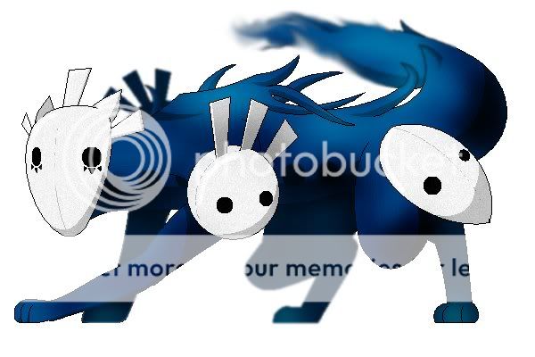
I think it's perfect! But anyone else can feel free criticize it. In fact, anyone can tell me it's ugly.
Also, little tufts at the back of the paws styled like the end of the tail would look nice. At least in my mind it does.
Edit: You know what? Maybe just doing the paw thing would be good.

I like Caladbolg's art, (a LOT) but it seems to me that it gets attention because it is good art. The shoulders, arms, and head seem very human to me. I know he's reworked it so many times, but I think it should be more surreal and less human.
Wyverii, that is a very cool design, it has more ghost in in than some of the other drawings, which I consider a good direction, but since Steel is the primary typing, maybe a little more metal on it would take it in that direction.
Cyzir, I think you should definetly go with the first one. It is a great combination of the Steel and Ghost types.
That's my two cents for now.
I happen to like both the ghost bell design and Wyverii's surprise.
In my opinion, the ghost knight armor concept seems a bit too contrived, mainly because the armor tends to look extremely elaborate instead of having become organic after being inhabited by a pokemon.
Also, I really, truly, from the bottom of my heart detest the idea of pokemon actually wielding swords or spears that have the semblance of being man-made, when the pokemon games never make a reference to those weapons; it just seems anachronistic.

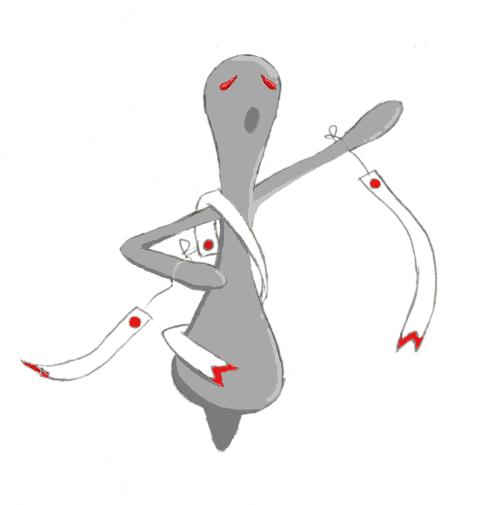
I think it's sweet how one trip to photoshop will all of a sudden move everyone's attention. I thank you all very much for your support. I added Eyes, a mouth (that is stationary, since it's a mask) and expressions to the false faces. also, a last minute smudge 'o the ankles.

More criticism please! Should I include a triangular nose? The design is sort of straying from a fox... so... yeah...
More criticism please! Should I include a triangular nose? The design is sort of straying from a fox... so... yeah...
No triangular nose. I prefer the uncanny feeling that a flat white mask raises. It reminds me of no face from Spirited Away, actually.
Would be awesome as a concept if the red eye dots could appear in the other two or four masks as well (is it symmetrical? It would also be interesting if it really did only have 3 masks).
EDIT2: I actually meant to say that the red eyes might have the ability to move like Duskull's one eye has the ability to move from eye socket to eye socket, not that all of them had red eyes. Also, a pointy mask would be fine with me, but not a triangular nose.
EDIT:
Cyzir, go with no. 1. I would love to see it colored.

I think it's sweet how one trip to photoshop will all of a sudden move everyone's attention. I thank you all very much for your support. I added Eyes, a mouth (that is stationary, since it's a mask) and expressions to the false faces. also, a last minute smudge 'o the ankles.
More criticism please! Should I include a triangular nose? The design is sort of straying from a fox... so... yeah...
I think you should try the triangular nose, this is looking less like a fox & more like a Hollow from Bleach every revision. :P
That doesn't stop it from being one of my favourite designs though. xD
EDIT: I don't think the other masks should have glowing eyes.
I think that's what makes the concept work tbh.... plus things with more than 1 face just weird me out. ^_^It has Steel plates over it's ball joints, each with FALSE eye-marks, to influence the idea that it's tricky and malevolent.
*Glares at the doduo family*
Also, I really, truly, from the bottom of my heart detest the idea of pokemon actually wielding swords or spears that have the semblance of being man-made, when the pokemon games never make a reference to those weapons; it just seems anachronistic.
In my design the spear is part of the poke's arm. Like the Pyroak's cannons.
Elegy of Emptiness...awesome. The main face made me laugh. It fits so awesomely the way it is. I guess you could give a triangle nose a shot (although I like it without it). It might make it look like a pumpkin-face though.
I don't know about making red dots in the other masks. I like the main eyes standing out. But hey, that's just me.
I can't think of anything else to add. It's my fav one as of right now, though.
I don't know about making red dots in the other masks. I like the main eyes standing out. But hey, that's just me.
I can't think of anything else to add. It's my fav one as of right now, though.

New version of the horse design.

- Status
- Not open for further replies.