CAP 8 CAP 8 - Art Submissions

Status
Not open for further replies.
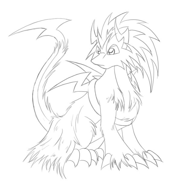
Im just going to submit another one. My last two got completely ignored so its time to try again. Sometimes I feel like my art is just way to complex for CaP, so this time I decided that Im going to start simple and work from there based on comments. So here it is:

http://i731.photobucket.com/albums/ww313/MarceloSM/cap8f.jpg

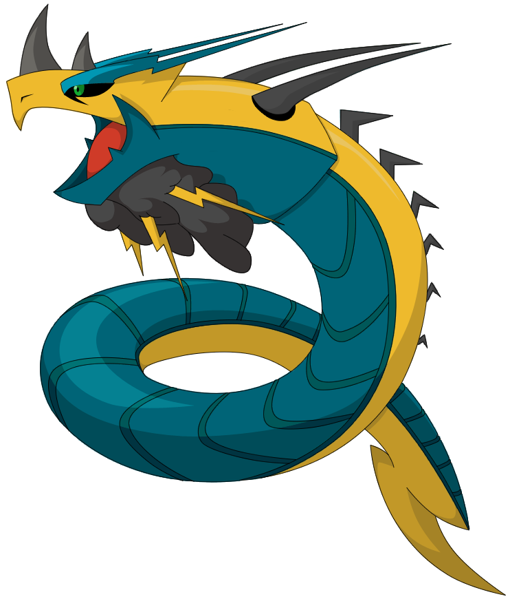
I apologize for the sketchyness of it and paper lines but apart from that I hope you like it, I have a very simple colored version that I did on paint. Its not great but its pretty clean:

http://i731.photobucket.com/albums/ww313/MarceloSM/LastCap.jpg

As you can very plainly see I am pretty bad at working with Paint, bit at least it gives me the opportunity to play with color combinations and have a clean version. Hope you like it! What I want are suggestions as to what exactly I could add to this to make it better, for know its going to be plain, maybe Ill play with the colors a bit.

And here are my past submissions that got totally overlooked...

http://i731.photobucket.com/albums/ww313/MarceloSM/cap8e.jpg

http://i731.photobucket.com/albums/ww313/MarceloSM/cap8d.jpg
 
Is it the tail? Other than that I cant think of anything else that is similar other than the body type. I mean, It cant have a long body because Seviper already has one?

The tail is completely different than sevipers. First of the shapes, seviper's is more like a blade while my art submission's is supposed to look like a thunderbolt.
 
fenix, make the fat dragon more pokemon like (ie, simpler), and it'll get a lot more attention. that's a pretty decent option, and it has gotten some attention.
 
Ill work on it during school, I already have a simple less shady ect. version of it but I want to make it like more pokemon-y. What exactly should I do though? I am horrible at making things simple.
 
Ill work on it during school, I already have a simple less shady ect. version of it but I want to make it like more pokemon-y. What exactly should I do though? I am horrible at making things simple.
You could start by making it's head bigger in proportion to it's body. Right now your head to body ratio is like 1:10, which makes your pokemon look like it's bigger than a 2 two story house. In comparison, Snorlax's head/body ratio is closer to 1:4, while Blastoise's is 1:5. All pokemon have large heads compared to their body, it's what makes them so appealing to all ages and genders.

@KOA: Yeah, those colors look great. I would just swap the colors of the Eyebrows and the two "Feelers" on the neck. That will help keep the black from being too concentrated in one area of the picture, and also the eyebrows are lightning bolts so it seems more fitting for them to be plasma colored.


My probable entry (also my first art submission for a CAP. Yeah!). I'll need a lot of help for it, though:

1. Any ideas on how I can make it look more dragon-y?
2. Any tips on colour scheme? I really have no idea as of now.
Looks a bit like a Chimera Dragon to me. As others have said a more reptilian snout may give it the extra dragon push it needs. You could perhaps also have some 'scaled' areas that peek out. Such as around the mouth and claws and just before the end of the tail. Regardless I love Chimera Dragons so I really like this guy!


Others I am liking since my last post are Cyzir's Thundercloud Hydra, Buffalo Wings Gargantua and KoA's sleek and lean beast. I, personally, like both of the color options on KoA's.
 
I may end up coloring the Komodo tomorrow, but enjoy this in the meantime.

EDIT: Limbs are overrated. :o
Why does the red start at the top and end up on the bottom? It's like, in addition to curling himself, he twists himself, too, which I don't think is the intent. I think something's off a little with the perspective.
 

well my first design wasnt the best i just couldnt see any of the typeings in the design mabey it was just me but idk. the idea of some sort of magnetic dragon was buzzing around in my head. but then i thought shud i make a postive and negative dragon like plusle and minum? then i rembered all of the hydra submissions so i put the two dragons together into one hydra on half positive and the other negative comment it likes and dislikes
 
Hey All,

My final exams are finally over and now I can finally put my whole attention to the cap project! (as opposed to stealing valuable study time to doodle my Electric/Dragon concepts, when I really should be studying).

Since I'm here, I want to throw my concepts out earlier so I can get more feedback. So unfortunately these aren't so shiny as much of the art should be now, but I should get some nicer stuff up tomorrow or the day after. BTW I love drawing dragons, though most of mine don't look anything like pokemon, it was a nice challenge, and I imagine it won't be as easy as I'd like :D.

When I first saw electric dragon, I tried to think of a novel concept. The first that came to mind was the circuit dragon, it's my current favorite which I'm focusing on. What I think is the best about this one is that he's versatile in the sense of abilities, the gecko feet can give him Sticky hold, or Suction cups. The eyes could be compound eyes, or tinted lens' as well. Of course it's not limited to just these abilities.

Circuit Dragon(Direct Link)

The next concept came out when I was rapidly brainstorming doodles of anything that could be an electric dragon, the Raijin Dragon, I tried to think of other mythological figures but none really fit (many had weapons). I like this concept but my execution is still poor, and is apt to heavy change. Also waaaay too much Salamence.


Raijin Dragon(Direct Link)

As always I'm open to feedback and support ^^.
 
Here is a re..do of my submission.. x3 hopefully it looks less Garchompy this time around. The tail is kind of like a tesla coil, in shape and very likely in function, the head horns are supposed to be tazer-y.
 
Code:
[IMG]http://img.photobucket.com/albums/v74/Nyaunyau/rayogon2-1.jpg[/IMG]
Here is a re..do of my submission.. x3 hopefully it looks less Garchompy this time around. The tail is kind of like a tesla coil, in shape and very likely in function, the head horns are supposed to be tazer-y.
Yeah, I like this one better. Are you gonna color it? I'm interested is seeing what color scheme you choose.


My post got kinda overlooked, here it is for anyone interested.
Orange one looks best to me, it's a really nice design actually =/
:D Ok, I'll redo the main one in orange.

Aw, my design isn't on the compilation either. Sadness. Oh well.
Code:
[IMG]http://xs138.xs.to/xs138/09173/capupdate232.jpg[/IMG]
 
The current state. Played with the markings a little; dunno if it's an improvement upon prior uploads. Need to figure what to do about his haunches. And I really want to be able to know that my design is solid; I wanna get as early a start on the shading as I may.
 
[IMG]http://xs138.xs.to/xs138/09173/icklecap251.jpg[/IMG]
 
And, mostly for kicks, I drew a rough prevo. Unless people are largely of the opinion that this design is actually better for the CAP than the big guy, I mainly drew this for fun and to prove to myself that I can draw relatively cute and cartoony proportions.
I like these two more than your previous posts. Personally, I like the cutesy one more, but I prefer cute pokes' in general. On another note, they both look cool, but not really defensive. I'm not sure how to rectify that outside of giving it more bulk.

Code:
Uuh I havn't had much time to be on here or draw, but thanks to everyone who commented!
 
 [IMG]http://img253.imageshack.us/img253/954/wyvoltblanka.jpg[/IMG]
I felt i had to post a front view, i changed him a bit again too, and did it in a cleaner style (which i dont like doing). I'm not sure if i prefer this to my other version, but what do you guys think?

Also im not that happy with how it came out but i dont have anymore time to modify it more.
Cool, but way to bulky and mean looking to me.

Code:
 [IMG]http://img.photobucket.com/albums/v344/TheSapientBean/triotriotrio.gif[/IMG]
I imagine that if this were a real pokemon, it would be the evolved form of Manectric once you attached 'Halloween Dragon Costume' and leveled it up.. Haha.
<3 it very cute. I can't really see the "dog" inside though, maybe bring it's snout out a little bit?

Code:
Oh man KoA, that was a perfect change of color. It's awesome now! Also, I kinda agree with Parad, but I don't mind it as much.
 
Thanks for the comments guys. Hmm... I'll get a few more opinions on the hydra before I come to a decision. Also, I have clean versions of the rest of my designs.
 [code]
 [IMG]http://s293.photobucket.com/albums/mm54/CyzirVisheen/cap8lion.png[/IMG]
 The Chinese Lion Dragon.
 I decided to make the mane part of its head instead of being purely hair.
 
 [IMG]http://s293.photobucket.com/albums/mm54/CyzirVisheen/cap8velociraptor.png[/IMG]
 The Velociraptor
 Okay okay, it isn't that bulky.  But god damn it I like it so I'm going to continue developing it.
 
 [IMG]http://s293.photobucket.com/albums/mm54/CyzirVisheen/cap8viking.png[/IMG]
 The Viking
Not much changed on this one.  I decided to curve the tips of the horns outwards to remove the 'stag beetle' like appearance.  Also still debating whether to keep the Mjöllnir arms or to shift to Axe arms.
Anywho, as always all comments and suggestions are welcome~[/CODE]
The other two are just okay to me, but Velociraptor FTW XD
My only crit. would be that it makes me think of Sceptile and Grovyle, but that probably cause they're also based on raptors.
 
@ Keshiankae: I like this new one better than the first for sure. I'm not sure about the tesla coil tail though...It's a cooler idea but I think I liked the look of the lightbulb tail more. Also, I wanted to point out my favourite part of this design, the head. It's got a cool pharoah look to it, thats awesome. I have no idea if that was intended but I like it a lot.
 
This was the colour scheme I was thinking of. Heh, the pharoah thing came about while I was drawing it.. :) I stuck with it since it looked cool with it


I tried to make it look more bulky, but I don't know if I did enough. The feet are kinda off but I'll fix those later. I might also change the green to something else if I come up with a better colour-scheme.


I tried to make it look more bulky, but I don't know if I did enough. The feet are kinda off but I'll fix those later. I might also change the green to something else if I come up with a better colour-scheme.

I like the black on the head but the shoulder thing s need some tweaking. I prefer the way they were in you're last design.
 

KoA

Sorry, I thought anteaters were real
is an Artist
Why does the red start at the top and end up on the bottom? It's like, in addition to curling himself, he twists himself, too, which I don't think is the intent. I think something's off a little with the perspective.
That actually was the intent. See, the original image I posted was meant to be an Electric Eel Meverick in a Megaman X fangame, and eels are naturally nimble and lithe. I figured having a dragon be just as nimble isn't necessarily a bad thing.

With that said, here's latest adjustment #I forget. Darkened the blue a tad and changed eyebrow color as well as removed any pube-ness of the beard.

 
Wow, KoA's is really good.
Pretty simple design, and looks really sleek and bulky.
I think the coloring is really nice on it too.
 
@ Keshinkae: Wow, looks awesome coloured! The whole pharoah thing is awesome.

@ Estranged: I like it a lot more now, but I think the shoulder lightning bolts should only curve upwards (especially at the tip). The posture doesn't look too bad and it's nothing you can't easily fix up. besides it looks even cooler now.

@ KoA: Yours is coming along super well too, I'm happy you changed up the cloud-chin and even used my idea :). The darker blue is also better, although subtle.
 
Status
Not open for further replies.

Users Who Are Viewing This Thread (Users: 1, Guests: 0)

Top