
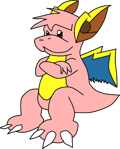
KoA: I like it! Wyrms are dragons, too. At first glance I wouldn't guess it was Electric, though, but that's not a really big deal.

-
Follow our Instagram!
-
The moderators of this forum can be found in the CAP forum staff directory.
-
Welcome to Smogon! Take a moment to read the Introduction to Smogon for a run-down on everything Smogon, and make sure you take some time to read the global rules.
You are using an out of date browser. It may not display this or other websites correctly.
You should upgrade or use an alternative browser.
You should upgrade or use an alternative browser.
CAP 8 CAP 8 - Art Submissions
- Thread starter CyzirVisheen
- Start date
- Status
- Not open for further replies.


I think it looks very electric-y. I'm going with Cartoons!' and yours as my top submissions at the moment.

It might just be the color scheme. Try swapping the red and the yellow.

And maybe putting a few tiny lightning bolts in his "beard."
I obviously support anyone who wants to try to do something with my concept, but other than that, Cartoons' "thundershitter" barely gets my vote; they're all awesome concepts, but IMO no one has thought of a more EPIC word than "thundershit" so far.
EDIT: Here's the unshaded "final product" for anyone interested, but not interested enough to sift through pages of work:

KoA, could you try it with the eyebrows shaped like a lighting bolt somewhere? Seems like it would make it look more angry, and stronger I guess.

Excellent art as usual, KoA. However, it strikes me more as dragon/steel than dragon/electric. Maybe you could lessen the steel effect by using less gray?
... someone please comment on mine? D:
... someone please comment on mine? D:

I liked it better red. :P
Well, maybe the red one can be the "shiny"? (to the person who said it looked like Gyarados, it looks more like Rayquaza to me... not that that's a bad thing, mind you KoA! ^_^;)
Also, I love yours, Sanglunaria; no one can say yours isn't "electric" enough, that's for sure! I'd love for someone with some computer artist talent (read: someone who can use a tablet well) go over it for a final product.
Also, I love yours, Sanglunaria; no one can say yours isn't "electric" enough, that's for sure! I'd love for someone with some computer artist talent (read: someone who can use a tablet well) go over it for a final product.


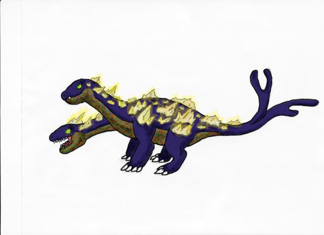
Aww, but that completely ruins the hydra idea I was aiming for Woodsy, and that was its defining feature. Hmm... Well, I'll give the people a choice.I'll probably be voting for Cyzir, assuming he gets rid of the extra heads.
I honestly don't see any Hydra in his picture whatsoever - just a dragon made out of thunderclouds and lightning giving off a Raikou vibe.

3 Headed Hydra

Single Headed Hydra (Not a Hydra >:()
To clarify for the people who liked my other designs, I haven't dumped any of them (other than the neon wyvern and random electric dragon thing). I just want to get this issue out of the way right now.
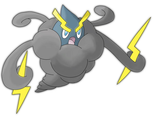
EDIT: KoA, try out a dark slate blue or violet for the underbelly. The grey still gives it a rather steel-y feel.
KoA: The yellow does look better, though I'm not a fan of the beard thing (keep it though). You said it was a thunder cloud, which I can see now, but first thought was that was like a rooster.
Cyzir: I really really like that design (though it sort of imitates Heatran), though I dislike that the neck(s) is just a lightning bolt (like how does that support the head!). I think it'd look better with a real neck, though that could just be me. Keep working on it, I'd love to see it finished.
Cyzir: I really really like that design (though it sort of imitates Heatran), though I dislike that the neck(s) is just a lightning bolt (like how does that support the head!). I think it'd look better with a real neck, though that could just be me. Keep working on it, I'd love to see it finished.
KOA, I second making the stomach dark/navy blue to make it look more dragon/less steel.
I also suggest making the spikes light blue to look like lightning bolts.
I also suggest making the spikes light blue to look like lightning bolts.

Wow, now I'm the one that feels honored :). Thanks for the input it's very helpful, I was just about to add another head XP. I'll work on front and back views tonight, that's a great idea. I tried doing a bipedal design and I just kept getting frustrated with it, I'm just not good at them. Although, I did do one thing...I experimented with the stereotype Electric colour scheme and this is what I got:
I'm thinking stay with the purple as well, but I may change the underbelly colour or the crystal colour. Although, in my opinion this does look way more "Electric" typed. I'm also feeling torn as I really like the blue but everyone seems to like the purple. What if I made the body blue and the under-belly purple. What do you think?
@nardd: Thanks for the feedback, on the frontal and back pictures I may change the crystals like you said. Once I finish colouring my other designs I'll put them up as well, I just don't like them as much...maybe I've become too attached. :P
Oh my god!!!! This thing is bloody brilliant! Just one question: did you mean for the necks to be beside each other or one on top of the other? Right now it looks more like the former. Also, I'm missing slightly the electric current running between the forks in the tails. Could you try adding that again? And just out of curiosity, try puting a ring of stones on the tails as well. Just below the forks. Just my imagination running wild...
@FM. Yours is also really good! I was surprised to se it!
Ah, I guess it's the body type. Hmm, perhaps giving it a smaller spherical body and removing the hind legs would help...Cyzir: I really really like that design (though it sort of imitates Heatran)
The frail look of the heads is intentional. It IS a hydra, after all. Even if you blast the heads clean off, it can just create new ones effortlessly. Besides, the real source of its bulkiness is its body.though I dislike that the neck(s) is just a lightning bolt (like how does that support the head!). I think it'd look better with a real neck, though that could just be me. Keep working on it, I'd love to see it finished.
Also, I love yours, Sanglunaria; no one can say yours isn't "electric" enough, that's for sure! I'd love for someone with some computer artist talent (read: someone who can use a tablet well) go over it for a final product.
Yeah, I just ordered a wacom bamboo from amazon this past Monday, so hopefully it'll get here soon enough for me to color it in and finalize it before this thread closes.
Also, Cyzir, I'm surprised I didn't notice your hydra beforehand. I can't believe that the idea of hydras didn't even occur to me when I was trying to think of different kinds of dragons... but you managed the idea really well! I like the multiple heads version more, personally.
Btw, Elagune. Yours is also very good, but it looks more like Dragon/Fighting to me. Perhaps if you give it more clawed, reptilian hands? and a more reptilian smile?
And narrd. Try once giving your toad reptillian eyes. Either that or just go with the toothed version, 'cuz it was cool.
And narrd. Try once giving your toad reptillian eyes. Either that or just go with the toothed version, 'cuz it was cool.


Anyways, new concept. Let's do feminine, shall we? Feminine Pokemon are usually slightly defensive (and there certainly aren't enough feminine CAPs). Let's also shy away from cliched yellow and give it a blue-black color scheme. Slighty mystical....oooooooh.....
I love it. It's graceful and dragonlike but also has a pretty clear electrical theme. Plus the color scheme is one I love--this is why one of my favorite pokémon (aesthetically speaking) is shiny Umbreon. The only changes I'd consider making would be possibly making the zigzag stripes down the back look more light lightning bolts (perhaps a pair of the classic "z-shape" bolts, mirrored across the spine, running down the length of the body?) Very well made.
I took into account some of the worries about how the previous design turned out, and so I cranked out this one. It should look a lot more like a Dragon/Electric now. And thanks, Cartoons, it's good to be back.
Certainly has the 'bulk' down, which is good since CAP8 looks like its headed in the semi-defensive/balanced range. Not really sure why it stands out to me...Perhaps it's the face; it has the look of a classic dragon pokémon (IE Dialga/Palkia)
Onward, onward.

Continuing with the initial direction, tweaking colors and fussing with the initial style of swoopy markings.

Then we have this. OH SNAP UNEXPECTED TWIIIIST. Decided to run in a different directions with most of the markings, to both simplify the design (was concerned it was getting too crowded) and give it a more Electric feel.
However, if approval runs more towards the first image, I'll definitely continue with that way; as well as taking into account any opinions on colors or design. I did try to slim the fellow's gut down a bit, and as per earlier commentary, I'll probably smooth the curve of his back a touch.
I think I prefer the first image here. The 'circuitry' motif is pretty cool, but doesn't seem to carry the same look as the 'fire/plasma'. Perhaps you could make the body markings more angular, to look like an electric arc? Also, I agree with previous posters, the 'hump' (or upward curve or whatever) could be reduced somewhat. Might even be worth it to redraw the thighs/shins/feet; as it currently sits, I can't see the shin-parts at all (unless its hind-legs are like canine legs, and even then I think it could benefit from a little touch-up).
All good submissions! Now I don't know who to vote for anymore...though I suppose good work is always worth seeing! ^__^

Oh my god!!!! This thing is bloody brilliant! Just one question: did you mean for the necks to be beside each other or one on top of the other? Right now it looks more like the former. Also, I'm missing slightly the electric current running between the forks in the tails. Could you try adding that again? And just out of curiosity, try puting a ring of stones on the tails as well. Just below the forks. Just my imagination running wild...
@FM. Yours is also really good! I was surprised to se it!
Wow, thanks a lot Bassoonist! I'm actually working on a new design right now. I was going to upload the sketch but my scanner scans things as HUGE images, so I have to fix that since photobucket would not upload it. Basically, I've taken a lot of advice from pkmn-taicho321. The design now has it facing more to the front, it is now bipedal, I've changed the tail and the crystals will be more organized and larger. Also, the heads are supposed to be beside each other lol. Lastly, in your opinion Bassoonist what colour did you like best, the blue or the purple? In my new design I'm pretty sure it will have a blue back and a purple belly.
@ The Mutant: I have to agree with Ezekiel, I like the first design better. The only things in the second design that I like more are the wing and the circuit symbol underneath the eyes. Also, the second design is nice because it's simpler, so maybe you could just take off some of the blue lightning bolts from the first?
@ InHell 13: Wow, looking great. I would take off the cloud on the head, I would also give the back cloud a more "storm-like" appearance. You could also make the back look more mountainous, so it would look like clouds in mountains? I'm not sure how that would come out, it's just an idea.
@ Cyzir: The dragon looks awesome. I like it more than the old viking concept, the idea was cool but it didn't appeal to me as much as the dragon does. I think you should stick with one head, and state in it's backstory that it can have multiple. Or, if you know how to make an animated sprite, you could have the animation for when it's sent out of the pokeball the other heads flashing out and then back in.
@ Aragorn: That looks fantastic, and very original so far with the feminine design. It's cool to see that both you and Doug are going for a sleek look. I hope you'll find time before you graduate to work on it more.
KoA: I actually liked the original color scheme better, but the updated eyebrows are very nice. The beard probably needs to look a little more cloudlike somehow, and it doesnt stand out from the underbelly so its harder to notice... but I can't think of what to suggest that would look better.


I really like Atyroki's ^~^ Meganium lookalike, Elagune's whatever-it-is and Cyzir's first rendition of the Hydra. However, this needs more attention.
I know Caladbolg only used it as inspiration, but what's wrong with it? Not Dragon enough for you? You accept Altaria.
Plus, it is fat. Anything that is fat is instantly cool. Provided that it has a good expression. Which it does.
I know Caladbolg only used it as inspiration, but what's wrong with it? Not Dragon enough for you? You accept Altaria.
Plus, it is fat. Anything that is fat is instantly cool. Provided that it has a good expression. Which it does.

Cyzir: I really really like that design (though it sort of imitates Heatran), though I dislike that the neck(s) is just a lightning bolt (like how does that support the head!). I think it'd look better with a real neck, though that could just be me. Keep working on it, I'd love to see it finished.
First of all, other than the way the legs are, it HARDLY immitates heatran, and secondly, the head is part of the lightning bolt too, I don't think it NEEDS support =/
- Status
- Not open for further replies.