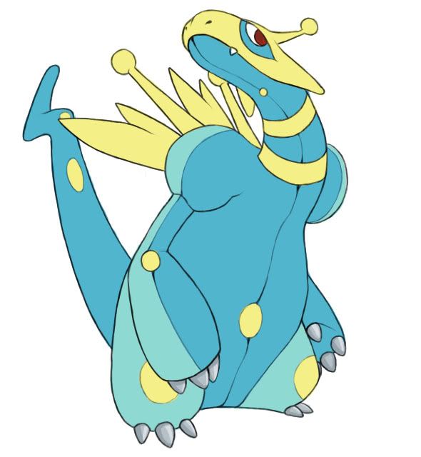
Tried a brighter, more...electric color scheme.
Link to the first one for reference: http://i44.tinypic.com/dwxgsh.png
I'm kind of attached to my darker color scheme, but what do you guys think? Any suggestions on what to add/remove/edit on either one would be great, too.
Darker one for sure
_____________________________
@ pkmn-Taicho I really liked the color scheme of your first design, if you fiddle with the colors on your second 1 a bit it is defiantly going to be better than it is now (and it's damn good now)