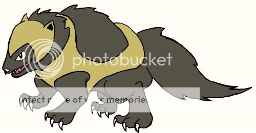
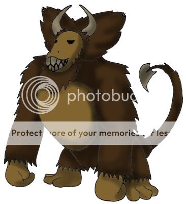
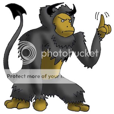
Workin on the outline :d Can't color till I have a good design. This an improvement at all? Trying to make it more like the lion/manticore bastardization it's supposed to be. (Also, is the tail ornament fine or should I change it? Opted out of the tradition scorpion tail- I feel that's more Poison and would just overcomplify this design.)
Thanks for the support so far!
I like it. Keep the tail ornament: It looks like a sickle.