
-
Smogon Premier League is here and the team collection is now available. Support your team!
-
The moderators of this forum can be found in the CAP forum staff directory.
-
Welcome to Smogon! Take a moment to read the Introduction to Smogon for a run-down on everything Smogon, and make sure you take some time to read the global rules.
-
Congrats to the winners of the 2025 Smog Awards!
You are using an out of date browser. It may not display this or other websites correctly.
You should upgrade or use an alternative browser.
You should upgrade or use an alternative browser.
CAP 9 CAP 9 - Art Submissions
- Thread starter Plus
- Start date
- Status
- Not open for further replies.


Yeah, I nearly had a heart attack when I came into the topic and saw your armadillo. Believe me when I say that I hadn't even seen your concepts prior to starting on my own.It's just me or our designs have a lot of things in common?


But yeah, Glyptodons were related to armadillos, so there wasn't a whole lot of ways they could have looked different.


Any thoughts on the scheme?
Hmmm... Firstly, I like the repose. In the first picture, I kept thinking he was holding a large club instead of it being his tail. Secondly, I like the added patches of color. Perhaps darken it a bit? I don't think black, or any color near that, would look particularly good. So maybe a darkened green?
Lastly: I wish I had the animation skills of Cartoons!, because I have some extremely awesome ideas for what your Thorny Devil would look like in action.
Buffalo_Wings said:Mannn awesome CAP designs, I love Cyzir's and Calad's.
<Insert Awesomeness here.>
Bleeh well heres my first try at a design for this. What do you guys think?
I love it. The only thing I would recommend would be the color scheme. Maybe change the head plate and other brown spots to a darker shade, while changing the greenish hue to that of a more "earthy" tone.
Yeah, I nearly had a heart attack when I came into the topic and saw your armadillo. Believe me when I say that I hadn't even seen your concepts prior to starting on my own.
Don't worry, I believe you.
@Atyroki: Hey Aty, change the right arm, it looks edematous. Good concept, but I believe your dragon is over detailed.

"Eviled" it up. Heres to da dark snakey-worm.
http://fc04.deviantart.com/fs50/f/2009/278/7/6/Snake_CAP_color_3_by_kai7735.jpg
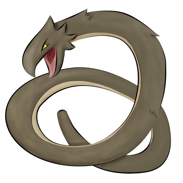
(to those asking about the tail, its coming from the ground. I just havent taken the time to add the dirt. I wanted it to look like the rocks/mud from diglet or onyx.)
Did you mean like the button things cyzir did?
http://fc04.deviantart.com/fs50/f/2009/278/7/6/Snake_CAP_color_3_by_kai7735.jpg
(to those asking about the tail, its coming from the ground. I just havent taken the time to add the dirt. I wanted it to look like the rocks/mud from diglet or onyx.)
That's the idea I had but since I can't draw, I waited/asked some otheres. I envisioned the "snake/worm" thing more "dark". Possibly some fangs, a second mouth on it's chest (you know, the little circular ones?), some random skin tags. Evil it up a bit, and it'll be awesome!
Did you mean like the button things cyzir did?


This thread is racking up a lot of infractions, deleted posts, and edits. I'd like to remind everyone of a few rules that people are breaking left and right:
Don't spam the thread. This applies to all CAP threads, including art. Some of you feel compelled to comment every five minutes here. Stop doing that. Particularly those of you that aren't posting much constructive commentary. One line compliments are just fine, and encouraged. But if you want to comment on a lot of art, then save up your comments and make one post to several artists.
Stop posting big art -- image size AND file size. There is no reason for you to post uncompressed or lightly-compressed artwork. If you don't know how to properly compress your pictures - then don't post pictures inline. Just post a URL, and you can link to a high-quality image. BTW, "high-quality" images don't look much different than reasonably-compressed pictures, for even the most detail-oriented observers.
Stop asking when the thread will close. CAP threads do not follow a set timetable. If you want to know the general process, look at the website and read the process guide. It's pretty easy to see the art poll coming up in relation to the other threads in the project.


I really, REALLY like this submission. However, I feel as if it needs to look more dark, instead of so cutesy. Perhaps give it a different pose or open the eyes and make them red? It just doesn't seem...dark enough.
If you can make it look more like a dark type, I forsee this winning.

Hey dudes, on the subject of past CAP art, what about Absolution's smog pixie?
Back then people were saying it looked Dark/Ground, and here we are with a Dark/Ground Pokemon. Since it was a final submission, would it still be eligible for entry (if Absolution is around to submit it again)?
Back then people were saying it looked Dark/Ground, and here we are with a Dark/Ground Pokemon. Since it was a final submission, would it still be eligible for entry (if Absolution is around to submit it again)?


"Eviled" it up. Heres to da dark snakey-worm.
http://fc04.deviantart.com/fs50/f/2009/278/7/6/Snake_CAP_color_3_by_kai7735.jpg
(to those asking about the tail, its coming from the ground. I just havent taken the time to add the dirt. I wanted it to look like the rocks/mud from diglet or onyx.)
Did you mean like the button things cyzir did?
Like the mouth on Mastadi's submission but like...on the chest.
@Knargle: It still looks really poisonous to me. i dont know how it will fit.
@Defno: Taken into consideration. The tail now is litterly sharp.
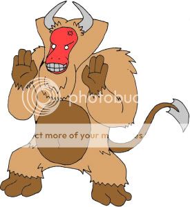
@Elegy: I don't know what it is, but your monkey is creeping me out. I think it might be the huge Y fur tuft on its head. It seems strange. otherwise, the original color scheme is fine by me.
@ Familyguy: OOOoOooh. Like a digger/worm mouth. This is considered.
_________________________________________________________________
Anyway to the others out there, Here is a link to another concept for this. Is this one better/more prefferable than the other?
A tail is ACTUALLY included in this one.
http://fc07.deviantart.com/fs50/f/2009/278/1/c/Snake_2_CAP_by_kai7735.jpg
@Defno: Taken into consideration. The tail now is litterly sharp.
@Elegy: I don't know what it is, but your monkey is creeping me out. I think it might be the huge Y fur tuft on its head. It seems strange. otherwise, the original color scheme is fine by me.
@ Familyguy: OOOoOooh. Like a digger/worm mouth. This is considered.
_________________________________________________________________
Anyway to the others out there, Here is a link to another concept for this. Is this one better/more prefferable than the other?
A tail is ACTUALLY included in this one.
http://fc07.deviantart.com/fs50/f/2009/278/1/c/Snake_2_CAP_by_kai7735.jpg
Haha, i was saying it looked a lot like a dinosaur.It's just me or our designs have a lot of things in common?
In any case, I hate all of you. My head is going to explode trying to choose which one to pick in the poll. Nearly all of them are excellent!


New colours, I like em better.
(Edit: Darkened everything)

A bit weird of a comment, but one thing that's a bit strange is it's foot. Or well, feet. They both look a little... awkward. Dunno how to describe it. ...Thin, maybe? *Shrug*http://img2.imageshack.us/img2/8158/cap95.png
New colours, I like em better.
(Edit: Darkened everything)
And this is more of a personal opinion, rather than a problem with the art, though it's a bit too bow legged for me... *shrug*
Good job overall.
In an unrelated topic, I had a personal idea for a frilled lizard, though probably could never draw it well enough for it to be a winner of any sort. What a darn shame. ...Just sayin' that, for... Well, no real reason, really...
New colours, I like em better.
(Edit: Darkened everything)
Looking good man! Might I recommend swapping the yellow-y part for grey? I did it myself in paint but I would never post without consent. Give it a try, it looks really cool IMO.
Go ahead and post it if you want, I have no objection.
(Please, don't quote the picture though, it's unnecessary, thanks C: )
(Please, don't quote the picture though, it's unnecessary, thanks C: )
Go ahead and post it if you want, I have no objection.
(Please, don't quote the picture though, it's unnecessary, thanks C: )
Ok, awesome.

What do you think?


Atroyki, you design overall seems solid, but i have a small nitpick. While the forearms of it are pretty thick, the humerus (the back half of the arm, words are escaping me right now) is like a twig. Do you think thickenning that portion would add to the qualty of it much?

Atyroki, I like you're newest color scheme. Looks very nice.
Kai, I think you have a great, simple design. However its too simple. This could be fairly simply solved by giving it some kind of spikes or ornamentals somewhere, and definitely making the tail much more interesting. Still, really nice muddy brown color and I love the head on that thing.
Kai, I think you have a great, simple design. However its too simple. This could be fairly simply solved by giving it some kind of spikes or ornamentals somewhere, and definitely making the tail much more interesting. Still, really nice muddy brown color and I love the head on that thing.

I love the colour change that famlyguyman did to your drawing Atyroki. I love the thorny devil idea fitting very nicely with our ground type, but it did lack the dark aspect. But now it doesn't it looks awsomely scary and ready to lay the smackdown on anything it doesn't like.

Personally, I am very fond of this design. I think the sandy paws were a very nice touch, and I also like how it doesn't look "evil." The color scheme is pretty, too. The only thing I really have to point out is that it looks a bit like the Riolu/Lucario line. Perhaps if you changed the tail a bit and added some embellishments to it?

What do you think?
I think...brilliant. But I agree with golden knight...i think the arms would look better if the humerus was thickened a bit (not too much)
- Status
- Not open for further replies.