
-
Follow our Instagram!
-
The moderators of this forum can be found in the CAP forum staff directory.
-
Welcome to Smogon! Take a moment to read the Introduction to Smogon for a run-down on everything Smogon, and make sure you take some time to read the global rules.
You are using an out of date browser. It may not display this or other websites correctly.
You should upgrade or use an alternative browser.
You should upgrade or use an alternative browser.
CAP 9 CAP 9 - Art Submissions
- Thread starter Plus
- Start date
- Status
- Not open for further replies.


Absolutely flawless.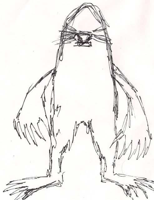
scary mole?

Now I need your opinion. I saw some people almost begging for something like Umbreon, so here is my best.
http://i34.tinypic.com/ms12yu.jpg
http://i38.tinypic.com/vgj6.jpg
Which colour scheme is better? Any other C+C is also welcome.
http://i34.tinypic.com/ms12yu.jpg
http://i38.tinypic.com/vgj6.jpg
Which colour scheme is better? Any other C+C is also welcome.
Now I need your opinion. I saw some people almost begging for something like Umbreon, so here is my best.
http://i34.tinypic.com/ms12yu.jpg
http://i38.tinypic.com/vgj6.jpg
Which colour scheme is better? Any other C+C is also welcome.
I like the first one better, but the ground components look kind of rock-ish. if you gave it more of a glaring frown it might also look a little more angry as well.
edit: you could try doing a sandy thing instead of mud.
I like the first one better, but the ground components look kind of rock-ish.
Yeah I kind of meant for them to look like dried mud...
OK my favourite has changed to Zantimonius, I just fucking love the purple feathers
To make it a bit more ground type, err how about like having some crusty mud maybe on its fur or around its paws? Its not amazingly Ground, but it will work
Also I dont see why everyone wants everything to look overtly ground / dark. Swampert, Quagsire, Phanpy, numel never strike me as being ground :/

@Metal: The chubby/plumpness of the extremities of those pokemon helped show their groundness. Ex: Numels belly, swamperts huge paws, quagsires feet, etc.
@bear: Nice mole. ;)
@Monkey: I was thinking as well that it was more ghost type. That's unfourtunate because it's a great design! Nice job.
And as I was saying, dark doesn't mean evil (except tyranitar, he's special). It represents
that the pokemon is somewhat devious. Ex: Murkrows pester people, Hondoom is supposed to like dig through trash at night,


SHADINGS :V

Note that this does not mean I have settled on this color comp. I will very likely end up shading the black/tan version as well. The number of opinions on which of the two color schemes I should pick is so goddamn split down the middle that I wanna scream.
Anyways. Opinions? Changed the color of the claws and tailtip on this one but I dunno if it was the right move. Particularly curious about the thoughts of those that suggested I use the other color comp- is this version acceptable at all or would you feel your vote would only ever go to the other color scheme?
Even if I do end up settling on this version, this won't be my final submission- the shading still needs touching up and I may yet add elbowfurs or other tweaks.
(And if you don't want to seek out my last post with my two main color schemes, it's here.)
TheMutant, didn't a lot of people say to pick colors in the middle and get the best of both worlds? I like that idea. Red is too red, and the tan could be darker on the other one.
I feel like the red pushes me over to fire type, just because it's red. Sorry if that makes people angry (about type/color prejudice), but it's true- that's what I think of when I see a red lionthing.
I feel like the red pushes me over to fire type, just because it's red. Sorry if that makes people angry (about type/color prejudice), but it's true- that's what I think of when I see a red lionthing.


Well here's my design. My lovely little dark horse. Done painstakingly by hand in MSpaint.
It's based a bit on pack horses and camels. The gourd upon it's back sucks in anything damaging from the atmosphere and the horse's body and digests it, turning it into a nutritious drink for the Pokemon (and any other animal if they can get it). As such it'd be very difficult for this Pokemon to get ill and it doesn't need to eat or drink for long periods of time making it suitable for desert travel.
I've got a crapton more info about the design but i'll leave that for my final submission. Hopefully i've made something unique to add to the table.
A humble first submission

A very rough sketch. It's a Pokemon that can collapse into a single flat earthen disc, disguise itself, and then strike out when the time is right.
A very rough sketch. It's a Pokemon that can collapse into a single flat earthen disc, disguise itself, and then strike out when the time is right.

Yes you have Wyverii. You have brought something unique. Awesome original idea, so is that gourd thing and the dark horse like separate creatures in a symbiotic relationship?

I present to you: Fezmon
This guy is based of the famous actor from the thirties and forties, Sydney Greenstreet (whom Jabba the Hut was based on). Its a black slug wearing a fez-what could be cooler?
Fezmon is infamous for guarding its favorite food-Couscous! So, any advice would be appreicated, more supporting stuff is to come.

Well here's my design. My lovely little dark horse. Done painstakingly by hand in MSpaint.
It's based a bit on pack horses and camels. The gourd upon it's back sucks in anything damaging from the atmosphere and the horse's body and digests it, turning it into a nutritious drink for the Pokemon (and any other animal if they can get it). As such it'd be very difficult for this Pokemon to get ill and it doesn't need to eat or drink for long periods of time making it suitable for desert travel.
I've got a crapton more info about the design but i'll leave that for my final submission. Hopefully i've made something unique to add to the table.
This is absolutely my favorite by far. It really fits the idea of "stopping the secondary" because of that Gourd. Not only that, the shape, animal, everything fits nicely with the Somewhat Offensive style it has and the Physical/Mixed Physical build that it will likely have. Only thing I feel it lacks is that it doesn't suggest the Ground type in either its design or its coloring. It looks more like mono dark to me.
Also, the fingers on the front legs, though they're cool, give it more of a soft/special based feel than the rugged look that Hooves give. Perhaps replacing those with hooves might serve the design better?


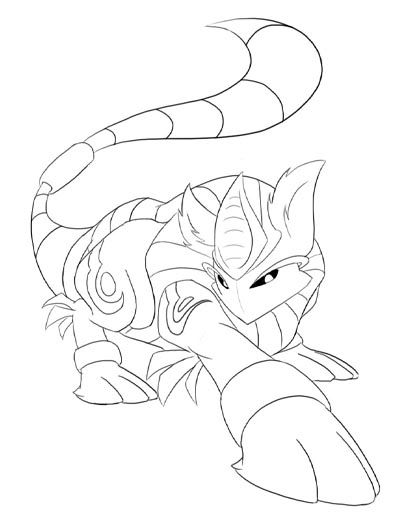
New pose.


I have three works right now.
2.- The Ventriloquist. Its looks is very Dark, but less Ground in my opinion.
http://fc09.deviantart.com/fs40/f/2009/042/d/4/Twiloquist_by_TheBlueFlames.png

3.-The Armadillo. Armadillos are desertic animals that go out only at night, to avoid hight tempetures. So, its nocturnal (Dark) and its desertic (Ground).
http://fc00.deviantart.com/fs50/i/2009/276/f/6/Armadillo_Fakemon_by_TheBlueFlames.jpg

Thanks for watching. Please, tell me what do you think about this capmons.
These two are standouts for me, they are both artistically shaded quite similarly to the way that existing pokemon art is, and I think both represent the typing brilliantly. These are great.


Caladbolg's Armadillo caught my interest early on, but now that I saw Wyverii's dark horse I know where my vote will go^^ And to all who think her art needs a "earthen touch", there are a lot of Ground/*Type* Pokémon who have only the *Type* color scheme (Quagsire, Cacnea and Camerupt to name a few)
Overall, the quality of the artworks is as high as ever. Pretty much in line with the more recent CAPs. Which is a pretty good standard if you ask me!
Overall, the quality of the artworks is as high as ever. Pretty much in line with the more recent CAPs. Which is a pretty good standard if you ask me!

Supporting art for the sandcastle!

The top is Bronzong using Hypnosis, only for the sound waves to bounce around in the bucket and right back out!
The mid-left is CAP9 whacking a Blissey(actually, I think I drew Chansey...) with the shovel. Possibly Night Slash?
The mid-right has Azelf tricking a Choice Scarf onto CAP9, only to be caught by a powerful Pursuit.
The bottom left is CAP9 pointing the barrel of the bucket at us like a cannon, asking, "Do ya feel lucky, punk?"
The bottom right is CAP9 spending its time scooping up hazardous SPIKES and ROCKS and putting them in its bucket, so that noone hurts themselves on the way in...
I'm aware of the size inconsistincies between CAP9 and the other Pokemon, but it was the best way to show the scenes I wanted.
Comments+Criticisms! Attack me!

OK, this is what I have so far...

I guess the key feature about my entry is the medal thing stuck to its forehead. My version of CAP9 loves to burrow into peoples homes and steal valuables, and what it loves most are objects that have mystical powers. Amulets are typically objects that protect the wearer from ill effects, so I figured having one on CAP9 would suit stopping the secondary quite well.
Apart from that, pretty simple. It's Ground because it's a mole, and Dark because it's a thief. I aimed to get the build offensive but with a bit of bulk behind it too. This is by no means my final design, there are many elements about this I wish to change (such as darker colours, I have a bad scanner).
Feedback and criticisms are most welcome : )


That is awesome scampy. My only concern is that the medal might make it seem more like a Fighting-type. What if it was a dark jewel (maybe with a silver chain) on its forehead?
- Status
- Not open for further replies.