• Check out the relaunch of our general collection, with classic designs and new ones by our very own Pissog!

Smeargle's Studio General Thread: Spriting and Banners go here!

Status
Not open for further replies.
Fuzzberry, that griffin is brilliant; looks exactly how it should, very well executed. My only suggestion is do something to the tip of the tail, the star on the end just doesn't seem right.

Now, I posted this aaaages ago and have tried editing it according to people's comments. So, Sparkra's gone from this...

Sparkra.png


To this...

Sparkra2inprogress.png


...so far.

I have heaps of trouble making it face the right direction. I THINK the body can pass off so far, but the head is my problem.

Also, I don't know what to do with the arms.

Please give C&C :)
 
No, are they that bad? =/
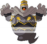
For the most part, no; however, there are a few areas where the outlines are a bit too rounded (the back of Porygon's head), and the lines sometimes don't join up (for example, Dusclops' eye and the base of Exeggutor's leaves). It just looks a bit odd to me. But as long as the final sprite comes out good, it should be fine :)
Fuzzberry, that griffin is brilliant; looks exactly how it should, very well executed. My only suggestion is do something to the tip of the tail, the star on the end just doesn't seem right.

Now, I posted this aaaages ago and have tried editing it according to people's comments. So, Sparkra's gone from this...

Sparkra.png


To this...

Sparkra2inprogress.png


...so far.

I have heaps of trouble making it face the right direction. I THINK the body can pass off so far, but the head is my problem.

Also, I don't know what to do with the arms.

Please give C&C :)

The back leg should be a bit smaller and further up. Right now, its legs are on the same level horizontally, so it looks like it's walking a tightrope or something. Also, don't put the arms in that pose, as it makes it look like it's facing directly to the left. It's a good idea to refer to a sprite with a similar pose to yours; with the arms, have a look at Mewtwo's D/P sprite, as that seems to be similar to the pose you're going for. Same applies for the head; you could refer to Charizard or Feraligatr. The main problem with it that I can see is that the eye is too high up, and you can't see the right side of the head on the other side of the horn.
 
:)

Here is the new Avatar I promised a week ago. It is kicking off a new side project I am doing for fun, which involves fusing random media with Megaman characters. The main sources of "random media" will, for the most part, be taken from Pokemon and Sonic, which make up my three favorite character groups, actually. I am planning for Sonic characters to become main characters from Megaman (eg; Knuckles is Zero), and for Pokemon to be random bosses (eg; Metang is Galaxy Man). So, of course, I have to start with Megaman himself, who, of course, is fused with Sonic himself. So, without further ado, here is Sonic X.

SonicX.png


C+C is highly smiled upon, as usual.

@MrBlack: I honestly think it would be more effective to redo the entire thing. The main body is going to make it look funny no matter what you do, since the sprite is facing straight to its right. I think that you could probably make it look a lot better in a new pose now that you are more experienced. Just my two cents.
 
picture.php


This one was pretty fun to make. Took a Squirtle and made my favorite TMNT when I was a kid ;-)

Donatello is too cool for the Squirtle Squad.
 
Hey guys! I figure I'd start posting my sprites around here. I've never actually sprited Pokemon before. I usually sprite other series such as Fire Emblem, and uh.. Fire Emblem. XD Anyway..

Alakazam has always had amazing artwork, so I decided to base a sprite around the original Sugimori artwork.

2d8jsbp.png
from..
065.png


It's still far from perfect, so I'd love some constructive criticism.

Nothing?
 
Quote:
Originally Posted by Fat Cubic
Hey guys! I figure I'd start posting my sprites around here. I've never actually sprited Pokemon before. I usually sprite other series such as Fire Emblem, and uh.. Fire Emblem. XD Anyway..

Alakazam has always had amazing artwork, so I decided to base a sprite around the original Sugimori artwork.

2d8jsbp.png
from..
065.png


It's still far from perfect, so I'd love some constructive criticism.

Sorry about that. I actually meant to comment in the morning when I first noticed it, but I had to leave for school before I could finish. Looks pretty good; I will have to say that Fire Emblem taught you well. You even remembered the Base Outline Color, and few people do nowadays. I only see two things that could make it look better. The first of which involves shading. I notice that, right off the bat, you have a spot of shine on its right knee plate, and this is the only spot it is at. The sprite would look much better if (a-reccomended) it was more evenly dipersed throughout the plating, or (b) eliminate the color outright. Secondly, the outline for the left foot is crooked. It straightens out at first, and then curves to the side all of a sudden. I believe that you should eliminate the dip in the outline and straighten it out with a plain line. Still, looks great. Kudos to you. ~Steven :)
 
jreo9c.png
2h55r36.png


I did a new one with the DP sprite's colours on the right, with the other one on the left. Thoughts?

Also, I'm still not so sure about the whole base outline colour thing. =/

Had a go at a Porygon2 colour too, didn't turn out too badly I hope.

72t2lf.png
 
Ggogogo, sprite that I spent two and a half hours on!
Griffin.png

Continuing my series of mythological creatures made of Pokemon, I present you with my Griffin! And I shall name him Peter.

C + C would be muchly appreciated. To make him, I used the HGSS Pidgeot, Pidgeotto, and Moltres, then the Pt Luxray and the DP Luxio.

@Rannon- Noooooo. Please no JPEGs. They destroy the quality of your sprites. Save them as PNGs- the color won't get all mucked up that way.

Aside from that, the shading on the ones involving Mewtwo could use a lot of improvement. In all of them, the areas where the spliced parts meet need to be smoothed out. They're disjointed- that is to say they don't connect smoothly into the body. They look pasted on.
OMG I LOVE IT! That literally made my day :) And really i see nothing wrong with it, just posted to say how i much i love you for making that <333
 
Bonus Porygon-Z attempt!

34hgopu.png


C+C. I know the eyes aren't meant to be yellow in the middle but it looks very bad if I make it solid black. =/

Edited with Duskull colour attempt! Bahaha!

xmn8s5.png


Excuse the exclamations.
 
The outlines should use the darkest colour shade when in the light (at the top-left), and black when in shadow (bottom-right). Also, use black to outline parts where two colours meet if the normal outline colour is lighter than the colour it's touching (as on Duskull's mask).
 
Fuzzberry, that griffin is brilliant; looks exactly how it should, very well executed. My only suggestion is do something to the tip of the tail, the star on the end just doesn't seem right.

Ahh, but the star makes it identifiable as Luxio's tail. I want my mythological guys to retain at least a bit of a Pokemon-y feel. Like how Chimaera had Luxray and Ekans' heads.

But thank you much. X3 My hours of work have apparently paid off.

OMG I LOVE IT! That literally made my day :) And really i see nothing wrong with it, just posted to say how i much i love you for making that <333

-bows- Thank you, too. Making people's day is fun.

I think I'm going to try my hand at some more mythological mass fusions sometime tonight. You can expect to see those up, comrades. And maybe some Buizels. =)
 
Can anyone make a sprite with these characteristics?
Can you give it Blastoises shell, and it NEEDS the puffy things from Jumpluff on it... It needs to keep the Physical, features of Jynx
Thank you!
 
Wow nice to see all the activity in my abcense. I'm so excited that I'll finally have access to a computer tonight and do some animation.

Xandz: Thats pretty cool. I like the new dithering tehnique you learned that's on the legs. Couple nitpicks I have are that the left hand has five fingers, none of which are identifiable as a thumb. Maybe change the bottom finger so that it comes out at an angle that's perpendicular to the other four so it looks like a thumb. The other is that the hair is positioned a little too far to the left from the brow, it looks disconnected and kills he depth. And since it's your avatar, make that background transpaerent dude!

Mrblack: u seem to be having the same problem that many newbie artists have, myself included: perspective. What really helps me when I'm having trouble picturing an object from a certain angle, i try to find an object around me that's small and a similar shape and use that to help me figure out the right perspective. Eg, a pencil turns into a sword, etc. However the rest of the line art has some major issues that I cannot address now (low batterry) and you may want to consider starting over. Artwork is kind of like a relationship, in that if things just aren't working out with a piece, you shouldn't feel obligated to keep working at it just you put such and such amount of effort into it. If it's not going to work than it won't work, and it's better to just start over and use the previous work to know what to do and what not to do on your second attempt.

Reaver: I'm flattered that you used my sprite as your avatar, but you jpeged/resized it and it looks awful. Please reupload as a png or allow me to make an avatar for you.
 
Xandz: Thats pretty cool. I like the new dithering tehnique you learned that's on the legs. Couple nitpicks I have are that the left hand has five fingers, none of which are identifiable as a thumb. Maybe change the bottom finger so that it comes out at an angle that's perpendicular to the other four so it looks like a thumb. The other is that the hair is positioned a little too far to the left from the brow, it looks disconnected and kills he depth. And since it's your avatar, make that background transpaerent dude!

I'll definately try to fix the hand, it looked awkward while I was making it, but I just couldn't put my finger on exactly what was wrong (pun intended.). As for the background, I thought I'd transparatize it once I was sure it was a finished work. And finally, hair is actually meant to look like that; Sonic's head spines are actually like that normally. For example:

http://images1.wikia.nocookie.net/sonic/images/a/a3/0152_sonic_unleashed.png

See what I mean? I'll still see if I can't make it look better, though. Thanks for the comment.
 
That picture actually kind of proves to me that your characters hair extends to far to the left. I mean, if you compare the two, both characters are facing in the same directions, but your characters hair spines jut out to the left as if he was facing at a 90* angle to the right. The Picture you gave has much shorter spines (pixel length, not 3d length) to portray that the head is turned toward us. Remember that old artistic concept foreshortening? That's what's at play here.
 
That picture actually kind of proves to me that your characters hair extends to far to the left. I mean, if you compare the two, both characters are facing in the same directions, but your characters hair spines jut out to the left as if he was facing at a 90* angle to the right. The Picture you gave has much shorter spines (pixel length, not 3d length) to portray that the head is turned toward us. Remember that old artistic concept foreshortening? That's what's at play here.

Well, whatever the case, I'll see if I can't fix it tomorrow, since right now, I need some sleep. I'll see what I can do, though.

EDIT: Okay, I see now. I had one of my many "brain farts" yesterday. I was actually completely misinterpretting what you were saying by getting two definitions switched. Sorry about that. I'll try to fix it after school.
 
I'm so stoked that I finally have time to myself to sprite that I want and did a scratch in 20 minutes. The reason it's so big is that I intended it to be for Wizwum. Used a completely new palette because I didn't like the ones from the gamefreak sprites. My first speed sprite, what a rush.

th_Charmandersprite-1.png
 
porygoncolour.png
porygoncolour2.png
porygoncolour3.png

The latest version is on the right, C+C?

duskullcolour.png

I edited this one slightly too.

exeggcutecolour.png
exeggcutecolour2.png

Now, I recoloured Exeggcute, and the one with the DPPt sprite's colour scheme is on the right. I know the outlining isn't up to scratch, but I personally prefer the colouring of the left one.

Gave Exeggutor a shot with the whole colouring thing, turned out like this:
Eggycolour.png

WIP obviously. Haven't quite done the leaves yet, but C+C on what I have done would be top notch.

Also, WSC entry for C+C:
WSC11.png

It's Grass/Steel by the way.
 
Does this look any better?

thSonicX.png


The spines were a pain in the -edit-, so I just turned the head around to match the momentum of the sprite. Should be fixed now.
 
I'm so stoked that I finally have time to myself to sprite that I want and did a scratch in 20 minutes. The reason it's so big is that I intended it to be for Wizwum. Used a completely new palette because I didn't like the ones from the gamefreak sprites. My first speed sprite, what a rush.

th_Charmandersprite-1.png
His mouth needs some work.
And his snout is pretty small.

Very sexy for 20 minutes though, just more annoyed by the snout than the mouth tbh. :<
 
Congratulations, you have mastered the paint bucket tool in mspaint! Now you may want to consider moving on to more interesting forms of spriting. That's my c+c.

@XandZero2: The head looks a lot better now that the direction of the hair matches the direction of the face. I thought it still looked really flat though, so I tried playing around with the palette and came up with this. I didn't change any of the shading or add any colors, I just increased the contrast in the hues.
 
Status
Not open for further replies.
Back
Top