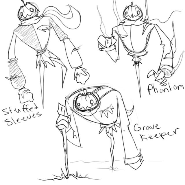
Masks - The trophy idea, as well as the drama masks, is pretty cool in my opinion. It fits with the concept very well, and the emptiness in the Pokemon created by the juxtaposition of the masks and the bleak coloured Pokemon really emphasise the ghost nature of the Pokemon, creating a similar effect as Yamask in highlighting the Pokemon's nature as a faded actress. I agree with the general notion that they distract from the design overall, but as you said, here and in the next section, it is problematic trying to remedy that. Perhaps to show how outdated she is, the trophies can look like they've begun to age, like a bit of colour fading or so? Maybe a minor crack or scratch? In the colours section, I found the bronze and silver masks (nice touch, by the way) managed to fit in with the main design much better than the standard colour scheme, but I'll mention that later. Otherwise, I cannot think of anything else to be done to the masks themselves.
See-through Mask Holes - This was one of the main critiques I saw of the design in the thread, but seeing two of the most likely alternatives makes this a hard thing to fix. I suppose the obvious answer would be to change the way she's holding the masks, but I think you'd need to change the pose of the whole diva for that. Perhaps instead of showing the background leaves in full colour, you can still make out the silhouette but make them appear gold behind the eyes, as if the back of the mask was translucent? Or maybe the gold you used to fill in in the second option could be darker, to make the mask feel more hollow. Perhaps you could put some holes in the leaves (not too many to distract, but as in going with the decaying theme I mentioned earlier in the colour masks) so that the white in the eyes seems normal? I can't really think of any other solution either, I'm afraid.
Colouring - Personally, I prefer the washed out green than the rich green, for much the same reasons you mentioned i.e. not going particularly well with the grey. As I mentioned before, I think the masks on the alternate colourings fit with their scheme better than the gold masks do, themselves, in particular the silver mask. Have you considered putting the silver masks with the main colour scheme? I think that may solve some issues people have with the trophy masks sticking out too much, but your mileage may vary.
Grand Dame References - Strange, I would have considered going with Yzma from Emperor's New Groove (even though she doesn't quite fit the archetype) simply for how creepy she is, lol. If there was one thing I might have considered, it would have been putting a leg slit through the dress, but considering she doesn't even have legs, that's a bit pointless, lol.
Eye References - While I quite like the eyes, and can see where you're going with the open eyes look, I can't help but feel that the sources you chose seem to show more angry, shocked or maybe even envy (though I think envy would be quite suitable for this Pokemon) emotion rather than wistfulness and despair. I'd suggest trying to give the eyes you've used some sort of emotion, like an eyelid, but I like the eyes how they are now, and I have no idea how you'd incorporate an eyelid.
Learning Sketch - While using 'Drama Masks' as a unique item would be the logical conclusion, I'd assume that the whole 'actress trying to prove that she's still relevant' angle of the design would justify her 'playing a role' of copying another Pokemon's moves. As you said though, it's not quite relevant to this stage other than how it incorporated into the design.