If you had to chose the best (or your favorite) what would it be?
-
Smogon Premier League is here and the team collection is now available. Support your team!
-
Welcome to Smogon! Take a moment to read the Introduction to Smogon for a run-down on everything Smogon, and make sure you take some time to read the global rules.
-
Congrats to the winners of the 2025 Smog Awards!
You are using an out of date browser. It may not display this or other websites correctly.
You should upgrade or use an alternative browser.
You should upgrade or use an alternative browser.
What is the Best Type?
- Thread starter TheMogRunner
- Start date
Poll up
If you mean Jinx, no
helvetica
it's pretty obscure, though, you've probably never heard of it
it's pretty obscure, though, you've probably never heard of it
Are you serious Helvetica is hella ugly.
@Macle: Big tits=saggy tits eventually
@Macle: Big tits=saggy tits eventually
saggy tits= more money for breast implants
breast implants= non saggy big tits
breast implants= non saggy big tits
Just a clue to the OP, probably best to keep this sort of thread out of 4m and...actually, not sure where this goes. Hopefully not Trou.
In other news, Dragon is broken and should be moved to the uber tire.
In other news, Dragon is broken and should be moved to the uber tire.
Are you serious Helvetica is hella ugly
lol, really
There's something to be said for how played out it is-- being a wildly successful typeface that has had a profound influence in graphic design for some 50ish years
to the point where it's completely overused, overdone, thoroughly explored, sure
but Helvetica Neue still rocks faces, dig those thin weights, just thin as rails, so baller
helvetica beats arial any day
right now I feel like brothers is my favorite type
Pros read Wingdings.
Rock is by far the most consistently awesome type.
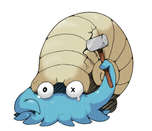
Rock does strong:


Rock does cool:


Rock does crazy:


Rock does cute:


Rock does happy:


Rock does sad:


Rock does mysterious:

Rock does hilarious:

Rock rocks!

Flying and Bug are alright too..
Whoops, I missed out a phrase. But in the middle there, after sad, rock also does good and then bad. With a rhyperior for bad and a carracosta or tirtouga for good. If I can find an image of them carrying someone about on their backs. I cant be bothered fixing this right now.
Rock does strong:


Rock does cool:


Rock does crazy:


Rock does cute:


Rock does happy:


Rock does sad:


Rock does mysterious:

Rock does hilarious:

Rock rocks!

Flying and Bug are alright too..
Whoops, I missed out a phrase. But in the middle there, after sad, rock also does good and then bad. With a rhyperior for bad and a carracosta or tirtouga for good. If I can find an image of them carrying someone about on their backs. I cant be bothered fixing this right now.
normal/normal
Brain implants>breast implants.saggy tits= more money for breast implants
breast implants= non saggy big tits
Rock is by far the most consistently awesome type.
Cool Stuff
I see no mention of Aggron, I am sad to not see this I mean

the fuck is this bullshitAre you serious Helvetica is hella ugly.
Thank you.lol, really
There's something to be said for how played out it is-- being a wildly successful typeface that has had a profound influence in graphic design for some 50ish years
to the point where it's completely overused, overdone, thoroughly explored, sure
but Helvetica Neue still rocks faces, dig those thin weights, just thin as rails, so baller
helvetica beats arial any day
right now I feel like brothers is my favorite type
Well, Helvetica does look like complete trash when it's not properly kerned - especially at smaller sizes so I can see why people might dislike it at first glance.


