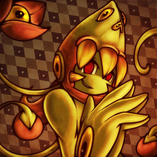
Is it just me or should the lips be.slightly higher? >.> Haha but this is still great even though I have no idea what it is lol! You're using those block black lines lesser now? Anyway Yilx too pro *_*
-
Check out the relaunch of our general collection, with classic designs and new ones by our very own Pissog!
-
Welcome to Smeargle's Studio! Please be sure to review the studio rules. Feel also free to check out our hub to learn more about this place!Welcome to Smogon! Take a moment to read the Introduction to Smogon for a run-down on everything Smogon, and make sure you take some time to read the global rules.You are using an out of date browser. It may not display this or other websites correctly.
You should upgrade or use an alternative browser.Yilx first place artist
- Thread starter Yilx
- Start date
How do you churn these out so fast
; 3;How do you churn these out so fast
; 3;
I just draw too much for my own good I guess... :(
I love the background and shading!
thxThe steel type and the flying/fighting type are neat.
How many layers did you use on Amorpha, that artwork looks so FULL OF WIN AND EPICNESS. D: Unbelievable.
Not alot to be honest lol, about 10 maybe??
yomu
 Yilx what I love most about your art at the moment is that you are (very successfully) breaking away from the "yilx style" you had of black background etc. The backgrounds you've been usin recently are just lovely and really help to like add onto and complement the piece instead of just being there like the old ones. And your shading is just to die for, it's so smooth and rich :)You are a true professional indeed.
Sawk
You are a true professional indeed.
No way... I'm no where anywhere near that level yet.
Look up aragornbird/rocket grunt/etc if you want to see a true pro
Hey Yilx, could you do a Haunted Pokemon House filled with Haunters, Chandelures, etc?
That would be really great thanks!
Pleease.
On a different note, your art is probably the best Smogon has to offer. I salute you.
Someone already did that way better than I ever could even dream of doing, actually.Looks good yilx. Nice touch with the red lighting. My only criticism is that the shadows aren't in the same direction as sawk's attention which makes his pose's angle look a bit weird.It feels pretty smooth but yet metallic like it's a blue iron man >.> haha
Such lineart isn't what you normally do right ?_? IDK it feels like somewhat a mix of Zracknel and you >.> haha the shading on the right leg seems somewhat awkward :d
You just can't stay away from your jagged shadows can you x)It feels pretty smooth but yet metallic like it's a blue iron man >.> haha
Such lineart isn't what you normally do right ?_? IDK it feels like somewhat a mix of Zracknel and you >.> haha the shading on the right leg seems somewhat awkward :d
You just can't stay away from your jagged shadows can you x)
I used to do it like this, way back in 2010. Then I started black-backgrounding...looking at that sawk yilx, i cant tell which way is the front. The legs seem to be facing towards the right and the body is swiveled to face to back right. Its like his torso got flip turned backwards. maybe its just me though.
as for you not being pro status, you are on the same level as Rocket Grunt and Aragornbird and whoever else, but i guess we all say that we just arent as good hahahaI love the warmth of the red shading on Sawk, a nice contrasting touch. I think the piece would have an overall more professional feel to it if there was more of a back ground, showing the source of the light. You've worked a lot recently on backgrounds. The discrepancies in the stance and pose have been highlighted already. If you developed the shadows a little more then it would have a more professional feel to it definitely. The shadows currently don't make sense unless the red isn't a light it's just to highlight the shadowed part of Sawk. Still, the shadows on the ground could be more developed. A good piece and I've always loved your work but still there are areas you could improve on. Just like everyone. Hope this helps and isn't complete nonsense :)yilx, your art is absolutely exquisite.
of course this is a pokemon forum, but i am constantly enamored with your humans and girls that you constantly draw. you're very adept with minute details, and their hands are never, ever awkward! everything is in its rightful place, doubly so when adapting to a pokemon design and still retaining your own flare in its creation.
also can you tell me how to just draw myself some abs like iroha uta, thanks~


