Yilx first place artist

Needs more Stag boobs :/

Seriously though, the lighting in this one is absolutely amazing. You're really improving Yilx. Great job, especially on that scenery one earlier
 
I'm sorry Eagle4.

I just liked your Secret Santa Toxicroak a little too much lol

1DyVS
 
is it just me or does it look constipated

is it just me or does it look constipated

is it just me or does it look constipated
 
Wooo! Meloetta-P to the rescue, slaying TTar and saving Kirlia! EPIC ART IS EPIC <3333

EDIT: Lol, you won MAC!
 
That piece of art is super-effective and really epic.

I like that a fighting type saves a psychic type who are helpless to dark types.
 
The hand's a bit messed up, and a couple of the squiggles look a bit slapped on - especialyl some of the ones on her 'headdress'.

But yeah excuse me whilst I go and wank myself into a coma over your lighting.

Seriously though, how do you start building up your lighting? And how do you choose your colours?

unfortunately what i can say about colour picking comes through practice and studying. i'm still practicing.

what i did was draw environments and try to match the colours without using the colour picker tool.

1Koqo
 
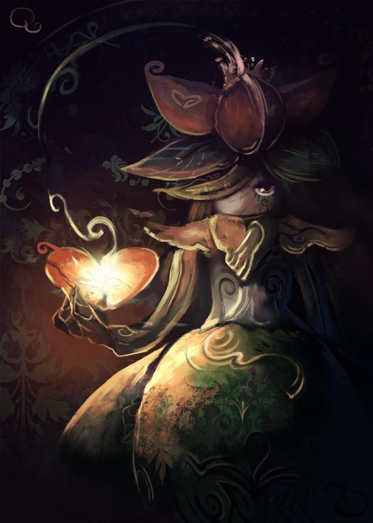
Instantly thought of FF X-2, despite the Touhou tribute. I am always intrigued by images with depth, which you've managed well by adding fine details to some parts while others stay less defined. Her head and body appears to be the main focus, but her limbs doesn't seem to be following the same depth perception though, like how her left arm is unusually sharp compared to both her right hand and left leg. Her hair could also use some single strands in-between the tufts, so that she doesn't look like she overloaded it with gel.

With that said, the gritty look combined with colors of low saturation made for an easy eyecatcher, and I'd love to see other iterations of it.
 
I have little complaints about this image ...... except for the eyes. I can't really pinpoint what's bothering me about them, but it might just be that I don't find the sparkly anime eyes to be appropriate for the setting. Try to remove some of their reflections and see how it turns out.

also I can't recall if that earlier WIP of yours included a drink or not. Either way, I was looking forward seeing a tipsy Nocturna.
 
Back
Top