• Check out the relaunch of our general collection, with classic designs and new ones by our very own Pissog!

Sticky X/Y Sprite Project

Heliolisk QC: Not sure what request Typhlito made (can't find it on the thread), but wasn't under the impression that it needed any changing - if anything I would have said it was almost ready for animation as it was (especially as Layell has been posting shiny sprites for it).

Oh it wasnt on thread. But anyway, It really just needed a palette edit to be consistent with heliotile. That qc'd head looks kinda weird to me. Liked the old head better tbh but thanks for the help :)

As for florges's back, since I forgot to save it in parts, it is going to take much longer to fix. Gonna try getting it done in 2-3 days since its a busy weekend for me.
 
Last edited:
So, I fixed up Mega Blaziken's backsprite based on the errors that were given to me, and I want to make sure it's acceptable before I apply it to the other 3 sprites. After that I'm going to work on Mega Banette.
nega blaziken back (fixed).PNG
 
Last edited:
aXl Aurorus's legs seem too "straight" and thick, and the positioning on the ground is awkward. There isn't enough distinction between its head and neck; probably either have it face to the side more or tilt its head forth a bit. The crystals on the sides of the body should be diamond-shaped. The shading on the sails is fine, but they could be more impressive-looking. In terms of colours, the blue part of the sails seems too dark. Isn't it a light indigo? I also believe that the underbelly should be light blue, not white as it is currently.

Wobblebuns Mega Gengar looks great. One thing I'd change is, as you mentioned, moving the tail a bit to the right and maybe down one pixel so that it isn't level with the body and gives the illusion of being slightly closer to us. Other than that, the upper lip looks kind of crooked; I'd suggest smoothing out the outline.

I'm not so sure about Heliolisk. I guess that now would be the time to fess up and say that I was the one who requested Typh to request a makeover. I'm not a fan of the new proportional changes, but I like what you did with both hands, the eye, general shading, and the outlines on the orange collar. I suggest applying all of those things to the current set of sprites as well as smoothing out the outlines.
 
I got the motivation last night to bring this up. Let's talk about Sylveon.

Here are all the reasons I will be using the current version of Sylveon rather than the N-Kin/Ridaz one

flareon.gif
vaporeon.gif
jolteon.gif
espeon.gif
umbreon.gif
glaceon.gif
leafeon.gif


There all seven reasons.

9rmyKFX.gif


Just looks like in fits it much more than

1Uz26BH.gif

With that, it seems Sylveon's been stuck with its current face without additional substantial edits that help it fit with the other Eeveelutions. I've been waiting for you on IRC, princessofmusic, but I haven't seen you, so I'm bringing up my concern here.

I've been seeing a lot of comments, from both in the thread and outside, about fixing Sylveon using Layell's sprite over N-Kin's or another spriter's suggestion:

OBJECTION!
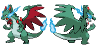
Gen V eyes do not follow the rules for outlining elsewhere on the sprites! This can be seen in existing Eeveelutions, such as Leafeon and Glaceon, as can be seen below.

You can see in the above picture that the eyes actually get softer on the edges in the case of Glaceon, ensuring a smooth transition between the two shades of blue. This shows to what lengths GameFreak is willing to go in order to ensure the subtle features of a Pokémon's face. Gallade is shown here to provide an example of Gen V shading where the eye is mostly outlined, here because the eye shares a shade of white with the surrounding face. So actually, making the eyes more subtle actually works into Gen V's style to a greater extent.

Your point about accuracy still stands, but I am inclined to disagree with you in regards to eye outlines. +)

I see your point, but, I just feel like there's something left here. I just know this can be improved, by picking the quality of both sprites and turn it into Gen 5 style. Is it the contrast? Amount of outlines? the eyes?~

Also, I forgot about this QC made by RedRooster. What about this one? It's getting closer to the Gen V look, IMO
fairy-png.6071

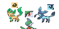
I also asked various people on IRC (with Layell's and pom's suggestions) on what Sylveon they prefer based on overall 'beauty' (pom, your word) and comparisons to the Eeveelutions, using this as a guide (as Layell so much used those 'seven reasons', so have I).

2mhvtx4.jpg


#1 is pom's edited version
#2 is Layell's version
#3 is a modified N-Kin version
#4 is RedRooster's suggestion
#5 is something I've fiddled

Note that as I used a slightly different image for comparing Eeveelutions and Sylveon versions, so there are some quotes where 6 has been moved to 5.

various IRC users said:
  • "1 and 2 face forward, which seems off in the grouping of all the eeveelutions."
  • "sylveon's eyes are creepy in all of them but I think least so in 4-5"
  • "5/3/4/2/1. the eyes are way too huge on number 1"
  • "I vote number 5. sylveon's eyes are going to be creepy no matter what, but in that one they're at least not demonic and the head feels less warped than the others"
  • "i really like 3 and 5"
  • "3 and 4 are fine by me. 3 has the best proportions and linework. the eyes on all the others are too large"
  • "i kinda like 4 the best/still like 4's face the best"
  • "EVERY OTHER EVEE FACES SIDEWASYS"
  • "Quanyails, 5 looks the best"
  • "i like #5"
  • "4/3/5/1/2 in order of preference. i find the eyes on 1 and 2 are a bit big and buggy. 3 is nice but perhaps overly cutesy. 4 looks correctly sized and proportioned, and is pretty and elegant"

So, as you might see, the audience--some artists, some not, some people in charge of PS!--do not prefer #1 and #2 and more toward the suggested changes. I've discussed against Layell and pom about why #1 or #2 shouldn't be kept, although neither user opts for updating Sylveon. I personally prefer #3 or #4.

Here are arguments presented to me against changing the sprite:

Argument: Sylveon's eyes are less accurate when they're not egg-shaped, and accuracy is a key quality of sprites.
Response: (Props to Typhlito and Leafia_Barett): The shape of Sylveon's eyes only are most blatant when Sylveon's eyes are facing more front. The other Eeveelutions, as many have pointed out, face to the left more, to the extent that only one eye is fully visible while the other is partially obscured. By turning Sylveon's head, its eyes will look better without awkward pixellation while maintaining accuracy (which, as previously mentioned, should not adhere 100% without considering overall aesthetics).

Argument: There are precedent for Sylveon's head being tilted back and facing forward.
Response: Layell's "seven reasons" don't, though. In addition, many other sprites--the majority--have a leftwards face more than a tilted back one.

Argument: Sylveon's mouth is obscured in the edited versions by the bow.
Response: It's fine if a few pixels are tangent to some other pixels. Sprites typically have anti-aliasing that allows the user to perceive a sprite as something more than what the individual pixels means. Anti-aliasing makes the mouth look natural and less shunted up. Even then, the mouth is not an argument about the eyes, which is the primary point of contention.

Many other people say that #1 and #2 do not look as good compared to suggested changes because of the position of the head and the buggy, fully-outlined eyes, and I would think that our audience knows and prefers a sprite which appears better as a whole and integrates well with similar, in-game sprites over perceptions about how 100% accurate the design is to its Sugimori art.

--

In short: People like the edited Sylveon sprites over the current. These edited versions have been denied pushes onto PS!. I am concerned about the lack of attention and reaction toward this general opinion by Layell and pom, and hence, would like an update to the current sprite.
 
Last edited:
Lets not forget the actual current version of the sprite, which again isn't on that image.

sylveon.png


I've chatted with Wyverii, who happened to be back today. She had a big hand in the original sprite thus may be of some help to this. Currently I am really only interested in edits on the eyes of the sprite I have posted. Currently the best approach I see to any current suggestions is modifications to the eye outline. One possible way I am open to this is adding another blue colour into the eyes. N-kin's has four which I have thought excessive, but may help for us to properly define the eye shape.

I do not think an outright replacement is necessary, anything other sprites have over this one at this point should instead be adopted into this sprite.

If you have any suggestions at all, instead of just talking about them, actually sprite it. Make it happen, this is the fastest way to convince me to change it. Anything else I will ignore and/or delete. For this sprite this has to be how we move forward.

Also Slurpuff

KW8059z.png
5vel0in.png

1CIwepH.png
wvcPqKS.png


Some palette edits to make shiny work.
 
Last edited:
Yes, Wyverii was on irc today. I didn't know until Layell told me separately. Feeling very confused and excited, I dropped everything to greet the old co-director (maybe not a smart idea, since I have a communications assignment due tomorrow morning. It's past midnight, and I'm not done, but it was worth it). I was worried and I'm glad you're safe, so welcome back. <3


About Sylveon

For those who haven't been fully involved, the context is, since late December or early January (so over the past month), Quanyails has been freedom-fighting for Sylveon to face sideways by confronting Layell and I about it regularly over IRC. Layell and I feel that the new edits are inaccurate and unattractive.

I've been waiting for you on IRC, princessofmusic, but I haven't seen you, so I'm bringing up my concern here.

There are two reasons I've been absent from IRC. One, I'm drowning in university work. I've already mentioned this on the channel while you, Layell, and aXl were there. Instead, I debate with aXl, Typh, and the boss himself regularly over PM. You don't send me private messages. Do I smell or something?

Two, I've been avoiding IRC on purpose. I know that you're probably there, and if you are, it means that I'm going to be bombarded by Sylveon arguments, and I don't need that. I leave sprite talk at Smogon and go on IRC to relax with my friends and co-workers.

This is splitting hairs, but you mixed up #1 and #2 in your diagram. #1 is the one that I did.

It isn't really about eyes or head angles anymore. Layell and I are tired and don't want to be harassed. We have one thing to say, and Wyverii captured it best:

Well my stance is pretty clear on the matter. I think people are in the monkey house at the moment and have been working on it for so long they just can't see it clearly anymore.

There are lots of other unfinished sprites waiting for QC. If you have time, work on the others. This goes for everybody.
 
aBELcyJ.png
3qkjczb.png


A few touch ups here and there, may do some more who knows.

I also did some earlier touches on these two.

fmxQ4qQ.png

xoQ09nh.png
 
Last edited:
Thread's dead. I was hoping to rhyme-zone that somehow but I can't think of anything else that'd make sense. Anyway, no posts in nearly two whole days, so I might as well be the one to break the silence.

So yeah, here's a thing.

Aurorus
New______ Old_______


So I've clocked in another four hours mainly doing color correction work, although I have a million other edits in here to hopefully fix any issues with it. Now instead of having all of the shared colors, Aurorus now has the following unique pallets:
-underbelly
-base skin tone
-sail yellows
-sail fringe/face pattern/claws
-gems

The only two sets of colors that should be altered in the shiny are underbelly-teal and base skin-blue. With that said, I think I may have well made my first shiny-friendly sprite this whole project. Aside from that, I put in a possible leg edit (thinner and possibly less straight? idk i just thought they looked good), made the sails have more of a presence, made the gemstones less square, and rounded out the area where the tail meets the body. With that said, maybe sometime soon I'll be able to move onto the backsprite. +)

So yeah, time for the second round of QC guys. Let me know any concerns you may have and I'll try to get to them in between required reading for school.

Sláinte!
 
aBELcyJ.png
3qkjczb.png


A few touch ups here and there, may do some more who knows.

I also did some earlier touches on these two.

fmxQ4qQ.png

xoQ09nh.png

Not entirely sure, but I'm thinking there could do with being a bit of shadow underneath Heliolisk's orange 'flaps' (I'm ill and can't think of anything better than that so **** it) - just looks slightly odd otherwise (my attempt below, probably needs work)
Heliolisk.png


For the Meowstic duo, can't see any issues with the male - but the female looks cross-eyed @_@

Thread's dead. I was hoping to rhyme-zone that somehow but I can't think of anything else that'd make sense. Anyway, no posts in nearly two whole days, so I might as well be the one to break the silence.

So yeah, here's a thing.

Aurorus
New______ Old_______


So I've clocked in another four hours mainly doing color correction work, although I have a million other edits in here to hopefully fix any issues with it. Now instead of having all of the shared colors, Aurorus now has the following unique pallets:
-underbelly
-base skin tone
-sail yellows
-sail fringe/face pattern/claws
-gems

The only two sets of colors that should be altered in the shiny are underbelly-teal and base skin-blue. With that said, I think I may have well made my first shiny-friendly sprite this whole project. Aside from that, I put in a possible leg edit (thinner and possibly less straight? idk i just thought they looked good), made the sails have more of a presence, made the gemstones less square, and rounded out the area where the tail meets the body. With that said, maybe sometime soon I'll be able to move onto the backsprite. +)

So yeah, time for the second round of QC guys. Let me know any concerns you may have and I'll try to get to them in between required reading for school.

Sláinte!

Looking at the angle of the head, I'm thinking it should be angled slightly more in line with the neck than it currently is - either that or slightly lifted so it doesn't look like it's facing downwards...I dunno, something just looks off about the head that I'm not entirely sure about @_@
 
Hawlucha
Hawlucha.png

Been a while since this was looked at, so here's a hopeful go - I recall Typhlito wanting to mix Layell's and princess's versions together, so here we go.
1. Mix
2. princessofmusic (coloured by myself)
3. Layell

All I've done is take the head from princess's Hawlucha (which has the most accurate feathering and eye shape) and added it to the body of Layell's. Having looked at the colour palettes, I'd wager the one I came up with would be too dull for Gen 5 style, so I went with Layell's instead - I can try and put one together with my own colour scheme if people think it would be better suited. Will take care of merging the backsprites once I have a fair idea of what looks best to people.

(Edited because of a wild 16th colour in the eye)
 
Last edited:
Wow pom both squidwards look amazing altho I cant help but wonder if little squidward (since I cant remember its name off the top of my head) could use a bit more shading on the whites.

On aurorus, is there any way to make her face a bit more prononced? Think her face blending into her head a bit too much. Otherwise, its good :)

As for hawlucha, I like it. Only thing I see off is his left claws. Think it could be a bit more refined there but otherwise, its pretty good!

Anyway, heres the long overdue back animation for florges. Sorry it took so long. School is really eating away on my free time.

9AXTdXO.gif


Yeaaaa it looks like I have two layers up on that one frame (when I really dont) but its not showing up on my photoshop so I dont think I can fix it. Really weird since it shows up fine on my computer when I try to fix it. Someone is going to have to go in and erase it from that frame since I cant do it :s

EDIT: LAYELL EDITS POSTS, REPLACES ANIMATIONS, SUCCESS ALL AROUND!

Edit: Thanks Layell!

But... on the bright side, besides that, think florges is completely done now. On to xerneas!
 

Attachments

  • florges-back.gif
    florges-back.gif
    65.2 KB · Views: 1,654
Last edited:
This days i couldn't animate sprites for the exams... so, i decided to animate some icons. It' s very easy (there are only 2 freme per icon), and i think that we could include to this post.
Here, some examples that I've animated from Pokemon Wiki:

wdXfPUj.gif
azRuYXZ.gif
f3U2CLX.gif
foIoIhj.gif


In one week, more or less, i will continue the aerodactyl animation that i started many weeks. Then, i would like to animate mega kangaskan. I download the baby from a page (i don't remember who has create, i cannot give credit to him :pirate: ). The image is this:

lwbdoIj.png
E7Zdjlp.png


Do you like that kangaskan's baby?

EDIT: I forgot to upload the final back froakie animation.
1zvMqCU.gif
uveZz7V.gif

R0Gpzws.gif
BdVbEzb.gif
That Kangaskhan baby was actually created by me. I posted it on here a while back, though this is the updated version which I had posted about a month or so ago on DeviantArt here: http://thecynicalpoet.deviantart.com/art/Mega-Kangaskhan-Sprites-419630783

It's completely fine with me if you guys wish to use my Kangaskhan sprite.

Ok, if there's no problem to use your kanga's baby,and they like (i think this is the best baby that i've found) i will startwhen i will finnish the mega aerodactyl.
 
There might be some colour problems with Kangha baby, it will make Mega Kangha go over the 15 colour limit, I agree we need an improved one, but we might need to have some fun with colours which I'll do eventually.
 
MegaCharizardXShinytouchups_zps2f4a27d0.png

Just showing an draft of a more accurate Shiny X-Zard. The flame colors have been left intact, this one has the same amount of colors as the normal X-Zard and is an exact palette swap. It may need some fixing, but I'd like to know if this is a good palette.

As always, feedback's appreciated and thanks for reading.
 
There might be some colour problems with Kangha baby, it will make Mega Kangha go over the 15 colour limit, I agree we need an improved one, but we might need to have some fun with colours which I'll do eventually.
Just curious, but (excluding transparency) Kangaskhan's normal Black and White sprite has 13 colors without having its baby in its pouch. Unless I'm missing a color (which even if I was, the point would still stand), that would leave Baby Kangaskhan with only using two unique colors of its own.

Now, it is possible to have the baby use the same belly, ear, and head plate pallet, but that would still leave only two unique colors for the baby. You could remove the secondary shade of the eyes and use Kangaskhan's mouth color (which it already is, I believe), but you'd still be faced with the inevitable removal of the baby's blush, as well as having to try and somehow create a plausible purple pallet that can somehow blend with the brown color scheme Kangaskhan already has.

My question is that, seeing as Mega Kangaskhan is the only Pokemon that utilizes two individual Pokemon, would the 15 color limit still apply to it? It seems like there would be too much to stretch for the baby sprite to actually fit the style.
 
7YcgvNU.gif
0OXsONI.gif

seleccion, I "uncropped" the standard Aerodactyl animation to be 96 by 96 pixels. For the sake of consistency, I think it would be better if you worked on this version of the animation rather than the one on Pokécheck. It also grants some extra room in case the spikes would extend beyond the smaller borders of the other version.

I've been meaning to sprite the alternate versions of Mega Aerodactyl's wings facing downwards as soon as it got approved for animation, but I'm really being pressed for time here. Sorry I don't have that now.

Anyways, I haven't posted here in a while, but I promise I HAVE been getting some animation work done since Wednesday. I'll probably be able to post a preliminary version sometime soon.
 
I'm also going to mention that animations can be more than 96 x 96 as some of the genies do kthnxbye.

kangha baby expanding the colours is plausible, and will be something I do consider, it all depends on if the browns 'blend' into the mama too much. Once again I'll probably take this on at some point in the near future.
 
iitrN1n.png
ASbon1X.png
rlN1Tlr.png
RU91b2K.png


So, I was stuck on what to do with Braixen for the longest time. Before this, I tried an edit based on the appearance of the in-game model, but it looked too stiff and didn't work. Finally, I realized that Braixen probably has the most acceptable DW artwork out of everything gen 6, so that's what this edit is based on.

As for Delphox, I made minor changes to the shading and some outlines. Many thanks go to Layell and Quanyails for correcting my original weird-looking back while I forgot about it.
 
pLfIt6K.gif
qbm5w56.gif

KqRP2m2.gif
NK7eMyL.gif

Believe it or not, I used to be a fairly efficient worker. But in the past week, I've developed some alarmingly severe procrastination habits. I finally got all of the animation files for Mega Scizor set up. However, it's not like there's anything to show for that. So I quickly threw together some wing movement alongside the usual final sprite edits, just a little something that can be put up on PS! in case the claw motion and stuff doesn't get finished anytime soon.

I hope a lot of Mega Scizors are running Defog, otherwise this isn't going to make all that much sense. I'll call it "good enough" nonetheless.

EDIT: Typhlito, it's not going to happen. aXl's post outlines some of the reasons why. By the way aXl, I considered going for only two frames, but I didn't want to overdo it. I think that four frames at 20 FPS strikes an ideal balance between speed and detail.
 
Last edited:
pLfIt6K.gif
qbm5w56.gif

KqRP2m2.gif
NK7eMyL.gif

Believe it or not, I used to be a fairly efficient worker. But in the past week, I've developed some alarmingly severe procrastination habits. I finally got all of the animation files for Mega Scizor set up. However, it's not like there's anything to show for that. So I quickly threw together some wing movement alongside the usual final sprite edits, just a little something that can be put up on PS! in case the claw motion and stuff doesn't get finished anytime soon.

I hope a lot of Mega Scizors are running Defog, otherwise this isn't going to make all that much sense. I'll call it "good enough" nonetheless.
Hey legit although the wing movement you gave it is nice and smooth, I dont think its suppposed to move its wiings like that. If you look at regular scizor's animation, its different compared to most other winged bug types.

212.gif
212.gif


It looks weird to me seeing mega scizor moving its wings that way you made it but dont think its a hard thing to fix. Keep at it c:

And pom, maybe the shading on the tail on the back sprite could be adjusted since it makes that angle. Not that shadows dont make angles like that lol but just throwing it out there. Otherwise nice job there
 
pLfIt6K.gif
qbm5w56.gif

KqRP2m2.gif
NK7eMyL.gif

Believe it or not, I used to be a fairly efficient worker. But in the past week, I've developed some alarmingly severe procrastination habits. I finally got all of the animation files for Mega Scizor set up. However, it's not like there's anything to show for that. So I quickly threw together some wing movement alongside the usual final sprite edits, just a little something that can be put up on PS! in case the claw motion and stuff doesn't get finished anytime soon.

I hope a lot of Mega Scizors are running Defog, otherwise this isn't going to make all that much sense. I'll call it "good enough" nonetheless.

This is worth mentioning, but in the ingame model, Mega Scizor's wings flap ridiculously fast, up to the point where an accurate representation would literally just be two alternating frames. Granted, I don't know how accurate we're trying to make these sprites in terms of animations since I've been completely separate from that part of the project, but its worth mentioning. Also, Normal Scizor's wings don't flap at all in XY, so I think it's safe to say Mega Scizor gets a lot more jittery upon mega evolving.

All of this can be found on YouTube if you're looking for good refs. I'd link the source that shows this but that's hard to do on an iPhone.

Actual update post should be coming tomorrow or the next day, I just thought I needed to throw in my two cents here before you made another half dozen frames. Looking good so far, keep up the good work!

EDIT: Also, I think if the wing animations were different, it would help to differentiate between normal and Mega Scizor, so I actually think I'd approve of going with standard horizontal motion rather than normal scizor's weird vertical wing flaps.
 
Last edited:
Back
Top