A Knight's Artwork

NOTENOTENOTE: NEWER STUFF IS LOCATED NEAR THE BOTTOM, IGNORE MOST OF THE STUFF UP TOP


Heeey

When I'm not wasting time on the internet or being at school, I'm almost always drawing. I only started to get serious with my drawing/Pokemon character development about in September of last year, and I finally got a tablet for X-mas, plus started to improve a lot with sketchbook work. Here is some of the stuff I've drawn so far this year.

Torchic (not my general style, I'm a black-outline guy):
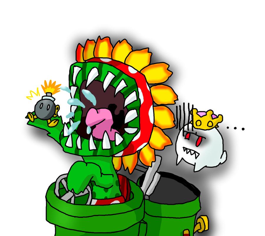
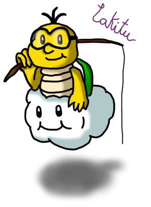
chicky1.png

Wario (?)
immagonnawin1.png

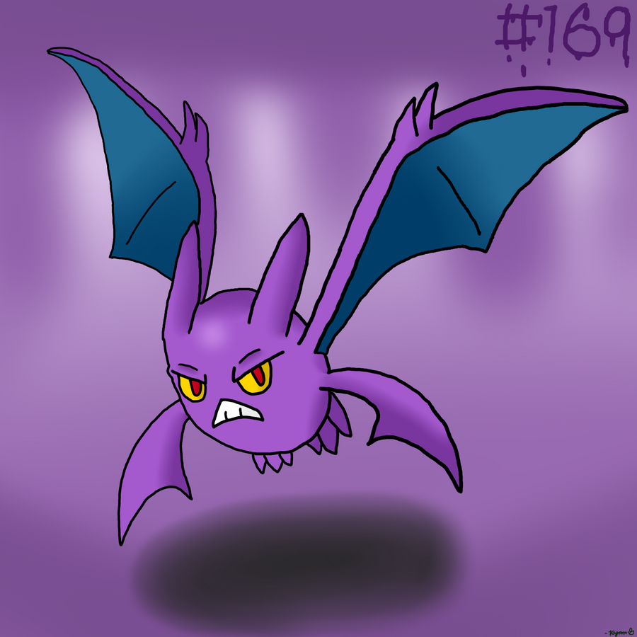
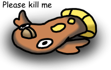
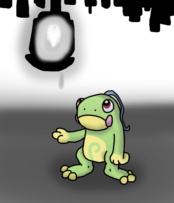
My Trick Room Darmanitan and Sandile (it's a Krookodile in-game YES I MAKE POKEMON CHARACTERS):
scale1.png

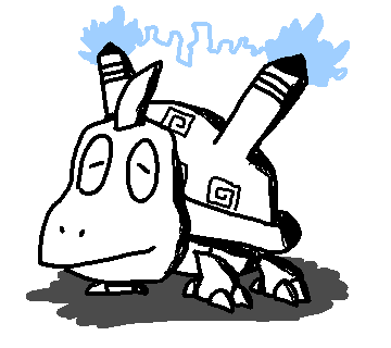
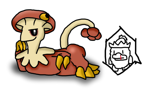
A huge Pokemon sketchdump:
au4j.jpg

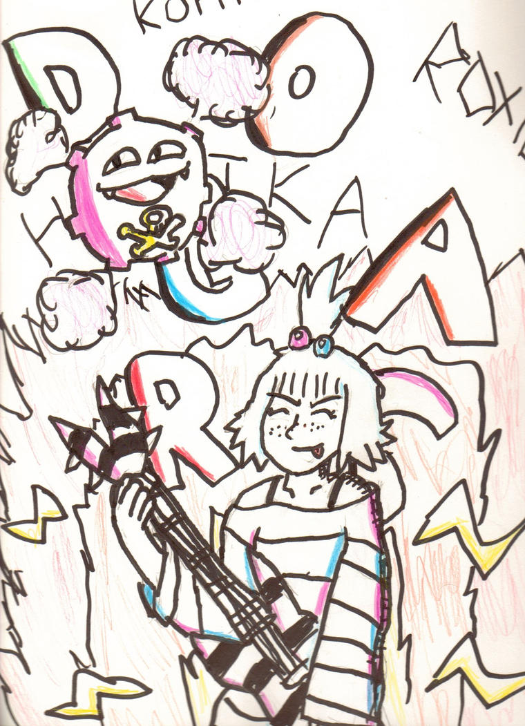
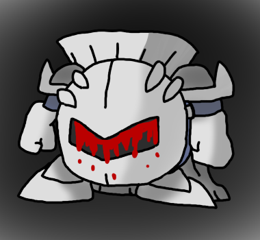
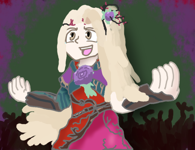
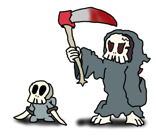
My VGC Hitmontop Droodle trying to show his appreciation to Lady Bow, my TR VGC Dusknoir (They work as an amazing team in-game):
ashy2.png
 
That "MY BALLS!" thing on the next to last sketch is uber funny xD

These look good! They might be a little like, unclean? Sometimes it looked like you rushed them :/ I'm a black outliner type of person too!
Are you using a tablet or mouse? For a mouse they're pretty good, but if you don't have a tablet, you should get one. These would look awesome! Also, try outlineing scanned sketches. :P and do drawings in layers. Try gimp, it allows a bunch of layers, and is totally free. lawl. You could also pirate Paint Tool Sai too if you wanted to, but w/e. xD

Sometimes the anatomy of the Pokemon/people/whatever looks a little weird, but not so much on the last sketch. So idk. Either way... KEEP WORKING! :D

-dance dance-
 
Hehe, thanks :P

Yeah, I do have a tablet and GIMP, and I plan on using Paint Tool Sai in the future.

Yeah, that's just my style as you could call it. I can draw real proportionate people, but I just enjoy cartooning better :)
 
...whoo, haven't updated this one in awhile D':
But I can confidently say I've been improving over the last coupla months with me obtaining Paintool SAI, and here's my stuff:

-Infernape with fake vectors (also my current avatar):
infernoape.png
-A DA friend's Meganium character, Hazel:
hazel.png
-Homika, drawn the day of her reveal:
poisonousn.png
-Scraggy test speedpaint, took about 5 minutes:
scragy.png
-Rhythm Heaven Fanart (DJ School :D )
scratchohey.png
-Nausicaa from the Studio Ghibli movie Nausicaa of the Valley of the Wind:
nausicaap.png
-Another DA friend's Dewott character, Luke:
lukeyh.png
-My Tornadus Apu :P
apuscowls.png
-Sgt. Frog/Keroro Gunso fanart:
kerorororo.png

Sooo... what do you guys think? :)
 
You are certainly improving and there is always a room for improvement. So, these are pretty good like the coloring is excellent. So good job! :)
 
I personally think that you are one talented artist there wario. You definitely got the basics down, that's for sure!

Luvdisc'd.
 
More stuff I worked on this week:

MUCH-better Homika and a friend's Scolipede character:
hnghv.png

...I drew this one when I was depressed on Wednesday. 'Tis pretty dark.
cannot.png

9-Volt of Warioware fame :D
poweronl.png

My submission for the Smogon Monthly Art Contest:
garchompa.png
 
Alright, massive post alert...

Wow, I haven't really been posting alot of my artwork here in the last month and a half... but here's all the stuff I've done in between then, in chronological order:

Amoonguss done in vector style (one of my favorite drawings I've done):
amoonguss.png
My friend's Kirby OC, Goro:
gorogoro.png
Another friend's Scrafty OC, Kevin:
itskevin.png
Metagross and Porygon2 characters I made a while back:
metagon.png
Snivy and Stoutland characters I made awhile back too:
poochyntaja.png
Rap Women from Rhythm Tengoku:
rapwomennnnnn.png
T-Shirt design I made for myself (I could post the picture of it up here if anyone wants to see it):
tshirthg.png
Tornadus and Thundurus characters:
apunbashir.png
The tap dance lady and her monkey, also from Rhythm Tengoku:
breaktime.png
See from Rhythm Heaven Fever:
seeqh.png
Elekid in about 7 minutes:
selecm.png
Random gif:
ballgif.gif
Rapper Red, DJ Yellow, and M.C. Adore of the Rhythm Heaven series:
daisukiki.png
Manzai Birds from Minna no Rhythm Tengoku, except as Pokemon:
manzaimon.png
Francis from Super Paper Mario:
nerrrrrrrrrrr.png
Ness:
nessssss.png
Spiteful Murkrow:
spitefulmurkrow.png
Scizor and Durant characters, done in an alternative style:
bugzo.png
Ms. Fortune from Skullgirls:
unfortuneate.png
Vector the Crocodile:
vecroc.png
VP from Toontown:
vpsap.png
Me in classic toon style:
retrooooooooo.png
Rapper Yellow from Rhythm Tengoku, having a heart attack:
pump.png
My Toontown OCs, Oliver and Elanor:
bronsis.png
Filia and Samson from Skullgirls:
agirlandhermonster.png
Parasoul and a Paras:
parasoul.png

--
I'm probably missing one or two, but you get the gist. I definitely think I've improved, at least a bit...
 
Disclaimer: You've definitely gotten a lot better.

Anyway... I really dig your 2-character sketches, and your stylized scrafty is just awesome.(extra bonus points for drawing Ness)

keep it up!
 
Solid stuff! Your work reminds me of someone else, but I can't quite place who. Feels like 70% JarardoMartino and 30% RitterCat. [That's a good thing by the way!]

I think you know as well as I do that you could clean up your lines a bit, but that comes with practice, so just keep at it like you have been!

I'd encourage you to use more shades too, and go for some adventurous colour choices. Have a go imitating NJ's [Nastyjungle's] stuff, I think that'll stretch you a little.

Overall, pretty sweet! :>
 
Seeing as apparently you are 30% me, I'll give that 30% some advice!
Basically the big thing at the moment is what Alch said, the line art. It's a bit sloppy, but I think you're doing it with a mouse(?), so to improve try zooming in more and working slower.
I like your character and colouring however, but being adventurous with colours nj style is something that could help the pieces look REALLY nice, and it's something I need to work one too :/

Also Alch your post made me realise I miss Jarardo :(
 
Yeah, lineart has always been something I've been trying to improve on, being steady with my hand on my tablet has always been kinda hard considering my tablet pen is all screwed up :/
Yeah, besides that I've been considering trying to experiment with the colors also. Thanks for all the tips! : >
 
Some stuff from this month (MASSIVE post alert):
tumblr_m820qmW5Py1r9nn5ho1_500.png

squigly_by_ryan_knight-d59ercv.png

crobat_by_ryan_knight-d59lf8r.png

tumblr_m87458JHMx1r9nn5ho1_400.png

tumblr_m88nbtQ4yR1r9nn5ho1_400.png

chibi_marie_by_ryan_knight-d59yina.png

tumblr_m7yb79Tgzf1r9nn5ho1_1280.png

tumblr_m8b5jgXVKH1r9nn5ho1_1280.png

tumblr_m8cqty0CYU1r9nn5ho1_500.png

tumblr_m8ewuxJyFS1r9nn5ho1_500.png

tumblr_m8f4ofXJt61r9nn5ho1_250.png

tumblr_m8g0wjeoHr1r9nn5ho1_400.png

believe_in_yourself_by_ryan_knight-d5ab9qf.png

tumblr_m8qvs43MuA1r9nn5ho1_400.png

forest_everywhere_by_ryan_knight-d5b8c2j.png

tumblr_m8vipsPQKh1r9nn5ho1_400.png

tumblr_m8z70n04oF1r9nn5ho1_400.png

style_meme__sara_by_ryan_knight-d5bsdj7.png

tumblr_m90u37thDz1r9nn5ho1_250.png

(Galvantula)
tumblr_m927smLiq01r9nn5ho1_500.png

(Fakemon)
drop_from_the_other_world_by_ryan_knight-d5bxocy.png

tumblr_m94y0zXgVT1r9nn5ho1_1280.png
Used some of the art tutorials on here for help, especially nastyjungle's ones, and I've also been trying to vary myself in coloration and clean my artwork like you guys have recommended.
 
Your artwork is definitely improving. I love the shading that you're doing, but I would suggest that you work on lineart. If you improve that, I think that your pieces will be taken to a whole new level!

Keep up the great work!
 
I love this! Late Night w. Kyurem and Fresh Tunes w. DJClus are both so awesome. You're a really great artist- keep up the good work! :D
 
Oh wow umm I haven't posted in my own topic for ages and I should feel sorry for it.

I've been up to date on my arts on nuggetbridge, but I guess to make it up I'll post some of the better stuff I've done in the three months of not posting:

bigbooty.png

darkdragonz.png

cattt.png

phantomr.png

biancaq.png

unityl.png

wariwario.png

img0002rgu.jpg
 
I know it gets a little flak, but your lineart is really good in the sense of proportion. You've got human proportions down really well and manage to make it look natural, rather than awkward- which is something a lot of people, including myself, struggle with. The proportions on the animals depicted are also pretty natural-looking, and your style is bright and eye-catching. :3

Critique below:

As others have mentioned in the thread, your lineart is a bit jittery. I've not had any experience at all with tablets (;~;) so I'm not really sure on ways to get around your shaky tablet pen. Something you might try, though, is line variation- it adds a bit of spice and depth to a picture in your style, and it helps me with avoiding awkward-looking lines (again though, not sure if that'd be the same).

Compare the images below:
rEoWw.png
2ZBXD.png


They're pretty quick, but the one on the left is a normal kind of lineart, and on the right is a line-variation-version. (See that the little bump on the left's chin was overwritten with the thicker line?) I would recommend trying it out and seeing if it looks better to you- your lineart is good as it is, but this might help with the jitter problem (maybe. Again, I've had no experience with tablets).

Good luck with your art! :D You have a good style going and I'd like to see more of your work.
 
Here's exactly 46 days-worth of art:

nsmbue.png

85591364.png

chompy1.png

tebow1.png

vanilla1o.png

gurd1.png

sar1.png

felix1.png

genesect1.png

ferrotho.png

fil1.png

sandv1.png

obamasn1.png

vens1.png

darkgai1.png

windy1.png

monita1.png

doods1.png

van1.png

jessiejames.png

monkey1.png

metaldragon1.png

gothic2p.png

ambi1.png

sra1.png

After the Rotom-W pic, I converted back to Sketchbook Express, and I'm loving it due to the fact it actually has pressure sensitivity on a Mac.

In a month or so I'm going to be putting together my porfolio for two art colleges, so it's gonna be hectic.
 
Back
Top