
-
Check out the relaunch of our general collection, with classic designs and new ones by our very own Pissog!
-
The moderators of this forum can be found in the CAP forum staff directory.
-
Welcome to Smogon! Take a moment to read the Introduction to Smogon for a run-down on everything Smogon, and make sure you take some time to read the global rules.
You are using an out of date browser. It may not display this or other websites correctly.
You should upgrade or use an alternative browser.
You should upgrade or use an alternative browser.
CAP 12 CAP 1 - Art Submissions
- Thread starter reachzero
- Start date
- Status
- Not open for further replies.


gave mine some color and a more interesting pose
[sphinx]
Just wanted to say I LOVE this. There are a lot of good concepts in this thread but most of them look more like physical attackers to me, I think something like this would be perfect for a specially based flying/fighting type.
I'd maybe contribute something if I had any artistic ability, but I don't.


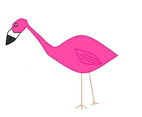
I've redone my balloon sumo wrestler, please let me know what you think. This is a pokémon that doesn't actually try to bring down opponents with physical force like a real sumo wrestler, but with strong currents of wind instead; a combat between two of these consists in seeing who can send the other flying the farthest.

Antarctros, I don't know if this was intentional or not, but the sumo's "topnot" combined with its red color makes it REALLY seem like a giant whoopee cushion. Flying=Air=Inflation=Whoopee Cushion. Ingenious. It puts a whole new spin on the design, making a rather cute design into something much more. I'm liking this guy alot.
Quick update on my Rocket Boots. Drew it in a more dramatic pose. Maybe that will make it looks more appealing. I also refined the design a bit more. Shrinking him down and making him seem a little more bulky.
Also, I'm not too set on this color scheme of red and silver. If there is anyone with a bt more finesse in color coordination, maybe suggest something better? Any comments or criticism at all is greatly appreciated.
Also I apologize for the dirty paper. I'm not too good with digital art, so I just scanned it as is.
Antarctros, I don't know if this was intentional or not, but the sumo's "topnot" combined with its red color makes it REALLY seem like a giant whoopee cushion. Flying=Air=Inflation=Whoopee Cushion. Ingenious. It puts a whole new spin on the design, making a rather cute design into something much more. I'm liking this guy alot.
It was an accident, but now that you mention it... you're right! I think I'll go with it XD
Regarding your design, I really don't know... maybe white and blue, as a homage to Mazinger? In any case, it should probably be something that reduces the Steel undertones as much as possible.
I'm not saying it's a bad design for a Flying/Fighting, but I just don't see a plane being.. flexible? enough I guess? When I think of "Fighter" jet, planes never make contact or they explode. But, ya. Since this is a living creature I can imagine it can make contact with other Pokemon and not go into pieces.
As for the Iron Crosses, if Sawk and Throh and Jynx etc can have clothing as a part of their body, I don't see why these symbols would cause problems. I actually like them as part of the design. Though if they're too much, why not sub in Pokeball symbols?
As for the Iron Crosses, if Sawk and Throh and Jynx etc can have clothing as a part of their body, I don't see why these symbols would cause problems. I actually like them as part of the design. Though if they're too much, why not sub in Pokeball symbols?
I also think the robot might need a bit of steel reduction surgery maybe, It's a good design, I just feel the steel type stands out too much. But I know you can be creative with it ;)
Lol, I am fond of whoopie cushion sumo too. That is a great accident lol, though i feel the shade of reddish pink is a bit bright, maybe dulling it a bit would help out?
And I got Puppetmon's lineart sketched out, I will work on it more tomorrow and hopefully finish it up then.

For now, I'm off to bed. Peace.
Lol, I am fond of whoopie cushion sumo too. That is a great accident lol, though i feel the shade of reddish pink is a bit bright, maybe dulling it a bit would help out?
And I got Puppetmon's lineart sketched out, I will work on it more tomorrow and hopefully finish it up then.
For now, I'm off to bed. Peace.

Yilx: Awww, I wish ya had avoided finalizing that; I was going to tell ya to go with the 'tanuki-copter' thing. I like em both, but the valkyrie just can't seem to shake the whole 'just a tad too human-like' vibe, whereas the only thing the other one needs is some larger (wider) ears.
Regardless, still love your work.
Fatecrashers: Yep, definitely would go with the cloudy version of it; it looks awesome.
DJD: I'd ditch the wheels - if those are wheels I see underneath it. Maybe add some feet that resemble the ski things seen on helicopters? Not sure what to do about the mouth, except go the Electrode route with a 'shitty grin'.
Antarctros: What can I say - is there anything not to love about a whoopie cushion sumo?

Urgh, something about inking a picture just takes forever! and because something is wrong with the brush properties file in my photoshop I have to doctor ever single line with the eraser tool...
I'm nearly done with the snout a half hour into this particular attempt.

I'm nearly done with the snout a half hour into this particular attempt.


I'm not sure about the colours noobiess but otherwise i think you're set for final sub.
A fighting stance, more muscular, fighting bandages/boxing gloves...etc??????: Anything specific you could suggest? I'd appreciate it.

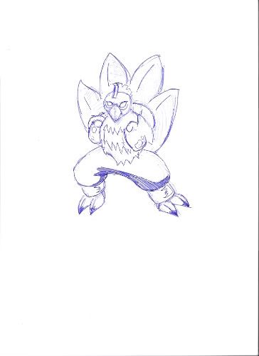
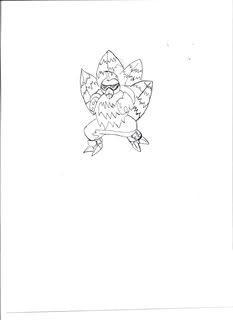
A bit of a WIP, I stole the crane back from Fate. The arrow is meant to be going through his hat, i just made a mistake sketching it, but that can be patch up in photoshop.
http://i747.photobucket.com/albums/xx120/_Giggity_/CRANE001.jpg
Comments are welcome and appreciated
http://i747.photobucket.com/albums/xx120/_Giggity_/CRANE001.jpg
Comments are welcome and appreciated

I love the design; it may have something to do with my fondness for cranes, but I think it exemplifies the Fighting-type without being to obvious about it. One problem I have with your current sketch, however, is that it looks more like a Water/Fighting instead of a Fighting/Flying. Maybe have the wings spread out a little bit? I'm not too great with art so I wouldn't know.Precipice said:big pic
The arrow in the hat is a nice touch.


Hey guys and gals here's the newest sketch for my circus-y parachute rabbit.
Im going to get some action shots up soon.
I'm still having trouble with the colors, I tried to make it more vibrant at Sentret's suggestion and eliminated the tail. Comments and criticisms are welcome :)
KoA I love the whirlwind puppet. Awesome idea. Only thing is i always associate puppets with a dark typing but you managed pretty well to keep it in the realm of fighting.
Sentret I'm divided in my opinion of the color scheme. I loved the green and the little bamboo sprouts but now he seems like a flying wrestler sensei panda cloud, which I approve of.
noobiess What about a blue and yellow color scheme? though thats not very fighting, I think your design is enough to imply that. Perhaps i deep blue body with a golden stomach? That is just what I pictured when i saw your black and white sketch.

OK, Panda update!
This time with a more coherent color scheme, bamboo, and a grandmasterly expression!
The hands are posed so that you can imagine whatever special attack blast effect being channeled in the upward palm and being blasted out the other hand. You guys like?
Mayatrese I like it a lot! But what if his chest ruff was white? I love its stumpy arms.

Loving the panda Sentret. I personally think that the eyes were much better left alone though, and I still prefer no bamboo shoots (especially now that they're not green). Just my opinion though, and the pose and facial expression are fantastic!
Lots of other fantastic designs here of course. Great work everyone.
Lots of other fantastic designs here of course. Great work everyone.
@Sentret
That thing is perfect. By far, the best art I think I've ever seen for a CAP.
That thing is perfect. By far, the best art I think I've ever seen for a CAP.


I agree with Paradox, the bamboo looks really out of place and the eyes look very strange now. I think the design would be solid if you'd ditch the bamboo and revert the eyes; you wouldn't need to change anything else.

I love your design, Sentret, but I honestly preferred the old color scheme. I supposed it looked a bit like a grass-type... but it looked damn good. Anyway, I agree that the shoots look pretty strange now, but with the old color scheme I liked them a lot.

I like bugmaniacbob's concept, but i would like to make a few adjustments:
1. I think in between the legs should be wings so it could glide or something like that, because right now it doesnt look like a flying type much.
2. I think you should add a sword/ spear and helm for the ancient war hero concept.
1. I think in between the legs should be wings so it could glide or something like that, because right now it doesnt look like a flying type much.
2. I think you should add a sword/ spear and helm for the ancient war hero concept.
- Status
- Not open for further replies.