CAP 12 CAP 1 - Art Submissions

Status
Not open for further replies.
Semi-pre-double-reverse-quadruple-written explanation speech, go!

When I thought about CAP1 having base 60 attack (tied for third worst with DW Medicham and Makuhita, only DW Meditite and Tyrogue have a worse base attack stat) I realized that the traditionally "buff" design of Fighting-types would be more of a liability when selecting a credible design than an asset. Because Coatldaxel was based around an animal that may have been able to push its entire weight off the ground with its arm musculature alone, I realized it was impossible to justify...and decided not to use it.

I thought harder: What could cause a Fighting-type to have such high special attack despite the low attack? After all, when I made this design some spreads (keep in mind that 65 base attack is still very very low for a Fighting-type, 37 being downright pitiful) showed a Special Attack higher than even Keldeo, special attacking champion among Fighting-types. Heck, even now we have the same special attack as Raikou.

I came to a conclusion as to what could have caused this.

http://www.majhost.com/gallery/ToaNeya/kits/CAP-9/Gen-V-CAPs/CAP1/Chronophinx/chronophinxv1.png
[Compress your pictures]

Age. (and no, the scanner was not kind to it.)

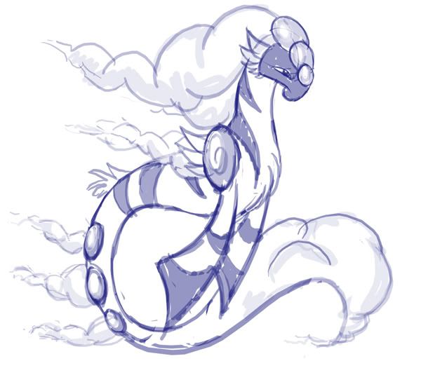
She's a literal pun on the Riddle of the Sphinx-as according to my original background for this CAP design, there would be a quadrupedal baby sphinx pre-pre-evolution with a toy kite, a bipedal pre-evolution with a war fan-like kite, and, of course, this sphinx in the sunset of her life who must use her kite-like glider as a cane (main pose), shield (lower left), and aid when flying/gliding (lower center-left). Of course, while her physical attack has fallen victim to age, her spirit has become wise, and her Special Attack has improved drastically as a result. She is more than willing to prove it to you with a devastating Aura Sphere (lower center-right) or badly-drawn Hurricane (lower right).

If you're wondering why this is a female sphinx...the Greek Sphinx who asked the riddle was female. Inspired by Nastyjungle's sphinx-though I certainly hope this is different enough.

Finally, it should be fairly obvious that an old haglike sphinx that can throw a Hadouken at you would be rather Intimidating.

Comments/criticism would be much obliged, especially given the momentum (pun fully intended) of some of the other designs.
 
Sentret, I'm falling for the Panda more every time you update. I support your changing with the seasons idea, and you could be able to work the bamboo into that. Also, since their has been a lot of talk about Intimidate, I was worried that this serene panda sensei might not fit the bill. Glad to see that I was wrong.
 

Fatecrashers

acta est fabula
is a Site Content Manager Alumnusis a Top Artist Alumnusis a Senior Staff Member Alumnusis a Top Contributor Alumnusis a Top Smogon Media Contributor Alumnusis a Battle Simulator Moderator Alumnus


Drew a side view of Cloud/UFOmon and slightly redesigned parts so he looks more threatening and less cutesy

Stuff I like:

Sentret - the latest rendition of the panda looks perfect in my opinion

DJD - Getting rid of the crosses for the circles was a great move

CyzirVisheen - All we have to go on is a sketch but I enjoy the design anyway, would love to see this fully fleshed out

Cartoons - So ferocious but so cute too, loving the uniqueness of this design

Calad - I think that kabuki duck would fit this concept really well for some reason...even though it looks like a Farfetch'd evo

Not Scicky - That demon thing is just great...
 
@fatecrashers: I like your design but the latest pose looks kind of unfocused. maybe a 3/4 perspective would work better. hope you don't take my suggestions to critically.
 
@Fatecrashers: I really like it, but I agree with Sambobz that the pose does not do it justice.

And I'm not sure about baphomon. Doesn't seem to be getting a lot of support, but I'll probably tweak him a bit still and come up with a few other designs.

Edit: I think Paras Hilton's (I think that's who it was?) Robin Hood is my favourite so far. Also, why the hell is Smogon so slow right now? Q__Q
 

jas61292

used substitute
is a Community Contributoris a Top CAP Contributoris a Forum Moderator Alumnusis a Battle Simulator Moderator Alumnus
I am absolutely loving Sentret's panda, and I think the season idea is awesome. I just think you might want to shift which season is which, rotating one clockwise. Red and Yellow make me think of the colored leaves of Fall. Yellow and Green would also make sense for the brightness of summer. I think spring just needs green and winter needs white, so those two would also be fine. But even without that it is by far my favorite design so far.
 

Stratos

Banned deucer.
I like the serenity of the sensei panda much more than the "IMMA FIRING MAH LAZOR" panda, SoIHerdYouLiekSentret. Definitely go with Wikey's idea.


Some supporting art drafted up for the pixie, using aura sphere. Mind you I'm pretty sure that considering the confirmed stats of this mon it could get away with not having distingushable limbs at all. Special attackers can occasionally swing that way.

Here's the base design that will probably be the showcase picture and main submission.

It has come a little way from what it was originally like, I've updated my previous post with this version earlier as to not try and hog the thread with small updates but changes were made to the hair, leg positions and eyes. Some suggestions have been made for adding patterns to the wings but I feel that it's complex enough as is and doesn't need extras.

Back when I designed this, I made it look mean for a reason. Intimitate and Prankster back then were being thought about a lot for abilities and I didn't want to end up making this too adorable, pixie or not. Most other abilities are easier to work around.

Reference picture, side pose.

At the moment the design stands with 4 base colours, the red is on small enough body parts that It'll probably not need as many shades. This should be fairly comfortable for sprite artists to work with. With red, white and blue on the main mon I couldn't help but run with it and nickname it the freedom Pokémon.

The design is fairly mallable. The wings should be big enough to cover the body minimum since it's used for protection and most of its attacks. They're more like a second pair of dominant hands so they can be moved towards wing-like or a slightly more hand-like appearance. The face is obsure enough that small changes can hint towards a more bird-like, dog-like or even lizard-like bent depending on the sprite artists choice.

I'll probably work towards a story now. Doing art in MS paint is slow and tedious but hey, that's what I get for never learning how to use a digital art program correctly.
 
So I was going to do an eagle...but I think i have a better design! So feast your eyes of my wip, Mothai! Yes its a bug, but it doesnt have to be bug type D:<


"I am the mighty MONARCH! Number 24! Number 21! Bring me the Monarch Mobile!"
 
I like the thick lines on your design SENTRET; they remind me of Paper Mario.

I prefer the red coloration, but all four colors can be used because to male/female differences and shiny colors. There can be 16 different colors if seasonal colors can be implemented.
 

Kevin Garrett

is a competitor
is a Top Tutor Alumnusis a Tournament Director Alumnusis a Site Content Manager Alumnusis an Artist Alumnusis a Senior Staff Member Alumnusis a Tiering Contributor Alumnusis a Smogon Media Contributor Alumnusis a Battle Simulator Moderator Alumnusis the Smogon Tour Season 12 Championis a Three-Time Past SPL Champion
I changed the concept around from what I was originally planning to do because it is a special oriented Pokemon. I made some of the line art smoother in places where I had sharp curves and edges. I also fixed some of the colors and details that didn't look right to me. To make it look more mystical I made a wing in the shape of a hurricane and added some cloud-like details in. The other wing will be open so I'm thinking I will be able to show some more details off with that. At least this is a start to get some more comments.

 
Alright well I decided that even though birds seem to be an unpopular choice for this CAP (which personally, I do not see why) I inked and colored my design.

It's been forever since I've actually sat down to draw and color something lol.
So sorry since I know the shading.. doesn't actually make sense.
But ANYWAYS.
Here he is.

 
Adding to the recent art flood...

Flying/Fighting Cloud Lion Pokemon.
I picture it producing Aura Spheres through roars and additional tricks such as that. Also can use the wind in its mane for attacks. Comments and Crits on the base design would be GREAT.

@Doran: I like the concept, especially since my first concept was a mantis that I dejected for looking too bug/Megaman Zero 3-ish...
As a pointer, I would try to emphasize the flying part of the bug a bit more, as it is Flying as a primary type. Also, I'd much like to see a version of it without the shadows, as I feel they obscure a few details. +)

@magic.: I like what your design is going for, but I feel it looks to flat and plain. Try to give it some more details, maybe replacing the black areas with actual cloth? Just a thought I figured I'd put out there.

@Kevin: Hmm. I want to see a fully fleshed out drawing of this. If you could make a concept sketch of what you want it to look like, I could give much better criticism. Currently, I feel it is a little hodge-podge, as each part seems like it has a completely different thing going for it. If you're going for a rooster idea though, make sure to include the giant rooster tail, which is something Blaziken left out. +)

And that's it for aXl's local comment corner. Thank you and goodnight. +)
 
Im not sure if this is considered spam or not, sorry if it is. But I really havent seen a design that has "WOWed" me yet. I remember every single CaP project in the past, i have had my jaw drop from several art designs, and I have always been very adamant in the support for the designs i liked. But i havent felt this way towards a single design submitted here yet.

I wish I had the artistic prowess to be able to design one myself, but alas I do not. Ill just continue to check out this thread and hopefully something grabs my attention.

Wyverii's is pretty cool though. The only one I find Pokemon-like enough that I can see myself voting for.

Good luck though.
 
DJD: Love the color scheme. Still think it'd be better if the wheels were replaced with ski-like feet, though.

Then again, it'd be a tad difficult for the thing to get off the ground, wouldn't it? Hmmmmmm..........

Fatecrashers: That thing's starting to seriously grow on me for some reason.
 
Sentret, I really like your panda idea the most of all. One thing that bothers me about the bamboo that no one mentioned is that it just seems randomly placed. I like the bamboo concept, but not the execution if that makes sense. Here's an idea: try adding more bamboo, but slicking it back so that it looks like hair, rather than a small forest that has spontaneously sprouted on panda-fu's head.
Also, I agree with those that favor the green and white color scheme.
 
The panda so far is my favourite. I was thinking, not sure if its too late, but you could give a bambo staff. Sorta like farfetch'd plus, not sure how that'd look. Just an idea because at the moment it looks amazing, I preferred it when it was green to red, but red is still one of the best designs here.
 
Hey guys can someone help me out? I've saved my design to My Pictures but have absolutely no idea how to post it here.
 
Hey guys can someone help me out? I've saved my design to My Pictures but have absolutely no idea how to post it here.
You'll need an account on an image-hosting site to upload it here; I personally use and recommend Photobucket.com. Once you sign up, you can upload images there, and they'll provide you with a piece of code in the form
(I think) which you can post here. The forum will then automatically display the drawing. Simple enough, eh?
 
Yeah, thanks a lot :)


Anyway, this is pretty rough. I was originally planning to have small stubby feet but the only way to do its left arm which felt right involved resting it on that leg.... =P I'm going to change the face around a bit, put some colour in, and try and make it look a bit lazier and Snorlax-ish. Suggestions please :)
 
Just a question: does the design absolutely have to tie in with the stat spreads and stuff? Because I absolutely love the panda one but it looks more of a Regenerator/Cursed Body than Intimidate.
 
Status
Not open for further replies.

Users Who Are Viewing This Thread (Users: 1, Guests: 1)

Top