CAP 10 CAP 10 - Art Submissions

Status
Not open for further replies.
DougJustDoug said:
You know I love this guy. Still, I've got some feedback that'll hopefully move it in the right direction. I suggest that the yellows be more vibrant, more along the lines of what you see on Zapdos. Also, the tail really isn't as spiky or as eye-catching as it could (and needs to) be. It looks too rounded for the concept, and kind of steals a lot away from the electric feel. Experiment with some of the things we talked about in IRC and when you get a WIP of them, don't be afraid to show it off for some additional feedback.

Also, the streaky way you colored the fur is very strange and is too much of an eye catcher. I feel like a solid color would go over better. Furthermore, I think that the eye isn't a very catchy color. A slightly brighter red would offset and contrast the design more, I feel. Worth a try in any case.

Oh, also, what do you think of a spiky mohawk for the beaver? :P
Keishinkae said:
Very much better with the bulkiness. It also looks a lot more badass, for what that's worth. I still don't get quite any electric feel from it, though. Even with the jagged tail, that looks more like arbitrary aesthetic design than an actual attempt to show off some electricity. It also needs feet instead of those nubs. Really, try a clawed foot design, it'll look better.

I also feel like it looks way too offensive, though. That thing appears to me as though it should be tearing through my team right next to Colossoil.
 
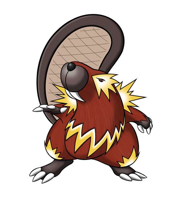
Aha...massive redo of the thing, made it bulkier, and, I suppose, more defensive as well, and made it more electricy

http://img245.imageshack.us/img245/4133/gaviwatredo.jpg
You know, I'm torn. I could really see this guy unloading with a bunch of strong moves, like he'd be a real threat. But he doesn't give the impression of being super-versatile. I would suggest adding some gimmicky little appendages, like some wide fins on its back or tentacles or something. That make it look more like it's able to pull out some crazy moves you wouldn't expect from a bulky Water/Electric type.

But I'd get some additional input before making any drastic changes. I could be over-thinking this. :)
 

Yilx

Sad
is a Top Artist Alumnusis a Smogon Discord Contributor Alumnus
Not being lazy, but... it dosen't necessarily have to look bulky to be bulky, right? I mean, look at Uxie and Cress...
 
xD this is alot harder than I though!

So..made it a bit different..

Dropped it to all fours


Im not exactly married to the idea, so, here's another concept..


Based on a handfish/mudskipper sort of thing..

Quick sketchy colours.

 
Not being lazy, but... it dosen't necessarily have to look bulky to be bulky, right? I mean, look at Uxie and Cress...
Alligators/Crocodiles have been around longer than a vast array of species. They are resilient and tough. You can always say it has thick skin, being bulky doesn't necessarily = a fat poke. Look at Vaporeon and Wobbuffet.

I like your second design better than this third one. You could add some fins/something on the shoulders and backs of the 'hands' for some badass effects. Otherwise I still think your first one looks great. Meek, not super threatening, but looks tough. I think a new pose could make it seem more powerful or intimidating. Try dipping the snout down a bit to give it more of a predatory feel, or give it a more looming sense which is something that I can see working very well on the second design but just as well on the first.
 
@Keishinkae: Your second idea definitely has the potential of being an Elec/Water monster compared to your first (Dark/water). Can you try to give the horn/spikes a yellow-ful shading and a propeller-like tail.

ps: Not to try to take over err, something. I think the gray-ed head part can be a good mask.
 

Yilx

Sad
is a Top Artist Alumnusis a Smogon Discord Contributor Alumnus
Alligators/Crocodiles have been around longer than a vast array of species. They are resilient and tough. You can always say it has thick skin, being bulky doesn't necessarily = a fat poke. Look at Vaporeon and Wobbuffet.

I like your second design better than this third one. You could add some fins/something on the shoulders and backs of the 'hands' for some badass effects. Otherwise I still think your first one looks great. Meek, not super threatening, but looks tough. I think a new pose could make it seem more powerful or intimidating. Try dipping the snout down a bit to give it more of a predatory feel, or give it a more looming sense which is something that I can see working very well on the second design but just as well on the first.
I tried changing the design slightly, but it didn't work out very well. However, a redraw is definitely in order...
 
I tried changing the design slightly, but it didn't work out very well. However, a redraw is definitely in order...
Erm sorry I was Keshinkae. I misred what you had posted, my mistake. I thought you were referring to the alligator as 'unbulky'. But yes, my statement: bulky =/= fat still stands. I believe a presence of confidence can greatly change how 'bulky' something can look. Confidence is not to be confused with menacing.
 

Yilx

Sad
is a Top Artist Alumnusis a Smogon Discord Contributor Alumnus
But yes, my statement: bulky =/= fat still stands.
That was my point too; sorry if you misunderstood it lol. I was saying that something dosen't have to look bulky to be bulky.

That's why I brought up Uxie and Cress, actually.
 
Late to the party, and not likely to win, given the competition. Still giving it a shot:


Working concept, an anemone-based Pokemon. Feedback welcome.
 

CyzirVisheen

Am I poplar yet?
is a Top Artist Alumnusis a Forum Moderator Alumnus
Well with the way the stat spread poll is looking, the revamped Anemoninja idea won't get off the ground, and the other designs I had planned won't really match up either, so I guess I'm gonna go with either the reverse angler or (lol) Kinesta v2

Tweaked the design a bit, and laid some base colors. Might remove the stripes on the antenna. I was trying to avoid using blue, but I probably won't be avoiding it ~_~
 
That's very nice Cyzir,anyway in my eyes it look a bit more like Ghost/Electric,so I think you may want more blue colour on it,but that's just me.

Erm sorry I was Keshinkae. I misred what you had posted, my mistake. I thought you were referring to the alligator as 'unbulky'. But yes, my statement: bulky =/= fat still stands. I believe a presence of confidence can greatly change how 'bulky' something can look. Confidence is not to be confused with menacing.
I agree with you Rhys29.Actually CAP10 will prefer smaller size rather than bulky looks,because it is part of water type meaning when having a huge size,any pokemon that run Grass Knot can hinder it,for example,Infernape and Celebi.
 
Cyzir, I like it a lot. I'm not feeling the stripes down the antennae too much. My favorite submission.

Paras, I'm probably gonna have to flip a coin between you and Cyzir. The colors you ended up with were just right. A little ghosty, but you can still tell it's elec/water.

Doug, I like the design, but it resembles Bibarrel a lot. Like, so much I don't think I could vote for it. Probably my favorite of your CAP submissions nonetheless.

Aragorn, the last design you posted with the shorter legs is awesome! you really took it places. One of my favorites still.

Also, any comments on mine? Do the colors bother you? Gimme some hate at least. ~.^
 
Also, any comments on mine? Do the colors bother you? Gimme some hate at least. ~.^
I'm not one to be a buzzkill but I don't think you're submission will go much further than the top ca's here. I will say you made my day with the addition of 'derp' to your supporting material. Fits it perfectly.
 
Hey there guys. Im really new to Smogon, and this is my first CAP. I just thought up of this. Scanned it in and tried to mess around in OpenCanvas and Paint.net.


Its practically a mix of a light bulb, clam, octopus and a jester. I tried to make everything look at least slightly meaningful towards the type combo. Such as the plus and minus signs on the clamshell like wings.
 
Galactic Grunt: Good to see you're getting into the game a little earlier this time, your CAP9 entry came out of absolutely nowhere and didn't really have much time to gain any support :pirate:. Your current entry is pretty neat and the "standard" Blue/Yellow colour scheme looks right at home here. I'm not sure if it was intentional, but the eyes look like + signs which is a cute throwback to Chinchou and made me smile. The pose you have here looks pretty unnatural though-- he's a slender creature who looks like he should be on all fours all the time? I dunno, though, I just think he looks sort of weird leaping.
Oh thanks for the comment! Yeah, the Chinchou eyes kinda inspired me to give him a more electric vibe when I first designed him, haha. But like I mentioned in my first post here my submission's based on a mix between a salamander and a basilisk. Basilisk lizards can run on water, so that's the main reason why he's in that pose. It might look a little awkward but I guess I can include this with my supporting material:

http://www.youtube.com/watch?v=45yabrnryXk

Though I'm considering doing another pose if that one doesn't look right, expect one sometime soon.


PS your concept is amazingly adorable. Really unique and out of the box, though I will say that yeah, he kinda has a big head. The colors I'm sure you can play around with if they aren't to your liking, but I think they're good enough. It's also a really innovative way to use his attacks too with your supporting material. Yet another top notch submission here -.-V
 
xD this is alot harder than I though!

So..made it a bit different..

Dropped it to all fours


Im not exactly married to the idea, so, here's another concept..


Based on a handfish/mudskipper sort of thing..

Quick sketchy colours.
I prefer your Crocodile over your mudskipper. Actually I preferred your second version of your design over this quadruped version.

CyzirVisheen: It's cool to see reverse angler fish in color, and I like how your trying not to use blue, but purple isn't really a good color for this pokemon. It looks more like an Electric/Poison type or an Electric/Ghost type because of the purple. Maybe you could try turquoise for it's main color.

DougJustDoug: Love the beaver! I really like how almost all of your designs have a great back-story, and this is no exception. However, the color scheme is a tad bland. I know that beavers are brown, but there is already a brown beaver pokemon. (Bibarel) Your design already looks like a beaver, so I'd encourage you to spice up the color scheme.
 
DougJustDoug: I cannot shake the feeling that that looks incredibly like electric evo for Bibarel. It fits the typing, and the tail makes it look like utility. Not the best of you, though.
 

andrea

/me cresselias
@Keishenkei- I still like your crocodile concept better. The 'bulkier' version could be interesting to see colored, although I do like your re-vamped croc with the additional markings at the top of the page. The croc on all fours seems a bit too 'speedy,' for lack of a better word. Kind of like a cat about to pounce... =P The bulkier one looks like "Hey, I'm here to mess things up a bit." The perfect stance for a utility counter that you don't want to mess with.

Sorry for the lack of decent descriptive language xD I do really really like your design!

@DougJustDoug- Very nice. Fits the stat polls well and is beautifully drawn for lack of a better adjective. Reminds me a lot of Bibarel =)

@pkmn-taicho321- This is a nice improvement over your last version. The cloud on the stomach looks very well done. I'm not sure how I feel about the purple cape-like thingy.... Maybe recolor it? It's a bit too contrasting with the other elements of your design.

@darkmattr- Love it. The supporting material is great, too. =) Excellet job.
 
CyzirVisheen said:
Let me definitely recommend that the lantern part of the bulky half of the Pokemon be transparent. Inside of that , you can make a bright light at the center, but it should definitely be transparent. An opaque yellow, as you have it now, completely nullifies the feeling that this thing is a lantern in the first place.

I also feel like blue is unavoidable if you want it to remind people more of water than ghost. It's strange that the angler even feels ghost-like at all, but it does.
 

DougJustDoug

Knows the great enthusiasms
is a Site Content Manageris a Top Artistis a Programmeris a Forum Moderatoris a Top CAP Contributoris a Battle Simulator Admin Alumnusis a Smogon Discord Contributor Alumnusis a Top Tiering Contributor Alumnusis an Administrator Alumnus
Moderator
I did not look at Bibarel much at all while making my hydroelectric beaver design. I looked at it during the sketch phase, mainly to make sure my design DIDN'T look like Bibarel. Of course, since they are both beavers -- yeah, a certain amount of similarity is inevitable. But beyond the basic concept of a beaver, I wanted to stay away from Bibarel's main design elements as much as possible. So with my design, it has a very different head, feet, hands, general proportions... well, everything is different, really.

Except the coloring.

When I was coloring my beaver design, I knew I wanted to go with a brown body color, and yellow for the electric elements. So I picked some shades that appealed to me, and then tweaked them until I felt they were "just right". I had no idea how similar the colors were to Bibarel.

So after posting my design, I noticed several commenters mentioned comparisons to Bibarel -- which I kinda dismissed, because I figured it was just a comparison based on the fact that they are both beavers. But, I finally looked at the two side-by-side, and I was surprised how closely my design colors correspond to Bibarel's colors. Although the base designs are very different, the colors REALLY do look a lot alike.

So, I'm trying out some new colors that shift my overall design color palette away from Bibarel's main colors.

Here's my latest experiment, which I think is pretty good. The main body color is more reddish-brown, which is not only different than Bibarel -- but it is a more vibrant color overall. I also shifted my yellow and grays to go with the new reddish-brown body color.


Here's a side-by-side comparison of Bibarel, my first color scheme, and the new color scheme:


You can click on these thumbnails to get the full pics.

Anyway, so let me know if you think the new color scheme is better or worse.
 
@DjD: Have you tried inverting the color scheme? This would lead more away from the Bibarel-esque feel. I also want to suggest again you make the teeth straight. A beaver with curved teeth simply doesn't make sense.
 
DougjustDoug, I think the Beaver design is absoloutely stunning, although I must say I prefer the original colours to the more reddish version. I don't think it looks too similar to Bibarel, and I think the Curved teeth help to differenciate them, so I personally feel they should stay. Apart from that, I cannot sse anything NOT perfect about the design.
 
Status
Not open for further replies.

Users Who Are Viewing This Thread (Users: 1, Guests: 0)

Top