CAP 10 CAP 10 - Part 13 - Sprite Poll 2

Which should be CAP 10's sprites?


  • Total voters
    320
  • Poll closed .
Status
Not open for further replies.

beej

everybody walk the dinosaur
is a CAP Contributor Alumnus

so close!

reachzero said:
Name: Utility Counter
General Description: This Pokemon is capable of being customized to counter virtually any specific Pokemon, but is incapable of countering a large number of Pokemon at the same time.
Justification: It is not unusual for people to say that "versatility is broken" from an offensive standpoint; less attention is given to versatile defensive Pokemon such as Zapdos or Hariyama. This Pokemon would allow us to study the impact of having a Pokemon that is capable of dealing with such varied threats as Salamence, Lucario, and Gengar....but not all at once.
Questions To Be Answered:
--How useful is defensive versatility in a metagame with so many different threats to account for?
--Given the existence of a Pokemon that can hard counter only specific major threats, which threats will be prepared for the most?
--How would team building change if certain difficult-to-prepare-for threats became easier to prepare for?
--Which is more useful, a Pokemon that can somewhat handle a wide range of threats, or a Pokemon that can handle a few threats extremely well?
Name: Krilowatt
Typing: Water/Electric
Stat Spread: 151/84/73/83/74/105
Ability: Trace
Ability: Magic Guard
Movepool:
Level-Up:
H Night Slash
H Sand Tomb
– Bubble
– Charge
10. Spark
12. Detect
15. Copycat
19. Aqua Jet
24. Discharge
30. Imprison
37. Confuse Ray
43. Haze
48. Guillotine
52. Perish Song
55. Heart Swap
57. Zap Cannon

TMs/HMs:
TM02 - Dragon Claw
TM03 - Water Pulse
TM06 - Toxic
TM07 - Hail
TM10 - Hidden Power
TM13 - Ice Beam
TM14 - Blizzard
TM15 - Hyper Beam
TM17 - Protect
TM18 - Rain Dance
TM20 - Safeguard
TM21 - Frustration
TM23 - Iron Tail
TM24 - Thunderbolt
TM25 - Thunder
TM26 - Earthquake
TM27 - Return
TM28 - Dig
TM29 – Psychic
TM31 – Brick Break
TM32 - Double Team
TM34 - Shock Wave
TM40 - Aerial Ace
TM41 - Torment
TM42 - Facade
TM43 - Secret Power
TM44 - Rest
TM45 - Attract
TM46 - Thief
TM49 - Snatch
TM50 - Overheat
TM54 - False Swipe
TM55 - Brine
TM56 - Fling
TM58 - Endure
TM66 - Payback
TM67 - Recycle
TM68 - Giga Impact
TM70 - Flash
TM72 - Avalanche
TM73 - Thunder Wave
TM77 - Psych Up
TM78 – Captivate
TM79 – Dark Pulse
TM81 – X-Scissor
TM82 - Sleep Talk
TM83 - Natural Gift
TM87 - Swagger
TM88 - Pluck
TM90 - Substitute
TM91 - Flash Cannon
HM01 - Cut
HM03 - Surf
HM05 - Whirlpool
HM06 - Rock Smash
HM07 - Waterfall
HM08 - Rock Climb

Egg Move Stuff:

Egg Groups:
Water 1
Fairy

Moves
Ice Shard - Lapras, Seel, Dewgong, Snorunt, Glalie, Froslass
Mirror Coat – Corsola, Squirtle*, Wartortle*, Blastoise*
Counter – Breloom, Squirtle (3), Wartortle (3), Blastoise (3)
Mind Reader – Breloom, Poliwrath
Draco Meteor – Dratini, Dragonair, Dragonite, Kingdra
Sheer Cold – Lapras, Glalie
Poison Fang - Mawile
Flail - Feebas
Follow Me - Clefairy, Clefable
Metronome - Clefairy, Clefable
Me First - Slowpoke*

*Chain Breed
(3) - 3rd gen move Tutor

Move Tutor:
AncientPower
Bug Bite
Fury Cutter
ThunderPunch
Fire Punch
Ice Punch
Bounce
Dive
Swift
Aqua Tail
Outrage
Knock Off
Sucker Punch
Magnet Rise
Earth Power
Helping Hand
Magic Coat
Low Kick
Signal Beam
Icy Wind
Gastro Acid
Zen Headbutt
Role Play


Down to three. Pick the sprites you would like to see on the server.

We will not allow posts in this topic such as "I voted Sprite." Put some substance into your post. This means that you need to back up your post with reasoning or you will be infracted. Needless to say, this also applies to making statements like "those sprites are awful."

I'm completely uninterested in listening to anymore complaining about my poll slate this time around, so please cut it out.

Submissions:


Cartoons! said:
Chaoscrippler said:
DougJustDoug said:
 
My reasoning hasn't changed much in the last hour or so.
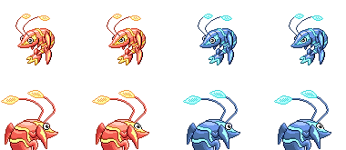
I still voted Cartoons! I love the defensive, warding stance of the front sprite, along with the amount of detail it crams into a small space. It looks like it could dodge or twist easily, and it looks like it's got the reach to pull of some of the attacks. The gender difference is cute (and widely emulated in this CAP, although Cartoons! was inspired by existing pokemon).

The back sprites look pretty good, and the simple posing and style looks the most like the existing pokemon. Cartoons! was really the only one to make the shell look thick or layered. Everyone had seams, but Cartoons' sprite is the only one that looks like it overlaps.

I have no problem with the shiny at all.

-I almost voted DJD. His front sprite kinda looks like Krilowatt is about to have a Wild West duel, claws poised over the holsters on his belt, ready to be drawn the moment the clock turns. DJD is also the only spriter to give Krilowatt's antenna bulbs a filament, which was a nice touch.

The back also looks good. My little dog will stare at me sideways all the time, and the Shiny is one of the most appealing sets. The gender difference doesn't really do it for me, though, and ultimately I preferred Cartoons! backsprite.

-As my third choice, Chaoscrippler has a lot going for him. A technically sound sprite, a good, vibrant choice of shiny colors, and was also the only one to give Krilowatt pincers or a visible mouth. The style is definietly unique, but ultimately Krilowatt looks a little soft. The back sprite reminds me of Mickey Mouse, (the eyes + the curve of the nose). This haunted me since I first saw the backsprites, though there is nothing technically wrong with it. I don't think I'll be going with it unless my first two choices are eliminated.
 
I can't believe how close this vote is... o.o'

I just want to reiterate (...no wait, just iterate) to everybody, that something is too small is not a (good) reason to not vote for it (keep in mind this is a shrimp we're talking about here). Cartoons', while the smallest of the sprites present, still has an unbelievable amount of detail, and possibly the best shading between the three.

...so yeah, you can probably guess where my vote was cast (it's Cartoons! if you can't). I feel that it has the best technique in terms of shading and detail, while retaining a lot of character despite its small size (I shouldn't say 'despite', I like the fact that it's small too). The shiny palette is my favorite between these three, and the gender differences are the most clever of the lot, IMO.

Chaoscrippler's might have got my vote if not for the strange front sprite (why did you change it? D: ), although the back sprite is quite nice. Doug's is nice and elementary, and also accurately captures Kril's size, but I happen to feel that Cartoons' has more character and personality to it (and I think the shading is better on Cartoons' too). Also, I don't particularly care for the angry eyes, gender difference or otherwise. :\
 
I absolutely voted for Cartoons!. It really just seems to stay truest to the concept of Krilowatt all the way to the concept art and everything else. It has the best shading, best shiny colors, and definitely the best male/female differentiation. I also just like that pose better than the original art which Doug was trying to replicate. Ultimately I think it just has the most polish, and the "angry" look of the eyes in Doug's just doesn't do it for me.
 
Doug's angry eyes and shading just turn me off, so my vote was always split between Cartoons! and Chaoscrippler, but I think the shading on Chaoscrippler's basically won that for me. So yeah, I voted Chaoscrippler.
 
Cartoons! without a doubt. Just perfect spriting, captures the look of the "cute little thing that can still destroy you" perfectly and doesn't look cartoony at all (a criticism I'd levy at Chaosrippler's - and I really think the mouth detracts from the overall look), but like a real Pokemon sprite. And the lines are quite smooth and clean, on Doug's I think they're a bit too sharp. Also, the mean eyes really don't tickle my fancy.

Just a fantastic, fantastic sprite.

Also, it's a shrimp - it's supposed to be small. I think Chaoscrippler's sprite and to a lesser extent Doug's really gets this wrong. Seeing the former's sprite I'd think that Krilowatt was the size of Whiscash.
 

vonFiedler

I Like Chopin
is a Forum Moderator Alumnusis a Community Contributor Alumnus
Choascrippler's reminds me far to much of Latias/Latios. It's interesting that even as an accurate representation of the same good source material, one sprite can have a such a different mood, one that I really don't care for. I'm voting for Cartoons! here.
 
The shading and detail on Cartoons!' submission just ooze quality - I'd love to play with that sprite. I'm also a fan of the way he changes the tail between genders.

DougJustDoug's sprite was an early favourite of mine, but put next to Cartoons!' it just doesn't look quite as vibrant - I guess because of the shading, and the way the claws are just hanging there.

Chaoscrippler's has a very different pose to the other two, and I'm sure that's helped it in the voting - I'd love to see a final poll which is just one-on-one (but I guess Beej already knows what his plans are). However there are some real merits to it: the bold colours and that distinctive stripe across the face, especially on the backsprite.
 

SJCrew

Believer, going on a journey...
is a Tiering Contributor Alumnusis a Battle Simulator Moderator Alumnus
Doug's sprite still manages to represent rather perfectly the ideal image of Krilowatt we should support: a cute little shrimp that owns OUs. Cartoons does that too, but still, don't care much for the size.

Also, I don't see anything wrong with keeping the stance the way Aragonbird originally had it in the concept art, since it's perfect as is and doesn't need any real improvement. I'm just glad at least one spriter shares my view on the matter and even better that the design made it into the polls.
 
All the finalists have done an amazing spriting job and all of them deserves to win this. Sadly that of course isnt possible.

This time I actually voted for Chaos unlike last time (Cartoons).
While I still think that Cartoons got the best backsprite (I love that you made the shell pieces overlap) Chaos sprite has just grown on me, I love the mouth! It's just to damn cute. Also the style reminds me the most of what would be in a Gen 4 game.

May the best schrimp win!
 
I voted for Chaoscrippler because those sprites are in the same shading style as the rest of the Generation 4 Sprites, in terms of simplicity of shading, and therefore won't look as awkward, and even though it's less detailed, I kind of like sprites that way. If it were RSE, I might have chosen differently because those sprites are more detailed and have more dots. I don't think that this poll should be like it's a competition, so it's not the best spriter wins. Besides, even though that pose is pretty strange, at least it has a pose. Oh, and I really liked how the eyes made it look all "cute", which made it more like an actual possible Pokemon. The others look more serious, which some Pokemon are like, but Pokemon should not be strict representations of animals, they should be more cartoonized and have look slightly different from what animal they are supposed to represent.

TL;DR: I voted for Chaoscrippler because I liked his pose concept better and it's more like a DPPt sprite rather than an RSE sprite, rather than because of spriting abilities.
 
I feel like the Cartoons and DJD really nailed the technical aspects of the sprite. I like Cartoons backsprite the best due to the overlapping shell that others have already pointed out and but the finished product looked too static for me. Kinda like Krilowat is in atrance/coma. I liked Doug's sprites a lot too but the head seems to sharp or something. It is hard to put my finger on but maybe it needed to curve up a little more to avoid the beakish feeling I get. In the end, despite the quality of these sprites, the personality of Chaos won me over. I do wish there was more texture on the shell of the back sprite but it seems like a minor issue now that the mouth and eyes of the front sprite have captured my attention. Great work everyone!
 
I still think that Doug's one is superior, it is actually the only one that looks like a pokémon sprite! I don't like Chaoscrippler sprite and Cartoons is just that the shading is strange for a pokémon sprite imo... I just gotta give to him that his backsprite is beautiful!

And DJD's Shiny is PerfectJustPerfect.
 
Chaoscrippler got my vote again. I do like Cartoons!, but from Chaoscrippler's I just get the sense that this Pokemon actually has quite a bit of fight in it - while retaining the "cute" quality that I find important here.

DougJustDoug's sprite really does look like a real pokemon sprite - from 3rd gen. I really prefer Chaoscrippler's 4th gen style of spriting.
 
All three were so good, that I was forced to vote on a rule-out basis! The best would probably be DougJustDoug's, but the angry eyes really turn me off. Not only that, I think the shading was sort of too much- I have the feeling it's the white. Not to mention, it looks like Krilowatt's going to headbutt you, which is so very wrong xD

Next I went to Chaoscrippler. I was debating on whether to vote on him or Cartoons. After a long battle within my head, Cartoons was always going to win, because Chaoscrippler immediatedly screamed to my mind "Cartoonish!" Ironically, Cartoons was neither cartoonish nor difficult on the eyes. It also doesn't have the "details crammed into a small space" that Doug's has to my eyes. The small size, as others have repeatedly said, is a great factor in my ultimate decision. So ultimately, I voted for Cartoons!
 
All of these are really great, I had to think for a while before I voted. I eventually came up with Chaoscrippler's. His is unique, with a nice color scheme for the shiny sprite. The back sprite also looks like he is pumped for battle, rather than a dull/boring look.

Great job to Doug and Cartoons!!
 
All three are amazing and have their strong points. Cartoons! nailed the shell, coloration, and pose. Chaoscrippler's has the most personality and a cute pose. DougJustDoug's hit a lot of the little details like the filament and how the stalks bend. His also has the best eyes out of the three. That said I have to go with Cartoons! because of the shell, gender differences, colors, and overall quality. Even still, no matter who wins CAP10 will have an amazing sprite.
 
Wow, real close this time around.

Again, I voted Cartoon's' sprite. Its shape, male/female differences, its size, and its shiny colors continue to blow me away.

Chaoscrippler's sprite has grown on me in the sense it's dynamic and shaded in the most realistic, up-to-date sort of way. I would have voted for it except for the dynamic pose makes it a bit too big, and is a bit over the top in my opinion.

Cartoon's' back sprite looks very Ruby/Sapphire/Emerald-ish, which I personally like. Chaoscrippler's is very Heart Gold/Soul Silver-ish, which is awesome, but I don't like it as much. DougJustDoug's falls right in the middle.

All three sprites are very cool in this round, and honestly, any shiny coloration is awesome. All three choices are very good, color-wise. My vote stands with Cartoon's for the reasons stated above.
 
Chaoscrippler, by far. The only one that IMO looks like a real sprite (and a good one), and I love the strong colours. In dougs sprite, they seem somewhat faded away.
 
I can't believe Cartoons' sprite is in last place - it's by far the best. Chaosscrippler's looks pretty good, and the backsprite is arguably better, but the main sprite just looks wrong. And with Doug's sprite, while it does look great, it has the feel of a Gen III sprite to it, the way the shading is done etc. I think Cartoons' design is clearly the best.
 
Cartoon's backsprite prevented me from voting him in this poll or the previous one. Doug's looks good, but still...just a bit static now that I think about it. (Voted for Doug on poll 1.) I voted for ChaosScribbler this time, primarily because he has a good front sprite and a nice backsprite I could actually see in a Gen IV Pokemon game.
 

Bull of Heaven

Guest
So it's down to my three favorites. Chaoscrippler's sprites are good. Doug's are good. But Cartoons' are clearly in a class of their own. As much as I like the others I'll be very disappointed if (when?) they lose.

To add a little substance to this post, can someone explain how Cartoons' sprites are "too small"? It's not just that I disagree, it's that I literally don't see any possible problem at all. Their size looks perfectly normal to me, just not MASSIVE like some of the sprites we normally see in CAP. There`s definitely no lack of detail in them.

On a random note, I especially like what Cartoons did with the antennae. Banryu summed up my other views well:

I feel that it has the best technique in terms of shading and detail, while retaining a lot of character despite its small size (I shouldn't say 'despite', I like the fact that it's small too). The shiny palette is my favorite between these three, and the gender differences are the most clever of the lot, IMO.
I agree 100%.

Seriously, I don`t think I`ve ever felt this strongly about any kind of art poll before (edit: maybe CAP 5 design polls when Lofty`s comet was still in). To bad my favorites are losing. No offence to the other spriters of course, yours are great but Cartoons`are incredible.
 
Status
Not open for further replies.

Users Who Are Viewing This Thread (Users: 1, Guests: 0)

Top