


corrected. thank you cartoons!
I also used the shape of the tail as gender difference. but to avoid copying, my female sprite's tail is shaped like a crescent moon.

Doug, i think your sprites are awesome, however i think the back sprite angry eye needs tweaking, as ATM looks more gleeful than angry like its front sprite
Normal, Shiny
Shiny
Normal Female, Female Shiny
ok, I hope you like them, do you like my last shinys or these ones?
any criticism? I could use some...


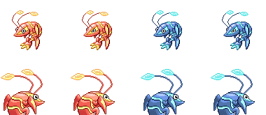

Ok. I brightened the colours up a bit, and made a female sprite. Male on the left, female on the right. And the bottom two are my shiny options. Vote which one you guys prefer.
And my attempt at a backsprite. I know it's not great, but this is my first ever backsprite. Again, male on left, female on right.


Shiny togekiss, I think that if your Krilowatt's antennae pointed forwards it would look absolutely stunning. As it is now, though, it's still one of my favourites. Good job.


Poppants, awesome that your first post on Smogon would be a CAP contribution. I'm glad you found my selection pleasing, the colours are everyone's to use.
I'd suggest refining the linework a little, particularly in the application of black in shaded spots. Generally, the sprite's light source will be coming from the top left, and the areas furthest away from the light, as well as areas covered by other parts of the body will have a darker outline. On this page, Doug and Vader have particularly good applications of this principle.


Frost-Phoenix1 said:Ok. I brightened the colours up a bit, and made a female sprite. Male on the left, female on the right. And the bottom two are my shiny options. Vote which one you guys prefer.


