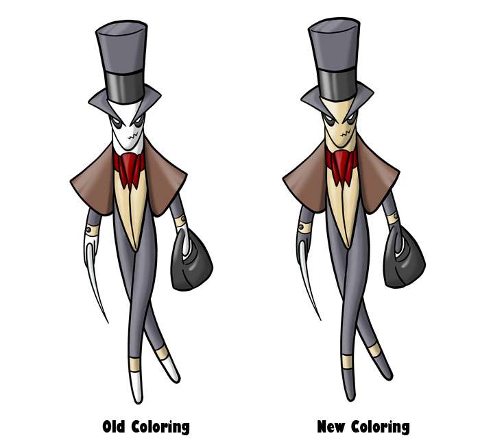
SEO, I definitely prefer these colors to the ones in your previous post. I really like the purple.
Darkmattr, that's really, really cool.
Darkmattr, that's really, really cool.


All right, this will be my final concept, though not my final submission of course.
http://img830.imageshack.us/img830/4835/cap11.jpg
Panther warrior with Mayan-inspired motifs. Things may change in the end depending on stat spreads and maybe ability choices. I'm definitely going to play around with traditional Mayan ornaments, jewelery, and patterns to see which looks best.
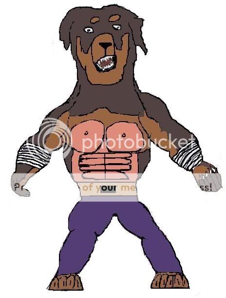
Is it Dark and Fighting enough though?

I like it, 'nuff said. It looks almost too realistic, though.<design snip>
I think this is going to be my main work. I'll get around to some supporting work at some point but i'm more concerned about the main design itself. I'll take on board any critique anybody wants to say about this piece.
A big thanks to everybody so far! Artists really do appreciate comments on their work so please make sure you haven't missed anybody while scrolling through the thread.
As for the work itself, I was originally going to do more advanced shading however I feel a simple clean style is more fitting for a Pokémon. I also don't feel I need to adjust the build of this mon judging by how the stats appear to be swinging towards a fast and slightly special based mon.

also everything looks great so far but if i had to choose one i'd go with caladbolg~!