• Check out the relaunch of our general collection, with classic designs and new ones by our very own Pissog!

CAP 13 CAP 2 - Art Submissions

Status
Not open for further replies.
Did we ever get this one in colour? I thought it had quite a novel theme going on with the cutest little Grim Reaper thing.

I concur. This design is begging for a colored sketch or detailed sketch or even a different angle. It's a good idea to work on.
 
I'm trying a more feminine look than my "Rapekin" on Page 1. This is unfinished though and I might just trash this specific version...
SunflowerFairy.jpg

I'm personally loving the concept of a ghost sunflower fairy and I'll probably stick to it but I'm considering redoing the art completely instead of finishing this since I made it look a little too "forced" of a theme than I wanted. The colors are dark because it's a "wilted" Sunflower but I think it does make it a little less eye-catching...

Any thoughts about the concept though and maybe how I could pull it off better?

Edit: Looking at it now, I think the whole fairy part might be what's making it forced & unnatural...
 
--271396318


This is my Pokemon CAP2 rendition, it is based off of a Chinese lantern (Physalis alkekengi)... I have no story at the moment... Description is that the fruit determine the type of attacks, the white encasing, uses ghost moves mainly and the orange encasing uses grass moves.. the small white flowers near the bottom give the user the ability to sketch. Criteque away... I know it is not that great.. but I wish i could use the best of my art ability. but alas, i have no tablet or camera, so windows7 paint, will do..
 
Seagull's one is my favourite, as the design is quite pure and not a bit overloaded as some others can be. Moreover, the fact that its typing is not directly shown, wheraes the pumpkin's design do, is very attractive.
 
Here I tried a personal take on the old haunted tree concept, or in this case, an undead tree. I've nicknamed this design Frankenstump's Monster or 'the Monster Mash Tree', being based on the popular horror character with elements of a skeleton and a zombie. The 'ribs' are bracket fungi feeding off the dead wood. This pokémon seems to produce a large shadow despite not having any foliage (the 'hair' is moss), but that shadow is in fact a layer of thick, rotten sap that it leaks through the tips of its roots and its fingers. This sap is extremely sticky, and the pokémon uses it to catch unwary prey while disguising itself as a normal tree to reduce suspicions. The sap can be reabsorbed by the pokémon, and some artistically inclined individuals actually use it as paint.

One of these two will be my final submission but I'm not sure which one should I choose, so suggestions, comments and critiques are welcome.

Your #2 is excellent, although I would get rid of the sap. I'm always wary of CAP designs with huge backstories simply because it is rare that said backstory/dex entry comes across simply by looking at the design. But I do really like the tree on its own.

EDIT: Also, tbh, I don't mind the pumpkin designs because if TPC designed a Grass/Ghost Pokemon there is probably a 99% chance it would be pumpkin-based. So it might be original but it still has the potential to be very 'Pokemon'.
 
CAPleafymonjpeg.jpg


A little redo of the ponytail painter. Trying to make it look a little less psychic, and slightly more capable. Sorry for really rough sketch! Thank you guys for the wonderful feedback!

http://i782.photobucket.com/albums/yy101/SentretLover/CAPScarecrowreduxcolorsjpeg.jpg

Here's a link to some different color schemes for the Scarecrow. I think my personal favorites are 6 and 4. For all who don't like the Military jacket, what do you propose instead? I'm drawing a blank! (apologies to anyone who had a suggestion I might have missed) I just think that plaid would be overkill. Sorry to anyone who was a fan of the slim version, he's staying bulky to fit the stat spread! I think the design would be rather bland without the scarf personally, but a hat is an idea that I must toy with. I definitely think that a reaper scythe is overkill even though it would look badass. I think I will incorporate sketch elements with the supporting artwork. I'm thinking of him digging his claws into the ground to rake patterns or something. We'll see.

And as for feedback, I gotta say that Mayatraese and Yilx have some fabulous concepts going. I look forward to seeing more from everyone! :D
 
I think the scarecrow should keep the jacket for sure. That's one of the design's central selling points if you ask me. One of the great things about it is it offers up a ragged look by means of the tears but still gives the scarecrow a polished appearance. I think pretty much all the jacket colors you've shown are acceptable, but I really don't care for the red scarf. The green and orange (from the pumpkin) combination provides more contrast than red and orange.
 
Hey there, don't take it the wrong way, but I don't think the grass tornado is not a particularly good idea/concept for this contest. It has to be in the field group (so it can breed with Smeargle), and to be quite honest, it does not fall in that category whatsoever (yours isn't the only one, mind that). It just seems... really out of place in this contest, and you're taking the wrong approach. Maybe that Grass Tornado can be a project of your own, and you can whip up something new. Again, please don't take this the wrong way~

We could always make Sketch an event move.

If not, 95% of the designs in here are screwed.
 
SoIHerdYouLikeSENTRET - The ghost lady seemed to lose a bit of personality in the transition, in my opinion. I think maybe if you added some kind of sinister or cute smile, it would be so much awesomer? Also, I like coats 3 & 4 best, and the coat works really well, but if you want to try out other costumes just to test them, maybe some kind of old shredded cloak or something? Still, some pretty wicked shit here.

TinyTyranitar_T - I think it looks a bit too cluttered. The detail in the leaves and the thorned vine is fine, but the texture of the main fruit seems to make it look too crowded. Otherwise, a great idea!
 
GRs Cousin - I like the idea of a skeleton used by puppetry vines. I would make that relationship stand out a bit more; perhaps have a mushroom head or flower that controls the skeleton? I also don't understand the vines that extend from its lower torso. Keep at it!

Glad to finally get some critique! I made some minor changes accordingly, namely a more mushroom-esque head and more defined broad shoulders, of which have shroom caps as well.
GrassGhostCAPmon-2.png

I've made concept art for its pre-evolutions as well, shown in the spoilers.
Funghull-1.jpg

Basic little fun-guy that mimics a skull so that predators won't think to eat him. The growth on its forehead contains nutrients needed to evolve. It has a decaying, body with various stitches that upon evolution split into limbs, which brings us to...

Mushororpse-1.jpg

The growth is starting to take a larger control of its host, hence its more developed stem and zombieish appearance. Gaining half of all the host's daily intake of nutrients, the mushroom zombie is a malnourished Pokemon, which is why when the growth finally takes over in the final form, it becomes a lifeless extension to the skeleton growth rather than an individual being controlled.

Anyway, the vines at the bottom are the remains of its prevo with the mix of giving it a ghoulish tail. Again, I've noticed a lot of good concepts here, but most of them don't come off as part Ghost-type, so I felt this should've been an emphasized amount of the CAP. Really, less paintbrushes and more ghostliness people! It only gets an egg move of Sketch. Give the flavor some more love outside of its competitive existence.

I hope you guys will give me more advice as to how I can improve the design. Even if my artistic talent sucks, I really do try to put the love into my creation.
 
My third rendition: of the Chinese Lantern Pokemon.. MLaRF, thanks for the advice for the second rendition.. Anyone is welcome to critique my example CAP2..
DSCF5196.jpg
I have based my art submission off of the mature chinese lantern fruit.. Due to its ghastly appearance.. I used the vine protruding from the fruit rind, displaying a flower which the stamen has long bristles at the end of the flower similar to a paint brush and has the ability to sketch the opponents move.. after luring them in with the opened flower..
 
A quick sketch-up of an uncoloured version. The idea was a ghost sealed into a tree truck. He's a tad shy, so he can pop into his home and the lid covers on top. He can freely move his wee root-tentacles around, a bit digglet-esque! He's furry, but very much translucent and wispy inside.

I'll colour it in a bit, but I have no idea to to do so through any computer program, just coloured pencil. If anyone is willing to colour through a program, it would be greatly appreciated! That also means that you would be part of the design, no?

http://i105.photobucket.com/albums/m225/funerallaughter/CAP21.png

*btw, how would I just post the picture here but in those snazzy hide boxes?
 
Did we ever get this one in colour? I thought it had quite a novel theme going on with the cutest little Grim Reaper thing.

YAY.

Ok, I thought it was trash and was gonna let it fade into obscurity, but now I'll get it done all thanks to you.

:D
 
YAY.

Ok, I thought it was trash and was gonna let it fade into obscurity, but now I'll get it done all thanks to you.

:D
Any chance this would get an evo? I'm not sure what to improve about it, but it just seems incomplete... It might be the Chikorita design with only a pair of scythes to differ it. I'd recommend having a more going on to it, possibly in the ghost-type department.

I'd also like to say that I love both of Calad's designs, Wyverii's design, and Yilx's shrine maiden design. They all fit the Grass-Ghost typing without forcing one typing over the other, as well as leave room for the Sketch concept without shoehorning them into their designs. Can't wait to vote for these.
 
This is easily my favorite part of the CAP process. I can't really art myself, so it just amazes me that people are able to do these things so well and so quickly.

First off, the only reason I'm not a fan of bugmaniacbob's is that we already have two corpse flower Pokemon, Gloom (unbloomed) and Vileplume (bloomed). While the inspiration is obviously fitting, I'd personally rather see something else. That being said, I really do like the execution.

DJD's is probably my favorite right now, though there are several very close behind it. Given the older inspiration, it gives off the Ghost vibe better than some of the other designs I like, such as aragornbird's, Yilx's flytrap maiden, and PaintSeagull's which feel more Dark-ish to me. Another one that I particularly like is the Sleepy Hollow inspired design by Calad.

EnergyStorm's is pretty cool too, it just doesn't feel very Pokemon-esque to me. Hard quality to really define though, so I can't really give any specific suggestions. The second design from SoIheardyoulikeSENTRET is good as well, but I have trouble seeing ghosts look that cheerful. It does seem to incorporate the sketch aspect better than most which is also good. I'm also waiting to see some more of Wyveri's as well.
 
Woot, Grass/Ghost Centaurmon! 8D Here's my first draft:


cap2sketch.png


(Please pardon the erase marks, I can't draw horse legs worth a Magikarp without a visual reference right in front of me. :P )

My reasoning and thought-process in choosing to base this on a centaur was as follows: "Grass/Ghost = Jack-O-Lantern -> Headless Horseman = Man on Horse -> Half-man Half-horse, - Man + Plant = Centaurmon CAP2!"

Anatomically speaking, Centaurmon is a parasitic plant which has taken over the body (and mind) of an Equidaen. In doing so, the plant has acquired many of the abilities of the mammal, including efficient locomotion and the ability to generate its own body heat, as well as near-sentient thought. The plant itself is made up of fantastically malleable vines, with which it can assume multiple appearances and shapes* - but due to a preference universal throughout the species, its "at-rest" form resembles the upper half of a human body. The one flaw in the Centaurmon's shape-shifting ability is its inability to emulate the human face; as a result, it frequently wears the carved rind of a gourd as a mask.* The roots covering its fore-hooves allows it to absorb additional nutrients from the soil when it stomps them into the ground.

Females typically have longer "hair," larger "pectoral bulbs," and an overall sleeker appearance. (The Centaurmon pictured above is male.)

*Indirect justification for the ability to use Sketch.

->"But, that design doesn't fit the Ghost-type!"
The horse's body is "dead," and the plant's malleability is rather peculiar, too. Of course this design fits the Ghost-type. B)


Comments and critiques welcome! :D
 
A few thoughts on the ones that jumped out to me.

DougJustDoug
I really like the idea of a single-gender CAP, and I feel this does really suit the spec so far, as well as being very inventive. As I'm sure others have said, the eyes in the mask would look better if they were clear though.

Calad
I quite like your Pumpkin and Onion design, although it doesn't really look that much like a pumpkin (not necessarily a bad thing). I feel it avoids all the stereotypes we were expecting a pumpkin design to fall into, but work needs to be done on the legs to make them look more leafy.

aragornbird
I definitely like this design, but the Ghost element of the mask I think needs to be emphasized more. Not really sure how you could do this, perhaps it could be as simple as changing the colours? Or maybe glowing purple eyes? I don't know, experiment with it, but I think the idea's great.

Yilx
I'm actually really struggling to pick out which I prefer of your two designs, however I feel that they both need a bit of work to make it clear how they reflect the 'sketch' aspect of this CAP, so whichever can be improved in that regard I would go for. Not really sure the best way to go about this however...

Bird
There's something about this design that really appeals to me, but the idea that the ghost changes form to reflect the move doesn't seem very clear, regardless of any difficulties it would take implementing. I think leaving the ghost how it is might be a better idea. Also, I feel like the eye on the body should be different to the eye on the ghost.
 
I should do more than small posts if I'm ever to make a name for myself.

@Katakiri
I like the sunflower much better than the rape-kin. The wilted sunflower has more off a melancholic touch to it, befitting of a ghost like shedinja. I suggest adding 2 more leaves at the bottom where it fades off or taking out the leaves. I think having one leaf there's a bit awkward, but then again, what do I know?

@SoIHerdYouLikeSENTRET
Both of your designs are great. I favor the scarecrow, though, since it exudes more of a ghost-type feel to it. Stick with the uniform since anything other than the uniform may feel out of place. It does a good job already.

@GRs Cousin
Not a bad concept. The vines coming out the side of the waist seem awkward so I suggest removing them. The mushroom head was a good edit on the design. If you were to draw another angle, I suggest one facing at around 7:00, back arched forwards and eyes looking very menacingly. Then again, I'm no artist, I'm just a lurker.

@tinytyranitar_t
I see what you're going for. I suggest some overlapping the leaves over the fruit-head. In addition to that, try drawing the leaves not for detail of what a chinese lantern leaf is, but what a typical leaf is like. Other than that, the fruit is very scary which exudes the ghost-type feel, which is good.

@funerallaughter
A very fun design. I suggest adding more of a grass-type feel to it, because I feel that any ghost type can be bound to a tree. Then again, I'm just a lurker so feel free to ignore me. As for the snazzy boxes, I think you have to click on the "Wrap
tags" button at the top of the reply message box, right-most button. Within there, I think you have to type <img>_____</img> where the underlined space is where you paste the link to the picture. I've never tried that before so please don't criticize me for being wrong.

@Lucario_Guy
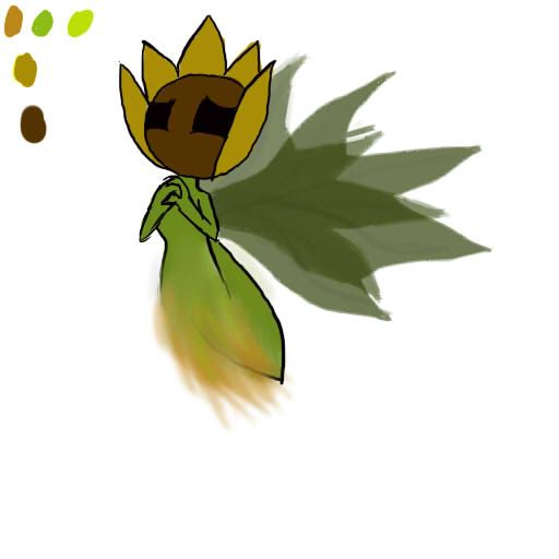
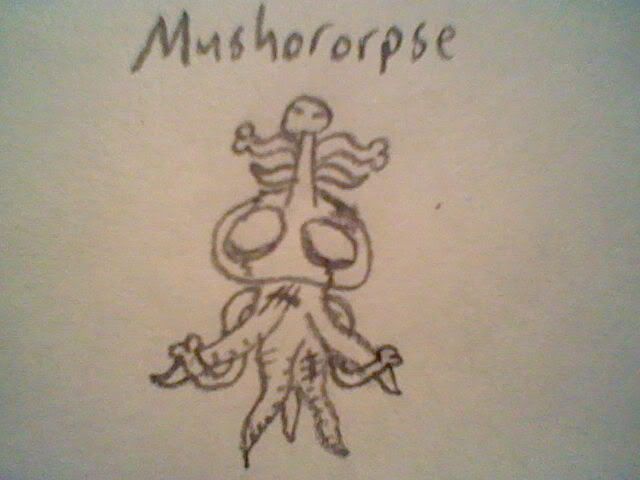
I can see it fitting as a ghost-type, I can see it fitting as a grass-type, and I sorta see its ability to use sketch. I don't see it as a pokemon, though. It's a wonderful drawing, nevertheless, but I'd say tone down the realism. We have ice-cream and lawnmowers with eyes and smiles for pokemon.

@Yilx
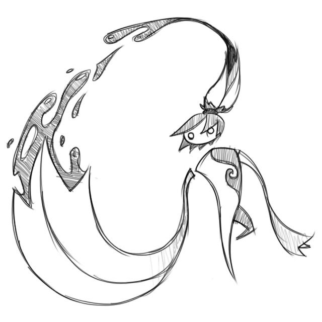
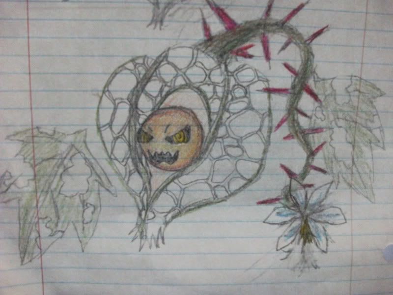
The shrine maiden is personally my favorite design yet. I agree with jas61292 where the black makes her look like a dark-type and less of a ghost-type. Maybe lightening the black to purple? I don't know. Still a very good design.

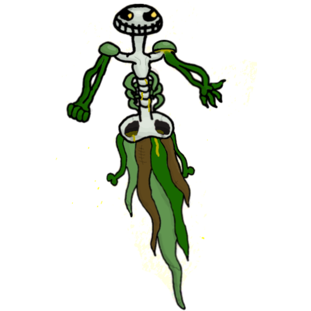
Regardless of criticism from either me or others, these are all still very creative and talented drawings.

We could always make Sketch an event move.

If not, 95% of the designs in here are screwed.
This may be necessary since most of the designs may fit into amorphous, grass, or human-shape. That's up to Rising_Dusk, though.
 
@GRs Cousin
Not a bad concept. The vines coming out the side of the waist seem awkward so I suggest removing them. The mushroom head was a good edit on the design. If you were to draw another angle, I suggest one facing at around 7:00, back arched forwards and eyes looking very menacingly. Then again, I'm no artist, I'm just a lurker.
Good to know, I'll take your advice to heart. The only reason I kept the awkward vines at the waist was to keep the prevos' remnants in the design, but I can see it doesn't contribute to the mon's design in terms of coolness... I'd draw from another angle, but I'm simply god awful at drawing as it is, I don't think I'd be able to do it without butchering it. All I can hope for is someone of artistic talent to try for me, haha.
This may be necessary since most of the designs may fit into amorphous, grass, or human-shape. That's up to Rising_Dusk, though.
What's to say an entirely separate mon with Grass as an egg group and Sketch as a level up move doesn't exist? It could still be an egg move. Unless CAPmon 2 only exists in Generation V... Not that any of this matters, I'm just spewing out more Game Freak flavor.
 
Funerallaughter - aionhfvqlmvfn IT'S SO CUUUUUUUUTE
You do it by clicking the picture of the mountains on a yellow background if you're in advanced reply, in quick reply you use tags. The design is really awesome and a nice refreshing breath of fresh air from the spookiness everyone else is posting!

EDIT: You said "tree truck." Beep beep meow everyone ride the tree truck.

[b]TinyTyranitar_T[/b] - eugqlwnvjsnhfcud IT'S SO AWESOME
I really love what you've done with it. I think that's all there is to say on the matter.
 
A quick sketch-up of an uncoloured version. The idea was a ghost sealed into a tree truck. He's a tad shy, so he can pop into his home and the lid covers on top. He can freely move his wee root-tentacles around, a bit digglet-esque! He's furry, but very much translucent and wispy inside.

Oh My God.

This one is awesome. He's like a cute Oscar the Grouch!
 
To the designer of the art concept inspired by LoZ's forest temple; It is damn good. That is almost exactly what my thought of the art was in my head for a grass ghost and you put it in visible form.
 
Status
Not open for further replies.
Back
Top