• Check out the relaunch of our general collection, with classic designs and new ones by our very own Pissog!

CAP 13 CAP 2 - Art Submissions

Status
Not open for further replies.
I don't mean to be a Perfect Metapod (yeah I'm bringing that back) but a lot of these concepts don't look... like a ghost type. In almost all of these all I see is just purple or black in one spot in the sprite and they just call it a ghost type, which doesn't work for me. Regardless of if Ghost is a secondary type or not, it should have a little more of a ghostly presence to me if it wants my vote.
All I'm trying to say is most of the concepts so far just don't look ghostly enough.

Thanks for the critique! Even though it was technically for everybody.

I could add some sort of ghostly aura surrounding my Uglimon (see first page) if you guys think it would look better that way.

Second order of business, I've written up a dex entry supporting my artwork. It should explain a lot of my reasoning for what I did and why.

UGLIMON were once ordinary Uglifruits. Like most fruits, the Uglifruit is produced by its parent plant for the purpose of spreading seeds via consumption and excretion through Pokémon. However, this Pokémon came into being because the Uglifruit, as its name suggests, is quite unappetizing. No one wanted to eat them. As the fruits slowly rot away, some of them become possessed by a burning desire to fulfill their purpose, and come back to life as UGLIMON. Then, they wander around, looking for other Pokémon. If they can get close enough, they will fling themselves into the mouths of their enemies using moves like Tackle after they are weakened by its ghostly attacks. This usually results in the unfortunate victim being choked to unconsciousness. Occasionally, an UGLIMON will succeed in being eaten, and when it comes out the 'other end' of a Pokémon as shapeless mush, it will be reborn from the excrement, often knowing one of the moves of the Pokémon that ate it. Once they are reborn, UGLIMON are much more docile, as they have fulfilled their sole ambition in a past life, and can be trained to use their seeds effectively as weapons.
 
[IMG/]http://imageshack.us/photo/my-images/194/halloween1c.jpg/[/IMG]

scaled.php


Here is mine.

Original design, didnt look at others' yet. they all look great :)

it looks somewhat like ghastly. not intentional.
 
Thanks for the critique! Even though it was technically for everybody.

Yeah, I'll agree that even I didn't make mine ghostly enough. He looked better in my head, but I'll have mine redone soon. Hopefully I can think up a way to do the colouring in a less shitty manner (maybe involving JPEG files with maximum compression).

EDIT: Mektar, if that was you who put all those colour tags in your post and not just a result of me hitting the quote button, I am going to flip shit.
 
Still kicking around ideas, but here's attempt number one:


It's a sort of swamp moss ghost. As soon as I drew this, I realized it looks an awful lot like something from The Last Airbender. Ah well.
 
Updated both designs... still not sure which one to pick, though...
The second female one. Forget the first one

Here's a little redesign of the scarecrow. Redone to fit the stat spread a little better I think.
I was dreading seeing anything with a Pumpkin design, but...DAMN. This would look badass with a harvesting scythe/sickle to fit the theme of harvest/fall/Haloween
 
Personally I'm really enjoying The Ticketmaster's design. You may want to slim down the design a bit per say, in order to better fit the given stat distribution. But otherwise it looks pretty interesting.
 
Okay my first concept was made a couple of days ago, but now I see and find that the idea is too much straight to the point, and it's not pokemon enough, so I made a leaf ghost :)

Donphan I actually really like yours and would be keen to see it developed a bit more! It looks very Gen2 :)
 
Here's a little redesign of the scarecrow. Redone to fit the stat spread a little better I think.
Yeah, your scarecrow is definitely a lot better than mine, and I think that it's definitely one of the better entries in general. I only have a few suggestions:

1) The leafy scarf thing is sort of weird. On the one hand, it does add a little something cute to the design, but on the other hand, it feels like an unnecessary attempt to play up the grass-typing. And by unnecessary, I mean almost bordering on overkill. It already has obviously wooden leg-stand-things, straw sticking out of holes in the shirt, and a pumpkin for a head. Even as a far as scarecrows go, this design is already far more Grass-evocative than Ghost-evocative.

2) (This one is definitely coming from a space of bias because of my own scarecrow-inspired design) If you do get rid of the scarf, consider some other accessories. For example, I happen to think that scarecrows always look more awesome with a hat, and I think that one would fit yours very well. I also want to say that it would look awesome with a scythe, but that might be me reaching too much to want to see a design similar to mine being done by a much better artist.

3) The stat spread has yet to be decided upon, so I don't recommend trying to tailor design to them. Plus, taking higher physical sweepiness as suggesting more masculine has some unfortunate implications. I would be in favor of slimming it down at least a bit and going for at least a slightly more gender-neutral approach.

Though honestly, even if you don't take the above critiques into account, I could still definitely see the design being a major contender.


And while I'm already posting anyway, I want to go ahead and send out some praise for this design:
Hello all, here's a first draft of my concept.
This one is a dead flower designed to look like an angel, and it paints with its uprooted roots.

Any suggestions on improvements are welcome/suggested/begged for, etc.
This looks really cool, and I'd love to see it developed more. I think that turning the roots into a paint-brush is unnecessary for the overall design that you're going for, but I still like the concept of it holding up its roots and their being something. I also like that you're going with something that looks more angelic than sinister, like Shedinja, one of my all-time favorites.
 
I find the usage of a pumpkin a bit-overused to a point where if one pumpkin-mon is better designed, then the rest are overshadowed. At that point, creativity seems to define an entry more than the others in this thread.

Overall, I say props to DougJustDoug, Energy Storm, andalite191, Yilx, Aragornbird, WPS, mayatraese, and SoIheardyoulikeSENTRET. Their designs really stuck out to me with a creative look upon Grass/Ghost or sketcher.

Then again, I'm just a lurker. Who listens to me, anyway?
 
34j4ncp.jpg


(that is supposed to be a tree on its back, I am horrible at drawing foliage.)
I like the concept of this mon, and wanted to draw something that represented it. Without the concept, we would have no mon right? so I incorperated sketch by using the hands as pencils. where the metal bindings would be, I used vines instead. Anyways, I tried to make the eye look like it was surrounded by petals, but as a reminder that every rose has its thorns, I put some thorny vines extending from the body. The ghost typing is with the disembodied hands. Please feel free to critique my work.
 
Updated again. He now has hands, and leaves are visible. I also took out the spinning blades of air that were sticking out making the thing feel messy. Thank god for transparencies, huh!

GrassghosttornadoPokemon3-1.png


I really like how his hands came out, especially it's left, or our right. Or maybe constantly spinning tornados with constantly spinning hands don't have left or right. Whatever.

Things I want to improve:

  • The shading on the main body
  • Find a way to balance the left over spinny things on the main body, as well as the swirly, so it matches the hands yet doesn't look clustered.

I am also concerned regarding the leaves. When I first finished doing them, (the body took ages!) they looked like leaves but now in hindsight, they kind of look like scales. This is the last major thing I'm looking to fix, but I really hope I don't have to draw the main body from scratch :o

Any and all advice is ABSOLUTELY NECESSARY would be incredibly helpful.

EDIT: After going through posts I missed, I decided to critique some that really stood out to me.

SoIheardyoulikeSENTRET I have to agree with what the others said, in that the military style jacket is a bit too much for the design. Yet I can't really see how much you can ruin the jacket without your Pokemon turning into a fairly generic scarecrow figure :\ I'm really digging it's scarf, though. I'll be honest, I kind of liked your other idea better, but with a bit more a subdued colour scheme, but they're both pretty good.

The Ticketmeister I like this guy, it's simple and sweet, yet seems perfectly grassy with some elements of ghost. I don't see the point of the smoke though - is it a smoker, or is the ghost supposed to up the Ghost nature of the guy?

Yilx While you're bleeding heart plant looks better with the improved colour scheme and has a cool concept of the design, I'm really digging you're updated shrine maiden, now that it has more plant-like features. I disagree with it looking too human-like, though - take a look at Mawile. That thing goes on a similar path between human and Pokemon. Actually, that may be my one slight critique with it - besides colour scheme, the giant mouth, feminine yet monstrous features and having jaws where they shouldn't be sort of draw comparisons to Mawile to me. And the bottom half looks like the Immoral Beast from the game Catherine, lol That's just me being nitpicky upon close observation, but so far I think the maiden is one of my fave submissions in this CAP so far.

Lokon I kind of like this guy, but I cannot tell if those branches on those back are like tentacles or like Larvesta's horn things. The helmet thing is pretty cool, but I don't know why the inside of it is white/grey instead of matching the green of it's foliage. I also feel the eye colour could stick out a bit more, but I like the colours used, in general.

mayatrease I really like this dead angel plant you've got going on. I can't help but feel that the arms supporting it's dead tail look too much like scarves and less like the arms/tentacles of a plant like being. The face is kind of similar to Chandelure, but I don't mind too much. I just couldn't help but notice like Chandelure it seems like it was ripped right out of a Kingdom Hearts game. Were the angel heartless the inspiration, by any chance?

T3hB33 Are you a brony? The design is cute, but the concept seems completely bizarre - a dead plant taking the form of a ghost pony? But I really like that, it makes the design really original. I'd personally lighten up the plant part a bit more (I know it's supposed to be dead, but I feel it could use a bit more colour), and the ghost pony could be a bit more transparent. Otherwise, the colours you used were pretty appropriate, and this is another really cool entry.
 
I am really, really liking what SoIheardyoulikeSENTRET has done. The earlier forms of the scarecrow-inspired design fell flat for me but the latest simply oozes awesomeness. I had doubts that anything with a pumpkin could work but you have proven me wrong. I think it strikes a perfect balance between the dual typing. I say keep the scarf for sure, as it is a great touch, and I particularly like the misshapen mouth and the jacket. That design is a top tier work for me.

Also, there is no question that Doug has created a phenomenal figure but I wonder if the masks are actually too much. They look great, and in any other situation I'd call the work flawless, but one of my first impressions of it is that it's too busy, and I feel the masks detract from the overall impression intended. Still a tremendous effort though.
 
Well, I'm not going to pretend I'm any good at anything considered artistic, but I think that your tornadomon might look better with actually claws instead of tornados, almost like haunters hands, although perhaps with a more.......ferals the only word I can think of to describe it atm. I think that could help out more but again, I don't really know
 
Thanks for the advice, Ragnarokalex. I was originally considering concieving Haunter like hands, but the reason I went with mini tornados instead was that I felt it would be inconsistent. With Haunter the claws are reminicent of it's head, whereas my Pokemon is kind of featureless besides the leaves and the tornado, and I'm not sure how one with a lack of artistic talent like me could turn haunter hands into leaves. Or it would mean I'd have to come up with the being that is inside the tornado, even though my intentions were that the being was the tornado.

However, I will try drawing some sort of feral ghost hands, and attempt to see if they'll look any good on it. Shame, I felt the side tornadoes looked far better than the main tornado, haha.

EDIT: Here are two -extremely- rough versions of possible 'feral hands' in the style of Haunter. And by rough, I mean 'Within about two minutes with only two layers' . The first takes from the eyes of the Pokemon, the other takes the leafy body theme from the main body so I can try maintain some consistency. While I like the leafy texture on the second better, it doesn't really make sense as to whether it is spinning or just a big pile of leaves. The other one, based on the warpy eyes, was intended to portray the base ghost, but I feel it either takes away from the eyes or looks really awkward.But if having hands like these wins me the CAP, so be it durrr.

Grassghosthandroughcopies.png
 
SoIheardYouLikeSentret thats so sweet looking dude, very dynamic.

The Ticketmeister that guy is adorable(and I don't kick that term around lightly) and I fits really well.

But Doug's design is just stunning. I love the direction he took(female inspired, thats... inspired :) A weeping willow/ghost/dead actress/awesome masks. Seriously awesome
 
My sentiments echo Rodan, I personally think that aragornbird's looks a lot like Shiftry. I also don't think it really communicates the Ghost typing all that effectively. Next, I want to note to SoIHerdYouLikeSentret that I much prefer the ponytail flower painter to the Jack Skellington jack-o-lantern guy. It feels more original and communicates the typing better with a will-o-the-wisp style petal structure. I also think it looks very feminine, which lends itself to a mono-gender very effectively (something I particularly love).

I have to say that I'm genuinely surprised in how little people seem to try to communicate Sketch in the design; I thought that'd be the crux of the art uniqueness of this CAP. I understand that we're forced to put Sketch as an egg move so that it actually works, but it is very fundamental to the way the Pokemon operates, and I think it'd be really great if the art reflected that. Down the road I expect the CAP's flavor movepool to hinge on Sketch's presence and practically be defined by it, so I'd like to see that same thing here. This CAP presents a lot of unique opportunities for artists, such as creating a mono-gender CAP (which we've never done before) or even using a prop (which we've also never done)! I really want to discourage artists from drawing generic ghosts or grassy things, and would also like to really get the "pumpkin" designs out. They're so... Unoriginal and unexciting, in my opinion, and I know you're all capable of so much more. Think outside the box, like Doug did with his weeping willow (still not a huge fan of the eye styling or the masquerade masks, there has to be something better for the prop).

If you're stuck for ideas, there are lots of cool things that can be done. Things like ghost writers, phantom actors/actresses, grassy pixie ghost thingies, muses, or whatever. I'd love to see that sort of dramatic stylization explored in this art stage.

Either way, great job so far to everyone, and keep up the good work!
 
Question - does grass tornado look too stereotypically ghosty? I could give it a top hat and a moustache Seriously though, I think I'm going to edit some more 'acting' features on to my guy, i.e something that allows him to do something besides spinning. Like maybe a mouth, or something, I dunno.

Well anyway, I guess I could just blow out an excuse and go with my 'tornado sucks in and then spits out' attacks thing. But Rising_Dusk, I think the reason there are so very few designs focusing on the move Sketch is that I believe Wyverii suggested the focus be on the Pokemon being as creative as it's potential movepool. I'll try incorporate your ideas somehow though, or maybe start something completely different.

Being an artist sure is hard. I have far more respect for you guys now xD
 
I hope that you don't take this personally, but I have to disagree and/or object to a lot of what you've said, Rising_Dusk.

Next, I want to note to SoIHerdYouLikeSentret that I much prefer the ponytail flower painter to the Jack Skellington jack-o-lantern guy. It feels more original and communicates the typing better with a will-o-the-wisp style petal structure.
The original more feminine design (while beautifully designed, mind you) was exactly the wrong approach to making this CAP artistically memorable, at least in my opinion. The way to do that, again in my opinion, is going to be drawing on a conceptually fitting but still imaginative idea, not arbitrarily adding spooky features to a plant (as many submissions have done) and not just making something that incorporates the colors purple and/or green as their sole justifications for representing the typing (as many other submissions have done, including SoIHerdYouLikeSentret's other entry). Jack-o-lanterns and scarecrows may sound obvious or unimaginative, but they're still for more fitting that a generic cute-looking critter that just happens to be green and purple, and I think that the best artists are going to find ways to make the seemingly obvious concepts still end up unique and imaginative, as SoIHerdYouLikeSentret has done with this other entry.

I also think it looks very feminine, which lends itself to a mono-gender very effectively...
I need to object to the idea that anything feminine must automatically lend itself to only being of one sex. We have male Gardevoirs and Lopunnys, so I see no reason that a design that appears more feminine should be so restricted, just as I see no reason for designs that appear more masculine (such as Machamp or Conkeldurr) to be so restricted the other way. I object to the way that it's already done with official Pokemon, and I will continue to object to it here. I see no reason why, for example, DJD's Weeping Willow must be restricted to being female even though it has a clearly feminine appearance... Have you ever been to a drag show? Because I need to tell you, Weeping Willow is perfect drag queen material.

I understand that we're forced to put Sketch as an egg move so that it actually works, but it is very fundamental to the way the Pokemon operates, and I think it'd be really great if the art reflected that. Down the road I expect the CAP's flavor movepool to hinge on Sketch's presence and practically be defined by it, so I'd like to see that same thing here.
The bold portion captures where our opinions differ. Sketch is going to be fundamental to the way that the Pokemon operates in the metagame, but if Sketch is going to be an egg move, then that's not going to be how the Pokemon operates conceptually otherwise. A CAP's Art is one of the only places that portions of it can be created that need have almost nothing whatsoever to do with the Pokemon's metagame role, so I don't think that it's a good idea to suggest that this Pokemon's artistic design be limited to a metagame concept that, by virtue of being an egg move, must inherently not be central to its concept otherwise.

This CAP presents a lot of unique opportunities for artists, such as creating a mono-gender CAP...
This I'm simply curious about. How does this CAP present any greater opportunity for a mono-gender Pokemon than any other CAP? If anything, considering that most plants are hermaphroditic and ghosts cannot reproduce (I know, not in Pokemon, but still), the only mono-gender that this CAP may present a somewhat more unique opportunity to pursue would be the "gender unknown" category, though that would screw with out plans for the egg move.
 
Question - does grass tornado look too stereotypically ghosty?

Hey there, don't take it the wrong way, but I don't think the grass tornado is not a particularly good idea/concept for this contest. It has to be in the field group (so it can breed with Smeargle), and to be quite honest, it does not fall in that category whatsoever (yours isn't the only one, mind that). It just seems... really out of place in this contest, and you're taking the wrong approach. Maybe that Grass Tornado can be a project of your own, and you can whip up something new. Again, please don't take this the wrong way~
 
Alright, well I'll hopefully be getting up some more sketches tomorrow for my design. But in the mean time, how about I dish out some critiques =D! I think there are a lot of concepts out there and not NEARLY enough critiquing. C'mon CAP, let's be a bit more vocal about what we'd like to see! I'll be working from the last page upward so as to catch your latest version of a CAP design.

Absolclaw - A tornado of leaves leads me to think Grass/Flying personally, but your design is starting to get some more Ghost-like features! I would recommend focusing on some sort of recognizable face region to make it really stand out. The eyes are alright, but a face would really help solidify your idea.

MrcRanger97 - Your drawing is a bit vague and it's difficult to see what's going on. The eye surrounded by petals is a cool idea! Keep trying to develop some more distinctive features that mesh well together.

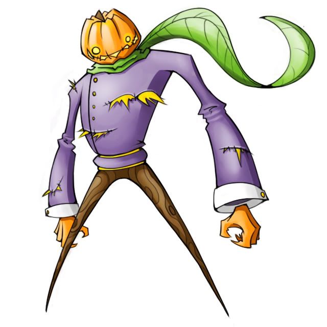
SoIheardyoulikeSENTRET - I personally liked your "sock puppet" design the best when I saw your original ideas in Smeargle's Studio. However, you've really come a long ways with the scarecrow design and I like it! I actually prefer the leaf scarf and enjoy seeing the extra bulk you added. What I'd like to see now is different angles of supporting art to make the idea a bit more tangible. I'd also enjoy Sketch being somehow woven into the design. I wouldn't make it glaringly obvious, but having something there could help.

The Ticketmeister - What a cute design! I would focus now on developing Sketch into the artwork. A paintbrush could potentially work, but let the question swirl through your mind for a day or two to come up with something truly unique. I'd also like to see a better development of the ghostly wisps; in my opinion, they should be more solidified in order to make spriting more bearable. Keep it up!

bluemon - Uhh, it looks like you are banned? Sorry to hear that. I don't understand the horn, but the facial concept works well! Keep developing the concept and striving for uniqueness and simplicity (to an extent).

DarkShiftry - One of your images is broken, so that is unfortunate. I feel lukewarm about the design. Methinks it is a little to complex for the world of Pokemon. Perhaps try simplifying things? Also, approaching an angle of cuteness or coolness might help.

V0x - Some descriptions might help me (and others) understand your design a bit better. I like the concept of a leaf mask, but there are lots of things that could be simplified and/or brought to the forefront of the design's features. The mask could be bigger, the tentacles could be more focused, and its legs could make more sense.

Yilx - I personally prefer the Bleeding Heart Mirror. While humanshape looks cool, I don't know how many people will go for it in the polls (my opinion, do what you want). If you end up going with the bleeding heart, I'd recommend posting some sketches of it from different angles. The picture is quite dynamic; showing it at different angles could help show the story you wish to tell.

GRs Cousin - I like the idea of a skeleton used by puppetry vines. I would make that relationship stand out a bit more; perhaps have a mushroom head or flower that controls the skeleton? I also don't understand the vines that extend from its lower torso. Keep at it!

AlfaTyrogue - Long creepy fingers are good! I think the design is very skinny for a Pokemon, especially one that is supposed to be bulky. I'd recommend making it a bit more broad. Also, his feet and arms seem to be going different ways. The stitching mouth and straw hat are pretty fun ideas to work around!

GtM - Like the above comment, your design is quite tall and gangly for a Pokemon. You might want to consider bulking it out and making the design more crisp and clear. I don't know how many Pokemon have clear joints throughout their entire body; Mewtwo is the only one that comes to mind off hand. The idea of wood-melding is cool! So work off of that to make something a bit more Pokemon-esque.

mayatraese - Good. I personally think that the design is a bit complex at the moment, but that might be my own personal opinion. I am guessing the tail is a sort of ink brush? Nice! What I'd suggest now is to draw your design from a few different angles and using an array of attacks to better visualize the concept. Great start.

T3hB33 - Cute and creepy! I can't tell if it's supposed to stand on four legs or only two, so I'd make that a little more distinct in a final product. Perhaps make the front ones shorter? Also, I don'e necessarily like the idea of the pony being translucent; having a solid body form isn't a bad thing! I'd also try to incorporate Sketch into the design somehow. Methinks the turnip could assist that!

Bork - Hmm. Pencils don't strike me as very ghostly. If you're intent on a pencil design, I would strive to make it as realistic looking as possible. Perhaps toy with eyes attached to the main beam, or leaves growing out of the woodwork. But since this is a final submission, then I guess this is irrelevant.

WPS - The design is inherently good! I would suggest that it is a bit too complex and not exactly Pokemon-y enough. I would recommend more Pokemon-like eyes, more distinct arms, and less complicated hair. Again, this is just my opinion. Posting multiple poses of the design might also make it more believable! Don't get discouraged; keep up the good work!

Donphan - Luck is a unique concept, and I adore the owl eyes! I would keep toying with different leaf patterns and eyebrows. Also, remember that CAP2 is bulky: something leaves don't normally represent. So try to work on making it look a bit more sturdy. I have no idea how that could be possible, but I am sure you are a creative guy. Just keep toying around with multiple fixes and see what strikes your fancy!

MLaRF - Cool design! I would stray away from gradients for a final submission. The face is very distinct and the fruit stem on the top. I would now focus on making the body that solid. It looks a bit lumpy and confusing (is that a cape?), so I'd focus on that for now. Keep working at it!

tea_and_blues - It is quite a different design, kudos for that! I don't know how well blood will go over on a Pokemon concept, personally. The pinkness of the hat also stands out to me in a bit of a negative way. I would recommend drawing out some sketches of alternate poses to solidify your ideas.

Asylum_Rhapsody - Scythes are cool! My complaint is that the face isn't very prominent and the arms look a little too flimsy. I know you'r going for a straw concept, but that doesn't mean the face can't be ghastly or that the arms need to be totally flat! There are some good things working on your design, so I'd focus facial features for now. Nice!

theseriddlesthree - You "whipped up" what is essentially a PacMan ghost, in my opinion. Work on the Grass-type part of the concept and see where it leads you!

Wyverii - Impressive! I really like the motifs of paper and grass-like hair. I would advise against that dark of a black for a Ghost-type Pokemon: it is getting to the fringe of Dark-type. I'd love to see some concept sketches from multiple angles of this Pokemon in action. I like the concept and I would advise that you keep working at it!

Aragonbird - I am definitely a fan of the second revision; the solidified arms look great. I would personally like to see some concept sketches of this Pokemon attacking and defending. I'd especially like to see what the backside of this entry looks like. The face paint is a definite improvement. You might want to consider paint splotches on its fingers as well!

Dust7 - The scan of your image seems pretty weak. I like the idea of scythes and a bean-shaped Pokemon, but there's a lot that can be improved upon. Try making a more distinct face, equal arms, and more believable grass wings. Just my opinions though, do what you want.

chocolate-kipp - A ghastly grass snake is a cool idea. I dig the concept. Now I'd work on solidifying the artwork to make it more distinct. I would also have the tail coil backwards since the face is the most important feature. Keep working at it!

CactuarJoe - Ghost snail concept is a go. It looks very sleak and has great features. I would recommend making it a bit more ghostly and a bit more grass-like. Let those ideas bounce around in your head and see if anything sinks into your design. I don't want you to mess up the integrity of the piece though, so I would advise against doing anything too outlandish. Keep developing and brainstorming!

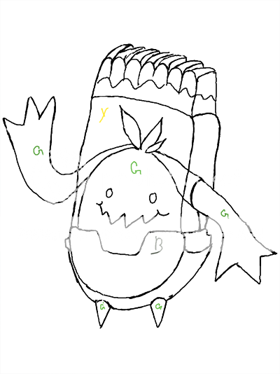
ToastTyrant13 - Sketching pumpkin is fun. I don't understand how the vines connect to it though, so perhaps a back shot would help. You have to remember though that pumpkins are a bit cliche. If you don't think your design stands out enough, I would try to take a different approach. Maybe having pumpkin-like features on a Pokemon isn't a bad idea! Just think about it and see where your imagination takes you.

andalite191 - Carnivorous plants are a great idea, but I would make sure that the design is clearly different than Carnivine. You have a good thing going. For your next step, I would recommend adding more ghostly concepts. I have no idea how you'd want to go about doing this, but I trust your judgment! Clean art and a niche of a concept.

jolah5 - I would make a larger concept design of your Pokemon to more accurately show what your mind is depicting. Also, the blue member might look a bit disturbing if seen in the wrong light.

Gerard - Multiple eyes and a dismembered body are interesting features. I would advise that your design is getting a bit complex, so you might want to cut down on frivolous things like its ear attachment or its craning neck. Its limbs also look a little too elongated for my tastes, but that is my own opinion.


Aaaand that's where I'm stopping for now (sorry paintseagull). I need some sleep! I hope these little tidbits help; I'll continue tomorrow. If you have any questions about my critiques, feel free to send me a PM or VM! Keep at it, CAP =D!
 
A rough sketch of my "Coal, Oil, Brush, Seed, Ghost and a whole lot of other ideas mixed together" CAPmon. Coal = dead plants + history? And yes, the seed stays inside the Jelly-like oil (which provides oil to the brushes, oil painting CAPmon, lol), it's arms are supposed to be capable of extending and those pants are made of coal. The seed itself will look scarier as soon as I learn how to color things, or even draw good lines.

Ghost-0119copy.png
 
Status
Not open for further replies.
Back
Top