
-
Follow our Instagram!
-
The moderators of this forum can be found in the CAP forum staff directory.
-
Welcome to Smogon! Take a moment to read the Introduction to Smogon for a run-down on everything Smogon, and make sure you take some time to read the global rules.
You are using an out of date browser. It may not display this or other websites correctly.
You should upgrade or use an alternative browser.
You should upgrade or use an alternative browser.
CAP 13 CAP 2 - Art Submissions
- Thread starter Wyverii
- Start date
- Status
- Not open for further replies.

Kythro That was one of my main problems I brought up in my first post, but I haven't really recieved many objections to the contrary, and I can just try write it off as a tornado being in contact with the ground anyway I guess, hehe.
Birkalyay I'm on the top of your list Thanks for the support! I agree though that there doesn't seem to be that much critique of the art (well, there seems to be a lot more now). Anyway, so far I've given the eyes more of a ">8" like look to them to make it more like a menacing ghost. I agree with giving it a more distinguishable mouth - I've experimented but so far I can't make one that doesn't look ">87" ish. Or perhaps I should give my guy a 'derpy ghost' look, I dunno.
Collol A cute concept, but I think it'll end up being a cutesy ghost rather than a terrifying ghost. Not that that is a bad thing at all, I think. Despite coal being made from dead plant life, I think the design could use a bit more obvious plants. Maybe the coal underpants could have or be made from decaying plants or something?
Ralts I think it looks a bit too simple main body wise. It seems like there are too many non-matching styles of plant life growing from the body. I noticed the crack in the skull with grass coming out of it, which is pretty cool, but the crack itself and the way the growth sticks out doesn't seem natural. iirc growth like that tends to spread or wrap around the crevice before or at the same time as sticking out. Also, I'm not certain if it is a forced perspective, but it seems like it would end up either too small, or if it is meant to be a large creature, too non-flexible. A good effort though, don't give up!
To both Kythro and Birkal, I'm trying to whip up a second pose completely from scrap, which I hope will help emphasise the ghost nature and ground it more in the field egg group. Keep going, everyone! :D
Birkal
Collol A cute concept, but I think it'll end up being a cutesy ghost rather than a terrifying ghost. Not that that is a bad thing at all, I think. Despite coal being made from dead plant life, I think the design could use a bit more obvious plants. Maybe the coal underpants could have or be made from decaying plants or something?
Ralts I think it looks a bit too simple main body wise. It seems like there are too many non-matching styles of plant life growing from the body. I noticed the crack in the skull with grass coming out of it, which is pretty cool, but the crack itself and the way the growth sticks out doesn't seem natural. iirc growth like that tends to spread or wrap around the crevice before or at the same time as sticking out. Also, I'm not certain if it is a forced perspective, but it seems like it would end up either too small, or if it is meant to be a large creature, too non-flexible. A good effort though, don't give up!
To both Kythro and Birkal, I'm trying to whip up a second pose completely from scrap, which I hope will help emphasise the ghost nature and ground it more in the field egg group. Keep going, everyone! :D


@ Asylum Rhapsody: Before I begin, let me say that this is not the place to argue over your opinions. I'll humor you this time to clarify my stance and hopefully hit a chord with the artists, but an opinion is an opinion and you are not allowed to clutter this thread with a debate on whose opinion is better. If you respond to this post, do not make it a tl;dr where you disagree with X, Y, or Z in my post. Just accept that people can post their opinions on art here and move on.
I don't mind if anyone disagrees with me, as it's anyone's game in art. However, there are a few things you need to recall here, primarily that I'm the TL! If an art concept appears logically to be primarily one gender, I have the capacity to say that it is that one gender only. That's not something that gets voted on or what-have-you. And trust you in me, if we get an art concept that looks like it can pull it off, I'm definitely going to make it mono-gender. I think that we need that in CAP. Furthermore, you express concern that I'm off-kilter when I suggest that this CAP provides a lot of opportunities to make a mono-gender CAP. Many of the ways to see Sketch translated into a Pokemon hint at a very stylized design like those I suggested in my past post, one which can be pushed further in the direction of one gender over both. A good example of this is Doug's weeping willow, which clearly shows what I mean.
I am, however, compelled to respond to one point of yours in detail because your post is very misleading to artists:
CAP art has always and will always be related to the Pokemon and its competitive notions. Artists develop their designs to match the stats that get voted on, they develop their designs to match the abilities that get voted on, and most obviously they develop their designs to match what the CAP is supposed to do. I can provide countless examples of past CAP designs that hinged on the CAP's metagame uses, and I hope that all of them in the future will as well. I'm not saying that it has to be related, but to blatantly design one's art to be completely out of place with the competitive side of the CAP is practically self-destructive if one wants to win the polls.Asylum Rhapsody said:The bold portion captures where our opinions differ. Sketch is going to be fundamental to the way that the Pokemon operates in the metagame, but if Sketch is going to be an egg move, then that's not going to be how the Pokemon operates conceptually otherwise. A CAP's Art is one of the only places that portions of it can be created that need have almost nothing whatsoever to do with the Pokemon's metagame role, so I don't think that it's a good idea to suggest that this Pokemon's artistic design be limited to a metagame concept that, by virtue of being an egg move, must inherently not be central to its concept otherwise.
I will say that I prefer the more creative and original applications of Sketch than just paintbrush's everywhere - which, unfortunately, is always going to seem a little clumsy and forced considering the typing. There are some beautiful designs that focus primarily on typing and sketch, but a lot of others where the typing is justified first and Sketch seems like a logical afterthought. Good examples are Yilx's spirit channeler's 'channeling' of different moves and paintseagull's ghostly crop-circle alien's slow and methodical creation of larger-scale patterns and art.


Favorite ones thusfar are Doug's weeping willow and Sentret's scarecrow. My only criticism about the scarecrow is that the legs look very strange and immobile. Perhaps you should give him some joints to clarify that he can move more adeptly than a peg-legged pirate. You could also try redesigning the lower body with slighty more mass to make them look less like toothpicks.
Yilx brings it hard too, something I've come to expect from him. I would say focus more on Concept 2, since it is cool, elegant, and 'distinctly female', which is apparently popular now.
WPS's design is nice, especially like the spell tags attached to her locks, but it looks too much like Meloetta.
@ Asylum_Rhapsody: Your design is starting to come to life. Just work on the details a bit and improve his pose. Maybe give him a spectral aura of some sort to make him look a little more enticing.

Asylum_Rhapsody
Guest
Forgive me, this was actually a misunderstanding on my part. I interpreted what you said as suggesting that this concept uniquely provided a lot of opportunities to make a mono-gendered CAP, when what you actually said was that this concept presents a lot of unique opportunities for a mono-gendered CAP, a sentiment that I find much easier to understand.Furthermore, you express concern that I'm off-kilter when I suggest that this CAP provides a lot of opportunities to make a mono-gender CAP.
Having gotten that particular misunderstanding out of the way, I have no intention of starting any argument over whose opinion is better here, and I do want to publicly apologize if that's the way that my post came across, because I did not intend for it to. I still disagree with some of what you say, and so I have some other questions for you, but I see now that this thread is not the place for them, so I've sent you a private message that I do hope you will reply to.
Now, @SoIHerdYouLikeSentret, I would like to say that looking back at your other design, it does have some aspects that I had overlooked before that I think could warrant some development. If you don't think that it will spread you too thin, so to speak, I might be curious myself to see the concept elaborated upon, playing up both sides of the typing a bit more and not relying quite so much on the color scheme to get the typing across.


Not very physical perhaps, but I wanted to do this nature spirit concept (with sketch brush) anyway:

Yes, that mist is part of the pokémon, it always has some arround it, but since even than it probably still counts as not being on a completely white background, here is the version without it:
http://img843.imageshack.us/img843/2013/sketchmonia2.jpg
P.S. While we are allowed to post all sorts of background stories I'm refraining from that on purpose, at least untill I had some feedback on it, as I feel like that would be dictating too much about the pokémon, which can only work as a community project.
And to contribute to the refinement and selection process, my own favorites so far (in the order I found them, no ranking implied):
The Ticketmeister (ghostlike, but also kind of a friendly teddybear, it's interesting)
Yilx flytrap lady design (very pokémon, for some reason)
Aragornbird (hoogabooga!)
Paintseagull (it looks like a giant ground sloth, but those are awesome, so that could work)
Puking rainbows panda (aahhhhh, it's cute!)
LouisCyphre (The creepy tree is a good basic frame for this one, in my humble opinion, but it still needs way more refining, just keep on heading where you were going)
TeraVolt (an emo flower? Well, it looks good.)
MLaRF (but it needs some more plant)


Just a quick concept I thought of while taking a shower.

Basically the story behind it is this Pokémon is the spirit of a tree that possessed a tube of paint that a traveling artist accidentally left behind. The tree merely wants to return the lost item, but over the course of several years has given up and instead enjoying "life" as a new species of Pokémon.
...least that's just what I got. Feel free to lynch me.
All I can say is, despite the amount of amazing designs is (and many of them are):
Yilx: HELL YES SHRINE MAIDEN. I may be predisposed to such characters (inb4 Reimu Hakurei) but she just seems to work so well. The devilish appearance highlights her ghostliness, and those arms...the fingers and shaoe are basically paintbrushes that avoid being explicitly implied artistic tools. The whole thing, including the spirit channeler idea to her amazing aesthetics just clicks perfectly for me~
I have to say I like this design the best, though people like paintseagull, DougJustDoug and many more easily get huge props from me for the hugely amazing designs.
I won't embarass myself by submitting some crap, though~
Yilx, your Flytrap Miko caught 100% of my attention the moment I regain Internet access. The design has a flavor of elegant, beauty, and originality that's simply to die for. Your way of justifying it's ghost secondary typing via Shrine Maiden/Channelling was very creative there. Now if it start using leaves as ofuda tailsmans then you have me more sold on the design than ever before.
DougJustDoug's submission is another one I can support as it's based around weeping willows and I f**king love weeping willows (minus their use as make-shift switches). The faded actress as a foundation for the design is an interesting twist on things though.
DougJustDoug's submission is another one I can support as it's based around weeping willows and I f**king love weeping willows (minus their use as make-shift switches). The faded actress as a foundation for the design is an interesting twist on things though.

Looking really nice so far, everyone! I'll try to give comments on as many as possible later :)

This is my WIP. As many other's it's a flytrap pokémon, except it sort of... Got possessed by the fly it ate. I'm gonna change the colours a bit to make the plant more zombie-like, but the idea is that the ghost of a tiny fly haunts and possesses the plant. The tiny ghost can change forms, representing it's sketch move. This is it's bug-form so it could have sketched signal beam or quiver dance, but it could be a tiny flame and use overheat, or anything.
DougJustDoug: every new CAP I like your designs better. This one is really cool, capturing both types ghastly well. I don't have a lot of comments, but I wonder how it'd look like if the cape was less... cape and instead moreso leaves growing out of her?
Katakiri; I really like the carving - sketch idea. Not too sure about the design overall, but I thought that was pretty neat. Try a different body... And something to carve with.
Rittercat; D'awwwww...
Teravolt; I really like this one, but I'm not so sure about it fitting an extremely good PS stat spread. Has the prevo-feel a little too much, I guess. Regardless this is one of my favourite designs... If only it weren't for those darndest stats!
LouisCyphre; Creepy! I'd love to see this one in full-colour. A praying mantis and a tree? I dig it.
Straw Hat; Maybe a little too Smeargle with the sketch implication? Not sure. It's fun if it'd use the plant part as one of those jumping sacks.
Calad; Really go for the second. Detachable head = win. Let it use it's head as a flail! Do it!
puking rainbows; Really, really fun designs. Got that lovely cartoonish feeling to them. The first seems a nice more bit unique, but while the second is a bit bland it does fit everything perfectly. Especially fojnd of the paint marks.
CactuarJoe; The only thing Magcargo is useful for anyway is the hatching process ;) I really like your idea, though. Shapeshifting slimes are fun.
Yilx; I'd go for the spirit medium/fly trap. It's much more your style.
T3hB33; Much as the MLP fad makes me want to murder people in cold blood... I really like your turnip idea. It's positively creepy.
mayatraese; D'awwww, a dead flower. I really like this one. Capture the typings and sketch really well. Wish PS wasn't such a big deal for this mon...
AlfaTyrogue; Lovely. The scarecrow hat/mouth really makes this mon. Would love to see it coloured.
The Ticketmeister; I want this, as a plushy. I love it with the pinecone and trunk feet. Fits the implied bulkiness and sweepiness nicely too. As long as Deck Knight's 112 spe spread doesn't win, that is ;)

Another CAP, another slew of amazing designs to face off against! :) And here are my 'two cents':
Nº 1
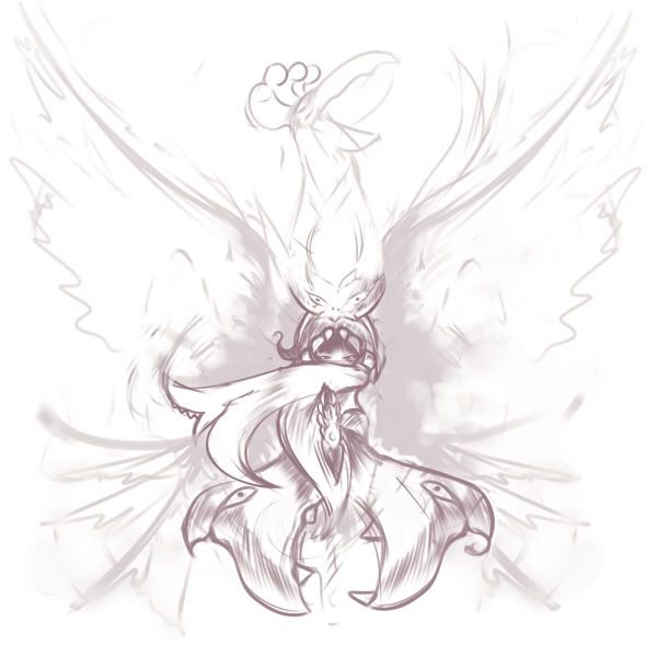
Looking for ghost-related plants and unusual ways to use Sketch, I came up with this ghost chili pokémon. Spicy chemicals give these pokémon a nasty flavor, but nonetheless some predators, in particular Dark-type pokémon such as Murkrow, still find them delicious. Thus, as a second line of defense, they create a more menacing shape for themselves by manipulating a cloud of smoke that they produce by combining the different spices inside their bodies. They can draw anything they want using this thick smoke, with the default and most common pattern being a personal variation on the ghostly figure seen above. Their gaseous creations can also be animated, being even able to execute some attacks; many of these feats are accomplished using thin tendrils that are usually hidden by the dark gas.
Nº 2

Here I tried a personal take on the old haunted tree concept, or in this case, an undead tree. I've nicknamed this design Frankenstump's Monster or 'the Monster Mash Tree', being based on the popular horror character with elements of a skeleton and a zombie. The 'ribs' are bracket fungi feeding off the dead wood. This pokémon seems to produce a large shadow despite not having any foliage (the 'hair' is moss), but that shadow is in fact a layer of thick, rotten sap that it leaks through the tips of its roots and its fingers. This sap is extremely sticky, and the pokémon uses it to catch unwary prey while disguising itself as a normal tree to reduce suspicions. The sap can be reabsorbed by the pokémon, and some artistically inclined individuals actually use it as paint.
One of these two will be my final submission but I'm not sure which one should I choose, so suggestions, comments and critiques are welcome.
Nº 1
Looking for ghost-related plants and unusual ways to use Sketch, I came up with this ghost chili pokémon. Spicy chemicals give these pokémon a nasty flavor, but nonetheless some predators, in particular Dark-type pokémon such as Murkrow, still find them delicious. Thus, as a second line of defense, they create a more menacing shape for themselves by manipulating a cloud of smoke that they produce by combining the different spices inside their bodies. They can draw anything they want using this thick smoke, with the default and most common pattern being a personal variation on the ghostly figure seen above. Their gaseous creations can also be animated, being even able to execute some attacks; many of these feats are accomplished using thin tendrils that are usually hidden by the dark gas.
Nº 2
Here I tried a personal take on the old haunted tree concept, or in this case, an undead tree. I've nicknamed this design Frankenstump's Monster or 'the Monster Mash Tree', being based on the popular horror character with elements of a skeleton and a zombie. The 'ribs' are bracket fungi feeding off the dead wood. This pokémon seems to produce a large shadow despite not having any foliage (the 'hair' is moss), but that shadow is in fact a layer of thick, rotten sap that it leaks through the tips of its roots and its fingers. This sap is extremely sticky, and the pokémon uses it to catch unwary prey while disguising itself as a normal tree to reduce suspicions. The sap can be reabsorbed by the pokémon, and some artistically inclined individuals actually use it as paint.
One of these two will be my final submission but I'm not sure which one should I choose, so suggestions, comments and critiques are welcome.

Really liking T3hB33's GhostPony design actually, as well as Yilx's Shrine Maiden and DougJustDoug's Actress as well. For different reasons, mind.
I love Yilx and T3hB33's designs more on an asthetics level alone (More T3hB33's, 'cause the pony is downright adorable), but DJD's intruiges me, due to how I imagine the thing pulling out different moves with the masks themselves, which is pretty cool.
I love Yilx and T3hB33's designs more on an asthetics level alone (More T3hB33's, 'cause the pony is downright adorable), but DJD's intruiges me, due to how I imagine the thing pulling out different moves with the masks themselves, which is pretty cool.

Birkal said:MLaRF - Cool design! I would stray away from gradients for a final submission. The face is very distinct and the fruit stem on the top. I would now focus on making the body that solid. It looks a bit lumpy and confusing (is that a cape?), so I'd focus on that for now. Keep working at it!
Monstermongler said:MLaRF (but it needs some more plant)
Thakns for the suggestions! I really appreciate them, because now I made my design even better! I hope this can satisfy you!

Enjoy!
I agree we should take a step back from the "pumpkin" theme going on with alot of CAPs. It just seems so.. uncreative and unoriginal. That being said, Yilx, Wyverii, paintseagull, and Sentret's ponytail gal are my favorites.
Wyverii's little hatmon reflects the typing very well. I like its little hat, kind of like an artist's beret.
Wyverii's little hatmon reflects the typing very well. I like its little hat, kind of like an artist's beret.
Hi all! I wanted to pop my head in and say that so far, the art for CAP2 looks outstanding. I'm very pleased that we've had such a turnout in just a manner of days, and am looking forward to seeing even more revisions and art from our users! I'm just going to say a few words about some designs that I like and would like to give some suggestions to
DougJustDoug: I like the Weeping Willow idea for a Pokemon. It fits very well for Grass / Ghost, and the overall design idea is very nice. I do, however, think that the masks either need a different color or a different design. Right now, the gold and the white lines in the middle seem too bright for the Pokemon, and don't really match well with the Pokemon's body. Also, the head seems a bit too simple and plain. I personally think a bit of detail in the dark region of the head might give it some more personality (it doesn't even need a mouth).
Nastyjungle: Very solid design. I do think that it's missing that "Ghost" type quality to it, though. Instead of adding some wisps around the neck and hands like in your supporting art, it might be a better idea to take advantage of the holes in the body, and perhaps allow that gassy ethereal substance to flow out of the holes. I would think it would give off the vibe of a "hollow cactus" that's filled with a Ghost's spirit. Just a suggestion!
Calad: The Pumpkin and Onion design is excellent, and really corresponds well with traditional Pokemon designs. I think you should work on that design instead of the forest elf, most definitely. Good work!
CactuarJoe: I like this design a lot. I think this could use some supporting art to show how it uses Sketch (just for imagination purposes), but the design itself is very strong. Not much to add otherwise. Good job!
aragornbird: Good design. I think the Ghost portion of the design is underrepresented, however, as to me this seems like a Dark / Grass or a Fire / Grass type. I think perhaps a change in color of the mask a certain older texture of the wood may give you a design that doesn't rely on smoke and auras but still looks like a Ghost type.
Yilx: The bleeding heart mirror is a strong design, and there's not much that needs adding to the design. The flytrap lady probably fits the "feminine" direction more, but I think that it's lacking the "Grass look" for the Grass / Ghost typing, outside of the hair and stem. I think there's a bit too much red in the design, and it really overpowers the perception of what the Pokemon is. I think the addition of gold (many fly traps have frames of gold around the "lips") might make the deign flow better as an overall Grass / Ghost type.
This is all that caught my eye so far. Keep up the good work, everyone!

I can't be the only one who thought this for grass/ghost:

Sacred Fire? bitch please
EDIT:
Aragornbird's design is just great. However, I agree with Darkslay that it could get a more ghostly look. Other than that, it blends the concept and stats very well.
Calad has my vote for now. The idea is excellent and original, and the art itself is very good. I really like it.
soiheardyoulikeSENTRET, I actually liked your first draft better than the one with legs. But that's just my opinion.
andalite191 has a solid design but I can't see the ghost part of it. It looks more like a grass/poison-type. Still very good.

Feedback time! I'll be posting an update to my design trying to incorporate the PS aspect more.
SoIheardyoulikeSENTRET - I like the pumpkin mucho. In defense of it I feel as though it isn't jack skellingtonian at all, simply based off of the same thing. As far as improvements, I think the color scheme needs some work. Maybe a more drab or 'ghostly' pallete would work better, to convey the age of the scarecrow, perhaps?
The Ticketmeister - I gotta say I love this thing. As others have said, it needs to look like it could move, but the leafy teddy bear painter wood spirit THING is a great idea. Maybe incorporate the paintbrush more into his design?
Yilx - I personally find the mirror to have very little personality compared to your flytrap lady. Though a possessed mirror is an awesome idea, I think that it is not a very engaging design and the amount of personality conveyable through that design is limited (I'm looking at you bronzong). The flytrap is also several times the creep factor of the average mon, something any ghost CAP should be proud of.
T3hB33 - Is this truly your final design, if it is I think it is one of the most ludicrous things on here and one of my favorites. I would like to see the sketch design incorporated a little more, maybe into the thorny vines?
I'm not new here, though I've only made an account recently... Anyway, I wanna know if this is decent or if it's too cute... I have a tendency to draw stuff like that... I wanna know before I color it and all...
IMAGE REDACTED
The scythe on it's tail is rotatable. Not based on anything in particular. It was originally had crosses signifying tombstones instead of scythes, but I've since decided this looks better.
Did we ever get this one in colour? I thought it had quite a novel theme going on with the cutest little Grim Reaper thing.


Wow, so many cool designs. I especially like the ones by Yilx. Personally I prefer the bleeding heart mirror, but I think both are awesome. My main concern with the flytrap shrine maiden is that I have a hard time seeing it as a ghost. I mean, I can sort of picture it, but in its current design it just screams Dark type. I think this could be fixed by changing up the colors a bit, especially the black. Otherwise though, I think both designs are fantastic.
- Status
- Not open for further replies.