
-
Follow our Instagram!
-
The moderators of this forum can be found in the CAP forum staff directory.
-
Welcome to Smogon! Take a moment to read the Introduction to Smogon for a run-down on everything Smogon, and make sure you take some time to read the global rules.
You are using an out of date browser. It may not display this or other websites correctly.
You should upgrade or use an alternative browser.
You should upgrade or use an alternative browser.
CAP 14 CAP 3 - Art Submissions
- Thread starter Wyverii
- Start date
- Status
- Not open for further replies.

Doug, your design is incredible precisely cause it's so simple. Love it to death. The resemblance to Reuinclus' line is a bit too much for me to overlook, though, but I guess there's no way to remedy that without losing the design's brilliance.
What about giving it a corona of radioactive "glow?" or even have it bathed in small green flames?
Alternatively, a radioactive orange coloration makes him seem more fire-like and sets him further from Reuniclus design-wise (though green still makes a wonderful shiny colour)


http://img801.imageshack.us/img801/7441/moccasingesupplementary.png
Quantities. O_o
Anywhoo, more supplementary sketches, of a two-piece set of a coiled oil snake springing up and down for an Earthquake or something, a Sludge Wave (pokemon logic with that amount of gunk), Overheat (or Outrage, if you'd like to give it that), an affirmation of Dry Skin, preparing a Gunk Shot, Shed Skin as a flavor ability (useless), and a tail-oil-boosted Quick Attack.
Art style, stop changing on me. :|
Comments:
- Doran Dragon: Then the other way around? Though your current picture does have the two purples look just about identical.
- SoIheardyoulikeSENTRET: Y'know, I can't shake the Pyro from TF2 from that image. The further use of flames on the back and hands does strengthen the design. I wonder what the design would look like if it was more gas-bubble-like for the body or less so. The small head and slim arms do have significant contrast with the large body.
- chuckeroo777: Again, I think you'll have to take a look at the aspects of art--especially shape, as the design is still quite a bit of a mutated potato to me.
- bluemon: All right, well, if you're staying with that design, I think a few more patterns on it should make it more stylized. Dots, stripes, pointed palettes... It's a bit boring currently.
- Solstice: Decent design. maybe a slightly less fluorescent green for eyes' sake. Overall, adequate.
- paintseagull: I did like those blisters on its back, but darn it if I don't like the design. I think the odd eyes are what draw it in for me, or maybe it's how well the entire creature works.
- Tin: I've thought of Godzilla as a concept earlier, so you could take that route for the design if it looks too metallic.
- BlueConcept: I do like this better than Mos's lava lamp creature, admittedly, as the lamp itself and the ink fit with fire and poison better. However, is there any way you could make it look less aquatic? Arghonaut exists as our cephalopod.
- nov: Your new design is quite complex, disjointed, and alien. I do like the flamethrower-tail (ahem), but the liquid stomach and vent at the top of the head feel too contrived for me. Simplify, naturalize--well, do whatever you can to make it more co
- Leethoof: If you could make it look less like a Steel-type, I'd be more approving. :/
- Mos-Quitoxe: Those glowy bubbles. O_o Cool. But wow, that must be some acid to dissolve those pokemon like so.
- tea_and_blues: I fear your design looks too eldritch to gather others' approval. Your art itself is good (you draw that with a MOUSE?!), but the actual concept's a bit... eh-worthy. As for my own design, I think a Mayincatec Ouroboros Gasoline Tire Serpent is a bit too much. Tomohawk's already done that sort of thing.
- marc6kteam: So Charizard and Hydreigon were one pokemon before? Well, divergent evolution sure favored one of them! But, ah--without knowing that backstory--and people will ignore it when it comes to voting, the initial Charizard-like design will detract from it being uniquely creative. Perhaps just create a new, extinct pokemon as the hide of this snake.
- thornchild: Yes, you've cylinder-ized it. :D But now it's a bit too fiery. D: The exposed flame on top, even if it takes away from the inherent water typing of a jellyfish, detracts from the poison typing. What about replacing that fire with smoke and seeing how that works out?
- Yilx: Hmm, I'm not sure how much I like it. The radiant-ness, even if despicable, of that sun god does not merge well with the brutishness of that golem. Maybe it's that the head is quite geometric compared to the looseness of the body and arms. Mechanical versus natural or something.
- DougJustDoug: I did fear it might look like a ghost-type, even with that intention of Fire/Poison. I'll have to bring up the Reuniclus card currently; a change of color or slight modification in design will definitely improve my thoughts on it. But I do love what you've done with those cartoonish bones. :)
- Steampowered: The Vs still don't work, and the exposed flames just look 'there'. Something more subtle, I think, would work rather than having a Salamence with Tyranitar holes with add-ons.
- bugmaniacbob: Bah, you think yours is boring? I've got a fire lizard as well. XD Could you take away the Quilava similarity, as mentioned before? Even if it's just with a slight redesign or recolor?
- MLaRF: I like it. Certainly hits all of the points of this CAP so far. :)


been working on the anemone


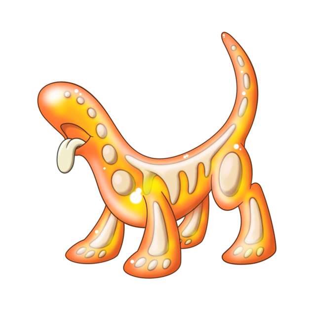
This is my entry, a poisonous stegosaurus. It lives near volcanoes and bathes in lava, hence the chosen ability "Dry Skin" works. It gains its poison through the poisonous mushrooms (e.g. Amoongus) that grow on its back. The spikes on its tail are highly poisonous, and the poisonous smog coming out of its mouth is ignitable. I realize the green plants growing on its back might make it seem more like a grass type, but I imagined it as mold and fungus living symbiotically on the stegosaurus. The plants get water from it in the harsh volcano climate, while it gets poison.
Criticism and comments are welcome!
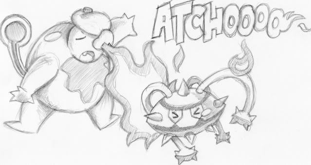
Concept art: I think explosion would be a cool move for a fire poison type. It seems so appropriate, especially when a cute little shrew is doing it :D .
Also Fatecrashers: I absolutely love the anemone. I don't think it got the attention it deserved the last time you posted it. Its really cool and the way you drew out its design is incredibly unique. Maybe some concept art with it using some fire type attacks would help it out though.


I was originally going to avoid posting here to avoid potentially offending any artists, but I think a lot of artists are doing the PokeConcept equivalent of shooting themselves in the foot.
There are many things about the way Pokemon designs are that can be objectively identified, among those are typing cues. A typing cue is something that hints at a certain typing, which helps people looking at your art identify a Pokemon's typing without being told what the typing is supposed to be. That last part is italicized because it's important. We're all suffering from a highly biased perspective when we participate in CAP because typing comes first and then we develop art. Had things been the other way around, you'd see a lot more of what I'm talking about.
Consider, for instance, that every single Fire-type Pokemon in the game has one of the three following qualities, if not more than one of them used in unison:
What you should take away from this, then, is that to convey "Fire-type" to viewers without telling them that the Pokemon is Fire-type, you should employ at least one of these three qualities in your own Pokemon designs. This is why designs like bugmaniacbob's or Yilx's clearly invoke the feeling of a Fire-type Pokemon. However, some designs like Doug's or Mos's strive too hard to push the boundaries of a Fire-type Pokemon, and I think this is a major detriment to their concepts as they do not adequately indicate the typing insofar as Pokemon are concerned. As far as raw concepts go, I love them dearly for their innovation, but as Pokemon concepts trying to communicate Fire typing, I find them lacking.
The Poison-type is a lot more flexible than the Fire-type is, which a lot of concepts thus far take advantage of, either intentionally or unintentionally. Either way, I think that there are many concepts that do not look the typing, and hopefully my posting this will help guide those artists to improve their work.
There are many things about the way Pokemon designs are that can be objectively identified, among those are typing cues. A typing cue is something that hints at a certain typing, which helps people looking at your art identify a Pokemon's typing without being told what the typing is supposed to be. That last part is italicized because it's important. We're all suffering from a highly biased perspective when we participate in CAP because typing comes first and then we develop art. Had things been the other way around, you'd see a lot more of what I'm talking about.
Consider, for instance, that every single Fire-type Pokemon in the game has one of the three following qualities, if not more than one of them used in unison:
- Is on fire.
- Is vividly red or orange.
- Has flame- or sun-shaped imagery.
What you should take away from this, then, is that to convey "Fire-type" to viewers without telling them that the Pokemon is Fire-type, you should employ at least one of these three qualities in your own Pokemon designs. This is why designs like bugmaniacbob's or Yilx's clearly invoke the feeling of a Fire-type Pokemon. However, some designs like Doug's or Mos's strive too hard to push the boundaries of a Fire-type Pokemon, and I think this is a major detriment to their concepts as they do not adequately indicate the typing insofar as Pokemon are concerned. As far as raw concepts go, I love them dearly for their innovation, but as Pokemon concepts trying to communicate Fire typing, I find them lacking.
The Poison-type is a lot more flexible than the Fire-type is, which a lot of concepts thus far take advantage of, either intentionally or unintentionally. Either way, I think that there are many concepts that do not look the typing, and hopefully my posting this will help guide those artists to improve their work.

i think quanyalis's design is excellent -- it's sleek, it looks like it belongs in a pokemon game, it's versatile, its typing is clearly communicated, and it looks like it has the ability dry skin. in regards to the "obvious communication" of type, i like the hose-tail a poison-element -- someone suggested a fiery mane? might make it look more 'fire-type'. anyway, props!

I would agree with you on a general level Dusk on fire-typing cues, but one of your outliers, houndoom doesn't fit your three criteria. It uses hellish fire imagary instead, akin to cerebus. On that note I'd also challenge the idea that Mos's cone snail isn't showing the typing since it has the very elegant solution of a lava lamp which is within the Houndoom type limits of using an idea to show a fire typing.
As for the thread in general. Tea and Blues submission was quite dramatically improved after he simplified it for spriting. I would really like to see more people take into account that these designs will be sprited, and as such small details and complex shading might not translate well to the final product.
As for the thread in general. Tea and Blues submission was quite dramatically improved after he simplified it for spriting. I would really like to see more people take into account that these designs will be sprited, and as such small details and complex shading might not translate well to the final product.

Darmanitan-Zen Mode laughs at your qualifications! Although i would also argue Numel is very yellow and shows (in my opinion) absolutely no indicators of being a Fire type.
I think that the chosen combination types for Fire are misleading though. Looking at the type combinations, we don't see many vivid colored types, such as Grass, Water, Ice, Poison or Electric (outside of Rotom which i discount because applicance Pokemon are a gimmick that has been completely used out). Bug and Dragon are the two closest such types, and looking at them, Reshiram breaks a lot of ground and Larvesta has only a few tints of red while Volcorona is truly a very good combination of type indicators. Victini is also much brighter than most fire types as well, for what tis worth.
My main point being, that while the basis for most fire types being upheld is in no way a negative, i dont think it's completely out of the question for something like Doug's Dog or the LavaSnail to be considered.


In regards to DogJustDog, I'd perhaps reduce the number of bones present for spriting purposes.
I'd also consider either having the tongue fade into the gel substance visibly, or simply making it out of the gel itself. As it is right now it cuts off very abruptly with nothing opaque to hide behind.
I'd also consider either having the tongue fade into the gel substance visibly, or simply making it out of the gel itself. As it is right now it cuts off very abruptly with nothing opaque to hide behind.


all the designs are SO FUCKING AWESOME ! my favorites so fa are DougJustDoug's, Tea and Blues's, and Mos Quixote's. good luck to all artists
EDIT: oh forgot Calad and Fatecrasher and Quanyails and soiheardyoulikesentret and many others. god im not looking forward to the spriting poll...
EDIT: oh forgot Calad and Fatecrasher and Quanyails and soiheardyoulikesentret and many others. god im not looking forward to the spriting poll...
Man, I'm loving these concepts!
So far, I'd have to say my favorites are KoA's slugfrog and Yilx's sun golem, but come voting time, I'll have a hard time deciding.
All these are so awesome, though...great work everyone!
So far, I'd have to say my favorites are KoA's slugfrog and Yilx's sun golem, but come voting time, I'll have a hard time deciding.
All these are so awesome, though...great work everyone!


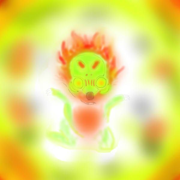
Thanks to everyone for their comments about my radioactive canine. (BTW, the name "Hazmutt" is a fave of mine from IRC convos, but I chuckled hard at LouisCyphre's comment about "DogJustDog"!).
I am still working to improve the design, and foremost of my concerns is the "it doesn't look like a fire type" issue. I don't necessarily agree with Rising Dusk that we need to be rigid about using existing ingame typing cues. Pokemon is notoriously inconsistent about visually showing typing, and when it comes to viewer opinions as to what "looks like <whatever> type", there is even more inconsistency. But I cannot dispute that Fire typing is FAR more conformant than probably any other type, and there are very few cases of fire types that do not exhibit the visual cues RD mentions. So yeah, I cannot deny that my design is bucking a clear ingame trend.
What does that mean for my design? Well, it comes down to two questions:
1) Whether I think making my design "look more like a traditional Fire type" will make the design materially "better".
2) Whether I think making my design "look more like a traditional Fire type" will get me more votes.
As to the first question, I haven't come up with anything yet that makes it more like a classic fire type that "improves" the design. But I'm still working on it, and I have a few things left to try.
As to the second question, I'm not overly concerned about the polls these days. It's a fine line to walk when playing for votes. I have no issues with tweaking a design to satisfy more people, particularly if I think my design has a real shot at winning. Not really because I want the win, but more because the winning design becomes the property of the entire community. So when I'm working on a design that I think has a real shot at coming out on top, I feel a certain obligation to bend to community opinion. When working on a more quirky design, I tend to ignore community opinion more often, because I know I'm not a real contender for the win.
It's a gray area for me. At this point, I'm keenly interested in feedback and several people have made some good suggestions. The compliments are greatly appreciated, and most of the criticisms are spot on. Making a good CAP design is a tough balancing act, as I'm sure all the artists in this thread can attest. We're all trying to make ourselves happy and everyone else happy at the same time. It's not easy. But I love the challenge!
In the case of my current design, I am trying to incorporate the fire type by visually showing "radiation". If you look up "radioactive" in Google Images, you will see a HUGE coloring trend in the results you get back (outside of the yellow-and-black triangular radiation symbols) -- "bright glowing lime green = radiation". That's why I made my design glowing lime green. Well, I made it "glowing" as much as I can within the rules of CAP design. For those of you suggesting I add an exterior glow effect to my design, you need to check the CAP rules -- external glowing effects are illegal. So for this design, while I agree that a glowing gradient effect would really hammer home the "this thing is radioactive" theme -- it would get my design disqualified. And I have no interest in trying to get around the rules in any way, because I consider that tantamount to cheating. So, an external glow effect ain't gonna happen. I've added as much internal "glow" as I think I can while remaining faithful to the general complexity of what I think can be sprited.
I was hoping people would easily connect the coloring to the concept of radiation. If the viewer makes the connection to radiation, then I feel fine about adhering to "game precedent", because I think radiation is a great "fiery concept", regardless of coloration. If people don't make the connection with radiation, then yeah, I guess that's a problem. I don't have an issue if people need it explained to them that this design is radioactive. There are many pokemon designs that needed to be explained to me before I understood them. I'm most curious if people can't see radioactivity AFTER it has been explained to them. I think the current design satisfies that basic requirement, and it just needs some tweaks to be improved.
I'm fully aware that voting polls do not have benefit of an explanation. Few voters bother to look at the full submission post. They look at the pictures and vote based on what they see in it. I am fully aware that some people will see the green and think "Grass". I'm also aware that a green pokemon with internal floating parts will invoke comparisons to Reuniclus. I've tried to get away from that by changing the coloring, but the results were not too good. Here's two alternate colorings (but I tried many, many more than just these).


One of those looks more like fire, I guess. The other looks more like poision. Neither of those looks like radiation to me. I'll fully admit that I've gotten accustomed to the glowing green, so if you think either of the above colorings looks better than the green, I'm open to hear it. I'll post more work-in-progress stuff as it develops.
What does that mean for my design? Well, it comes down to two questions:
1) Whether I think making my design "look more like a traditional Fire type" will make the design materially "better".
2) Whether I think making my design "look more like a traditional Fire type" will get me more votes.
As to the first question, I haven't come up with anything yet that makes it more like a classic fire type that "improves" the design. But I'm still working on it, and I have a few things left to try.
As to the second question, I'm not overly concerned about the polls these days. It's a fine line to walk when playing for votes. I have no issues with tweaking a design to satisfy more people, particularly if I think my design has a real shot at winning. Not really because I want the win, but more because the winning design becomes the property of the entire community. So when I'm working on a design that I think has a real shot at coming out on top, I feel a certain obligation to bend to community opinion. When working on a more quirky design, I tend to ignore community opinion more often, because I know I'm not a real contender for the win.
It's a gray area for me. At this point, I'm keenly interested in feedback and several people have made some good suggestions. The compliments are greatly appreciated, and most of the criticisms are spot on. Making a good CAP design is a tough balancing act, as I'm sure all the artists in this thread can attest. We're all trying to make ourselves happy and everyone else happy at the same time. It's not easy. But I love the challenge!
In the case of my current design, I am trying to incorporate the fire type by visually showing "radiation". If you look up "radioactive" in Google Images, you will see a HUGE coloring trend in the results you get back (outside of the yellow-and-black triangular radiation symbols) -- "bright glowing lime green = radiation". That's why I made my design glowing lime green. Well, I made it "glowing" as much as I can within the rules of CAP design. For those of you suggesting I add an exterior glow effect to my design, you need to check the CAP rules -- external glowing effects are illegal. So for this design, while I agree that a glowing gradient effect would really hammer home the "this thing is radioactive" theme -- it would get my design disqualified. And I have no interest in trying to get around the rules in any way, because I consider that tantamount to cheating. So, an external glow effect ain't gonna happen. I've added as much internal "glow" as I think I can while remaining faithful to the general complexity of what I think can be sprited.
I was hoping people would easily connect the coloring to the concept of radiation. If the viewer makes the connection to radiation, then I feel fine about adhering to "game precedent", because I think radiation is a great "fiery concept", regardless of coloration. If people don't make the connection with radiation, then yeah, I guess that's a problem. I don't have an issue if people need it explained to them that this design is radioactive. There are many pokemon designs that needed to be explained to me before I understood them. I'm most curious if people can't see radioactivity AFTER it has been explained to them. I think the current design satisfies that basic requirement, and it just needs some tweaks to be improved.
I'm fully aware that voting polls do not have benefit of an explanation. Few voters bother to look at the full submission post. They look at the pictures and vote based on what they see in it. I am fully aware that some people will see the green and think "Grass". I'm also aware that a green pokemon with internal floating parts will invoke comparisons to Reuniclus. I've tried to get away from that by changing the coloring, but the results were not too good. Here's two alternate colorings (but I tried many, many more than just these).

One of those looks more like fire, I guess. The other looks more like poision. Neither of those looks like radiation to me. I'll fully admit that I've gotten accustomed to the glowing green, so if you think either of the above colorings looks better than the green, I'm open to hear it. I'll post more work-in-progress stuff as it develops.
A few of my current faves in this thread:
Mos-Quitoxe - The lava lamp cone snail is brilliant. Don't change a thing.
Yilx -- Your art is breathtaking and I love the way you have developed the golem design. The latest version looks like a winner.
KOA -- Of the reptilian designs, yours is my favorite. One of your best CAP designs in a while, and I've liked all your stuff!
Tea and Blues -- The latest simplification of your fire coral design vaulted it to among the top designs, IMO. And that concept painting you did is the best single peice of art posted in the thread to date. Really great stuff.
Quanyails -- Hose snake hits all the marks for me. I love the design, the execution, and the supporting work.
For those of you that don't get on #cap on IRC, many of the CAP artists and CAP art aficionados tend to hang out there and we chat about CAP art often. For any of you that want to get more CAP art discussion than what's here in this thread, jump on IRC and join the #cap channel!
So after going on SynIRC #smeargle and getting some feedback, i noticed some blatant flaws in my drawing. So I fixed the problem of the snake coming out at an odd angle and I messed with colors. My CaP design is much more about >implying rather than showing, though i feel i've kinda balanced that out a bit better. thanks paintseagull, and the others who helped :)

I got rid of the purple mane, and replaces it with a reddish-brown color to look a bit more natural and fiery, I added some ears cause it really needed them. I colored the snake the same black red and yellow throughout to imply that its a coral snake, a species of snake that is highly poisonous. And purple spikes for more poison emphasis.
Now, i was pressed to figure out how to incorporate dry skin. I couldnt figure out a way by showing it, so i figured i could go with my >implyingMon farther. Since >implyingMon is a genetic creation much the same way mewtwo is, his molecular structure is slightly unstable. So, with more heat that is pressured onto it, the more unstable it becomes. With water, it reduces temperatures on and within it's body, causing it's molecular structure to become more solid.
tl;dr Dry Skin=Thermal Expansion


DJD, as a suggestion, what if you made the bones on the inside appear to "smolder"? That is, give them a fiery appearance. I think the neon green of the outside combined with a dark red / orange color scheme on the inside would very clearly convey "Fire/Poison" while also being reminiscent of radioactivity, while barely changing the design.
New chimera
I love that you've picked a color scheme that is far less flamboyant. The bright purple mane was very off-putting, so the new faded-red one is a huge improvement, in my opinion.
One issue though, is I feel you're design is a little... chaotic? There's a lot going on in it but, since that is the point of a chimera, I don't know if you could really remedy that exactly.
Well, seeing as my purely awesome coralmon did not get a huge response, what do you guys think of this?

This one needs some explaining. the orbs on the stalk and tail are filled with flame, and the spots down the back glow purple. Not sure the rest of the colors yet.
Basically, it lives deep in the ocean. Its flame orbs lure water type fish in the low light conditions. The water type fish thinks easy food sense its a fire type, but boy are they in for a surprise. Its immune to water (obviously) and if the prey is too big to swallow whole, it injects poison from its fangs.
Its inspired by the angler fish, as well as the gulper eel.
I think another issue with DJD's design is that not only it has a translucent body like Reuniclus, but it's also green. That invokes too much Reuniclus for some people (myself included, even though I can see its radioactivity). Changing its color scheme to orange would invoke more its Fire typing, but the radioactivity (and thus the Poison type) would need to be explained because it's even less obvious in that scenario. FlareBlitz's idea, however, might help the design without needing to explain much or changing its vivid green color.


@Doran Dragon: DD, I would suggest changing the lion part's skin. Make it scaly perhaps? That would easily give it the dried up look, and if you changed the colour scheme of the snake to maybe two colours, it wouldn't look as cluttered. Just a thought. :D
Other than that, I can see the whole fire and poison scheme with it.
Other than that, I can see the whole fire and poison scheme with it.
DougJustDoug After seeing the reality of an orange Hazmutt, I will have to agree . . . it just isn't the same as a bright green one. Which makes me truly hate Reuniclus since that is literally the only qualm I have about the design.
Aura effects may be banned for CAPs, but I'm sure their are similar effects which are not, if you wish to go down that path.
A good example tht comes to my mind, is, since thesprites are animated, what if Hazzmut pulsed with radioactive energy, glowing brightly, and then fading to the lime-green in the concept art? Or would that be too much of an eyesore?
Alternatively, something as simple (albeit ineligant) as a radioactive warning symbol (on a collar perhaps) woul be an instant visual queue.
Really, though, if I am being honest, the ONLY thing that will allow me to pick between your design and that of Mos-Quitoxe will be the stat spread for this CAPmon.
A cone snail seems inherently slow and bulky, wheras a radioactive "dog" just HAS to be a sweeper-type pokemon.

- Status
- Not open for further replies.