
-
Check out the relaunch of our general collection, with classic designs and new ones by our very own Pissog!
-
The moderators of this forum can be found in the CAP forum staff directory.
-
Welcome to Smogon! Take a moment to read the Introduction to Smogon for a run-down on everything Smogon, and make sure you take some time to read the global rules.
You are using an out of date browser. It may not display this or other websites correctly.
You should upgrade or use an alternative browser.
You should upgrade or use an alternative browser.
CAP 15 CAP 4 - Sprite Submissions
- Thread starter capefeather
- Start date
- Status
- Not open for further replies.


Here's an update to my sprite and a first pass at the back sprite:

As many have noted, these shell wings are very difficult to sprite, even with the most basic pose. This current pose with upturned wings makes it even more of a chore to do the back view of them -- but I am enjoying the challenge!
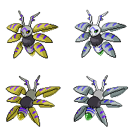
I'm now working on shiny colorings...
As many have noted, these shell wings are very difficult to sprite, even with the most basic pose. This current pose with upturned wings makes it even more of a chore to do the back view of them -- but I am enjoying the challenge!
I'm now working on shiny colorings...
Wyverii I have to say that yours is my favorite, especially the cool wing position and the glowing tail thingy
Lemondrop The most recent one has a really cool pose. I like the idea of it being able to move its wings around like that.
This makes me really wish I knew how to sprite...
Lemondrop The most recent one has a really cool pose. I like the idea of it being able to move its wings around like that.
This makes me really wish I knew how to sprite...
Currently experimenting with new shinies.
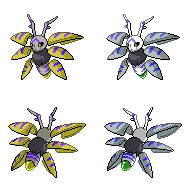
Move over Aurumoth, here's Argentumoth.
Oh and I'm really reluctant to enlarge the bottom set of wings. I kind of like the butterfly-ish shape the current arrangement gives, and I'm not sure how it will turn out if I change it.
Move over Aurumoth, here's Argentumoth.
Oh and I'm really reluctant to enlarge the bottom set of wings. I kind of like the butterfly-ish shape the current arrangement gives, and I'm not sure how it will turn out if I change it.
It's review time!
DougJustDoug: I just don't like it. Sorry. It's not just the style, but other nitpicks:
Quanyails: O.K, a few problems.
Wyverii: :D although the fluffy segment looks too blue on the normal sprite. And tone down the yellow in the orb/sting.
Lemondrop: Much better than your previous pose! Although a lot of problemos.
- The sprite in general is too large
- The orb/sting isn't in the right perspective to the body
- The antlers are too long
- The shape of the face is too long and oddly shaped
- The pose is awkward. I would have Aurumoth bend his body during the lower body segment. Right now, it looks like it's squatting.
- The colour of the orb is too yellow.
Quanyails: O.K, a few problems.
- The wings are too bright. Darken them!
- The head is weirdly positioned when placed on the body. It should be facing slightly to our left.
- The body is too pale.
- The stripes are too blue.
- The antlers look too straight.
- The back sprite isn't identical to the front; the orb/sting looks like it's bending slightly towards us on the front spprite. On the back sprite, the orb/sting looks like it's bending slightly towards us, or is straight on, which therefore doesn't relate to the front sprite.
- The fluffy body segment is too dark.
- The shiny looks horrible. Try with lighter colours to get the angelic feel towards the sprite
- The antlers are bent back too much
- The orb is too yellow
- The lower body is way too fat
- The wings are your main downfall. They look scattered. I won't be any help, but I suggest positioning and changing the angles of the wings to decide what looks right.
Wyverii: :D although the fluffy segment looks too blue on the normal sprite. And tone down the yellow in the orb/sting.
Lemondrop: Much better than your previous pose! Although a lot of problemos.
- The wings look awkward. You know that. They've been flipped over. angled incorrectly,etc.
- The antlers are too far apart. And small.
- The fluffy segment needs to look fluffy.
- The wings are also oddly shaped.
- The body's angle needs tweaking.


I've made a few tweaks to mine. The wings are angled a little so it looks more symmetrical and in-flight (more dynamic somewhat), and I tried to simplify the shading enough to fit in, but not so much it loses the style. I've also brightened the colours a tad, and I feel it looks better this way. Here's the shiny (The idea behind the colours of this shiny, guys, for pointless backstory, is a sort of demon to the angel. The green's meant to be reminiscent of tribal paint or something of that ilk. It still looks a little dark, though..):

Do you guys prefer how they were before? Prefer the pose but not the new colouring or simplistic shading? Any commentary's appreciated!
Commentary of my own:
DougJustDoug: Hmm. I love the pose about it, but like others have said, it's a tad big. The fur detail is incredible, so I really hope you don't lose that if you resize it- and the whole thing is really cute too- I guess I'm saying that as a whole it looks rather big, and the proportion of the head-to-body ratio is a little off- smaller head? Another nitpick is that the antennae are a little unsymmetrical, but perhaps that's intentional as a joke. :P
Ice-cold Claws: The lower wings are a tad off in the backsprite. I guess it's just 'cause they look smaller or thinner than in the front. I know they're turned sideways, but something still doesn't sit right. Apart from that, it's still an amazing sprite, and you've done very well on backspriting it! I absolutely adore your new shiny, stick with it.
Lemondrop: I prefer your other one, personally- the pose of this is neat, but I'm not sure if Aurumoth can pull that off in a way that looks right. Do keep working on it, as I'd like to see a pose like this, but I'm not sure how one would go about making it look right- the wings don't really look like they bend that way, or at least not to me. Maybe turn the active wing (the one bending over its chest) so that the point of it faces the viewer a little more? It's the only wing that bothers me- the others could use a little refinement but in terms of pose, that's the only one that "doesn't work".

Time for some critique, ordered by awesomeness:
Ice-cold Claws: Yours is, without a doubt, the most true to the design, and the neutral pose was, IMO, executed flawlessly. I think that on the whole, neutral poses are favored in the BW generation, so I'll tend to rank the ones with more dynamic poses a bit lower on this list. As for the shiny, I really prefered your first one. Try to get all of the purple out of it, and I think it will look even more awesome (I liked it the whole time, but maybe that's because I'm colorblind and couldn't see the blues and purples clash).
The Reptile: Your design is very good, with a lot of detail, but the proportions are slightly off. I think you should make the body size a bit larger, and, more importantly, straighten out the abdomen. I'm not sure why it's at an angle, but it seems less like a dynamic pose and more like it's askew to me.
Quanyails: Another great design. I can only think of a few changes, and they're not all that big. First, if you changed the shading on the antennae a bit, they would look less like they were angled back. Second, IMO, the blue crest around its eyes and on the back of its head could be a bit more curved. Finally, the entire coloration, especially on the wings, strikes me as being a bit too light (I'm colorblind, so you can treat that with a degree of skepticism).
Doran Dragon: The pose looks, on the whole, nice. I think it would be a good idea to curve the wings a bit more so that we can see that they're not little hovering cones. The antennae on KoA's design look like they point to the sides, not back like in your sprite (not quite sure how to fix it, but I hope you'll give it a try). Like with Quanyails, I would advise darkening the wings a bit as well.
I don't have much to say about the other entries. I can't really accept the more dynamic poses of some, and the others need to have a bit more depth of shading.
I changed my sprite's head and antennae based on feedback and also added shinies:

I call this shiny coloring the "Creamsicle Shiny". I was playing around with light colors for the shiny, because I was experimenting with a more angelic look. I was playing with copper colorings for the wings, and stumbled across a light orange shade. I've always been a fan of shiny Latias, and the color caught my eye instantly. I made many other shiny combinations, but I kept coming back to this one as my favorite. Maybe I've been watching too many Tampa Bay Buccaneer games in throwback uniforms, or maybe I'm just craving a Creamsicle -- but I'm liking this shiny coloring for now. I hope you do too.
I call this shiny coloring the "Creamsicle Shiny". I was playing around with light colors for the shiny, because I was experimenting with a more angelic look. I was playing with copper colorings for the wings, and stumbled across a light orange shade. I've always been a fan of shiny Latias, and the color caught my eye instantly. I made many other shiny combinations, but I kept coming back to this one as my favorite. Maybe I've been watching too many Tampa Bay Buccaneer games in throwback uniforms, or maybe I'm just craving a Creamsicle -- but I'm liking this shiny coloring for now. I hope you do too.
DJD: The rounder head is quite the improvement, and the shiny coloration is absolutely lovely. The only thing that I can critique at this point would be the eyes. I don't know why, but they seem a bit.. off... perhaps some experementation is in order to get them a bit more similar to the artwork. But again, the rest of the sprite is great.
ICC: ...I don't think I have anything to say about this. It's a very basic sprite, but it's done really well. It looks like something I'd actually find in the game, and that is a massive plus in my book.
Lemondrop: They dynamic pose is really unique, although I can't stop seeing the wings acting akin to limbs. Maybe change up the orientation of the bottom wings so they look less like they are acting as legs. The horns could also be made a bit bigger, but it's otherwise fine.
Doran Dragon: My only issue with the sprite would be the wings. They could stand to be angled slightly differently so that they don't just look like floating cones. And i know I'm starting to sound like a broken record, but otherwise it's a very good sprite.
As far as all the other sprites are concerned, they are, for the most part, structurally sound, and any critiques I would conjure up would seem petty in that regard.
Happy spriting, everyone!
Moar Comments:
CBMeadow - I like it, it's just that all of the other bw sprites have that simple shading, and I prefer that. But I enjoy your pose and shiny colors! The orb looks like it doesn't really connect to the body also, and the antlers are too thin.
Doran Dragon - I rather like the pose, but the antlers are way too bent. Also the lower body looks fat. And the wings are scattered everywhere it looks odd.
DougJustDous - The antlers and the head are too big. But I love the wings. Also it looks like it's squatting.
Ice-cold Claws - I love it don't change it.
Lemondrop - Rather awkward pose, but I like it. Also the antlers are too small and far apart.
Wyverii - Love the pose, and the orb. Just love it, my favorite.


Manipulated the wings a bunch, since I was annoyed at one wings' symmetry, which made me change five of them. I hope the back sprite's abdomen looks more similar to the front sprite's.
Changed colors back to the duller ones, as requested, except for the blurples. Makes those look more visible. I might do something with the shiny's wings, since the reds does not contrast on the blue-black well.
Comments:
- Lemondrop: Dynamics... well, I'm okay with that, but realize that it is supposed to be a fighting stance against an opponent, looking left and slightly down. (Flip?) The wings you have are suddenly flat, which is quite an upsetting change. The perspective you put into them (angle, distance away) is a neat and great part of the sprite. Keep that!
- DougJustDoug: The wings are in a unique pose, as I've mentioned on IRC, but frankly, the sprite is huge. If we're giving Aurumoth gigantic dimensions, I'd be okay with that, but usually, very large sprites exist only for complex designs or, well, gigantic pokemon. I don't see Aurumoth as being Steelix-sized. The face could be a little less oblong; if you're to keep that, like Doran Dragon has done, then it needs to look a little less stretched.
- Doran Dragon: Best application of artistic license. :D Aurumoth is so cute in your interpretation! The wings, of course, need slight modifications, since they look like egg-like dough wads (and they should be bigger, according to KoA), but still. DAAAAW. <3
- CBMeadow: Hope the tail on the backsprite is more normal now. I changed the wings to make them more even, but that might've just made them odd-shaped again. The asymmetry of your bottom two wings is the one thing, I think, unbalancing the sprite. Perhaps move one up or down? (Sorry for asking for these changes.) Oh, and love the shiny colors.
- Wyverii: Perspective makes the horns look quite narrow rather than like horns, but you can't help that, I suppose. Good job otherwise with sprite composition!
- Ice-cold Claws: Your front sprite's almost perfect; one qualm I have is that the edge of the left wings closest to the body look larger than the corresponding right wings. The other, similarly, is the antennae not being the same height. The backsprite's wings' symmetry... Uhm, well, it's not too great, honestly. The body is great! ... but the top right wing (and small areas of other ones) aren't symmetrical.
- Eagle4: Ah. Hah. Your last bullet point made me LOL. Since when were you under the impression Aurumoth should be completely angelic? Doesn't the color scheme remind you of something else? At least, something generally not an angel? I'd invalidate your reviews if it weren't for the fact others have asked me to desaturate the sprite (again).
- Meganium Sulfate: Mmm... well, the bent-back horns are intentional, but I see what you mean if I should keep them unangled. Not sure how better the curves on the head markings are now; it was a pain to get the backsprite's one to look okay compared to the head's roundness. I also desaturated it to its original colors, as various people (including you) have suggested.
Thanks for the comments fellas.
Not posting sprites today because it's my history exam tomorrow, so I figure I'll implement all the suggestions by Wednesday or so (but then again our GMTs are different so idk).
Keep it up spriters!
Not posting sprites today because it's my history exam tomorrow, so I figure I'll implement all the suggestions by Wednesday or so (but then again our GMTs are different so idk).
Keep it up spriters!
Quanyails: I was under the impression that Aurumoth was an intentional angelic pokemon for two reasons. Out of the 16 name submissions, 11 are related in one way or another to an angelic theme. In the second poll, 2 of the 3 were angelic. Aurumoth won, where the name creator related Aurum to angelic.
Koa himself says "The design is based off a Seraphim, a higher angel who harnesses six wings"
So yeah, I think this pokemon is meant to be angelic. Anyways, your sprite is good, but the middle set of wings doesn't relatee to the backsprite. The front sprite shows the wings facing down more than the back sprite does.
I updated the head and antennae of my sprite, based on feedback from Heatran1919 and others (thanks for the input everyone!):

Previously I was intentionally turning the head and exposing only one eye from the side. Several other pokemon sprites do this, so I thought it would be a neat twist from the standard angled front view of the face with both eyes visible. But I guess I just didn't pull it off very well, or maybe it was just a bad idea in the first place -- because several people commented that the previous eye didn't look good. So, I have turned the head slightly forward to expose both eyes. I liked the previous position just fine, but after seeing it this way, I think it is a noticeable improvement. I appreciate all the comments.
I think I'm getting close to the finish line on this sprite. I will continue to update it if I can improve it, but I don't expect many major changes.
Previously I was intentionally turning the head and exposing only one eye from the side. Several other pokemon sprites do this, so I thought it would be a neat twist from the standard angled front view of the face with both eyes visible. But I guess I just didn't pull it off very well, or maybe it was just a bad idea in the first place -- because several people commented that the previous eye didn't look good. So, I have turned the head slightly forward to expose both eyes. I liked the previous position just fine, but after seeing it this way, I think it is a noticeable improvement. I appreciate all the comments.
As for the size of my sprite being too big, I guess many of you have not been reading the CAP Kitchen thread -- because it has been established by our TL that Aurumoth will be about the size of Dragonite, which is roughly 7 feet tall. The thinking there is that since this is a 600 BST pseudo-legend with a lot of HP and big defense, that this pokemon will not be some dainty little bug. It will be a big archangel, if you want to think about it that way. Just to put it in perspective -- this pokemon will be taller than Tyranitar.
And even if the TL decides to cut down the height for some reason (it won't be finalized until the final product thread), my sprite is still well within size norms for other winged pokemon. Here's a side-by-side comparison of my sprite with some other pokemon:

Braviary is 4'11" and has outstretched wings and a lot of detailing in the face and feet. Braviary is a full two feet shorter than our pokemon, nowhere near it in terms of BST, has less HP and Defense, and isn't a pseudo-legend. Yet the sprite is bigger than mine.
Volcarona is 5'03" and is IMO a comparable "pseudo-legend bug". If you look at just the body (not the wings), Volcarona is bigger than my sprite. Even taking the wings into account, the sprites are comparably sized.
Salamence is a 600 BST winged pseudo-legend, just like Aurumoth. You might be shocked to know that Mence is only 4'11", which is two feet shorter than our Psychic Angel Bug.
I'm not posting this as some definitive proof of how big our sprite should be. If anyone has ever bothered to compare the size of pokemon to their sprites, you will quickly discover that Pokemon is INCREDIBLY inconsistent in this regard. That's the reason I tend to completely ignore the concept of "too big" or "too small" when it comes to the size of CAP pokemon with respect to sprites, stats, typing or whatever. There just isn't any justifiable rule of measure to follow.
With that said, I do acknowledge that people have "gut feelings" about this sort of thing. We all have a sense of whether this pokemon is supposed to be big, small, or somewhere in between. But I think many people in this thread seem to be associating Aurumoth with the "Bug pokemon" aspect of its creation, which typically connotes a small pokemon with a small sprite. I am associating Aurumoth with the "600 BST Psychic Pseudo-Legend Archangel" aspect of it, which I think implies a large majestic figure. I realize there are many tiny little legends with 600 BST (Jirachi, Mew, Celebi, the list goes on and on) -- but as the Kitchen thread has clearly pointed out -- Aurumoth is going to be much, much bigger than any of those pokemon. So instead of thinking little bugs and cute little legends, I'm thinking of big winged dragons and others in that same category.
And even if the TL decides to cut down the height for some reason (it won't be finalized until the final product thread), my sprite is still well within size norms for other winged pokemon. Here's a side-by-side comparison of my sprite with some other pokemon:
Braviary is 4'11" and has outstretched wings and a lot of detailing in the face and feet. Braviary is a full two feet shorter than our pokemon, nowhere near it in terms of BST, has less HP and Defense, and isn't a pseudo-legend. Yet the sprite is bigger than mine.
Volcarona is 5'03" and is IMO a comparable "pseudo-legend bug". If you look at just the body (not the wings), Volcarona is bigger than my sprite. Even taking the wings into account, the sprites are comparably sized.
Salamence is a 600 BST winged pseudo-legend, just like Aurumoth. You might be shocked to know that Mence is only 4'11", which is two feet shorter than our Psychic Angel Bug.
I'm not posting this as some definitive proof of how big our sprite should be. If anyone has ever bothered to compare the size of pokemon to their sprites, you will quickly discover that Pokemon is INCREDIBLY inconsistent in this regard. That's the reason I tend to completely ignore the concept of "too big" or "too small" when it comes to the size of CAP pokemon with respect to sprites, stats, typing or whatever. There just isn't any justifiable rule of measure to follow.
With that said, I do acknowledge that people have "gut feelings" about this sort of thing. We all have a sense of whether this pokemon is supposed to be big, small, or somewhere in between. But I think many people in this thread seem to be associating Aurumoth with the "Bug pokemon" aspect of its creation, which typically connotes a small pokemon with a small sprite. I am associating Aurumoth with the "600 BST Psychic Pseudo-Legend Archangel" aspect of it, which I think implies a large majestic figure. I realize there are many tiny little legends with 600 BST (Jirachi, Mew, Celebi, the list goes on and on) -- but as the Kitchen thread has clearly pointed out -- Aurumoth is going to be much, much bigger than any of those pokemon. So instead of thinking little bugs and cute little legends, I'm thinking of big winged dragons and others in that same category.
I think I'm getting close to the finish line on this sprite. I will continue to update it if I can improve it, but I don't expect many major changes.


Well here's the long-awaited (I hope) version-with-enlarged-lower-wings.
I don't know about this :/ It looks much bulkier which I don't suppose is appropriate for the stats.
Quanyails: I intentionally made the wings slightly asymmetrical to each other actually, just to avoid being boring.
Meganium Sulfate: I somewhat preferred my last shiny colors too, but then I'm red-blind as well and I think that's pretty much where our opinions differ with the norm. Better do things based on what the majority wants.
I don't think I should do anything about the height, should I?


I don't know about this :/ It looks much bulkier which I don't suppose is appropriate for the stats.
Unlike other CAPs I really don't mind this one being that large, if only because we've given it pseudo-legendary status (see Doug's justification in his hide tag). I think your sprite is looking great, ICC.
@Doug I will reiterate Murk's comment that the bend in the body seems a bit too acute.
Final Submission
Final Submission:

Upper right wing of backsprite enlarged, can't remember the rest of the changes. Don't have any more time to work on this but it appears to be a finished state regardless. No genders for me, I think that would take away part of its androgynous appeal (angels are often depicted as so).
Final Submission:
Upper right wing of backsprite enlarged, can't remember the rest of the changes. Don't have any more time to work on this but it appears to be a finished state regardless. No genders for me, I think that would take away part of its androgynous appeal (angels are often depicted as so).
You've really stolen the show, Wyverii, well done. You and Doug continue to derive mysterious and magical spriting powers from solar flares or distant quasars or something, doing your best work the more complicated your task is. I like what you did with, well, everything since your original post, especially the backsprites, which must have been the biggest headache ever from the looks of it. I rarely think backsprites are "badass," yet here we are. I was trying to come up with a good way to describe how yours and Doug's sprites appealed to me differently, but all I could come up with was that your sprites look "edgier," which I think is at least literally true. On the other hand, Doug's sprites look more exaggerated, cartoonish, and/or "grand," I can't decide, and are spectacular in their own right (I even like the artistic license taken with the body shape).
Posting to congratulate top-shelf work when a simple vote just won't suffice. Kudos to you and Doug for both coming up with intriguing and dynamic poses and following through with your artistic pixel skills, the stuff of legends. Best of luck to both of you in the poll!
Posting to congratulate top-shelf work when a simple vote just won't suffice. Kudos to you and Doug for both coming up with intriguing and dynamic poses and following through with your artistic pixel skills, the stuff of legends. Best of luck to both of you in the poll!
I don't know about this :/ It looks much bulkier which I don't suppose is appropriate for the stats.
Bulky is good! I dunno about you but 110 HP + 99 Defense seems pretty bulky, to me. I love how well you made the neutral pose look and your asymmetrical wings fit with in my flavor idea (in which Aurumoth's wings aren't true wings, per se, but pieces of its hardened, discarded coccoon that it manipulates freely with its telekinetic powers.) The free-floating nature embodies that perfectly. I also love your shiny colors (as it also matches with my flavor idea where Aurumoth meditates under a full moon to increase its power and make its gem-like stinger glow) but the left horn on the front sprite looks a little crooked and awkward... This is definitely my favorite sprite, by far.
Based on feedback, I made a few other small changes to my sprites:

I changed the antennae to be shorter and shaped less like big prominent antlers. I agree with commenters that they were a bit "too much" previously. I also changed the curvature of the abdomen slightly on the front sprite and changed the shape of the abdomen on the back sprite, hopefully making it look less like it is "sticking its butt out". I can't do much more with that part without significantly changing the pose, and I really don't want to do that at this point.
Since it appears that everyone is getting close to finalizing their sprites, I'd like to pass some well-deserved compliments to a few other spriters in this thread:
- I always expect great work from Wyverii, and she didn't let us down this time. After taking an ambitious wing pose myself, I can fully appreciate all the work that went into her sprite to make it look right. Extra props for the great perspective work on that back sprite, Wyv. Great job of matching it to the front, with such difficult angles and curves. You are always a technician and an artist, and you show off both skills beautifully on this one.
- Quanyails was one of the first out of the gate, and she set the standard for many others. I love the symmetry and artistry in her sprites. Her shiny is one of the best in the thread.
- I enjoyed seeing the progress Ice-cold Claws made, incorporating feedback along the way. I really like the way the top wings are done, in particular.
- CBMeadow has one of the most creative sprites in the thread, and I love the artistic flourishes on it. Fantastic menacing look and pose and well done all the way around.


I completely agree with the criticism of your sprite's angularity or whatever you want to call it, but I didn't post about it since I knew it would basically require an entire reworking of the sprite. The change you made was, to my untrained eye, basically unnoticeable. It still bothers me, which is a shame.
ICC totally has my vote.
ICC totally has my vote.
- Status
- Not open for further replies.