CAP 15 CAP 4 - Sprite Submissions

Status
Not open for further replies.


Gotta say, perspective on these little wings is hard (and counter-intuitive in places). I'll probably have to mess with the colours, I might have washed it out a bit too much. Also, anybody starting their first sprites on this have to remember, you need to do the back too, wings in the correct place and all.
 

paintseagull

pink wingull
is a Top Artistis a Forum Moderator Alumnus
Sorry to make a stupidly short post, but Wyverii I'd like to try to help with the perspective sometime soon, though I am pretty busy this week. I like the pose so far!
 
Took on advice and such


and additionally edited the shiny palette-


Might do something about making the eyes bigger
 
Thanks for the suggestion! <:


Made some little changes in the overall color of the sprite. Also made small tweaks in the horns and the fur, adjusted the wings, and lengthened the body.

I rushed the colors of the shiny sprite but heck with it, the original colors are what's important. c:

Well, I think it looks better now. Still making new drafts though!
 

Rowan

The professor?
is a Community Leader Alumnusis a Community Contributor Alumnusis a Tiering Contributor Alumnusis a Contributor Alumnus
@Lemondrop
At the moment yours is my favourite in terms of the colours which is great! But I still feel that your body needs to be longer. I'd make the fur slightly less flat and also lengthen the body below that some more. Your new version is a lot better and definitely a stop in the right direction, but I don't think you lengthened it enough.
As for the shiny, I'm not sure about the green lines on the white wings, they don't stand out enough for me, I would make it a darker colour. Maybe even a darker green will do?
 
O.K, time for my semi-useful critique.

Wyverii - I'm in love with yours. I love the chalenging stance you chose, and the shiny is magnificent. I also love that you differentiated your bottom orb from other sprites by having that glossy shading. I still think the wings need some tweaking, but I don't know why...

Oh and the antlers look a little too far apart.

Lemondrop - In my opinion, the body looks a little too short and stubby. The colours are all fine, except the stripes which should be slightly more blue. I also think you should make the orb/sting larger, it looks too small and insignificant at the moment. Your wings are fine. I'm unsure about the shiny version's colour palette. I feel the stripes need to stand out more. (Oh wow, I just saw corkscrew's post and his critiques are exactly the same as mine)

Meteor64 - Although the eyes need to be bigger, there are still many little problems I have with this sprite, hence the nitpicking. First of all, the body shouldn't be so dark and purple, and the stripes need to be a bit more visible. Furthermore, the "antlers" shouldn't be as straight as they are, and should be a little bit taller. The wings really bug me; they look different sizes, with the bottom two incredibly small. Your sprite is suffering from a lack of shading also, which makes the art look a little blocky and too vivid. the orb/sting suffers from this in particular. The orb/sting should be more yellow than green.

ICC - Lovin' it. My only critique would be that you have the wrong perspective of the antlers; it should be facing slightly inwards or to the side than outwards.

CBMeadow - The colours are great. The perspective is great. The art is great. But alas, the art is also too realistic to become a sprite. It's so amazing, it doesn't fit in with the generic sprite style. I love it, but the art is too good for a sprite.

Quanyails - I like it, but I dislike the wing pose; it's a bit generic and not really that daring. I thinkyou can make the blurple show more, by thickening the blurple stripes. Also, I'd alter the wing colour to be a little more bronze-yellow.

The Reptile - The body is smexy, apart from the sting, which should be increased in size. The wings bug me a lot though; again, the bottom pair look way too short, and the middle pair's stance doesn't fit with the rest of the wings.

I deduce that these wings are a bitch to sprite. That is all.
 

KoA

Sorry, I thought anteaters were real
is an Artist
One thing I like about Wyverri's sprite so much is that she got the size JUST right on the lower wings. ONe thing I wanted people to realize is that the wing armors are not only fun to look at, but they shield and cover up the body for defense too.


(Ignoring the older version of the abdomen), This pic demonstrates what I mean I think, the lower two wings in particular cover up the lower body while the top two are meant to cover the head. Wyv's pose shows this relationship perfectly and she is great with the proportions too.

Idk, just some references in case some spriters were wondering about what sizes to make them if they were unsure.
 
Wyverii- Your sprites look great, but your bottom wings are just awkwardly flipped over while the rest are the other way up. Keep the size and placing, but make them "flipped" over. Other than that, great job.
 

Quanyails

On sabbatical!
is a Top Artist Alumnusis a Community Leader Alumnusis a Community Contributor Alumnus
If I up the saturation in Photoshop, I get this:


I also adjusted the wings slightly; they still have some thickness to them, which I do try and preserve. Might thin out the top right back one, though.

I choose a standard pose because of in-game standards, and colors from the original design. Sorry for those who want something more dramatic, but this is not a challenge to make the most dramatic-looking sprite.

Edit: Oh, and comments, how could I forget?
  • Doran Dragon: Daw, your style is so round and nice. :) I love the main body, but the wings look a bit small and oddly-positioned. Are they meant to be asymmetrical?
  • meteor64: Well, I have quite a few things you could adjust: The wings are too close to being lenses rather than having a weighted shape. The lineart could be darker as well. The antennae are lopsided, and the face does look a big long.
  • Lemondrop: Yes, vivify the colors, first of all. It's all too neutral at the moment. The wings are a bit small in proportion to the body, and the abdomen looks a bit shriveled. That'd need a little more depth (shading?) to make it longer. Your head is quite nice in shape and perspective (antennae included!).
  • CBMeadow: The more I look at it, the more I think the outlines could be more distinct. It could be the dark shadows, but I'm not seeing too much of it. :/ You certainly have a unique pose, and I think it works well!
  • Ice-cold Claws: A lighter shade could make the sprite look less dark overall--but the colors are good! The tail light looks phenomenal! The antennae still look lopsided, though. :P
  • Wyverii: Eh, I'm not as interested as your pose, but go with it if you want. I know it's a rough draft, but the main body is quite devoid of shades. The tail light in particular looks bright without affecting any other shades. The wings, of course, are still a work in progress, with the perspective and all that.
 
I'm sorry for bombarding this thread with my sprites. XD

Anyways, here's the edited versions.


Teehee~

I did as what was suggested. Lengthened and rounded the body, made the stinger more noticeable, and made some little tweaks here and there; the markings, the horns, and the fur. I think I also adjusted the wings a bit.

You've all been helpful, thanks! Now, I'll just have to do the back sprites. Errr...The wings will be a problem for sure. ;D
 

DougJustDoug

Knows the great enthusiasms
is a Site Content Manageris a Top Artistis a Programmeris a Forum Moderatoris a Top CAP Contributoris a Battle Simulator Admin Alumnusis a Smogon Discord Contributor Alumnusis a Top Tiering Contributor Alumnusis an Administrator Alumnus
Moderator
This is still a work-in-progress, but here's my first pass on our Psychic Bug:
I'm not sure I like the neutral pose, but all my more dynamic poses really lost the general shape of the wings looking like they are "unfolding" outward, like a moth or butterfly. I plan to mess with the tilt and positioning of the body segments and see if I can improve it.
 

Korski

Distilled, 80 proof
is a CAP Contributoris a Forum Moderator Alumnus
Wow Wyverii you really nailed it on this one. Your wings are pointed and dynamic, and along with the projected abdomen, perfectly positioned and tilted to match the flow of the body. There is movement and grace in the design, and yet with all those pieces it doesn't look cluttered or forced in any way. I think it would be a huge mistake to change the pose even a single pixel, although I do agree that whatever those horns/antlers/antennae are seem to be spread too far apart and angled further away from each other than the original drawing, and it may serve your sprite well to reign in that particular area of creative license. The current horns makes the sprite look more aerodynamic, which is fine, but in my opinion, their appeal on KoA's art is that they look more like the horns or antlers you'd see on a reindeer or caribou than antennae you'd find on a bug, which gives this design a visually physical presence and overall more "woodland" appeal, which is a pretty clear motif, as far as I can tell, considering the color palette and obvious references to natural camouflage in the design itself (I also personally like the vertical-ish, more offensively cabable-looking antlers). The flavor people aren't going to like using Megahorn when the horns tilt backwards off the side of the head, but what do I know.

For everyone using the lifeless, limp-hanging lower wings of the original artwork, I would constructively suggest putting more energy into your poses, to the point of maybe trying to make the three wings on each side look like they're working together to keep this Poke afloat. I am no spriter, and I can tell that this design is Fidgit-level hard, even for the best of you, so I won't proselytize about how to do any of this "correctly"; these are just my four cents and I also wanted to make sure Wyverii didn't change the pose of her design at all because it is the best so far (again, no offense intended towards anyone at all for any reason).
 

Taking into account as much of the commentary as I could, here's the new version. It might need to be brought down as far as shading goes more than I did, though, I can definitely tell it's kinda detailed for a sprite, especially comparatively.

Shiny:


And the loose build of a backsprite, very, very WIP, but just checking for pose consistencies:

Not sure how I feel about it, I can tell it'll likely require some tweakings even as far as basic pose goes.

Commentary (I have a tendency to nitpick):
Doran Dragon: This is really cute! There isn't really much to definitively call it out on, but you might try out making the eye brighter and/or messing with the stripes on the abdomen to curve with the body (circling the glowlight instead of curving towards it). I can't say it will make it better, but it's worth testing, I think. As a whole it's an adorable sprite, with an equally cute pose. Definitely wins the cute award, and it's certainly well done! :3

DougJustDoug: I'm not sure what, but something about the face bothers me. I think its chin's not centered perfectly between the eyes- I can tell it's looking off to the side, but either shift the left eye over a pixel, or shift the spike of the chin over a pixel. Really just a nitpick, but it's the only thing off about your sprite- it is really a very nice sprite, I'm quite partial to it. I especially like the head- discounting the nitpick mentioned- as it looks alert and ready, perhaps at attention.

Ice-cold Claws: Yours is probably my favourite. I don't think I have anything to say on the actual sprite- the shiny looks a little bright, though, maybe saturate (desaturate? whichever means more grey) the glowlight/eye and wings just a sliver more. It doesn't have to be dull, it's just unnaturally bright as is. Again though, you've totally nailed the pose and proportion- excellent job!

Lemondrop: The body's a tad brown- and I hate to mention it but it looks like your lighting is coming from the wrong direction; sprites have the lighting hit where they're facing. It's only noticeable on the left wings, though. Apart from that, it's pretty good!

meteor64: The wings are a little wonky, they're less shield-shape than usual. Additionally, the body's a bit purple, and the glowlight a bit green. It's alright, it just needs some tweaking and detail.

Quanyails: The tail on the backsprite still is just a little inconsistent with the front, but not by much now. The front's points to the ground, the back's kinda points more towards the viewer. Apart from that, I really like it.

QuimicVital: I understand the artistic license you're showing, but the lack of black behind the eyes makes it look kinda derpy. I'd recommend to preserve the black eye areas. Apart from that, the glowlight is a bit off center. You've got the wings right, though, and I think those are the very hardest shape in the whole thing by far.

TheReptile: The abdomen bothers me. I'm not really sure why, but it's kinda odd in shape. Maybe it's more left-aligned than centered, but I really can't put my finger on what exactly. The middle wings also are a little strange in shape. Other than that, the shading's good, and I'm especially fond of its antennae.

Wyverii: As always, excellent spriting! I really don't have much to say on it. Maybe make the outline of the glowlight a tad darker on the original? It blends into the background a little as is. The shiny doesn't have that problem.
 

DougJustDoug

Knows the great enthusiasms
is a Site Content Manageris a Top Artistis a Programmeris a Forum Moderatoris a Top CAP Contributoris a Battle Simulator Admin Alumnusis a Smogon Discord Contributor Alumnusis a Top Tiering Contributor Alumnusis an Administrator Alumnus
Moderator
I really didn't like the boring pose of the first sprite I posted, so I decided to restart from scratch with a more interesting pose. Here's the new work-in-progress:

 
That pose is really nice Doug. Rather than having the wings(?) facing down, you've put them into a more dynamic pose that I think suits Aurumoth really well. I think there's a little issue where the bottom two wings on the right overlap. It looks like the lowest one is in front of the middle one. Just a slight difference in the shading there would make this the best sprite so far imo. I like the slightly heavier fur you've used for the thorax is nice and again, a slightly different take on it.
Only thing else I'll mention is that the wings seem a lot more yellow than KoA's artwork where it is a duller, slightly off-cream/grey but if that's the colour that you believe is right then that's great. :)


Changelist:

Backsprites added.
Antenna/horns now pointing up.
Minor tweaks to wing shapes.
Stripes on wings tapered and respaced.
Darkened the shade of the stinger to be more pronounced.
 

KoA

Sorry, I thought anteaters were real
is an Artist
Bloody brilliant Wyv. Yours and Doug's are easily my favorites, and I'm gonna have a terrible time deciding between the two. I admire the way you could handle the awkward shapes and figures of the wing cases and tastefully brought life to them.
 
Whew. I've never had a more frustrating backsprite to deal with. [edit: eventually figured out the shading.]

Thanks everyone for the input so far!

meteor64: Yep, you should make the eyes bigger. Everything else, Quanyails pretty much said 'em. Good luck!

Quanyails: Whoosh, awesome. I'd just like to note that the red is very hard to see in the black armor (or, it could be just me again).

Lemondrop: This one's really growing on me. I also noticed how your shiny palette emulates an angel's colors (wings, halo etc). Waiting for the backsprite!

Doran Dragon: Yes! Niceee. I enjoy the vortex-y arrangement of the wings. Throw out a shiny next?

CBMeadow: This is really unusually cool, but the shiny's really, really dark. I'm guessing it's colored like a demonic counterpart, but it could use some lighter shading.

DougJustDoug: Epic job! I'm absolutely gaping at the arrangement of wings here, but that aside, it's huge -- quick comparison tells me it's taller than emboar and vespiquen. It could afford to be much smaller.

Wyverii: Guess it's never going to be easy with you around :( cool psychic-y pose, but you don't think the upper right wing on the backsprite is a tad too small?
 
If I may give my two cents on other people's submissions.

CB Meadow - I love the pose, but I think you should try to copy the simple shading of Gen 5 sprites.

Me - I hate those wings. everything else looks pretty good, but figure out something else for those wings.

DougJustDoug - contrary to others, I honestly dont like your sprite very much, though honestly its mostly just the eye that I dislike. I would like to see alot of things about it become smaller as well. especially the head and antennae.

ICC - Honestly, I want yours to win. In my opinion, it most closely resembles the original art, and I love those shiny colors.

Lemondrop - honestly, you have alot of potential. I think you could easily become a great sprite artist. id suggest trying to bulk up the abdomen and work on the shading on the wings.

Meteor64 - the colors are a bit saturated, and the body is purple. try to tone down the colors a bit.

Quanyails - Same as above, the colors are quite bright, Id like to see you tone down the colors. otherwise perfect sprite in my opinion.

QuimicVital - I dont understand why you changed the symbols on the wing. Id also suggest you try working on the line art abit.

The Reptile - pretty good, but it looks like you should try to copy gen 5 shading.

Wyverii - I thought that generally Gen 5 pokemon arent supposed to be in action, and yours in quite active. I dont like the yellow on the tail, its too saturated. Love those shiny colors.
 
Ice-cold Claws: Gorgeous sprites! I particularly love that the top wings are horizonal, giving an impression of the bulky shoulder pads of American footballers. They look like both wings and armour, which is something you've achieved better than any of the other spriters. It also makes the rounded head of your sprite look slightly hockey-mask-esque, which adds to its sporty, robust physicality, all very important for a Psychic type that has 120 base Attack - it needs to look physically imposing and yours does that so well. It doesn't lose the mystical feel while also looking like a warrior.

I know I am gushing, but the horns are perfectly balanced between looking like antlers and looking like moth antennae, it's something about the angle of the bend, the length and the tiny flick upward at the tip. Just beautiful. A few suggestions, have you tried making the bottom wings larger? It does look good the way it currently is, but I feel like more people would vote for you if the bottom wings were larger. I don't know. Also, the bum gem could be more sparkly, on the backsprites anyhow. You can't see the detail on the yellow tail at all. That's the one area where I prefer Wyverii's sprites. These are minor suggestions though, I am still swooning over your sprites!

DougJustDoug: Aww DJD, I preferred your original pose, or maybe I am thrown off by the proportions in your current sprite, the body looks too big for the wings, even though it's very well proportioned in its constituent parts. The abdomen is a lovely shape. The line under the eyes doesn't work that well, the eyes look more mystical and imposing in your original,

CB Meadow: Awesome demonic shiny colours - best shiny colours of any of the submissions. Reminds me of cinnabar moths

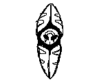
Wyverii: Great spriting work. You've really mastered drawing the wings from different perspectives, although I agree with ICC that the backsprite top-right wing should be bigger. The wings look very shell-like though, which is highly faithful to KoA's animation, but it just isn't my preference. They remind me of pieces of an easter egg, especially the top right and bottom left wings on the frontsprite. I would love to see a more vividly coloured shiny sprite too.
 
So I was trying for a dynamic pose...


D:
...

This a WIP, I guess 'cuz it still needs some tweakings here and there. Now about the wings...I was thinking that the Pokemon can freely rotate, manipulate, or whatever, its wings in a specific range hence the weird pose...?

*Oh, and how do you remove the white parts in your sprites?
 

bugmaniacbob

Was fun while it lasted
is an Artist Alumnusis a CAP Contributor Alumnusis a Top Contributor Alumnusis a Top Smogon Media Contributor Alumnus
*Oh, and how do you remove the white parts in your sprites?
Most people do it on photoshop but if you don't have that:

1. Go to iaza.com
2. Upload your sprite from computer or wherever you're hosting it
3. Under "Create", click on "Transparent"
4. Click on the background of your image, then click "Convert"
5. Paste here eg.


Though note that these will only stay up for 90 days and that they are automatically .gifs so you may want to reupload as a .png on a different hosting site.
 
Status
Not open for further replies.

Users Who Are Viewing This Thread (Users: 1, Guests: 1)

Top