CAP 5 CAP 5 - Art Submissions

Status
Not open for further replies.
XD. I guess I am the 'Break the Mold' guy.

Ok... I choose the Normal one.


I promise I'll work harder for the next CAP...Thanks for support me.
Its feet and chest area remind me vaguely of Abra, but don't take that as criticism- it's just merely a random comment. (Actually, it also sort of reminds me of a chozo statue). That aside, I like your design quite a bit. However, I think it looks better with blue stones instead of orange... you know, make it a little less stereotypically rock/earth colored. So just keep what you have above, but use the blue parts from the "shiny" form.
 
@Caladbolg: I too agree that your Easter Statue would look better with the blue gems on your shiny. Also, the blank white eye disturbs me a bit. However, it's one of my favorite designs so far. :D

@RegiDS: I hafta agree with the majority that it looks like a Rockeon than a stand-alone CAP. But I really have a soft spot for the rock-fox.

FINAL PIECE
I'm just going to make a proper post to confirm my submission, explaining my design and replying to comments.

Comments along the lines of "the face and body proportions looks too human-like", that was what I was going for. A sphinx is, after all, a hybrid between a woman and a lion. There are also other exceptional Pokemon that has "human-like body proportions", like Gardevoir (albeit somewhat anorexic), Jynx and even Lucario. Whether it looks too human or too alien (like Caladbolg's Easter Statue, which I might add, looks INCREDIBLE) depends on the concept itself. My concept is a sphinx and my interpretation of a sphinx is not just a person's head stuck on a lion's body, or a lion's head stuck on a humanoid body; mine is a hybrid, a (somewhat) balanced fusion. And this is what I came up with:

A humanoid head structure with feline characteristics, and used the Eye of Horus as eye make-up. The gray pupils and deadpanned expression, to me, adds to the overall 'stony look'. I see my sphinx that can walk bipedally or choose to walk on all fours, or just crouch motionlessly like a gargoyle. It is a statue that just springs into life, guarding ancient tombs from raiders; like a tiger under tall grass, waiting for the opportune moment to ambush it's prey. The jewels and gems embedded on its body and the display of AncientPower signify it as being Special-oriented.

I had fun taking part in this CAP design, more fun than the previous design. :) For those that liked my design, thank you for the support! And I'd like to see this as a female version of Lucario, lol.
 
Here's the one I'd like to submit;


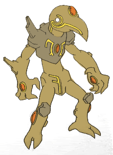
Originally, I wanted to create something small, rocky, with a gem 'eye' and claw arms to propel itself, the aim being a quick, agile, strangely cute poke... though toast if it took a hit.
That idea was shot down, so I evolved it, and evolved it again. It was kind of inspired by a Tyranid Zoanthrope in looks.
It has a large head, with a powerful brain to manipulate special attacks, but a frail body that can't take too much punishment. Its claws were meant to be its source of attacks, though not physically - it draws in energy, then its claw gems glow and the claws clack together in an 'x' to discharge beams, flames, etc.


It can aim the x in any direction, even have it orbit its body as it attacks. There are other examples of moves further back, but I'll post them here too;

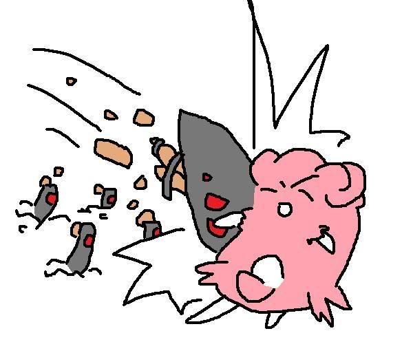
Overheat/Lava Plume;

where it glows red and unleashes flame from its body

AncientPower, where it calls on an ancient power;


and Head Smash, because I love Head Smash <3


The forces holding its claws in place act like there are bungee cords between them and its body. It digs them in and pulls back to thrust itself forward at force. If it stretches out, its claws will spring back.

...and, um, yeah. There it is. And my ramblings.
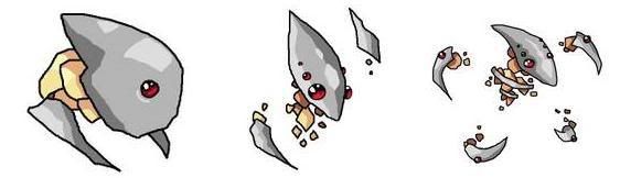
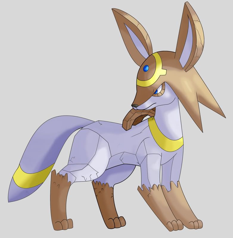
edit; evo line


Thank you for anyone who has commented/supported this idea. :)

....now make sure it wins, so I didn't waste my time :P
 
@yourDeadGrandad: I'm glad you coloured it in, because it looks a lot better than when you used the programme. Traditional FTW. Also Head Smash FTW.
 
I got 2 that I drew up a while ago. I couldn't hook up my scanner for a while.


If someone wants to ink or color these, feel free.
 
yourDeadGrandad, I really like the new coloring.
But I think that second position is a lot better than the first one, the one you've been showing.
The spacing between the body and the limbs is throwing me off, I guess.
 
I was supposed to be studying for a dynamics exam...

... but CAP happened. So it's drawn on engineering paper.


So a lot of you are probably wondering why the hell it looks like 100 different animals stuck together. I based it loosely on a qilin, sometimes known as the Chinese equivalent of a unicorn. (Some of you may be familiar with the Japanese brand of beer called Kirin... it's that animal.) For those of you too lazy to read the wiki link, it's supposed to be a mix of a Chinese dragon, deer, ox, and lion.

Too awesome. Got my vote

Given its mystical origins and all the crystals decorating it, I think it can pass as a special attacker. I also tried really hard to avoid making it too much like a dragon or too bulky. Instead, I aimed for a slightly more lion look and a leaner build. The front half of its torso is supposed to look more organic, while its back half is supposed to look more rock-like (its hind legs and hooves in particular).

Feedback is welcomed, although the thing I want opinions on the most is its hind legs- should I keep both the crystal-like growth and the rocky, square patches, or only keep one over the other? I got the rocky patches idea from Kangaskhan in the picture.
 
My personal favourites so far are Caladbolg's Easter Island Poke and Cerbi's Sphinx.
Not meaning to be jumping on the bandwagon, but I have to agree, Regi DS's submission looks like an Eeveelution.
 
AHHHH!
I'd want so badly for Regi's submission to be an eeveelution!
I would suggest evolving Eevee in the EVO project, but I don't think that would be plausible just because someone already has amazing artwork for the concept.
Oh well.
I like Regi's and yourDeadGrandad's the best so far.
If Cerb made hers a bit less feminine or something like that, then I'd probably go for that one as well.
 

eric the espeon

maybe I just misunderstood
is a Forum Moderator Alumnusis a Researcher Alumnusis a Top CAP Contributor Alumnusis a Tiering Contributor Alumnusis a Top Contributor Alumnus
As much as I loveRegi DS's Submission... It must be an Eeveelution and saved for the EVO project.

There are quite a few that look decent to me but... none have that little specialness to make me go for them.

Caladbolg's is the one that looks like it has the most support right now... I like the art and it does have that "Spark" of creativity.. but I don't think it looks quite Pokemonish enough.. and the design seams a bit too human and complicated.

I still support youDeadGrandad's submission, and the new art for it only helps.
 
How is Regi DS's drawing a goddamn eeveelution? They're 7 of them and all of them have something in common. Their oval shaped heads, big adorable eyes, cat like appearance, rabbit like ears. Regi DS drawing looks too much like a canine what with it's facial and body structure. I'm not seeing the whole eeveelution from it.
 

tennisace

not quite too old for this, apparently
is a Site Content Manager Alumnusis a Top Social Media Contributor Alumnusis a Community Contributor Alumnusis a Researcher Alumnusis a Top CAP Contributor Alumnusis a Tiering Contributor Alumnusis a Contributor Alumnusis a Smogon Media Contributor Alumnusis an Administrator Alumnus
Updated the first post. If I missed anyone, just shoot me a PM or something. Also, can we NOT double post? Please?
 
Just wondering, how long do we have left? I might not be able to get mine up till Wednesday, but if I have to, I should be able to get them up tomorrow.

Anyway, I've coloured my original design. I've also drawn and coloured a variation of it, with less crystals.
But more importantly, I've drawn and coloured a new concept. I think it looks pretty cool - you'll see once I scan it!
 
I can't seem to like Caladbolg's Easter monster thing. It looks NOTHING like a pokemon, nothing at all. It's too creative and complicated and pokemon aren't that complicated looking. It has too much detail to be a pokemon, but it's still an amazing drawing. I just don't see it fitting in with the rest of the family. It looks like some weird sea monster that lurks under the water with its asternaut looking head. I don't mean to offend you, I just feel like it's not right to have a pokemon like that. Of course everyone has their own opinions.
 
Here's the one I'd like to submit;

You know, this kind of reminds me of a Beta Metroid. At any rate, it looks like something that should learn leech life and giga drain.

Also, to Syprus, by not looking like a conventional pokemon, wouldn't that be another way that it breaks the mold?
 
Status
Not open for further replies.

Users Who Are Viewing This Thread (Users: 1, Guests: 0)

Top