• Smogon Premier League is here and the team collection is now available. Support your team!

CAP 5 CAP 5 - Sprite Submissions

Status
Not open for further replies.
Headpunch -

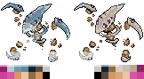
WKD pose but this thing is not That defensively fragile, base 90HP remember. The normal sprite colours are ok but with such a small sprite, if you're not willing to make it bigger maybe colour it more vividly to make it stand out more. For the shiny I'd personally go a little more crazy with the colour - look how popular Wyverii's sprites are and she's got pink rocks! All of the CAP shinies have had pretty out of the box sprites so far, clearly the community likes them.

Wyverii.....

DOH! You're totally right about the boomerangs, e-slap me! I think the reason yours reminds me more of boomerangs is because all the limbs except the 'leg' are on the plane that you'd throw a boomerang, horizontally - meh who knows!

The back sprite looks stunning now, especially with the shiny colours :-) Great job!
 
bad spriting? =(

Hey guys. How's it going?

Well, I suck at spriting and creating sprites from scratch, but I've made this thusfar. xP

cap5lc8.png


It's not that great, and did not come out exactly the way I expected it to. It looked kind of different on paper:

cap5yj8.jpg


Not sure if you can see that. =\ It is rather blurry. Though, mainly here's an explanation of what I did:

I looked at the first couple of pics of the pokemon and realized that the second pic is the one that looks most like a pokemon. I looked at the differences between it and the others and realized that the reason why it looks more like a pokemon is because of it's big front eyes compared to it's other eyes. So, I figured that if I made bigger front eyes, compared to the other eyes, the pokemon would have a more docile touch to it.

Additionally, I also felt that the first pose from the first pic needed more emotion. It needs movement, since movement bests captures the emotion at the moment. Hence why I decided so that it has it's left arm touching it's "chin" as if to say it is having a curious moment. This posture not only gives it more emotion but emphazises its alien qualities (it is pretty alien like, right?). In other words, its from "another world" and it's curious. At least that's the way I feel about it. It's big front eyes also seem to emphasize this.

So, yeah, that's mainly what I did. It came out better drawn though. =\ I'm just not an expert at spriting. Though there's an idea for anybody else that wants to attempt the pose.
 
yeah, change it back....sorry, i know it takes a lot of work, but the other one is so much better...and don't bandwagon, i think your original is the best sprite by far, and the fact that everyone else is doing something different shouldnt affect you...trust your instinct.
 
Yeah, I get what you're saying, I personally like the new one...
I don't know if I like it more, but I still like it...

I dunno, the new one kinda looks like an alien don't it? ._.

Alright, anything to make people happy I guess :3
 
Jagged Angel nearly every sprite here has boomerang shaped limbs so your comment confused the heck out of me. Still you're entitled to your opinion just like some people hate the pose or prefer bulkier sprites. ;p

RockmonWIP-6.png

I hated the scythe in the backpose so figuring that since the things are pretty far from the body I supplemented floating rocks in instead.
Very nice stuff, will probably get my vote in the end... A couple minor things to say, you don't have to listen, but something about the rocks in the back pose sprite don't seem quite right, I wanna say remove one possibly, so it's head doesn't jut out so far? I dunno. Also for the shiny sprite I don't personally like the purple rocks, not sure if you're going to experiment later on with different shiny colors but...
 
yeah, change it back....sorry, i know it takes a lot of work, but the other one is so much better...and don't bandwagon, i think your original is the best sprite by far, and the fact that everyone else is doing something different shouldnt affect you...trust your instinct.
it appears that bias is blinding. Take a look at all of the other sprites and count how many are actually in a pose remotely similar to the "mantis" pose. To Atyroki, your new sprite is substantially more appealing and has better syntax. Imho, you should have gotten some opinions from people with artistic talent before removing it.
 
Atyroki, one thing about your sprite, the top left scythe just doesn't look right. I think it's because it bends sharply instead of curving smoothly. Just something you might want to look into.
 
Jagged Angel nearly every sprite here has boomerang shaped limbs so your comment confused the heck out of me. Still you're entitled to your opinion just like some people hate the pose or prefer bulkier sprites. ;p

RockmonWIP-6.png

I hated the scythe in the backpose so figuring that since the things are pretty far from the body I supplemented floating rocks in instead.

This one gets my vote best positioning and back sprite; pink is unexpected but it looks great to me.
 
RockmanNewPose.png


My update for the day... was kinda busy. I'm playing around with the bottom limbs. This isn't quite right, but I know I'm moving it in the right direction. Hopefully by Wednesday the limbs will be in the right place.
 
Wow, the mantis isn't getting any love is it ._.

Maybe it could be the platinum sprite? :D *ba dum dum kshh*

@Bumface: Uhhh, make em skinnier on which sprite?
 
I was terrified that the sprites for this CAP were going to look like Syclant: overly complex, sharp and difficult to understand. My fears were clearly groundless. Wyverii, your most recent sprite is absolutely gorgeous. It almost looks balletic, or perfectly poised to strike. My only suggestion would be to make the claws have slightly sharper bends in them, but it's fine as is.
 
I really love Atyroki's sprites right now. Just slim down the top two claws by a few pixels each, and it'll be perfect. The back sprite is already amazing, and shouldn't be changed.
 
agreeing with skiddle, atyroki has done some awesome work. don't touch the back sprite, slim down the top two claws, and you've got the face of the latest CAP.
 
Oh yeah, one more thing... could you "un-align" the small rocks a bit, it almost looks like little legs on the lower appendages. the top ones are fine.
 
Hey guys and gals
Since the poll's closed, I'd like to say thanks to everyone who voted for my art, and to Caladbolg~/Skyshroud for making it one of the closest CaP polls I've ever seen (about even with the current ability poll :P)

Anyway, onto the sprites - there are so many good ones in this thread, but I think my favourites at the moment are;


Awesome sprite, and I love the 'dancing' pose. My only critique is about the back sprite, its eyes look like balls stuck on the surface of the rock, and its head seems too far forward.

and


My favourite back sprite :D the only issue with the front sprite is its claws, to me they seem a bit static and chunky. If you could re-do them it'd be near enough perfect.

I'm impressed by how well these are turning out, especially since you all seem to be able to get the rock texture on its head like I failed to :nerd:

If dathvader and elevator music can get their backsprites up, I feel this could be another difficult decision for the CaP community...
 
RockmanNewPose.png


My update for the day... was kinda busy. I'm playing around with the bottom limbs. This isn't quite right, but I know I'm moving it in the right direction. Hopefully by Wednesday the limbs will be in the right place.

Elevator Music, this is amazing. My favorite without a doubt, as yours seems to convey the pokemon like it was originally drawn without disfiguring and distorting it. I was curious if you would be able to make the head and scythe color a little darker and perhaps add just a touch more brown in the head and claws as well. Right now they seem to be bordering on metallic. If not, that's fine, as yours still has my vote, but I think it might be worth a try if you've got the time.
 
Updated

Well, I updated my sprite I guess. Changed a couple of stuff here and there:

cap512wf3.png


Like I said, I'm not really a sprite artist, so... I'm not really that great great at it. Though, I guess I had more time with this sprite, hence why it looks better than before.

The limbs are kind of "meh" though.

***

Ok, I guess I just updated a little. I noticed that it's head is too pointy. So I kind of fixed that. Rather than making a new post, I'll just edit this one.

Most Updated Version:
cap512wf3nd5.png


Updates:
-Made its head a little less pointy
-Made it's eyes a bit smaller
-Made it's lower left limb a bit better?
-Tried to shade it's body a bit more.


Well here's the progress I made with the front sprite, I changed the colours and tweaked the shading slightly. I'll probably start working on the backsprite soon, if I have the energy.
 
RockmonWIP-7.png

Edit to the backsprites. Integrated eyes in more with the head and added an extra layer of shading using outline colours.

This isn't important but all these sprites use 10 colours each (not including transparency) which is somewhat of a minor victory for me.
 
Status
Not open for further replies.
Back
Top