I've worked up several designs, but only one of them is interesting enough for me to continue with. I spent considerable time on two others, so I'm going to post those here too -- if anything, just to let you see the stuff I rejected. At the bottom, you'll see the design I'm currently intending to proceed with. But I have a couple other ideas, that I might flesh out. We'll see.
---------------------
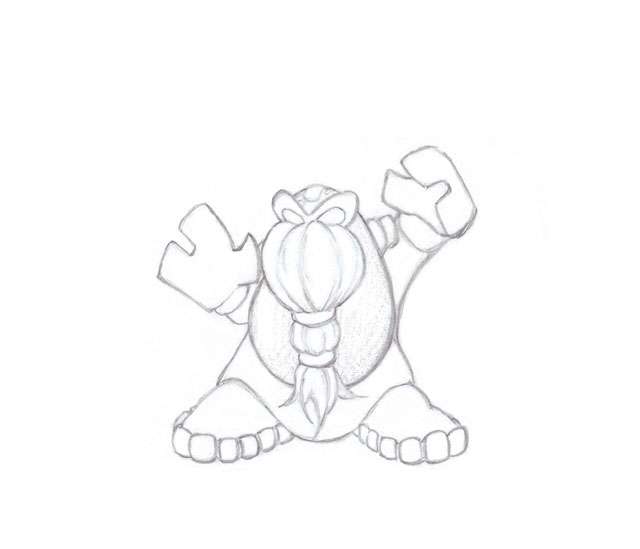
Anyway, my first "reject" is what I call the "Gnome". I wanted to do something reminiscent of my Dungeons & Dragons days -- a gnome or dwarf. But, I didn't want to do it "on the nose". I just wanted it to be vaguely inspired by those character classes. Unfortunately, as I morphed the design to not look like too much like a human figure -- the whole design kinda... "lost direction".
(Click the link or thumbnail for the full sketch)
 http://img142.imageshack.us/img142/8801/gnomelarge.jpg
The key elements in the design are an overall gnome/dwarf stature, a nifty "beard", a rocky/ground-ish main body, squarish hands to be used like spades for digging and moving dirt. The end result is still moderately interesting to me, but not worth continuing to develop.
--------------------------
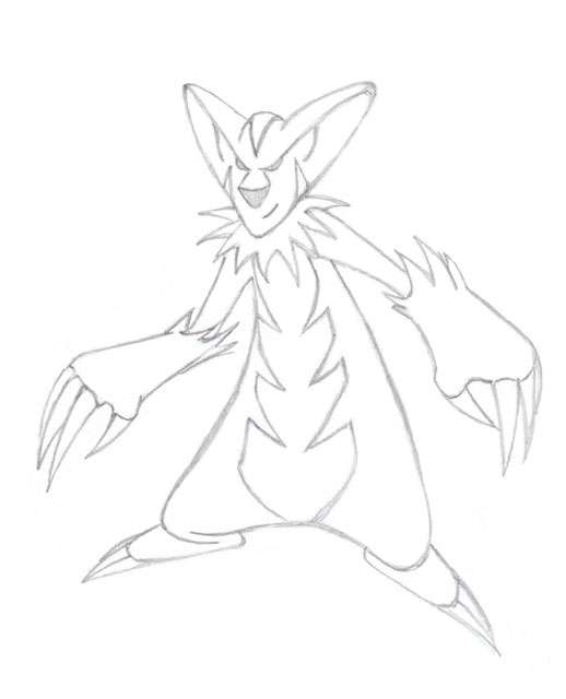
The next sketch I made was loosely based on pictures of badgers. I wanted to do something with really long claws, that could be used for digging. The fur pattern on badgers look very "dark" to me, so that was the feel I wanted to get with the body patterns. I didn't want to do a straight animal design, so I tried to "cartoon it up" quite a bit. Unfortunately, I ended up with something that is a little too cartoony.
(Click the link or thumbnail for the full sketch)
 http://img260.imageshack.us/img260/7789/badgerlarge.jpg
The design is too anthro (it looks too much like a person) to evoke a real animal feel, and it ended up looking like a person wearing a costume. My kids thought it was a clown. Gotta love honest opinions from kids! On top of that, there are a million other digging animal designs, so I completely lost interest in my "badger" design.
------------
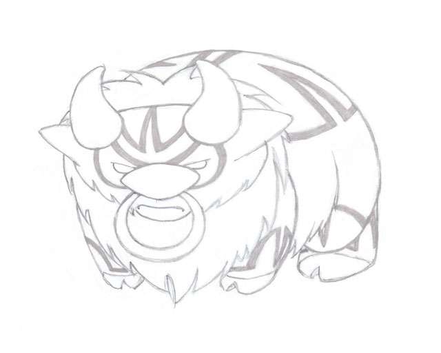
Which brings me to the design I like the most so far. It is based on a buffalo. I was thinking more about Dark typing in this case, and wanted to do a buffalo with a tribal look. I was thinking of a buffalo that is pissed off about the mass extermination of the species in North America. And with tribal patterns, I draw on the general mistreatment of Native Americans overall; Native American culture is deeply intertwined with buffalo. This is a tribal beast with revenge on its mind.
I think of buffalo with a fair amount of "ground-ness" anyway -- thundering hooves making the earth shake, herds running in big clouds of dust, etc. The color scheme I have in mind should bring out some more of the ground side too. But the primary type for our pokemon is Dark, and I want this design to be dark too.
The biggest risk with this design, is that I made a big, imposing pokemon. After seeing several people's idea for stat spreads, I'm predicting we get a really big HP stat on this pokemon. I don't expect the Def and SpDef to be huge, but the HP could be. Think Hariyama-esque defensive stats. If that happens, then this design works really well. If not, well then I may go in another direction...
That's what I have so far. As always, comments and criticism is welcome.