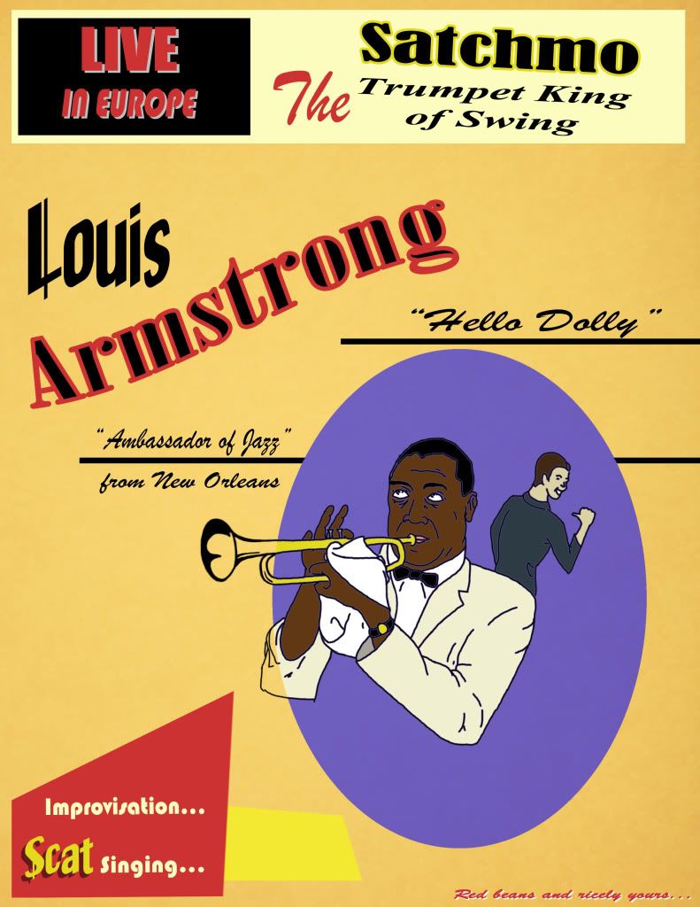
Nice Tsukasa, but I think the use of the blue outline makes it look odd when surrounding "darker" bits: e.g. the face, hair and bowtie. Maybe it'd look better with a blacker outline, or maybe a brownish outline, or maybe in black and white. Also I think the colouring would be cooler if it stretched outside the oval, instead of only being coloured within the lines. Your call thought, and the positioning and typography looks great :)