-
Follow our Instagram!
-
Welcome to Smeargle's Studio! Please be sure to review the studio rules. Feel also free to check out our hub to learn more about this place!Welcome to Smogon! Take a moment to read the Introduction to Smogon for a run-down on everything Smogon, and make sure you take some time to read the global rules.You are using an out of date browser. It may not display this or other websites correctly.
You should upgrade or use an alternative browser.nj art
- Thread starter Nastyjungle
- Start date
ヽ(●´∀`●)ノ
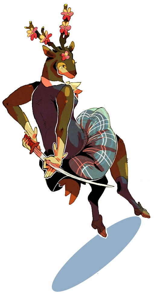 That sawsbuck could be a soul calibur character. You're awesome.
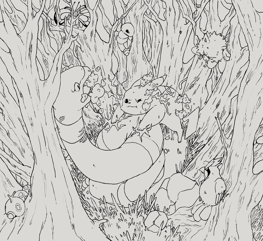
ahaha i started drawing an ekans and got carried away
ill color it later and probably change a few things i think are lazy, hopefully it will look less busy once there is colorThe above piece is shaping up to be a Smog-cover-worthy artwork.
I tip my hat to you sir.
A luvdisc long overdue.I now understand why there can be so many 'mons in one patch of grass. I love the details, the poison spewing out of Ekan's mouth, and the pokemon treasure hunt that comes as a bonus.
Fix'd.I tip my hat to you miss.Aaah this is really wonderful! So ambitious! I love how much detail you can put in without it looking forced (something I struggle with so I really notice when someone does it well!)
A couple critique points for you if you'd like:
It's not clear if Pikachu is holding on to Ekans or launching into an attack. I think the reason for this ambiguity is the position of his arms and body. His far arm is lined up to make sense with the position of his back, where his near arm is lined up to make sense with the position of his stomach, but there's a disconnect there. If he were holding onto Ekans I think you would see his body connecting from his neck to his stomach, where as here you have his stomach disappearing behind Ekans' body.
I also think that the nearest tree could be a little larger based on the perspective.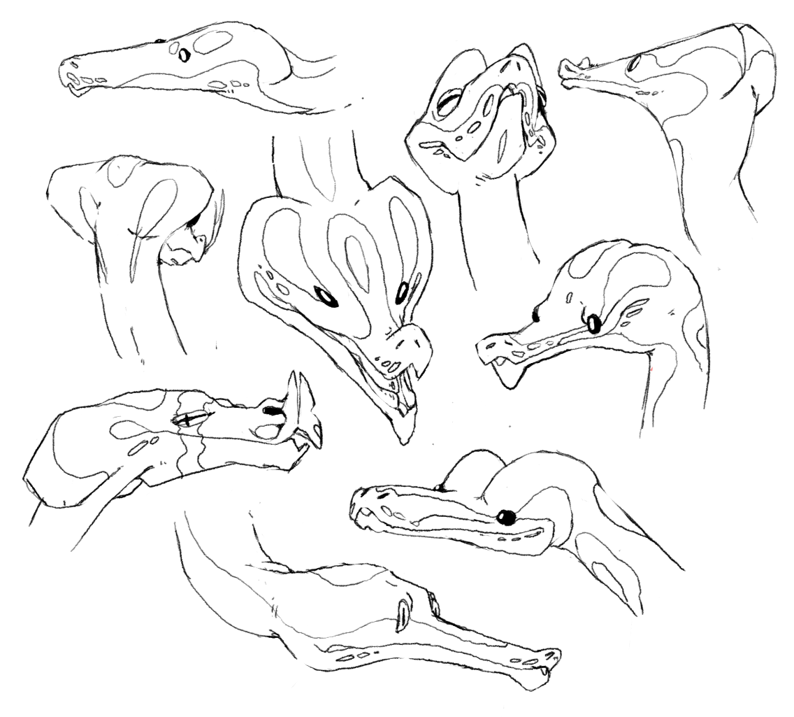
hissy faceslike a million sketches or wips from my tumblr i havent bothered posting
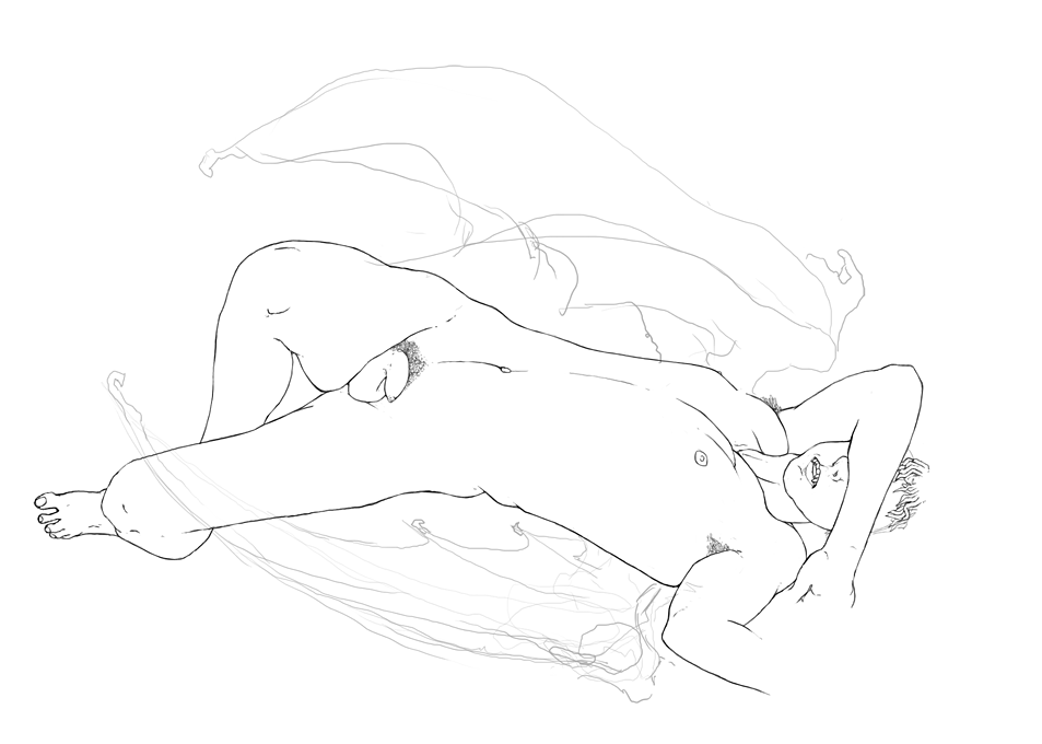
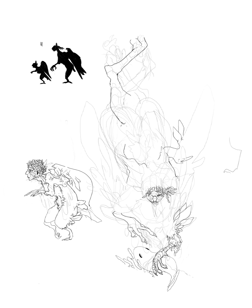
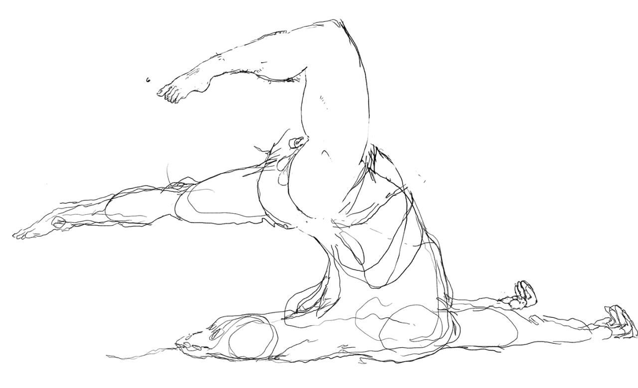
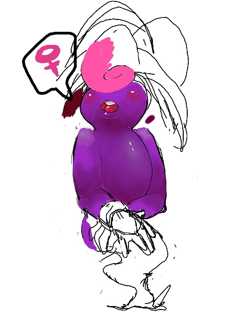
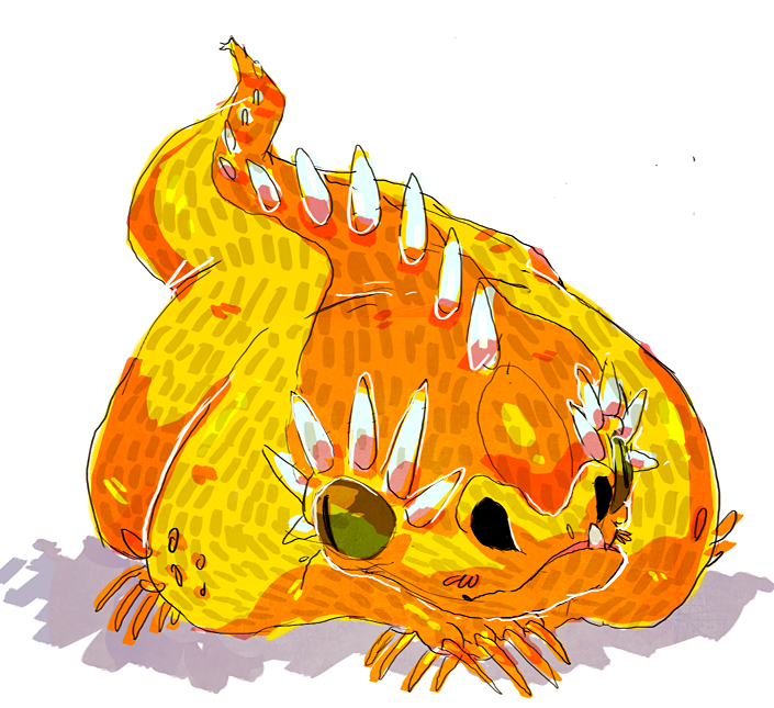
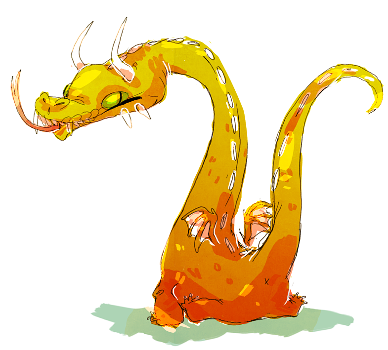
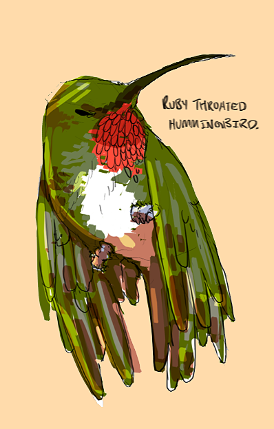
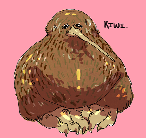
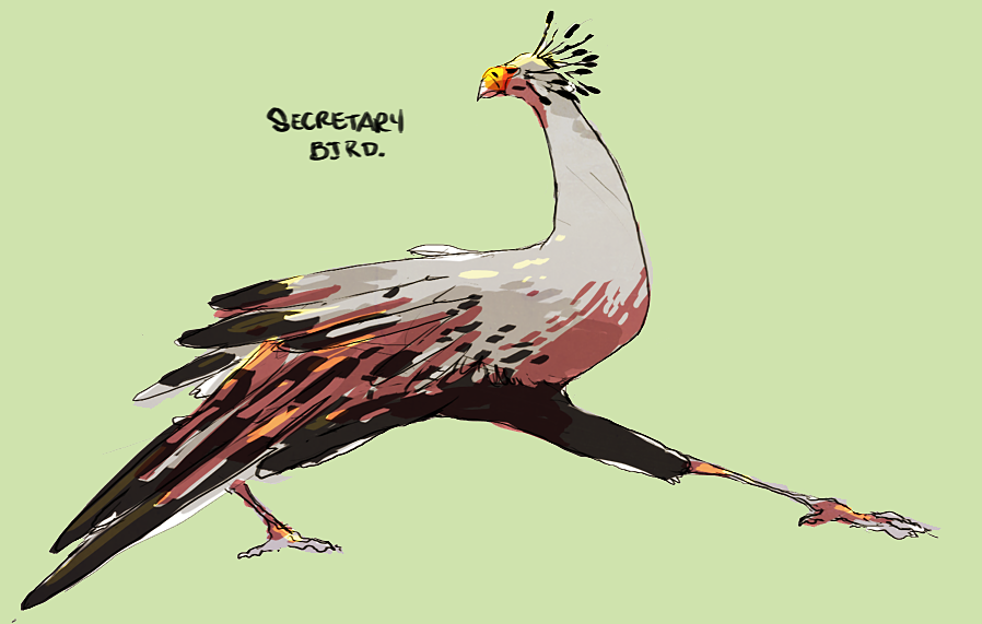
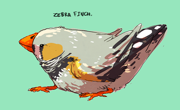
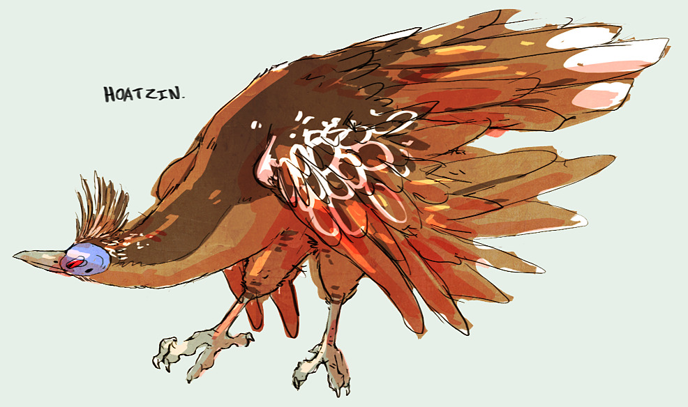
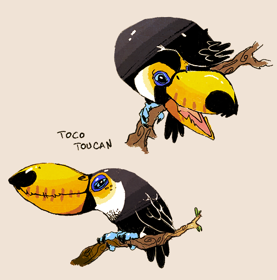
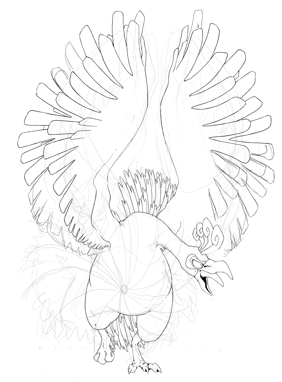
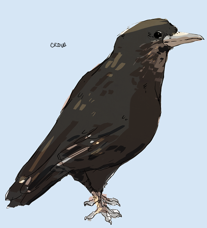
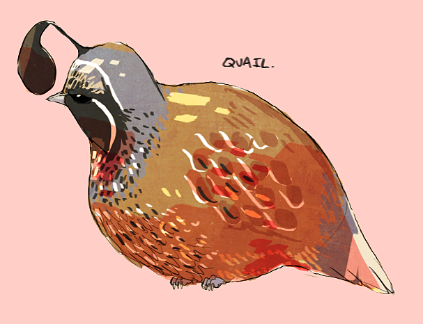 Go to the doctor, you're sick. #cornyI really like the dashed style you're using at the moment, its very unique to you and works fantastically well.
However you've got to be careful not too overuse it; A good example of this is the Kiwi drawing, its a really good sketch underneath - I can tell that much - but you've put so many lines over the top of the base colour it's begun to look tacky: As a rule I'd try and restrict the amount you apply to areas like the face which should be strong focal points. The same can be said for the fat lizard drawing, the effect has been overused to the point where it almost looks like you've spammed a texture.
On the other hand the colour theory is lovely. I'd really like to know how you build up the effect, go about choosing your colours etc. I know I've just slated a couple of your bird drawings but some of them are real standouts. The secretary bird, humming bird and Hoatzin in particular.
Also that Ho - Oh sketch is just wow, that might be one of my favourite lineart sketches I've ever seen. Especially those feet, perfect.
Looking forward to a lot more.holy shit that ho-oh wowowowowdemocratically elected to be the princess of the newly formed fat kingdom, marceline and princess bubblegum opt to help fionna fit the role

still trying to nail down a color scheme but here is the lineart for my concept for capstill trying to nail down a color scheme but here is the lineart for my concept for cap
mayyyy i suggesstttttt
http://design-seeds.com/I wanted to make a mon that was dark by concept rather than by design, so I wanted to avoid black and grey colors and evil looks. I also wanted to draw my concepts from biblical and mythological history.

My main dark type inspiration was the story from the bible of the false idol made for the Israelites by Aaron which took the image of a golden calf (called the sin of the calf). I equated sin and false idols with the opposite of god, aka "evilness" or "darkness".
Images of the golden calf: 1 2 3 4
As can be seen from a couple of those photographs, often times cows were worshipped and adorned with laurels and flowers, which is where I drew the imagery for a grass type.
Images of cows wearing fauna: 1 2 3 4
I chose to make the bull stand upright, akin to the minotaur, the evil half bull man of Greek mythology. I also gave it a pattern reminiscent of a tree, specifically referencing the original sin that occured at the tree of knowledge of good and evil.
yaycool concept, I like how you tied in so many different references. also like your trademark faded/grainy style and thin line art. One very small hting I noticed is the tree-line/limb on the bull/minotaur's outstretched arm. shouldn't it be positioned slightly higher to match the position on the other arm? Or is it more along the lines of clothing, where it is more loose fitting? Again, this is VERY small and nitpicky but overall I really like your art Nastyjungle! (I'm actually trying to copy some of your style in the piece I'm working on) but yea, keep working hard and you'll get even better <3


