I somehow managed, with some excellent advice from TVBoyCanti, to get from this:
to this:


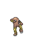
Your Raikou was coming along quite well, but it really wasn't finished yet. I finished it for you here (use this if you like, don't give me credit). Edit: Still very good for a first time pixel over!
The crest was still mishaped in a way that it looked like ears. Fixed the far "ear" so that it looked more like the reference art. As for the right ear, its still too long but it was taking me too long to fix it so I left it.
The stripes were left with that pink outline, so I got rid of that. Added highlights where they were needed on the body and the clouds. They really are important for adding depth.
I also made the legs in the background darker to add depth to the sprite. Objects in the back ground should be a darker color than objects in the foreground to show that they are on a different depth plane. It helps give a sprite that "pop" that keeps it from looking 2D.
Ramped up the contrast on the face mask. Added shading to the head balls. Also added dithering to the cheeks, they were looking really gradienty. Finally, I added a highlight to the eye and desaturated the iris colors, which really adds life to the eyes.
Wichu, if you use this sprite, make sure you credit LR and not me.