
-
Follow our Instagram!
-
Welcome to Smeargle's Studio! Please be sure to review the studio rules. Feel also free to check out our hub to learn more about this place!Welcome to Smogon! Take a moment to read the Introduction to Smogon for a run-down on everything Smogon, and make sure you take some time to read the global rules.You are using an out of date browser. It may not display this or other websites correctly.
You should upgrade or use an alternative browser.The Smog needs your help!
- Thread starter TAY
- Start date
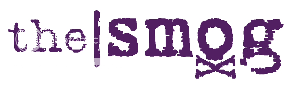
Letters. I personally like the trendy layout paired with the grungy font. Critiques on color and use of capitalization as well as feedback about your general impressions are appreciated.
Not a fan of the font itself, but I do like the idea behind it. My exams are finished, and I've tried to improve my design as much as possible.
New font (purple to match Koffing as well as Alakazam), more 'psychic power' on the spoons (and yes, I got my inspiration from AB's design), improved (probably) shading detail on the head and body, altered light sources, and I'm planning to add something on the back, like a smog cloud or a simple oval, to cancel out the annoying gaps in the slogan (which look out of place next to Alakazam). However, the method with which I uploaded the design was buggy and so this picture is just slightly blurred/altered from the one on my PC.
Hope you like it.
Also, is there a set of dimensions we can get, so as to see how our designs looks when scaled down?My exams are finished, and I've tried to improve my design as much as possible.
New font (purple to match Koffing as well as Alakazam), more 'psychic power' on the spoons (and yes, I got my inspiration from AB's design), improved (probably) shading detail on the head and body, altered light sources, and I'm planning to add something on the back, like a smog cloud or a simple oval, to cancel out the annoying gaps in the slogan (which look out of place next to Alakazam). However, the method with which I uploaded the design was buggy and so this picture is just slightly blurred/altered from the one on my PC.
Hope you like it.
Also, is there a set of dimensions we can get, so as to see how our designs looks when scaled down?
His left foot looks way to big compared to his other foot. o.O
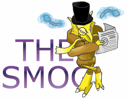
Okay, I think it's the day before I have to submit my design, so I guess I'd better post my finalised (hopefully) design here for you to critique, and possibly edit out minor flaws. And yes, I know I'm not going to win anyway, but this has been a fun project, and I want to make this look as good as possible.

Aside from the orange smoke and my going back to my old (and, I have to say, far 'funkier') font, I enlarged Alakazam's right foot a tad as well as enlarging, improving the shading and adding some claws on his hands. I don't know why dots keep appearing on his shoulder, but I'll try to make it go away before my final submission.I don't know why dots keep appearing on his shoulder
Because you're saving it as a .gif. If you get rid of the dots and then save as a .png, it will work.
This is awesome except for the Scizor. Try using Arbok or Seviper or Rayquaza lol
Prototype, I decided to use the most used pokemon for each letter, except O, in which both pokemon are UU, and Gengar, because I don't know how I'd make gengar into a G =/Wow, Headpunch, that is perfect. The capitalization and coloring are fine as is. That is very professional, I love it.
I love this one, dude. It looks great, and it's very versatile. I mean, the magazine IS names after Koffing's signature(?) attack, but like this you can put any Pokemon behind it. I think it's really succinct and well designed. You could even switch up the colors for each issue, depending on how you wanted the title to contrast/compliment the cover image.
Does anybody know how we 'submit' these concepts? Do we just make a Final submission, like in CAP?I love this one, dude. It looks great, and it's very versatile. I mean, the magazine IS names after Koffing's signature(?) attack, but like this you can put any Pokemon behind it. I think it's really succinct and well designed. You could even switch up the colors for each issue, depending on how you wanted the title to contrast/compliment the cover image.
Thanks :)
I guess the fact I didn't incorporate any 'mons into it dosen't really make it stand out as a Pokemon mag logo though :)
Since I'm going on holiday (with no internet access) for the next two weeks, I guess it would be a good idea to post my (tentative) Final Submission now.

Bigger Size: http://s485.photobucket.com/albums/rr217/bugmaniacbob/?action=view¤t=SmogF.png
Well, that's that. Now for some relaxation.Ok, this is my last try for this. I decided to stop with the Koffings and pokemon styled logos and started doing something more simple. So, I have 2 ideas. The first is the original, the second is a different version of the original.

This is just a simple, professional-looking logo. It gets straight to the point, nothing huge, but yet it is still effective.

I kinda liked how this turned out. The sort of wispy/smoggy look added a little "spice" to the letters.
So, I don't know if anyone likes any of these. The original is just a plain, simple logo, while the other version is more eye-catching and creative. If anyone has suggestions to make it better, I'm always ready for 'em. Since I'm going on holiday (with no internet access) for the next two weeks, I guess it would be a good idea to post my (tentative) Final Submission now.
Bigger Size: http://s485.photobucket.com/albums/rr217/bugmaniacbob/?action=view¤t=SmogF.png
Well, that's that. Now for some relaxation.
In my opinion this is the best one so far.
I really like the Alakazam reading while sitting on the letter G attempt.
it doesn't need a monocle and hat though in my opinionI like the concept there, but I find it rather hard to read. To someone just passing by that would not stick out to them.
That's an awesome idea. The fourth pokeball (purple & black) looks the best to me. But I'm not sure if people will be able to tell that it says The Smog, because we already know that the name is The Smog so we know what it says. Maybe you could try making the letters more visible? Like an outline or darker colouring?Really liking the design latinoheat, but a thicker border would look better IMO >>latinoheat- I must agree that the design is cool, but in my opinion it belongs more on a t-shirt than a webzine cover for two reasons:
1.) It makes a picture. A fairly complex and creative design such as this would be considered more as 'art' than 'title/banner' material. It is my belief that the best logos have text that is horizontally aligned, easy to read, and whose personality is carried in the font and layout. (Perfect example- Rolling Stone magazine)
2.) Since the pokeball design is centrally focused, off-centered placements would be distracting. I have never seen a magazine place their title/logo on the center of the page.
bugmaniacbob- cute concept, but if you really wanted to pull it off, you should have spent more time and attention while drawing that Alakazam. If you don't feel like redrawing + coloring it, then all I can say is choose a font that looks less comical and fill it with something that isn't a grainy metallic gradient.
GenghisTron- if I didn't have a submission here, I would definitely vote yours. You understand the concept of magazine titles and have produced one with great originality and personality.


