Hey, just wondering, what's the difference between this thread and the art for articles thread or the artwork for tournaments thread? Shouldn't some sort of merger take place to avoid unnecessary confusion and reduce clutter?

-
Follow our Instagram!
-
Welcome to Smeargle's Studio! Please be sure to review the studio rules. Feel also free to check out our hub to learn more about this place!Welcome to Smogon! Take a moment to read the Introduction to Smogon for a run-down on everything Smogon, and make sure you take some time to read the global rules.You are using an out of date browser. It may not display this or other websites correctly.
You should upgrade or use an alternative browser.★ The Workshop
- Thread starter Kaiju Bunny
- Start date
From what I understand, Art for Articles is for onsite articles that have been written mostly about battling strategy. Art for Tournaments is for actual tournaments that are happening. This is for anything that falls in the cracks, such as Threads in the battling forums that need art. Should there be a merger? I don't know, but I do think the separation helps, just due to the sheer number of things that need illustration.Hey, just wondering, what's the difference between this thread and the art for articles thread or the artwork for tournaments thread? Shouldn't some sort of merger take place to avoid unnecessary confusion and reduce clutter?frenzyplant
I like it! Could you possibly flip them though, so that the weak one is white and the strong one is a dark tint. Also, can you remove the words please o3o, I have a font in mind already that I'll add myself n_n. Ty :). Darn, looks like I was beaten to this, but this one's for you, Cobalt314 <3. It's grasswhistle evolving into sleep powder and then spore.

Here's another version, without the skewed wording.
Edit: I might've made this too big, I can shrink it down if you want, ehhe.Last edited:
It looks great! Thanks! I'll use this for now, but a shrunken-down version is much appreciated (I would shrink it down myself, but my Photoshop trial expired and I'm broke :P)Darn, looks like I was beaten to this, but this one's for you, Cobalt314 <3. It's grasswhistle evolving into sleep powder and then spore.
Here's another version, without the skewed wording.
Edit: I might've made this too big, I can shrink it down if you want, ehhe.Orright, here's a smaller version~. Hopefully this fits better; else, I'll check back when I wake up ^w^
 Much better. Thanks, Otter Power!
 Hey, just wondering, what's the difference between this thread and the art for articles thread or the artwork for tournaments thread? Shouldn't some sort of merger take place to avoid unnecessary confusion and reduce clutter?
To add on to what Andew said:
- You do not need to be an approved artist or have an art badge to contribute to this, this is open for everyone!
- In the other thread, Artwork for Tournaments, we generally allow plenty of users to submit their work since it's possible to use multiple images during the course of the tour. But in the case of this thread, only one image ends up being used, which means that all of the submitted images compete for the same slot
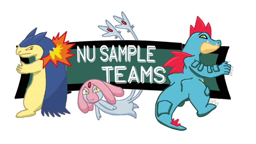
Those are the main differences between the Articles and Tournaments thread and this thread (besides the fact that this is mainly for threads), which make it kinda hard to merge. If possible, can someone do an artwork for the 'NU Sample Teams' thread? It isn't posted yet, but I felt like an artwork could be nice to have :). Something with Feraligatr, Mesprit, and Typhlosion with NU Sample Teams on it
Thanks!
edit: Thanks Typhlito :)Last edited:

Looking sharp! But one rule of thumb I often go by is: If the picture is very simple/flat, then adding special effects to the text to make it more 3D is rarely a good option, as it won't fit too well with the rest of the image. If anything, the reverse of more applicable, where the picture can be highly shaded while the text is only of a single color. The black rectangle also doesn't sync too well with their heads, although it's not as urgent to fix. But if you'd like to improve it, ditch the rectangle altogether and instead try to incorporate the text inbetween them better. You could even skip Mesprit's tails so that you can stack the words on top of each other, rather than trying to squeeze them all in on one line.
I usually drop by dafont.com whenever I find that none of my fonts fit the picture perfectly, so if you feel the same, I encourage you to do that as well.
got a sketch of it going. should be able to get it to you in a few days :]If possible, can someone do an artwork for the 'NU Sample Teams' thread? It isn't posted yet, but I felt like an artwork could be nice to have :). Something with Feraligatr, Mesprit, and Typhlosion with NU Sample Teams on it
Thanks! hi!
hi!
I'd like to make a request for a banner for the UU Viability thread. It's an integral part of the UU subforum and is one of our most active threads. Recently, the ownership of the thread changed hands to me, along with a couple of other people, and I'd really like to make it look nice @_@.
As far as design goes, the text "UU Viability Thread" should be the main focus. It should be graphically pleasing above all - it doesn't even necessarily have to have Pokemon on it. If you would like to have a couple of relevant Pokemon to decorate the banner, though, I'd caution against using anything below A- rank or in S rank, as its liable to be banned or isn't all too relevant to the tier.
Thanks so much!
EDIT: Fluze3 is working on this :DLast edited:Need a piece of art for "Don't use that, use This!" Ubers edition. Not sure how it really would turn out, but I trust you artists!
Thanks in advance.
I'm gonna have to ask you provide an example of a bad set and a good set, preferrable something where both serve the same function.Need a piece of art for "Don't use that, use This!" Ubers edition. Not sure how it really would turn out, but I trust you artists!
Thanks in advance.EDIT: Ignore my request. My bad.
EDIT 2: Nvm, someone is eager to do this ^.^Last edited: Hey, i would like to request a new logo for the OU viability ranking thread, as the amazing one that adeadnunboy made is outdated, because it featured Aegislash, which is now banned.
And it would be nice if Pokemon in the logo are from S and A rank, to represent the best Pokemon in OU.Hey, i would like to request a new logo for the OU viability ranking thread, as the amazing one that adeadnunboy made is outdated, because it featured Aegislash, which is now banned.
And it would be nice if Pokemon in the logo are from S and A rank, to represent the best Pokemon in OU.
I've got two ideas for this~ I'm gonna have a Rotom-W, and the centre either has a viability wheel Like the aegislash design:

Or a dice, kinda like a magic 8-ball (might change size and add bubbles if we go with this).

Whichever one you like better, I'll start working on it :3 I ended up moving Regime's art for STABmons to the main thread, so I need a cool banner for the Viability Ranking. The current art is... well it was created by me so I can say it stinks. I also changed the ranking categories to the standard S, A, B, etc and the Greek letters are now outdated. Here's what I would like to see:
- Diggersby should be the main attraction. I think it would be cool to have one using its ears to push other Normal-types like Ursaring and Stoutland down since it gives them competition.
- If there is room, I would love to see a prominent Steel-type like Skarmory or Heatran holding an Aegislash, though I understand that might be difficult without arms. You're the artist, you figure it out! :D
The first idea seems great, go with it!I've got two ideas for this~ I'm gonna have a Rotom-W, and the centre either has a viability wheel Like the aegislash design:
Or a dice, kinda like a magic 8-ball (might change size and add bubbles if we go with this).
Whichever one you like better, I'll start working on it :3