A bunch of FRLG's sprites are like

I'm just
I'm just standing here
I'm just
I'm just standing here

A bunch of FRLG's sprites are like
I'm just
I'm just standing here

stuff like this makes me wish there was a "nauseous" reaction on hereI just found out about this hideous front sprite that Garchomp had during Platinum's development
View attachment 208482
It's not. You can even check out all the sprites for Kricketune here: www.pokestadium.com/tools/spritesThat's definitely a different sprite having a different pose.
I just found out about this hideous front sprite that Garchomp had during Platinum's development
View attachment 208482
Ever since the prototype sprites for gen 1 were leaked, and we had the helix chamber people try to figure out what they might've looked like from the front, I think it's kind of a fun exercise to think about if we ignore that we KNOW what they look like, how close would we ever get?Mamoswine's back sprite in Gen 4 suuucks.
View attachment 207005
Notice how Mamoswine's main defining feature, its tusks, are totally missing and now it's just a brown blob. Its nose is missing as well.

Archeops and it’s 3D sprite,it looks like it’s trying so hard to fly but failsView attachment 210885


I don't see any images.will add more later.looks squished.
looks even more squished than Ivysaur.
What is with your nose?
What is with your mouth?
What is with your eyes?
just looks dead inside.
It's literally just a bird.
Again, what is with your mouth?
Now you don't even have a mouth???
doesn't have a properly defined head.
needs to hit the gym. And I mean an actual gym, not a Pokemon League Gym.
Something about the eyes just unnerves me.
SELF-EXPLANATORY.
Not as bad as the Blue sprite, but it just looks derpy.
Perspective has always been a problem for Vileplume sprites, especially in the earlier gens.
Where is your head???
just looks bad.
looks dead inside.
Mostly fine, but they fucked up the spiral pattern on its stomach.
Where are your eyes?
One arm is bigger than the other, and the expression is just stupid.
looks even stupider.
AAAAAAAAAAAAAAAAHHHHHHHHHHHH!!!!!
Its tentacles are too short.
has no mouth.
has a stupid looking face.
it's... it's just standing there.
wtf
what is with gen 1 sprites and dead-looking eyes?
just a big ball of gas with a face.
Looks fat for some reason.
AAAAAAAAAAAAAAAHHHHHHHHHHHHHHHH!!!!!!
looks like a plush toy.
Enough people have memed this already, I think you get the point.
durrrr...
One of the first sprites designed, and it shows.
just looks poorly drawn.
The parent is fine, but the kid has problems.
The origin of a racist controversy.
Pinsir got it the worst with the Gen 1 eyes.
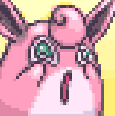
Vaporeon notably uses an old design for its sprite. No wonder this was changed.
The placement of the eyes is the biggest issue with this sprite.
Zapdos looks fine, but the other two birds look awful.
Seriously, what is with these eyes???
SELF-EXPLANATORY.


