Alright, I'm absolutely sick of everyone wanting Mega Aerodactyl to be replaced, because I've been hoping with all my heart every single time that it's NOT GOING TO HAPPEN. Everyone has their opinions on how the sprite SHOULD look, and I highly doubt anyone has even taken a second to consider exactly how difficult an animation it would be.
Let's take a look at this here.
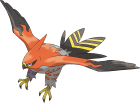
Notice how the wings move. See how complicated that motion is? It requires THREE DIFFERENT SPRITES FOR THE WINGS in order to make the motion work. In case you couldn't tell, let's look at the same thing at one fifth of the speed.
What does this mean? It means that if we scratch sprite a new Mega Aerodactyl, it will require scratch spriting TWO EXTRA PAIRS OF WINGS. And that's a task that's certainly easier said than done. Making sure that they fit together to make a nice, smooth animation would be difficult beyond belief, and a bunch of sharp claws sticking out from them sure isn't going to make it any easier.
The current Mega Aerodactyl sprite is a simple pixel over of the original, with the only changes to the wings being that they're somewhat sharper (more shaped like a hang glider) and they have their signature spikes added on. Drastically altering the pose is a great way to waste a whole lot of time trying to get the wing animation to work when it can be several times easier just by adding the changes to the extra frames of the old sprite's wings. It sure won't be easy, but it'll still be a massive step down in terms of difficulty. After all, we're lucky that Aerodactyl goes through minimal changes after Mega-Evolving. Failing to use that advantage when working with what could end up being one of the most frustrating animations makes absolutely zero sense.
I'll admit that Mega Aerodactyl's increase in size is actually a claim worth noting, but considering what a poor job sprites do of showing scale (lots of Pokémon that are supposedly the same height are at noticably different sizes, Joltik wouldn't be any bigger than a speck), I think that it's really not worth the trouble.
So basically, I'd really appreciate if everyone would shut up about changing Mega Aerodactyl, because every time that happens I get scared that it will actually be changed and this already nightmarish animation job will needlessly become about twenty times more difficult. On a similar note, to whoever ends up animating Noivern, I sincerely wish you good luck, because it's not going to be an easy job.
On a completely unrelated note,
princessofmusic, what you described about animating Mega Ampharos's hair is what I originally planned before deciding that doing so would be the "lazy way". In other words, it's totally doable and not that difficult. However, I doubt it'll be an improvement, and it'll certainly be a while before I get the chance to work on it. Sorry in advance for whatever delays end up occurring.
Also, the key ring on Klefki looking deformed is just the perspective changing as it sways left to right. I think it'll look less like a deformation if it's more extreme, or you could potentially remove that entirely (seems like a less good solution though).
EDIT:
For instance, compare the changes between Mega Garchomp and Regular Garchomp. Due to the lack of silhouette change, it's a fairly lackluster Mega Evolution transition, and it just doesn't feel as epic as say Mega Manectric/Alakazam/Scizor. Some pokémon like Absol can get away with it for this reason as well, as their silhouette changes are drastic enough to feel like a new Pokémon I feel personally that the sprite edits are a nice stop-gap for the time being, but I do feel they need to be completely scratched/reposed/whatever eventually, most likely after everything else has been done and the project is wrapping up.
I plan on making Mega Garchomp more distinct when I get the chance, the pose should definitely be more
firm and
upright. But that's low priority. Also, the current pose (as shown in the screenshots) is MUCH better than the pose in the official artwork, that one is just kinda goofy and weird.
Mega Lucario also strikes me as totally fine as it is, there are literally no structural changes and the pose works completely fine.