OK, it's time for an intervention.

We have to work fast before his drug addiction causes permanent damage to his body
It's funny because coming into this project, I saw Dragalgae's pre-release screenshot and thought, "Boy, I sure feel sorry for the poor sap who has to sprite out Methdra over there." And here I am, fresh from the maple.
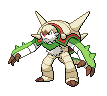
Alright, so before we have another Noivern on our hands, let's get some of the proportions talk out of the way now, before I add shading and make it harder to correct at a later date. This here is the current WIP of Dragalgae I threw together in around three hours. It's proportions are based primarily on in-game screenshots such as this one, with some ideas of depth and width integrated from the official art. Mainly just tossing this out for two reasons: one, to see if everyone is cool with the current proportions before I move on to shading; two, to show what I've been working on for the past day. This morning, however, I decided to break from this beasty to work on some of my other more metallic friends.


So hoipefully this fixes the orientation issue. Re-oriented the head quite a bit in order to make more of the side show with a few minor touch-ups around it. New one is the one on the left, old is on the right for comparison. I'd like to know if I'm on the right track here or not, or hey, even if it looks good enough to progress on. But yeah, I have more steel to come. i'm going to burn in hell for that pun


So hey, I tinkered with the swords some more. I think the one on the left (relative to us in both cases) should still have some slight angling to it, as without the angling, it just looks kinda flat, and not like its facing the opponent. Each of the two sets has slight differences, although currently I'm partial to using the left column. Bottom left's sword is slightly wider on right blade and left blade has a less obvious angling on the interior as well as a clearer tip. Top left looks more angled to the opponent, as previously mentioned. Tips on these would be appreciated.
PoM's original edits:


Sláinte.

It's funny because coming into this project, I saw Dragalgae's pre-release screenshot and thought, "Boy, I sure feel sorry for the poor sap who has to sprite out Methdra over there." And here I am, fresh from the maple.
Alright, so before we have another Noivern on our hands, let's get some of the proportions talk out of the way now, before I add shading and make it harder to correct at a later date. This here is the current WIP of Dragalgae I threw together in around three hours. It's proportions are based primarily on in-game screenshots such as this one, with some ideas of depth and width integrated from the official art. Mainly just tossing this out for two reasons: one, to see if everyone is cool with the current proportions before I move on to shading; two, to show what I've been working on for the past day. This morning, however, I decided to break from this beasty to work on some of my other more metallic friends.


So hoipefully this fixes the orientation issue. Re-oriented the head quite a bit in order to make more of the side show with a few minor touch-ups around it. New one is the one on the left, old is on the right for comparison. I'd like to know if I'm on the right track here or not, or hey, even if it looks good enough to progress on. But yeah, I have more steel to come. i'm going to burn in hell for that pun


So hey, I tinkered with the swords some more. I think the one on the left (relative to us in both cases) should still have some slight angling to it, as without the angling, it just looks kinda flat, and not like its facing the opponent. Each of the two sets has slight differences, although currently I'm partial to using the left column. Bottom left's sword is slightly wider on right blade and left blade has a less obvious angling on the interior as well as a clearer tip. Top left looks more angled to the opponent, as previously mentioned. Tips on these would be appreciated.
PoM's original edits:
Sláinte.