Yilx: I absolutely love the Bleeding Heart Vampire. It really embodies the Dark aspect, and it definitely looks like a Grass Pokémon, too! When you posted the colored version, I was like "this is what I will vote for". He really shows off the Dark and Grass types simultaneously, without seeming too Ghost-like. It's a great mix of the two, and definitely will be one of the top contenders. However, I don't like the Cactus Flower Demon as much simply because of Cacturne. The Cactus Flower really seems nice, but I am just too prejudiced against having another Cactus by how horrible Cacturne is.
Quanyails: I like your Pokémon because it's fairly original; not many Pokémon have huge fucking blades of doom! I mean, that's pretty awesome. The only problem is, it doesn't really seem like something that would exist in the Pokémon world. It also doesn't look like it's even capable of moving, which is usually a problem for survival (except for photosynthesis, in which case it wouldn't have needed to evolve blades or eyes and it wouldn't be Dark type or even a Pokémon, it would just be a tree).
Mos-Quitoxe: I love it. I simply love it. Wario's favorite food is Garlic; now he is one. It's perfect. Definitely Grass in the garlic and Dark in the Wario, it's the perfect fusion.
Birkal: This is hilarious, but it also fits the idea. It's great, it looks awesome, and it seems like it would be a good Pokémon, too!
Menshay: It looks pretty cool, and very original, but it doesn't seem very Dark. You'd definitely need to choose a color scheme which furthers the Dark aspect; red doesn't do anything for the Dark typing. However, it's a pretty good concept.
pkmn-taicho321: As for your first idea, it looks a bit odd, but I suppose that's normal in the Pokémon world. Anyways, the head looks a bit too large for it to even support its own weight, especially with those spindly legs. It would need a bit of a bulk-redistribution, and more added to the Dark part of it, but it isn't half bad. Of the following three ideas, the ManDrake is the one I like the most. It doesn't seem particularly Dark yet, but that is because it looks like a small child who has fallen over and is crying. Regardless, none of them are bad, except the cactus, and that's only because they are WAY too overdone.
elcheeso: Your Grass/Dark ram really looks great, but the Ankh could offend people (lol Monster Reborn). Just kidding, it really is nice, but it seems too realistic. It needs to be pokemon-ified before the final submission. It does fit both types though, and it seems like a fun Pokémon to use with Cotton Guard, which would be useful to stop the Fighting-types which it naturally is weak to. I really like this concept, and I can't wait to see a Pokémon-ified version.
paintseagull: It looks pretty cool! You definitely need to "pokemon-ify" it, but I'm sure it will turn out nicely. I got more the idea of a wolf-lizard from it, but then I have no clue what a binturong is. While it is black, I'm not sure it looks "Dark" enough, but my standards for Dark-ness are pretty high, so you can probably ignore this entire sentence.
Dracoyoshi8: I like the Adam and Eve idea, but the problem is that we already have too many snakes, including some Grass ones (namely Serperior). It's a good concept, but I just feel it has been done to death. Kind of like birds. But then you made Mariguana. And then I laughed extremely hard. Mariguana is perfect, it just needs to be finished (I see those sketch-marks) and pokemon-ified and it will have my vote all the way for the sheer hilarity behind its creation.
Chomz: I like the idea of the deer-thing with cursed wooden armor, but the only problem is that we just got a new grass-deer in Generation 5 and I don't think we need another one. As for the little jungle critter, it needs bigger eyes and more Grass-y features (which would probably be solved with a green coloring). I like the idea though!
Arkeis: The Tiki monster would be nice, but it needs to seem Darker. It is obviously Grass, but the Dark aspect would need to be accentuated somehow, yet without making it seem Ghost-like. As for the Tanuki, it is pretty neat, but I feel the hands are too human-like and the idea of mischievous woodland creatures has been done many times. It does fit the idea though.
zyrefredrid: It's not a bad idea, but it fits a Grass/Fire idea better than Grass/Dark. I see where you're coming from, but dark coloring does not make a Dark typing. That's the only problem with it.
Orivexes: Oh gosh, the Picklebear is hilarious! Unfortunately, it doesn't seem Dark, just fat. And Grassy. As for the pear bear, I still don't see anything Dark about him, but he would make a lovely pure-Grass-type. However, we also already have a couple bears, but if it can be made Dark enough, it would be quite the unique Pokémon.
Doran Dragon: Baphomet looks like a nice idea, but I'm not getting a Dark vibe from it. It seems more like Grass/Fighting from the Medicham/Lucario-esque body structure.
Green Dweeb: The leaf jester seems pretty cool, but he doesn't really stand out from the others. He fits the concept, but he doesn't go further. He just seems kind of bland. No offense, of course; it's a fine concept, it works perfectly, it just isn't very interesting, and it has nothing that really sets it apart from the rest (that I can see).
Nastyjungle: As others have said, the original rendition was much too humanlike. While minotaurs do look like that, Pokémon do not. Furthermore, I feel it doesn't really show off much of EITHER type. It has bits of leaves on it, but no real Grass body elements; it has a dark stripe and dark legs, but no real Dark and sinister features.
ShyGuy1221: Xenomushroom is really awesome; the only problem is that it looks more like a Bug than a Grass-type. Seriously, that's my only problem with it. It looks like a Bug. And the Type Equalizer is Grass. I really do like it, I do, but it doesn't fit the concept. For a Bug/Dark, I'd say you nailed it.
Steampowered: I like the idea it looks pretty neat, but it looks more like stage 1 of a Pokémon rather than the final evolution. It definitely fits in the Dark and Grass aspects; the fangs and red eyes give it a nice vampire look, too. It seems like a Furret re-skin though, but besides that it is a great idea. I like it!
Chris900: It's pretty good, but I feel it looks too humanlike, like a little demon child out of an anime or something. It looks like a Grass/Dark type, sure, but the humanized facial features detract from it for me. He pretty much looks like a furry.
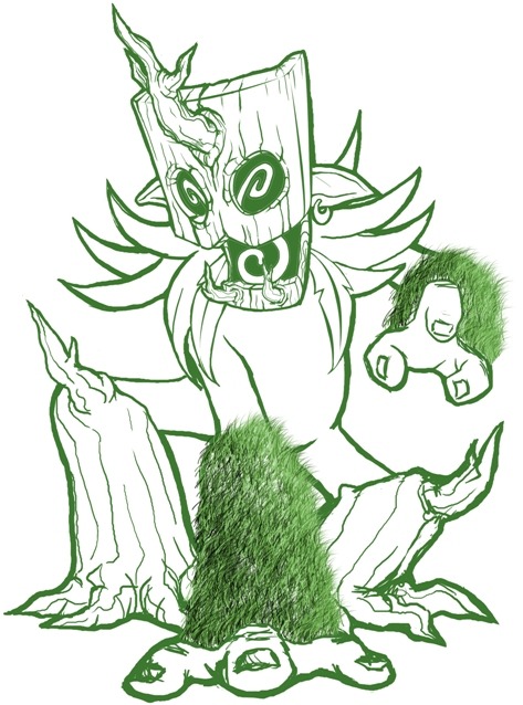
Harle: The idea is nice, but I feel like it's just going to break its sword when it hits anything that is harder than paper. Also, the knot in the wood at the crotch area has my mind in the gutter, might be a good idea to fix that if it was not put there intentionally. I actually prefer the non-autumn one, lily pads aren't orange.
Wyverii: It's not a bad idea, but it reminds me too much of Druddigon, or something like it. I don't know, the face just…I don't even know. It just seems unoriginal to me for some reason. I can't figure out why. But besides that, I don't see anything Dark about it, which kind of kills the idea for me.
Scorpio: Okay, I see what you're doing here, but it just doesn't seem right. Pokémon don't grow from logs. Ninjas are humans. The arms and legs look EXTREMELY humanlike, and just in general it seems entirely different from anything you would ever see in the Pokémon world.
QuimicVital: I don't know what I'm supposed to be seeing here, but it is a bit simple, and I barely see the Grass aspect, let alone any Dark aspect. It also seems like a pre-evolution more than a fully evolved Pokémon.
Calad: I like this, it's a pretty cool Pokémon, but it seems like a pre-evolution rather than a fully evolved one. It also doesn't really show any Dark aspect, seeming more like a Grass/Fighting than Grass/Dark. Not bad though.
Shanimanim: I like the idea, but it really fits Grass/Dragon better than Grass/Dark. When pokemon-ified, it would totally be a great Grass/Dragon or Grass/Rock or Grass/Ground Pokémon. Unfortunately, for a Grass/Dark type, it doesn't really fit the bill. It's a great concept, but it doesn't fit that Dark aspect at all for me.
ZirraNova: I really like the skull pumpkin one better between the two of them. It really seems like a Grass/Dark Pokémon. The only problem is, there aren't pumpkins in the Pokémon world, only
Pumkin Berries. :P
The Steam Punk: I like the idea, but I don't really think "Dark" when I think of Pokémon which don't like the light; I think "Dark" when I see Pokémon that are dark in color, scary, and known to do mischievous or evil things. Darkrai, for exmaple, is largely black, gives people nightmares, etc. Nevertheless, it's not bad.
KoA: I really like the Evil Tree. It's a lot different from most of the submissions here, and it definitely fits the Grass/Dark concept. Furthermore, it's well done, and it doesn't feel like any part of it clashes with the rest of it. Get it colored and submit it, please, I think it would do well! The Gnome Dwarf Warrior, on the other hand, seems a bit odd, and not really like a Dark Pokémon, and we have enough Pokémon which carry clubs.
CommanderZorvox: SOOOO CUUUUUUUTE!!!! <3 I love it! I swear, a pre-evolution of Badgherb would be the cutest thing ever. I love the idea, and I love the thought you put into it. The only complaint I have is small: it doesn't seem Dark enough to me, but it definitely works for the concept, and it looks cute to boot! I love it.
Eol: Oh gosh that looks scary. I love the idea, it definitely fits both the Dark and Grass aspects, and it would be one of the scariest Pokémon by far. Also, silly Eol, birds don't exist in the Pokémon world! I love the concept though, it's really good. Needs to be pokemon-ified though.
Furosuto: I don't think we need another bipedal Pokémon really, but yours isn't that bad. I see the Grass-y aspects, but it doesn't seem too Dark as it is; definitely needs to be colored in before I will see the Dark aspect from it, especially since the legs keep me thinking "Grass Lucario".
nov: Not bad, I like the concept, but I feel that we have a lot of vine-based Pokémon already. I also don't really see the Dark type in it, but perhaps I will once it is colored in.
sucker_puncher: I know I've said this to every cactus in the thread thus far, and I'll keep saying it: we don't need another cactus. The idea isn't to make a better Cacturne, it's to make a new Pokémon that has its own niche, and a cactus-based Pokémon would just turn into another Cactune. It's not that I don't like the idea; the cape is nice. I just don't like the fact that it looks like a cactus.
Hollymon: I don't particularly like your first one (the green one) as it is a bit bland, and doesn't show off the Dark typing. As for your second one, it looks pretty epic. I like the idea of one blade-arm and one hand-arm. It is fairly unique, and gives it a wide range of capabilities. Definitely go with green and purple, and if you use red make it a very dark red so it doesn't seem Fire-like.
CyzirVisheen: Oh gosh the Little Red Riding Hood one made me laugh, but I would never vote for it for the concept, if only because it's too obviously a parody of LRRH. As for the tiki, tikis are always cool, and we don't have one yet, but I understand why you wouldn't do it due to someone else already picking it. The artichoke stegosaurus is pretty cool, but it seems more like a Grass/Dragon than a Grass/Dark. Likewise, Bushman looks more like Grass/Fighting than Grass/Dark. I love the concept though.
Magistrum: Holy crap, that thing looks epic and evil all at the same time. I love the concept, but it's a bit hard to understand as it is; I can't wait to see a final copy to see what it turns into.
NeLLY979: It looks cute :3 I like it, but I feel we have enough rose-based and vine-based Pokémon already. I love how cute it looks though. It could totally be a Cherrim (pre-)evolution.
gwheeler17: It seems a bit too much like a green raccoon, not special in any way. Furthermore, I disapprove of using a color to show a typing; I hate that Mightyena is a Dark-type simply because it's Dark colored. Likewise, your green raccoon shows no signs of Grass-type or Dark-type besides the green coloring and the natures of raccoons. Definitely needs work before being submitted.
Myaura: I love the concept, but the tail seems out of place; definitely move the tail behind it, and shorten it. It looks very scary, and definitely has Grass aspects in it, too. Once finished, it will probably be one of my favorite ones!
RegiFlame150: As I've said before, snake-like Pokémon have been done a lot, and we just got Serperior, but yours isn't that bad. It just needs work, and to be pokemon-ified, as well as to have the Dark aspect brought out a lot.
Juicy Fruit: I can't really see a Dark aspect to it yet, but I'm sure you'll fit it in somehow in the fur; likewise, the Grass typing would have to be in the fur, or maybe in leafy sprouts coming from his arms and legs; regardless, once the two typings are brought into him, it won't be a bad idea. We don't have enough baboons.