CAP 14 CAP 3 - Sprite Submissions

Status
Not open for further replies.

Quanyails

On sabbatical!
is a Top Artist Alumnusis a Community Leader Alumnusis a Community Contributor Alumnus
I've been trying out an animation for Mollux:

<image redacted>

Still a WIP, of course, as I only have one loop. Of course, I'm an amateur at animation, so constructive criticism would be nice. :) I only have ImageReady, so I'm trying to make the best of it.

Comments:
  • DrOfla: The edges of Mollux's feet are linear, too. Those also have to be rounded. :) Now! The shiny back sprite's lamp's lava's shading probably should be changed. The red-rimmed yellow doesn't blend with the green-blue in that situation. Also; where are you going with those lines in the middle of the back sprites' front feet? If they specify a contour, you'll have to use shading rather than an exact line.
  • Doran Dragon: Yay! One tiny thing I think'll make your sprite even better: You see the right side of the neck on your front sprite? You notice how the outlines make it look slightly detached? Connect them. Maybe have them curve the other way rather than as concave lines.
  • elementalpenguin: I do think the pose has to be a little less tense, still. Then there're the contours of the lamp and its that don't fit. Make those symmetrical/parallel!
  • Wyverii: The red blobs on the shiny look a bit... flat. While the yellow could get a pass for being incredibly luminous, the red does not appear the same. A brighter shade should do. Remember to make the lips vertically-aligned, again.
  • TeraVolt: Your spriting style is rather lens-like rather than flat as the in-game precedent is. You should lessen these distortions, and then we can take a look at the other details.
  • aragornbird: Oh, yay! The addition of that pixel on the eye makes Mollux look... inquisitive, almost. Personality in any case! The lips should be up and down, again, but other than that, I don't think there's anything left to adjust. Maybe the anti-aliasing about the neck, if you'd want to get picky... but otherwise, nice!
  • ikasu: Other than adding more colors to make the lamp more easy on the eyes, the sprite should have more shading for more depth--or really, a greater contrast for shading. For example, the backsprites of the lamp are monochromatic. There'd need more shades for that!
 
That animation looks great for a start, Quan. Aside from the occasional side-actions that the BW Pokemon animations have (honestly not that big of a deal to me), I'd love to see the material inside his lavalamp shell move like an actual lavalamp, with stuff rising and falling instead of only jiggling and whatnot. Don't get me wrong, it looks great, but that would just kick it up a step higher, I think. LOL whoops. Animations got banned.

Hmm, at first I was going to be leaning toward a smaller design, like around Shuckle's size, but after some of these, I can see the merits of a larger one. This guy (Mollux, as I believe it was decided) looks great with the extra details and shading granted by a bigger sprite, and he doesn't necessarily need to be small like Krilowatt was and stuff.

Other sprites I like are Doug's, Wyverii's, aragornbird's, and with some further improvement, Teravolt's.

Wyverii is giving some great advice in here too.
 
Quanyails how many frames do you have in that animation? it looks really smooth for a sprite animation pokemon black style.

Not that that's a bad thing it's a very good sprite animation, I'm just curious. I love the blink frame as well as the slight uncurling of the tentacles. it's a very nice touch in an already amazing sprite.
 
Some minor improvements:

@Quanyails
Not sure what you meant by "lens like"
Thanks for all the feedback, anything else?
 
@TeraVolt, I like the body and pose you have going on for Mollux, but the lamp has an odd looking curvature about it: it looks like it's drooping in the back. Your pose is among my favorites, so keep it up!
 
We are placing a ban on animations being posted in this thread.

Concerns have come up since Necturine's (CaP 2, pre-evo) sprite poll where the animation appeared to give the submitter a marked advantage over the other participants. It should never be required for artists to be able to do animation in order to level the playing field.

You can make an animation if you want and hand it in if your sprite wins the final poll. Just do not post it in the thread or you will be warned.
 

DougJustDoug

Knows the great enthusiasms
is a Site Content Manageris a Top Artistis a Programmeris a Forum Moderatoris a Top CAP Contributoris a Battle Simulator Admin Alumnusis a Smogon Discord Contributor Alumnusis a Top Tiering Contributor Alumnusis an Administrator Alumnus
Moderator
I changed up the face on my front sprite, based on feedback about the "lips" looking wrong. These are more correct to the design, and this makes the face look "cuter", IMO.


I also have made a first attempt at a back sprite:
I don't like many things about this back sprite, but I'm still working on it. Getting the legs to look correct, when viewed from the back, has been particularly difficult.
 
In response to some critique, I've adjusted the contrast of the lava lamp and the tip of the lava lamp. Is this any better?

<---
 

the sprite design I was working on. I couldn't decide if it seemed to big.

DougJust Doug- I like your shiny and back sprite. Seeing the bulging bottom of the lava lamp is pretty neat
 
Err... Quark, I think your sprite may be too large for the thread's established parameters. You should double-check the OP and size it properly. Also, I recommend a file format that isn't jpeg, yours is pretty fuzzy. Use PNG or GIF.
 
Doran Dragon- Your sprite looks like it needs a little more shading around the neck to give it volume and definition. Your backsprite should have darker shading towards the ground and the areas closer to the lava lamp.

TeraVolt- It's hard to see the lighting on the lava lamp in the shiny sprite. I do like the way the lava inside the lamp is.

DJD- Your front sprites are amazing! The backsprite's legs are a bit odd though, especially the leftmost leg (which is the rightmost in the front sprite). In the front sprite, it looks as if the leg curls in front of the whole tentacle/forearm, but the backsprite contradicts that by having it curing behind the arm. That's a small inconsistency. Other than that, your sprites are the best.

Gun6- Yes, the contrast is much better, although the blobs inside the lamp look like they should have more life in them. Perhaps add a color around the blobs so that that they give the illusion of glowing?
 

Asylum_Rhapsody

Guest
DJD, about your back sprite, it looks fantastic, but there's just one little thing bugging me: lava lamps are supposed to be kind of transparent, but Molly's head disappears behind it completely on the lower left corner:
Doran Dragon also has this issue.
 
I see CAP 3's shell to be no more than 2.5 feet tall. As a result, I find Wyverii's and Ice-Cold Claws' sprites to be perfect
 
Here is my sprite :)


Male/Male shiny
Female/Female shiny

Dorandragon: I really like your pose. It looks really dynamic
Aragornbird: You are defenatly my favorite. It just looks perfect :)
 
Thanks for all the feedback :)
Here's another update:

Fixed up the tentacle leg....things
also darkened the yellows on the shiny sprite
and tried to tidy up the lamp's back's outline
 

DougJustDoug

Knows the great enthusiasms
is a Site Content Manageris a Top Artistis a Programmeris a Forum Moderatoris a Top CAP Contributoris a Battle Simulator Admin Alumnusis a Smogon Discord Contributor Alumnusis a Top Tiering Contributor Alumnusis an Administrator Alumnus
Moderator

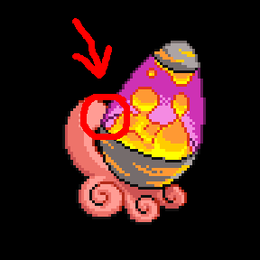
Made several tweaks to the back sprite, based on feedback.

Thanks to Mos-Quitoxe for pointing out the shading inconsistencies with the back sprite in relation to ingame back sprites. I changed it to cover most of the back sprite in shadow, and only put small top highlights on a few features. Great tip, Mos.

Thanks to Asylum Rhapsody for the tip about the lamp transparency. I added the see-through effect in the small place you noted, and I like it. I love little details like that, even though most people won't notice it.
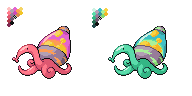
Thanks Mysticuno for feedback on the tentacles. I changed up the big tentacle on the back sprite to be pretty much a horizontally flipped carbon copy of the front sprite tentacle, and then re-shaded accordingly. It's still not perfect, and I plan to keep working on it, but I like it better than it was before. Thanks for helping me work through the issues with it.


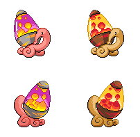
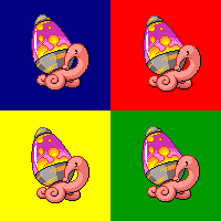
As for the other sprites in this thread, I like almost all of them. 
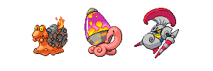
Wyverii's is probably my favorite overall, because it is so crisp, clean, and well-planned. I love the pose Gun6 is working. Noobiess has a lovely front sprite, and I look forward to seeing the back. I like the colors and shading of ElementalPenguin's sprite. Doran Dragon has the cutest sprite in the thread. I like Quanyail's lava lamp shell the best of all in the thread. Aragornbird doesn't know how to make a bad sprite, and his Mollux sprite continues his tradition of spriting excellence.

Lot's of great work by everyone so far.
 
i too added the transparency to the lavalamp, but it may not be too noticable. i also copied wyverii with a size comparison and background check. not sure what to do for male/female differences...


Quanyails

On sabbatical!
is a Top Artist Alumnusis a Community Leader Alumnusis a Community Contributor Alumnus
Since some people are doing this, I might as well. (Minor edits on the sprite [and animation] otherwise.)

Background comparisons:


The background colors may seem familiar to certain people.

Sprite comparisons with similarly-based pokemon:


Comments:
  • Doran Dragon: Welcome. :)
  • Banryu: If I could do that, I would. However, I think that'd require a lot of frames and additions, and even then, the rules now dictate I can't show them unless my sprite's chosen. Sorry. :/
  • pkmn-taicho321: 10, but the blinking that differs slightly each time makes it 20. My one in progress is currently at 42. :P
  • TeraVolt: I meant that the sprite looks like it went through a lens, so that the light is bent and makes it all curvy and stuff. The lamp is the biggest offender in this, though the size of the feet (the large front ones compared to the minuscule-looking hind ones) also look that way. Such size differences should only be slight.
  • DougJustDoug: Have I ever mentioned how I like the lava blobs in your lamp? Well, now you know! I do wish the sprite had less dithering, though. It makes for quite a bit of detail. As for the backsprite's feet... Have you thought about the left side of them look forward slightly, and the right side look back? They currently only look tilted in two dimensions, whereas your front sprite's feet look tilted in three. This'll also help trim that illusion that the front feet on the back sprite look as close to the viewer as the hind feet.
  • Gun6: Better! But I think the lava blobs and the light source in the lamp can be further differentiated. And there's that odd pose again... D:
  • Quark: You have 96x96 pixels, yes, but that doesn't mean you should try and use it to its full potential. I can't really make out much of the snail in that oddly positioned, artifact-filled image. Shrink it, apply some natural-ness to it, and save it as a PNG. :)
  • noobiess: Very adequate. Unlike other people, who have trouble spriting the direction of the feet, you have that. However, the feet look a bit spread apart to me--on the side of the snail, rather than closer to the body. The base of the lava lamp is also rather large, so it looks either like it's large, or that we're treated to a high-looking view of Mollux. The blush stickers are nice, but due to pixel constraints, they look square and flat; hence, a modification to that as well. Oh, and remember that the lips are up and down, not left and right!
 

DougJustDoug

Knows the great enthusiasms
is a Site Content Manageris a Top Artistis a Programmeris a Forum Moderatoris a Top CAP Contributoris a Battle Simulator Admin Alumnusis a Smogon Discord Contributor Alumnusis a Top Tiering Contributor Alumnusis an Administrator Alumnus
Moderator

Sorry for posting an update so soon after my previous post, but I completely redid a big part of the back sprite and wanted to get comments, if anyone has been tracking me on this.

I really hated the legs on previous versions of the back sprite. They just didn't look right, and they didn't convey the angled positioning of the legs in the front sprite (and I like the front sprite legs). So I redrew the back sprite at full size on paper, where I am much better able to eyeball proportions and such. Once I get into the small pixel format, it's very hard for me to "see" the forms as an artist. I admire those pixel artists that are able to keep their artistic perspective when working on a pixel grid. I just can't do it very well. So, I reworked it in a full size pencil sketch and realized a lot of things I was doing wrong. I am MUCH happier with the back sprite legs now. Still not perfect by any means, but I feel better about the direction I am headed. I think it is much more consistent with the front sprite pose. Thanks to Wyverii for help and advice.

I also did a quick lineup of a few snail pokemon sprites side-by-side:


And here's a background color check, which seems to be all the rage here in the thread:

 
Both snail shells and lava lamps come in a variety of shapes in the real world, but I'm surprised no one has done a gender sprite where the shape of the lamp was the gender difference. Nothing wrong with changing patterns or sizes, but I thought for sure I'd see a cylindrical or squiggly lamp on the ladies by now.
 
Status
Not open for further replies.

Users Who Are Viewing This Thread (Users: 1, Guests: 0)

Top