CAP 14 CAP 3 - Sprite Submissions

Status
Not open for further replies.

Quanyails

On sabbatical!
is a Top Artist Alumnusis a Community Leader Alumnusis a Community Contributor Alumnus


Alternate head. I intended my first one to be forward-facing, but it really doesn't show that due to the lack of sharp shading. So let's make the mouth stretch out more to show that it's facing forward! I also tinkered with the shell slightly, but really didn't make it bulkier.

Should I go with the head like that?

Comments:
  • xephslayer: I use MS Paint, too! Don't worry about it; it's excellent for pixel art, as long as you know the ins and outs. I first suggest you smooth out the back of the head/neck so it's a more natural curve. Perhaps make the sprite larger. I think the stripes contrast well enough from the gray shell. :)
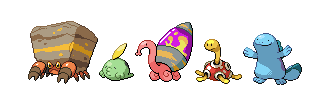
  • ikasu: Dah15%scaledpixelover. Ahem. The inside of the lava lamp is quite bright has high contrast. Desaturatig the colors slightly will make it look more natural.
  • tea_and_blues: Mine? I don't think so. It's slightly above Shuckle size, and a good portion of that is the length of the lamp.
  • DougJustDoug: Shiny. Maybe too much so. I've thought about a looking back pose, but I wondered how 'neutral' it was in 5th-generation terms. You sprited it nicely. I don't have many technical comments on yours, though the shading might be too advanced.
  • Dusk209: Large I've gone with. It does provide for smoother curves. Don't worry about 8-bit truecolor too much, as most art programs work in that limit. I really like the head on yours, because it gives it a turtlish, stretchy look. :D I just think the shell's positioning and perspective can be rearranged. But overall, with a bit of fixing up, nice!
  • GreenWailord: It needs better curves, as some of the transitions from the mouth to the head to the neck are angular. The colors of the lava lamp are decent compared to the bright pink body. You might want to fix that. :P
  • Wyverii: I was wondering if the white reflection on the glass could be a little less linear. I would think it's brighter and wider at one end and decreasing in luminosity as it travels down. Otherwise, the rest of the sprite is nice. :)
  • Ice-cold Claws: Other than the blue shell Mos mentioned (ah, colorblindness :/), the shading on the back leg makes the snail look tilted back. It should be supported rectangularly on the legs, right? The head and neck are just about perfect, save for a little, odd transition of outlines on the same y-coordinate as the tip of the mouth to the edge of the neck. The shiny shell's colors are a bit odd, I must say. If someone could help you, there's green on the body, green on the stripes, and green on the lava. It makes it seem like a half-finished recolor.
 

erisia

Innovative new design!
is a Site Content Manager Alumnusis a Forum Moderator Alumnusis a Community Contributor Alumnusis a Top Contributor Alumnusis a Smogon Media Contributor Alumnus
I didn't submit anything for the art poll, but I'll definitely try to submit a sprite. Here's something for a start:

I really like this one if particular, for two reasons. First, details such as the shading, head and legs just look more polished than the other sprites. Second, it's large size definitely supports the stat spread more effectively. I mean, this spread looks more like something with 95 / 83 / 105 bulk than the smaller spread (Shuckle is an intentional anomaly) Plus, having a huge lava lamp really emphasizes that this thing is going to be a seriously powerful special attacker. Small designs obviously help it to look cute, but I think we can still pull off cuteness with a large pokemon. It can just hug entire people rather than their legs. :p
 
Thanks for the input guys!


Decided not to change the pose. I tried one with outstretched front legs, and it looked...really messy. So...eh.
Tweaked the hind legs a bit.
Changed the turquoise to gray(-ish turquoise. Can you tell?)
Changed the lava to its original color, changed shell stripes to red.
As to why it was all green before, that was an issue with the 16-color limit.
Yes, right now my shiny has one extra color than should be allowed.
Oh, and transition between two long lines is hard to pull off, yes. I think I'm leaving it like that :<


Snailmon and his buddies
Does he fit in well?


Quanyails: Definitely this head, the old one sort of looked droopy.
Now your sprite is almost good to go, though I'm still slightly uncomfortable with how rough the lamp's outlines look.
The rest of the sprite looks really slick though :]
 
That looks much better ICC! though comparing him to other mons, I get the feeling he needs to be facing in a way that exposes both eyes. Somehow.
 

Less pink this time. Tried to make it curvier by shortening the head and neck (still could use some work). Changed the lid, but now I think the lamp looks crooked. Also figured out transparent backgrounds. Quanyails, I wasn't quite sure if you were advising me to change the lamp color or not, so I left it.

As for comments: right now pretty much everyone's is better than mine, so let my sprite be a compliment to the rest of you.
 
One disparity between the original art and the sprites is that in the original the head only rises slightly above the base of the lamp. In many sprite submissions it rises significantly higher. I think this is both making the design less cute, and contributing to my sense that the sprites are larger than CAP looks.
 

Arkeis

(づ。◕‿‿◕。)づ
is a Top Artist Alumnusis a Community Leader Alumnus
Okay, made the body slightly smaller and repositioned some parts. Changed the style of the inside of the lamp to make it smoother. Also added a shiny form with a blue and orange contrast going on.


DougJustDoug

Knows the great enthusiasms
is a Site Content Manageris a Top Artistis a Programmeris a Forum Moderatoris a Top CAP Contributoris a Battle Simulator Admin Alumnusis a Smogon Discord Contributor Alumnusis a Top Tiering Contributor Alumnusis an Administrator Alumnus
Moderator
I revised the pose to make the neck not stretch out so much, and turned the face to see both eyes. Also removed the slick shiny skin.


I'm still not sure about this entire pose, because it crosses the head in front of the shell. But I really have no desire to do another variation on the design pose. We have plenty of good renditions of the design pose, and I doubt I can improve them substantially. I'm really at a loss of how to do anything different from the design pose, other than this. So, I'll try to make the best of it!
 
To be honest, Doug, I liked your first submission better. The longer thinner neck gave the pose more breathing room and the highlight on the skin allows the head to pop better where now it gets just a little lost in the background. You lava lamp lighting treatment is still my favorite in this thread. The extra colours for the gradients were well spent.

Wyverii's is one of my favorites due to thought she put into the construction. The lava lamp looks like it has real weight to it as it compresses the body and the curled up tentacles actually look like solid shapes that exist in three dimensions. I also imagine it making a *beep beep* sound as it rolls past.

I also really like Gun6's, for attention put to the silhouette. It is probably my favorite pose in the thread being both active and well balanced. The one thing is that the non-shiny lava goop is a bit hard to see. Could you do the same thing with the contrast as you did with the shiny?

I doubt there is any room for me to make an entry, but if I have time I'd like to submit something before the end of the week too...
 

Quanyails

On sabbatical!
is a Top Artist Alumnusis a Community Leader Alumnusis a Community Contributor Alumnus
Darn you, expiring tokens, I have to type this twice. X.x


Embiggened the shell for the three people who suggested it. I was thinking fat and skinny shells as gender differences.

Comments:
  • Ice-cold Claws: Is the lamp better in smoothness now? If not, which parts need to be smoothed out?
  • GreenWailord: Well, the lamp could do with a slight desaturation. It looks like pure yellow and pure pink in there. Also, there's that crook at the bottom of the next you also have to smooth out. If you're struggling to make the sprite smooth, how about larger dimensions?
  • aragornbird: The actual snail is wonderful. :) The cone on the back, though, looks too far back--the vestibule (and its shading) between the body and the lamp's opening makes it look stretched and... I don't know. Something. I do think the sprite, overall, is a bit large. It could be intentional, sure, as we don't know its size, if you'd rather not change that.
  • DougJustDoug: I love the curliness and rubberiness of the snail, Doug. The insides of the lap, though, are quite bright and contrast greatly with the more neutral tones of the snail. A slight adjustment of saturation should do. Additionally, that white reflection on the glass part of the lamp is oddly placed, as it would indicate a light source directly left of the snail. It does not have to be on the edge to constitute a highlight.
 

Ray Jay

"Jump first, ask questions later, oui oui!"
is a Site Content Manager Alumnusis a Community Leader Alumnusis a Community Contributor Alumnusis a Tiering Contributor Alumnusis a Top Contributor Alumnusis a Smogon Media Contributor Alumnus
I feel like in the original drawing, the cone is a lot bigger than some of the artists' renditions (thus making it less cuddly).

Also aragornbird, your shiny form is brilliant.
 

breh

強いだね
I'd like to point out an issue that bothers me - a lot of people seem to be going for glares on the eyes; as far as I know, the eyes should be, more or less, pixel eyes ala ditto.

I'm liking ICC's and aragornbird's a lot right now.
 

Asylum_Rhapsody

Guest
I hope that this doesn't come across like too much of a rant, but I would like to say something about sprite gender differences in general as well as how they relate to this Pokemon specifically.

Pokemon gender differences are painfully overdone. They appear all of the time on Pokemon that they have no business appearing on, and it's almost always to reinforce stereotypical human gender traits, which is to say that whatever the male sprite is gets to be considered the normal one while the female sprite always gets a cuter element, has something smaller, or has longer hair or something like that. It doesn't happen all of the time, of course, but it happens often enough to be pretty absurd.

Look, I'm not saying that sprite gender differences don't have that place, but at least make them make sense. What we have here is a snail. Many snails are hermaphrodites, and for many that aren't, it's actually the female that's larger, so doing the same old stereotypical "female has smaller shell" for this CAP is pretty unimaginative.

What I think would be really interesting to see, though, would be more Unfezant or Jellicent. The trouble with most gender differences like I mentioned above is that they're subtle, gender differences for the sake of having gender differences. If you're going to do gender differences to this CAP, then at least make them radically different colors or patterns or something like what we see in Hippowdon.

tl;dr When it comes to sprite gender differences, go big or go home.
 
Okay, made the body slightly smaller and repositioned some parts. Changed the style of the inside of the lamp to make it smoother. Also added a shiny form with a blue and orange contrast going on.
I love this one, and the shiny sprite is so well done with the colour difference.
 

Well here is my newest version. It's bigger than my last attempt while also using less colors. Still not a very original design though, I tried other poses but they didn't look so good.
 
Not much of an update, but I do have a possible gender difference. Though it may not be true for snails, many animals have vividly colored males and more blandly colored females, so I thought that possibly the female could not have the orange stripes. I'm almost done with the backsprite and then I will be moving on to edits and choosing a shiny coloration.


Went back to the larger size since people on the forums and in irc wanted it. Retooled the shading inside the lamp to be more accurate to an actual lava lamp. It still stands at 16 colours. I didn't have to add or take any away.

If I can get away with it, I'd rather not do gender differences.

I also went back to the older style of outlines since it passed the background check better:


Since these sprites will be used on different backgrounds it's important to make sure it looks good on them.
 
I feel like in the original drawing, the cone is a lot bigger than some of the artists' renditions (thus making it less cuddly)
You might be looking at the original-original pic there RayJay. I shortened the shell in the final sub so the animal was less imbalanced.
 
All this gender differences stuff, and nobody has stopped to say: Snails are hermaphodites!

Isn't this the perfect opportunity to not have gender differences?
 

paintseagull

pink wingull
is a Top Artistis a Forum Moderator Alumnus
Wyverii: I think you can definitely get away with no gender differences. I love your sprite, and I like how you picked the other "traditional" poison colour for the shiny.

ikasu: Looking nice. There seems to be a weird gap between his back leg and body though? Also I'm not a fan of removing the stripes as a gender difference, they really add to the interest and texture of the design.

Doran: Love the pose!! And the perspective is done really well. I hope you continue with it.

DrOfla: Pretty nice, but I think you should try to smooth your lines, especially around the feet and in the lamp.

Quanyails: Love! I like both versions of the shell so I think that would work well as gender differences if you decide to have them.

DougJustDoug: I really like this. I do think it's an improvement over your previous pose, as it removes the compositional problem of the head line flowing into the shell line. As for bringing back a bit of shine, as Cartoons suggested, I'm not sure, but the head could stand to pop out more against the shell.

Aragornbird: Lovely. I like the blue a lot.

GreenWailord: Definitely too small but that gender difference is hilarious X)

ICC: Looks good!
 
May I suggest that we use Mos' original 'slim-line' cap-less design as inspiration for the female sprite. I feel as though if we do have gender differences, that would be an apt one.
 
!!WARNING, A GIANT POST APPEARS!!

Time for a proper critique post now that people have had some time to make and develop their sprites. Unlike most people I'm going to focus on pixel technique to improve the quality of your work. Things like composition, though very important, is more subjective and easy to comment on.

First thing, I'm going to focus on is linework. The smaller the scale of your sprite the more familiar with this you need to be. This is also a good thing to look at if you're a good artist, but not familar with sprites!

We all should be familiar with how sprites and lines work, but some pieces here clearly don't know how to manipulate them. At this scale every single pixel counts and must be very deliberately placed. The bigger you make your sprite, the easier it gets to make smooth lines that read well. This is why some sprites like Braviary are so large, they need the space to convey details since you have a limited amount of space for pixels.


Lines at 90 degrees are perfect lines, and so are those at 45 degrees, but what about other angles? Well lines aren't perfect at other angles and require extra shades to smooth them out properly, which can't be done in low colour count palette sprites. So you have to carefully position your pixels to make the best of the limited information you can convey with these little squares.

Lines that require two pixels then several single pixels until the next two pixel step are the only way to convey some angles, but look very jarring. Some curves are too small to get a smooth curve. The key is to try and design your sprite so that you avoid as many problematic curves and lines as possible while still being accurate to what you wanted to show. Sometimes it's unavoidable, and we have to bite the bullet, but a little forethought into the subject can go a long long way.

By rearranging the structure of the lines in DrOfla's submission (shown in blue), you can see how much smoother the lines flow. This is particularly important to think about for our snailmon because it uses a lot of spirals and varying curves in its design, and needs to flow well to look good.

So, for particular critique on the subject:


Here's a good example of poor flow on ikasu's sprite. At the top of the curl of the foot, near the join in the shell there's a straight horizontal line where the curve of the body meets the curve of the foot. It breaks the illusion of being a curve by creating that straight line. The fix I did here was move the body line lower so it no longer coincides with the foot.


This of course affects lines that aren't outlines and the edges of shades. This is also an example of where it's impossible to get a perfect curve. There are several ways to tweak the neck line there but it will always just be slightly off. There's not enough space to convey the information. (I'd do away with the line altogether doran, you don't need it).


The area I'd like to focus on is the neck, below the chin. As you can see when the line of the head meets the neck it turns off quite sharply, with only a single pixel buffer and back sprite has almost no curve at all. There are actually several ways of fixing this which is why I didn't make a specific edit. One is to restructure the neck so that you have enough space to get a smooth curve. Another is the extend the chin line past the neck (front) or neck to head (back) with a shade to imply the head is in front of the neck. The latter is probably the better choice in my opinion.

Of course there are many many more examples of this in the thread. The larger your sprite, the more space you have to work with (aragornbird's sprite has absolutely no issues with lines for example).
 
Status
Not open for further replies.

Users Who Are Viewing This Thread (Users: 1, Guests: 0)

Top