CAP 14 CAP 3 - Sprite Submissions

Status
Not open for further replies.

Quanyails

On sabbatical!
is a Top Artist Alumnusis a Community Leader Alumnusis a Community Contributor Alumnus
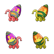
Made a relatively substantial change to the curvature of the head, thanks to a certain person's critique on #cap:


I also went with a happy (albeit dithered) medium for the lamp's cap's shadow. Not too dark, but dark enough.

If I can say so, I've made the lava blobs inside bloop up and down on the animation. Of course, the animation itself is a bit disjunct from the sprite because of my changes. XD

Comments:
  • Ice-cold Claws: The wall still needs to be adjusted, and, because of perspective, the left foot on the backsprite looks larger than the right one. Then there's the making sure that the lamp looks like it encloses over the back of the snail...
  • nibbletman: Retro? D: We want previous-generation sprites? Well, we got one last CAP... but yeah. Why is my sprite both retro and non-retro, according to commenting people? It's small or it's boring. XD
  • Deucalion2: I like the roundness you've given the sprite, although it's looking too far left compared to the 3/4ths post most in-game sprites have. I'll also have to say to watch the contours on your lamp and which way they go! They take a bit too much artistic license from the original.
  • elementalpenguin: Squishy. :) The shape of the head is nice! I just think that the eyes should be more toward the side of the head than in the front. The lamp seems a bit slumped, and should be more upright. The curves are definitely improved from the previous iterations, though!
  • Quark: I'd love those feet if it weren't for the fact they clash with pokemon's sprites completely. :/ Remember that they're supposed to match other pokemon on Pokemon Showdown!, so a left-facing, rolling-on-wall Mollux will look out of place. Even moving the head up like other people (don't be afraid of that) can make it look more natural.
 
Wow that was quite a bit of feedback :3
tried to fix up as much of it as I could
I'll probably have to fix up the back's lamps later

Did I miss anything?

@Quark- I kinda like it...it's a cool pose, try leveling it out and making the tentacles smaller, the lamp needs to be shaped a bit better too and he needs to be facing our left side
 
I always think of Shuckle when I see this 'mon, so I made a design that is a little smaller than some of those in this thread.

In case you couldn't tell, this is my first time ever spriting anything, so criticism and advice (specifically shading) is perfectly welcome. If I get around to doing a shiny, I was thinking of something like having blobs of poison floating in actual lava instead of the blobs of lava floating in poison.

Liking Quanyails's, DJD's, and Wyverii's so far.
 
Well, uh, this is tiring. Again, thanks so much guys.

Playing around with shinies until I got this really weird...thing

Oh and I flipped the front tentacles to the other way. Better? Worse?

Would like comments. :)
 
Teravolt you really need to get rid of that bottom-most reflection in the glass. It's in shadow, there's no light to reflect off it.

LockDown: firstly I think you need to alter the connection between the head and neck, currently it's too angular. I'd also suggest looking at poses that have already been done and observing how the lines join up, along with the shading practices. Trying to do novel leg poses (at least I assume they're novel) as a complete amateur is a doomed exercise.


After wrestling with the colour limit for some time, I've finally managed to shade to the point I'm rather pleased with it. Thoughts?

@Quanyails: Yeah, I intended it to be 5/6 with the head looking 3/4, because the first time I tried it, I did sprite it 3/4 and ended up with something so similar to Wyverii's in terms of posing I thought I'd have to vary it a bit. You're right about the lamp, I need to sharpen the upper end a little. I'll get working on that.

EDIT:


Made an RBY compatible version, just for kicks.
 

canno

formerly The Reptile
I'll add transparency when I make the back sprites.

Not the happiest about the shiny or how my outlines came out. :( Any suggestions?
 
Final Submission

Final Submission:


It's about that time again. There's been some more updates but the sprite is done. The backsprite lamp had some of it's inner shading changed again, the proboscis was shortened slightly and the neck shading made less flat.
 
Not the happiest about the shiny or how my outlines came out. :( Any suggestions?
It's looking pretty nice, and the outline seems fine to me, but the shiny would probably look a lot better if it wasn't so vibrant. You can see it in a lot of other people's shiny sprites and in the normal colouration, but there's really very few colours as saturated as yours that they use. But yeah, it's looking pretty nice, though one of its left legs could stand to differentiate itself a bit, however I love how you've done the lips. Keep it up!
 

canno

formerly The Reptile
Alright, so I changes the pallet on the shiny so it's not as hideously saturated.


I wasn't sure what you meant about the leg, MLaRF. I tweaked it a bit and it looks a bit different. Also, this is late-ish because life has been distracting me with cool shit. Next post should have backsprites and transparent backgrounds as opposed to the white I'm using right now (might also post some comparisons with color/other pokemon if I'm not feeling lazy)
 

Quanyails

On sabbatical!
is a Top Artist Alumnusis a Community Leader Alumnusis a Community Contributor Alumnus
Final Submission

Final Submission


Ayup.

Extra:


Comments:
  • TeraVolt: Better! Though I still think the shape of the legs is strange, but it's a lot less lens-like than previously. I'm not saying to straighten the legs out, but to make them less unbalanced.
  • LockDown: The head looks tilted to the left somewhat. A bit of dimension would be needed to make it look natural, the way you expect it to be. The inside of the lava lamp could have some darker shades, even though it's entirely illuminated. Lastly, a few shades for the outline will give it more of a solid flair. X3 Otherwise, it would look flat.
  • Ice-cold Claws: You know, on a non-technical note, your sprite's feet are quite large compared to the head. Either that, or the head is quite long and thin compared to the feet. A change in one makes it better for the whole.
  • Deucalion2: If you say so. Being similar isn't bad, per se, as there is an in-game standard to adhere to. I figure the cap could be a little more pointy, if that's the only non-stylistic change I should say about the sprite.
  • The Reptile: Have it lean forward rather than back, unless it's jumping up. The mouth, I think, can also benefit from being slightly droopy. It looks stiff otherwise.
  • Doran Dragon: Good sprite. :) Small and bright colors and THAT SHELL. :D
 

DougJustDoug

Knows the great enthusiasms
is a Site Content Manageris a Top Artistis a Programmeris a Forum Moderatoris a Top CAP Contributoris a Battle Simulator Admin Alumnusis a Smogon Discord Contributor Alumnusis a Top Tiering Contributor Alumnusis an Administrator Alumnus
Moderator
Final Submission

Final Submission


I may edit this to make a subtle change here or there prior to the poll, but I won't be making any major structural changes from here on out.

Great work by all the spriters on Mollux!
 
A 24 warning is now in effect!

Make sure to mark your final set of sprites clearly with a, Final Submission, title.
 
I have to say, DJD's sprite looks the most lively and vibrant of them all...the colors are perfect and the pose does not make it look as stiff as the others.
 
Right now, my favorite sprite would be Wyverii's or DougJustDoug's. Their outlines, colors, and shading are all very realistic for a Pokemon sprite.
 
Status
Not open for further replies.

Users Who Are Viewing This Thread (Users: 1, Guests: 1)

Top