CAP 14 CAP 3 - Sprite Submissions

Status
Not open for further replies.
Hello again

Since I'm not getting a lot of comments, anyone have suggestions for me?

Currently loving Doran's beautiful spritework and Noobiess's badass tank pose.
 
ICC, I just noticed that the forelegs on your backsprites are curling upwards, opposite to the frontsprites'. I think you'll need to redraw that bit entirely, since it's too small in comparison to the frontsprites as well.
 
Terravolt: That's looking great. It looks really natural.
DJD: In terms of size, you've hit the nail on the head. The legs seem a bit squashed though, as if it's crushed under the weight of its own shell.


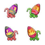
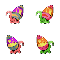
Changes: Deepened the shading on the shiny lamp to make it more luminous. The highlights on the lamp have been smoothed out on both front and back. Backsprite right back foot has been moved down and curled tighter to stop the feet from aligning and becoming too symmetrical. Shading on the back of the neck has been smoothed out. Shading on lamp innards has been changed in places.

I'm still leaning towards no gender differences. It would be interesting to have a sprite with no gender differences without it being genderless or single gender. Most Pokémon sprites are of this nature. It would also be interesting to have major gender differences for a CaP at some point but I don't think this one fits the bill for that.
 
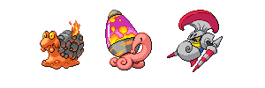
I really like Doug's sprite. I think the pose is a really strong selling point of the piece. A lot of the other sprites in the thread mimic the pose that GF gives to almost all snail/slug pokemon as is very obviously highlighted in Quanyail's post. That's not to say that it's a bad pose. But the pose that Doug has used really brings Mollux to life. It's a dynamic post that is very well done and shows creativity on Doug's part to not stick to the pose that Mos-Quitoxe used in his original artwork. Technically, a lot of the sprites are faultless, Wyverii, Doug and Aragornbird come to mind.

Definite Favourite in Doug's I also advocate no Gender Differences. As has been stated repeatedly. Molluscs tend to be hermaphrodites.
 

Quanyails

On sabbatical!
is a Top Artist Alumnusis a Community Leader Alumnusis a Community Contributor Alumnus
GlassAbsol? There is a reason why Game Freak gives most Black/White sprites neutral and 3/4ths poses. Animation does not work so well if a pokemon is lunging at the opponent, for instance. If you want dynamic poses, sure, I could've sprited one, but that would be contrary to the style used in Black/White. I think it's incorrect to criticize sprites because they fit in the in-game precedents. :/

As for my opinion on gender differences: Pokemon does not run congruent to real life. (That, and the CAPs that've been made mostly have gender differences.)

Other comments:
  • DougJustDoug: Better backsprite legs; I still can't say that I like them entirely, but they're very nice now. I could see the lips of Mollux being just a bit larger. Other than that, the sprite's good.
  • SinisterSamurai: I hope you noticed the shell differences on my sprites. :P
  • Ice-cold Claws: Could you make less of a 'wall' of lava on the backsprites? It just seems too much on that edge compared to your front one.
  • Wyverii: I believe I've administered all of my criticism for yours already on IRC. :)


Another update
tried to tidy up the lamp legs and outline some more
Thank you all again for all the feedback
I feel kinda bad never giving any back but yours' are all so much better than mine
X3
 

meddle

boomer user
is a Forum Moderator Alumnusis a Battle Simulator Moderator Alumnus
ICC: The body feels out of proportion with the shell in your sprite right now. To me, your Mollux needs a sturdier foundation in a more robust body; as it is now, it seems as though your Mollux would fall flat on its face under the weight of its shell. I think he could benefit from a bit of balancing in this regard. The back tentacle is also a bit jarring and I can't quite make out its shape.

Quanyails: The only part of your sprite that feels unconvincing to me is where the underside of the lava lamp cap is visible through the "glass." I might lighten up that shade a bit to give it less visual weight. I also might consider lengthening the strand of yellow lava to partially cover this area to make its position in space more convincing.

Wyverii: My favorite sprite in the thread. The only alteration I might try is to extend Mollux's back tentacles out farther to 'hold' the lava lamp a bit better. This may go against the more tightly-curled up body aesthetic that you're going for, however.

TeraVolt: I'm not sure that a highlight belongs on the underside of your lava lamp, as one would expect this area to fall under shadow. While I like what you're doing with the pose, I might see if you could make the tentacles look less like cabinet handles. The way they're outlined right now, the eye perceives both tentacles as a singular, forked appendage. I would soften the outline along the fore-tentacle where it joins the body.

DJD: As others have said, the dithering inside the lamp seems a bit much for a Pokemon sprite and is a bit distracting to my eye. It's much less noticeable in the shiny sprite, so maybe the pink hue just contrasts too much against the magenta. Loving the colors you chose for the shiny, by the way. This was the hardest pose to pull off in the thread, I think, so kudos to you for making it work so well!
 

Quanyails

On sabbatical!
is a Top Artist Alumnusis a Community Leader Alumnusis a Community Contributor Alumnus


I'm rather ambivalent, meddle, on making that change. On one hand, I do acknowledge the dark blot the shading made up there, and how changing that remedies it. On the other hand, that spot now looks empty and the liquid inside of the lamp looks nonexistent. I've tried moving the blob up a pixel or two, but that just looks like an abnormal curve of the cap. (And there's another reason I didn't change it, but I shouldn't discuss that further here.)

TeraVolt: It still needs less distorted curves. :/ Changing the lamp size doesn't help if the shape is still asymmetrical.
 
Aragornbird's then Wyverii's are my favorites. I can't think of the correct word, but the skin texture is very nice on both of them and seems similar to the standard artwork the sprites are based on. Some of the others feel a bit like third or fourth gen sprites, like they would have trouble being animated.

Teravolt, I am not sure if it is the goal but yours looks like it is standing up on its front legs.
 

Bughouse

Like ships in the night, you're passing me by
is a Site Content Manageris a Forum Moderator Alumnusis a CAP Contributor Alumnusis a Tiering Contributor Alumnusis a Contributor Alumnus
Honestly, ICC (and everyone), I'd love it if you all could use a variation on Doug's shiny. (If Doug's ok with it.) The earthy volcano scheme is the clear right way to go for me, and I want that coloring no matter what, which at the moment forces me to vote for Doug. That certainly isn't a bad thing, since Doug's sprite is good, as always, but I'd like more choices.
 
love DJD's design, it has an almost retro quality to it due to its quirky pose and colouring style. Sprites can end up looking too 'neutral' very easily, so it's nice to see one with a bit of flare and character. Also I think the proportions are about right, and the front legs the right way round ^^
 

paintseagull

pink wingull
is a Top Artistis a Forum Moderator Alumnus
srk: I know that everyone's aware that what you post is your opinion only, but please don't suggest to spriters that they should all do something that you have a personal preference towards. To put it in perspective, Doug's shiny colouration is my least favourite. Mollux has great potential for lots of great shiny options and it would be a shame for everyone to converge on one.

ICC: I think the legs are improved but I wouldn't say they're perfect. If you have time and inclination, keep tweaking. Not sure exactly what to suggest, because getting the perspective right with so few pixels on the spiraled arms is really tricky. I enjoy your shiny colours but maybe try pushing the contrast on the lamp colours!

Quany: I love! I like how the way you did the lava lamp is so different from everyone else's. It works well. Cute gender differences too!

TeraVolt: The shape of the lamp is still more light-bulb-like than lava lamp-like. It's bulging near the middle rather than at the base. Good job on making improvements so far!

Wyverii: <3

Ahhh I would comment on more that aren't on this page but it would just be gushing! Seriously high quality stuff from everyone. I love all the different shinies!!!


Thought I'd give this a shot, so there's the first draft. Ideally, I'd like to cut down the number of separate colours so I can shade the inside of the lamp a little better.
 

meddle

boomer user
is a Forum Moderator Alumnusis a Battle Simulator Moderator Alumnus
elementalpenguin: I am liking everything about this sprite except for the fact that it has a very choppy quality to it in some areas with the linework, particularly around the lava lamp. I realize this is hard to pull off given its shape and the fact that it foreshortens slightly into space, but I would see if you could somehow remedy the jaggedness. Otherwise I like the shape and texture of the body very much (the head in particular I like the best out of all the sprites in the thread, even if it's a departure from Mos' art).
 

I tried to take the advice given to me and made the design simpler. Personally I think it looks a lot better.
 
Quark: Is Mollux balancing on its nose or is it floating in the air? The way the head looks down below the level of his base makes it look like one of those. I would suggest, if you're going with that pose, to raise its nose so that it never goes below the bottom of its neck.
 
Quark, I really think you should go with a different pose. Mollux looks like it is dying in that one. The shell is tilted too far back and the head and neck are just laying on the ground.
 
It's definitely an improvement over your last design, but I am inclined to agree with the other criticisms on it; a better pose might well be the way to go.
 
Quark, if you made your 2 sprites black, white, and grey, it'd look like something out of R/B/Y. I just wanted to say how I think that's pretty cool, in a throwback kinda way. But yeah, the pose should change, to make it more in sync with B/W spriting. Although I kinda like how the legs are splayed, like it's kicking back.

Teravolt, your sprite makes it seem like it's forcing it's weight onto it's front legs. Maybe if you brought it's hind legs closer to its body, and made them slightly bigger, it'd look like it's weight was distributed evenly?

My favorites right now are Aragornbird's, Wyverii's, and DJD's.
 
Status
Not open for further replies.

Users Who Are Viewing This Thread (Users: 1, Guests: 0)

Top