CAP 16 CAP 5 - Art Submissions

Status
Not open for further replies.
Err... I actually spent some effort on this

I seriously feel silly posting my (sketched) HUSKMON here, there are so many good ideas already. And I can't color anything on my tablet at all, so I do have to go look up some tutorials right now. And thank you nov, but I'm still trying to figure out a way for it to move naturally. And a color scheme.


Edited version.
 
Some really creative ideas in this thread :) There's so many ideas here but I only have time to comment on a few.

@Collol: Here's a suggestion for the color of the eyes- what if you made them yellow? It could be interesting with a blank eye look and ties it back to the corn idea. (something like a dried out straw-like yellow to go with the husk concept I guess). I actually didn't notice the pupils at first but when I did, I think I liked the idea that it didn't have pupils to go with the above suggestion.

@Kadew: I love your idea, something that looks as innocent as a sloth and then boom! murderous grass sloth! I can see it suddenly dropping down from trees if you're not careful in the forest or something lol.

@Magistrum: One of the strongest designs and partly why I couldn't come up with any good wood-based designs heh. I love how you integrated the lines you see in tree trunks and hollows. Someone said about adding green, maybe just make its body (not the wood-covered parts) have a subtle shade of dark green so it's less gray? Maybe that could be enough, otherwise I love the autumny color scheme.

@Yilx: (cactus flower) I think probably one of the best proportioned designs. I love the horns on its head and it looks quite menacing and cute at the same time, and I think the horns and the arms make it stand out from Cacturne. The colour-scheme in the future will probably make it stand out even more but I do love how you arranged the thorns in its body with the leading lines.

(Vampire heart) very interesting concept and maybe it's the added colours but its a very strong concept for the typing. I love the expression on the mask/flower thing although I feel the body seems a bit too stick thin, even if it is a vine/stem. It seems quite empty in contrast to the very rich design of its top half.

@Quanyails: I think the top left one is the best in terms of the bottom half. The bottom left seems less of a Grass type now that it seems more human-like with arms. Maybe if you go with the top left and it has extendable vine-like arms with its scythes?

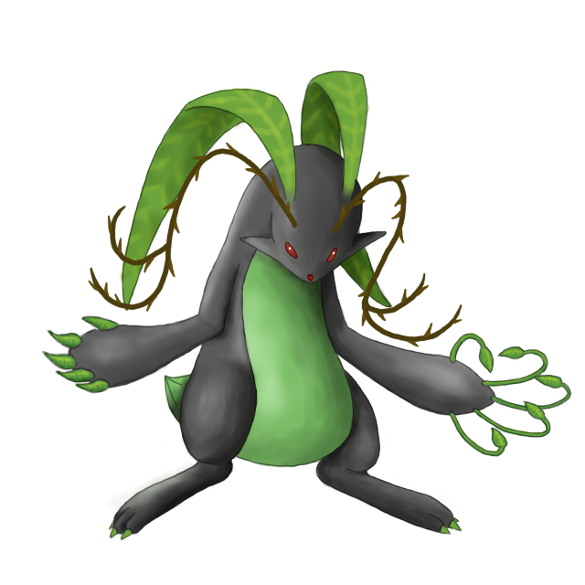
@Choms: This is a really interesting concept. I love the colour scheme, it has the perfect mix of colours for both types and isn't so dark that it obviously screams Dark type- which is good. The red eyes really help.

@Koa: I really love the concept of the shade but I feel maybe the leaf should be attached to or integrated more to its body or something. Maybe the back of its head, shoulders or back?
 
Magistrum, I've been too lazy to comment before and I just want to say that I'm really, really into your design, and that since you first posted that sketch nothing else has come close in my mind. Great stuff, really. I'm less fond of the frontview you posted with tons of bright red swirly stuff, and more into the other design you included in that post.
 
. . . Meet the woodland hermit.

The idea behind this guy is that he's a solitary beast of the forest. He trains vigorously and can use that giant leaf in battle. . . .

He looks wonderful, but his guru-like appearance screams "fighing type" to me, and while there are some clearly dark tones to his character, they seem overshadowed (no pun intended) by the overtones of fighting type that such a meditative and ascetic character design evokes.
 
So, I told y'all that I wold do another sketch, and this time more dynamic, without further ado, here it is (and done in classic Sugimori style)


Cool right? It looks the exact same as the earlier one... Well I tried. As far as the comments people have given me, the face will stay the same, in my opinion it looks dark and sly which is perfect,

In terms of standing out? Umm I thought the northern plants were good enough, and minks are awesome mammals that perfectly suit dark typing, I don't have anything else going for me though, so yeah?

Oh and comments and criticism always appreciated
 
*sigh* Having another go at it, heh. All this doodling is making my hands hurt.


This is just a sketch, obviously, I wanted to get some kind of feedback before I put the time into coloring it again. The concept has both evolved and devolved this time... He has his dewdrop "crystal ball" back and his rapier is now a cane.... Making him somewhat of a middle ground between the swindling fortune teller (who lies...) and the cavalier bandit (who steals!). He also has his complete double disguise now, with the actual pokemon living between the big fuzzy center of the flower and the carved hollow nut that makes the head. It pokes its face through the fuzz when it needs to be a cute little flower, then peeks through the eye holes of the nut when it needs to swindle! The body is made entirely of its long, flexible roots.
 

Brambane

protect the wetlands
is a Contributor Alumnus


Redesigned the tail. Some species have lollipops and tootsie rolls on their tails and inhabit playgrounds.
 
@Harle
I do like the personality of your drawn gypsy mon a lot better than you last one. But I'm afriad your concept is too scattered now that you've combined them. Fortune Teller Fencer doesn't really work to me. I'd pick one and stick with it if I were you.

@Dracoyoshi
Much better! You've captured an absolutely fantastic expression on the face. It looks so evil and malicious and happy that that Phanfy is about to fall into sin. Just needs to be a bit more fleshed out, and you are almost a shoe in if we get harvest as the ability! Only thing else I can say to improve it is make the fruit look more forbidden(?) I dunno. Its really cool as is tho. And lol at the tootsie rolls, it can be Hypno's best friend!

@Doran Dragon
Your Baphomet (is that the right word?) mon is way too cool to be wasting time on something else! Stick with that idea and make some amazing suppoting material. I'd love to see it taking on the Lati twins and toed. Maybe using some art of it using the more popularly talked about abilities on the ability discussion too.

@Invalio
Needs more dark type, and it legs seem a bit bulky for its small body. Id play around with some proportions.

EDIT: Woops can't believe I forgot Yilx
Cool design as always. I don't think you ever fail to disappoint. And you are actually going for a full plant, which makes your design very unique to everyone else's design who are for the most part using animals. Most ppl would have a hard time making a plant look attractive, but you did this very nicely. I have absolutely no problems with it.
 
Sort of narrowed the designs down and experimenting on colour schemes. I forgot a tiny detail that the leaves are actually really thick and sturdy like bromeliad leaves so they're not as fragile as a normal leaf would be. This makes it's slashing attacks much more powerful and dangerous.

Just using colour pencils for now since I can't colour digitally at the moment. The body's colour is meant to be a gray/dark green colour to connect it to the Dark type a bit more.


@Collol: Ah maybe I wasn't clear with my suggestion, I mean the whole circle of the eye (not just the pupil like you did) to be yellow. That way it looks more zombified and it would have less personality- I think anyway. ^^
 
Posting this because I might as well:


Concept is some sort of oak tree-plant-rat-vampire-fall season-mashup. Any comments on how I can make it grassier is appreciated.
 
As I am lazy (6 pages to review? Really?) I'll just give my 2 cents on "most improved."

Dracoyoshi8 I really agree with nov on this one. The eyes are beautiful, face is amazing and it captures the general idea well, while still showing clear improvements on the face, colour scheme and... Well, everything. This captures Grass/Dark well, not to mention the background is nice (A & E references are cool, even if I'm an atheist). This is a nice piece, and certainly has a chance of winning.
 

UltiMario

Out of Obscurity
is a Pokemon Researcher
I actually really like the change to the cane, but the Dewdrop isn't really great. It would've been better if this was part Psychic or something, but making the arm with the dewdrop normal again would make the design a lot more appealing.

Good shit though, really hope you win :3

EDIT

The idea is that he pretends this ordinary dew drop is some kind of crystal ball he can see in the future with... But he's lying. He has no psychic abilities. He tricks people who think a fortune telling pokemon is both adorable and likely to actually have psychic powers, but in reality he just takes their food/trinkets and lies or runs away. In the end though, I'm just taking whatever critique comes his way and trying to answer it with the design and was actually thinking of replacing the dew drop with a handful of leaf-cards like he's some sort of gambling, swindling, cane swinging pimpmon, but I don't know.
Sometimes simple is best. The expression and details you otherwise have already really attribute to your art looking dark, while not going overboard. Something in the right hand likely isn't needed at all.
 
@Harle
I do like the personality of your drawn gypsy mon a lot better than you last one. But I'm afriad your concept is too scattered now that you've combined them. Fortune Teller Fencer doesn't really work to me. I'd pick one and stick with it if I were you.
Thanks, he isn't a fencer anymore though. The stick is now just a cane for walking and head bonking, mostly. I think a cane is appropriate for a fortune teller.

I actually really like the change to the cane, but the Dewdrop isn't really great. It would've been better if this was part Psychic or something, but making the arm with the dewdrop normal again would make the design a lot more appealing.

Good shit though, really hope you win :3
The idea is that he pretends this ordinary dew drop is some kind of crystal ball he can see in the future with... But he's lying. He has no psychic abilities. He tricks people who think a fortune telling pokemon is both adorable and likely to actually have psychic powers, but in reality he just takes their food/trinkets and lies or runs away. In the end though, I'm just taking whatever critique comes his way and trying to answer it with the design and was actually thinking of replacing the dew drop with a handful of leaf-cards like he's some sort of gambling, swindling, cane swinging pimpmon, but I don't know.

@mcFlareon: I really like the latest sketch you've posted... Something seems a little awkward about the proportions, but nothing big.
 
So it seems the left one was the most popular.
Now I'm ambivalent over which one to use, so I'll offer both up for your appraisal. On the left we have the original, more garlic-y coloration with the pink nose, and on the right we have the purple, more-evidently-dark-typed variety.

CHOOSE HIS DESTINY
 
@Mos-Quitoxe: I love the right colour scheme more. Maybe the left one could be a shiny version?

@Harle: Thanks for the comment. Yeah I'll draw it more properly at a later stage, I'm just a bid bad at symmetry and balance in the leaves for example.
 

Magistrum

DOITSU NO KAGAKU WA SEKAI ICHI
is a Top Artist Alumnus
Comments! (/^o^)/
@koa: Damn that looks badass. It reminds me of koropokkuru which makes me like it even more since I'm a fan of the Shaman King manga/anime.

@mcflareon: Can't wait to see your capmon develop more, I was captivated by it. Although to be honest I liked the first two of the four poses on your first sketch. The overbearing gaze made it alluring and cool at the same time.

@yilx: That heavy slam...*awesTRUCK* Bad puns aside your design is damn wicked!

@dorandragon: For some reason I actually like this version of your baphomet over the spread-winged one.

@harle: Damn that pose is heaps better! It made the guy darker and menacing, although to be honest it didn't give me the impression of a fortune teller or a bandit, I actually thought it was a musketeer. It looks awesome either way.

@mos-quitoxe: Definitely the left one. Although the other has darker colors, the left one IMO is better.

And a minor update:

I tried to do mcFlareon's suggestion and so far I think it patches up the lack of green nicely. Thanks!

I think I went for the gray at first so that the dark portions in the eyes, mouth and stomach won't be alienated too much. But I think this is fine too. :)

Now to the image at hand, I developed the greener one I was originally working at, and fixed the distorted left leg on the back view. I am actually in an internal stalemate because both designs have their merits. Will dwell on this more, although nothing is slated in stone yet so I might come up with other designs. [winter theme? spring theme as a precaution for flower gift?]

@Fizz yeah I feel you bro, after looking at it one more time, the red-colored vine limbs reminded me of muscle fibers which is kinda disturbing so I sacked it.
 

nyttyn

From Now On, We'll...
is a Forum Moderator Alumnusis a CAP Contributor Alumnus
The tail looks completely unnessecary and actually makes it look worse, imo. I dig the concept overall, it's just, why does he have a tiny little tail. Why does he need a tiny little tail.

Plus it makes him look like he's pooping.
 
My first go at jackalope mon was a little boring, he was just standing there. Hopefully this stance will be a bit more successful in making it look...not like a statue. Also I'm hoping this will show off the claw concept some more (but I'll get some supporting art to help with that too).


Think it needs more brown?
 
Status
Not open for further replies.

Users Who Are Viewing This Thread (Users: 1, Guests: 0)

Top