nov, I love it. It's... it's beautiful.

-
The moderators of this forum can be found in the CAP forum staff directory.
-
Welcome to Smogon! Take a moment to read the Introduction to Smogon for a run-down on everything Smogon, and make sure you take some time to read the global rules.
-
Congrats to the winners of the 2023 Smog Awards!
CAP 16 CAP 5 - Art Submissions
- Thread starter Birkal
- Start date
- Status
- Not open for further replies.
Hey all!
http://imgur.com/VLyPpkV
So my inspiration for this art was looking at several plants that I would consider "bullies" of the living world. I came up with several plants, including the durian (yay for smelly obnoxious fruits), plants with burs like burdock, and various spiny plants like cacti or pineapples. I was planning on adding a sort of vine/chain thing to this guy to make it feel kinda like a chain-chomp from Mario, but there's no real way to stick one one without it looking too odd. It's supposed to invoke the same kinda feel as glalie as a fully evolved pokemon, but it still kinda feels unevolved. Also, I'm still exploring various color palettes to show off grass/dark typing (considering green/brown, black,and purple tips for the mohawk thing). Tips on how to improve either would be great. I'm gonna take a look at some of the art, and I'll be back with comments. ^.^


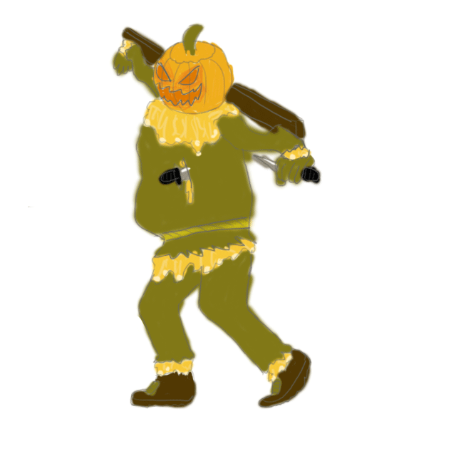
Cornmon B)

I was just playing around with some brushes for the shading; I'll try not to do something like that on a final product, haha. I'm putzing around with cornmon having an actual scythe. I think he looks pretty daring with it! I might try to make it more leaf-like. Any feedback is appreciated.
EDIT: Huge props to Wyverii for helping me work out some of the proportions. I know I still have a lot to fix (dat mask), but at least I'm on the right track now. Thankee

Thanks for the critique!The tail looks completely unnessecary and actually makes it look worse, imo. I dig the concept overall, it's just, why does he have a tiny little tail. Why does he need a tiny little tail.
Plus it makes him look like he's pooping.
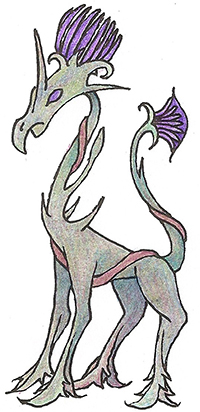
The tail actually serves two purposes, design-wise. The first one is that lesser trolls, such as forest trolls and its smaller brethren, actually have tails. It is said in folklore that trolls often transform as women or fairies to fool travelers passing by forests or mountains. However, trolls always[or almost always] retain their tails even after transforming, which is something that gives them away from outsmarting humans. Trolls usually have bushy tails or animal-like tails, which in this case I used a twirling vine tail to mildly relate to both types.
Which brings us to the second purpose. The swirling patterns inside the mask and stomach are also vines, but they can also be mistaken for eerie red light that emphasizes a sense of creepiness and darkness. Trolls in some folklore and in some games are adept in magic, which may relate to that. The eerie swirl is also seen in unrelated media like Persona 4[TV World's sky] and Panty and Stocking with Garterbelt's enemies, the Ghosts. So in response i added the tail swirling out of the tree bark body to clear the confusion.
A third purpose, albeit selfish, is because I want to add a tinge of comedic feel for the design. Trolls are, by definition, mischievous and silly-looking. Besides, I think that your comment that "he looks like he's pooping" actually proved the slight comedy I wanted to express.
So for now, I don't feel like removing the tail, but who knows, CAP5 is still underway (actually I'm stalking the abilities section right now and I don't like water veil >_<) so I am open to change and remove the tail if it comes down to that.
I hope that answers your questions and again, thanks for the critique!
Haha, you aren't alone. I don't think any of the CAPs so far could possibly justify water veil except maybe that swamp scarecrow that was posted a while back, and even that would take some redesign. Why must a simple name of an ability dictate our art?(actually I'm stalking the abilities section right now and I don't like water veil >_<)
Also I love the comedy of your corn reaper now Birkal. Its ironic in a huge way. Instead of humans reaping corn, the corn now reaps humans, however, I think metal is a bit strong of a material to use for such an organic mon. Perhaps you could make it wodden and have a peice of twine holding a couple corn shucks on the scythe for a decorative feel rather than making it metal.
Comments!
@Shanimanim: I really like your artwork, but your concept really doesn't translate into the actual image. The most recent one looks something like a demonic tree-octopus trying to eat some poor T-Rex, which actually is more intriguing than a dinosaur disguised as a tree imo. I'm probably overstepping here, but I really think you should try exploring that concept as well.
@Chomz: Your design is really great aesthetically, and it captures the feeling of a sinister grass type. One thing I'd suggest is to darken the grays and browns in the alternate coloring, and brightening the greens. That way, the color layout stays the same, but the contrast is a bit more dramatic, and it highlights the grass typing a bit more. Also, you might want to take a look at the Aye-aye's hands. They've got these really tiny and thin middle fingers that don't really look like fingers. I don't know if its something that you want to incorporate into the design, but it'll definitely add a creepier feel to it.
@Mos-Quitoxe: I really don't have much imput here, I feel like you've already got this concept nailed down really well. The design works, and I really like the humorous spins that you put into your artwork for these CAPs. One thing I will mention is that I really like the tan color palatte, but consider darkening the browns to make it feel a bit more dark-typed.
A couple of comments:
Firstly, Magistrum: I prefer the green design better, to be honest. I like the way it involves far fewer colors, which gives it a much simpler, cleaner look.
Now, Harle: I much prefer the fencing design to the "fortune teller" one, that doesn't really seem to be all that fortune teller-y in the first place. If you want him to have a cane so bad, there's no reason why you can't just have his rapier double as a cane -- after all, it is, in the end, just a re-purposed stick, so you can make it do whatever you want!

This and Yilx's just won my heart.Trying out with my attempt :)
Just some sketches for now.
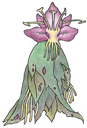
The concept is a sleek design that has less emphasis on the scary/evil attributes associated with the dark type and instead focuses on refined and sophisticated characteristics- sort of more towards how Absol is designed.
The main feature of the design is 'what grass design attributes relate closest to the Dark type?' and so I decided to emphasise the use of whip-like vines, thorns and sharp leaf blades. If I had to relate the design to a plant in real life, it would probably be a mix of a thistle, chestnut and bromeliad. Main attacks (which I'll do in a future support art) would be Leaf Blade and Night Slash with its sharp leaf arms and that vine-like feature in its head can be used like a mace (most likely with a Power Whip).
It also houses a sought after berry/seed in that thorny part- basically the sharp leaves/thorns are to protect the sought after seed. Although it has rough design elements with the thorns and razor edge thistle leaves it's fighting style is quite stylish and classy, even versatile with its mace ponytail thing. All these 'rough' designs are a result of it adapting to its environment and fiercely fending off enemies who want its precious seed. As such it has a fiercely protective reputation, doing anything to protect itself and add to the Dark type element of its design.
http://i47.tinypic.com/2co6e7m.png
Thanks for the comments, I finally did a more finalised design in terms of proportion, now just testing out colour schemes :)

My original concept I had in mind was the leaves having some red like some leaves do but I couldn't get quite the right balance of red and green right without clashing too much.
Also some support drawings (do they have to have finalised lineart for the submissions as well?)

My original concept I had in mind was the leaves having some red like some leaves do but I couldn't get quite the right balance of red and green right without clashing too much.
Also some support drawings (do they have to have finalised lineart for the submissions as well?)
http://i54.tinypic.com/25kmn1h.png
In the case of Needle Arm, glowing energy surrounds its leaves and the spikes extend as it stabs the opponent.
Faint attack uses its leaves to distract the opponent while it attacks with it's spiky seed thing- or vice versa.
In the case of Needle Arm, glowing energy surrounds its leaves and the spikes extend as it stabs the opponent.
Faint attack uses its leaves to distract the opponent while it attacks with it's spiky seed thing- or vice versa.


I really like this new version. You can continue to play around with the stubbiness but this version has a lot more character.Ok…so I re-design him with your tips in mind.
http://img197.imageshack.us/img197/7065/badgerfakemon3.png
Old version: http://imageshack.us/a/img542/3936/badgerfakemon2.png
I tried to make him look more badger-like and gave him more of a dark-type vibe. Not sure if I like him this stubby. But I do agree that he looked too canine-like. I actually intended for him not to resemble a badger TOO closely, as the official Pokémon designers often seem to stray just abit from their influential animal aswell (and I admire the resulting uniqueness of that).


Alright..... Assuming I won't be scolded...

I'm thinking this is close to if not my final draft. The design is now completely left open to interpretation, considering the feedback often mentions how they interpret it differently. Stick or rapier? Both! Heh.... Basically his theme has just been simplified to "swindler". My question now is... Purple or green? One I think is darker, the other grassier... I'm fond of the purple, but then again, I was also fond of the orange... But nobody liked the orange. Also, even though it's kind of insignificant, does the design look better facing left or right?

I'm thinking this is close to if not my final draft. The design is now completely left open to interpretation, considering the feedback often mentions how they interpret it differently. Stick or rapier? Both! Heh.... Basically his theme has just been simplified to "swindler". My question now is... Purple or green? One I think is darker, the other grassier... I'm fond of the purple, but then again, I was also fond of the orange... But nobody liked the orange. Also, even though it's kind of insignificant, does the design look better facing left or right?

Harle: Go with the "darker" one on the left, IMO. The right one could be a shiny.
Jesus, that looks like an amazing picture on it's own, too. I love your design, everything about it; my only complaint is the proportions, which you could -try- tweaking to match a more "chibified" look; it really looks too much like a human right now IMO! Besides that, your design has really won me over.

In case the abilities or stats don't fit the Vampire I'll fall back on Cactus Girl.
Jesus, that looks like an amazing picture on it's own, too. I love your design, everything about it; my only complaint is the proportions, which you could -try- tweaking to match a more "chibified" look; it really looks too much like a human right now IMO! Besides that, your design has really won me over.
In case the abilities or stats don't fit the Vampire I'll fall back on Cactus Girl.


Harle, I am going to say the one on the right. The colors are leafier. I don't like the green as much for the one on the left: it's darker, but it almost has a blueness to it. I think that one of your design's strengths is that it conveys the Dark type without dark colors. It's a sinister swindler striking self-assured pose.
I think what you have there would look great as a head, but alone it gives me that baby pokemon feel. It feels more like a pichu than a raichu, more like a happiny than a chansey. If that is the whole pokemon, then I won't believe it's fully evolved. The lack of detail is probably what makes me think "that's so small!" With glalie, you have more detail, the spikes on your pokemon aren't enough. You could make it look meaner and scarier and that might do it, that's how glalie doesn't seem like a first evolution. Then again glalie was still under designed. If you want your drawing to be chosen then you don't want anything under designed, you want something that stands out.
My opinion still stands though, that would make a good head.

I love this badger, it really looks like a Gen2 pokemon (kind of a grass Mightyena) but i feel that it fills the role of a pre-evo more than a fully evolved pokemon; perhaps something more bulky and menacing while keeping this badger-like theme.Ok…so I re-design him with your tips in mind.
http://img197.imageshack.us/img197/7065/badgerfakemon3.png
Old version: http://imageshack.us/a/img542/3936/badgerfakemon2.png
I tried to make him look more badger-like and gave him more of a dark-type vibe. Not sure if I like him this stubby. But I do agree that he looked too canine-like. I actually intended for him not to resemble a badger TOO closely, as the official Pokémon designers often seem to stray just abit from their influential animal aswell (and I admire the resulting uniqueness of that).
I do also like Yilx -Bleeding Heart Vampire- as it inmediatly make me think of a Grass-Dark pokemon; yet, looking at how the ability discussion is going, this slim guy does not look like taking a Draco Meteor from a specs Latios (as if something besides a Spdef metal-type could). Anyways nice drawing!...

cap coloring book
CAP is, at its core, a community project. And I want to get people who claim they lack artistic talent (I don't believe anyone truly lacks artistic talent) involved in the process of designing the aesthetics of CAP5. With that in mind, and 5 minutes in ms paint...
LET'S COLOR!

I want you guys to decide what color you think Snapple here should be! I want you guys to color it yourself! How?
1. Copy or save the above image.
2. Open up the image or paste it into ms paint.
3. Using the Fill (the bucket) tool, dump colors in the white spaces! DO NOT FILL THE BACKGROUND.
4. Save the image when you are done.
5. Upload the image to an image sharing site, such as imgur.
6. PM me the link to the image!
And that's it! I hope to see what color schemes you guys come up with!

YourFavoriteEgyptian
Banned deucer.
A rough colored sketch just to keep your eyes content for the time being. Quanyalis: I agree with what you said about my first post so I tried to make the entire thing flow more with more emotion and movement.
Keep the comments coming!

I had two ideas that I wanted to get out of my head and onto paper - only had some colored pencils with me at the time, but they show the ideas, at least. Either one merit my taking the next steps in polishing them?
First one: Thought of this CAP as a "dark horse," playing to underused types and facing down big guys... I took it a little literally in this design. Going for a (wingless) threstral and thistle cross. (wings made it too flying-type for me)
Second one: liked the idea of a demon seed for a literal grass/dark, a few tries later and the demon became cthulu crossed with an orchid.
I realize these are incredibly rough, but any and all critique would be more than welcome. Some of the submissions here have been fantastic – even if my two attempts fall to nothing quickly, I can't wait to see what else appears here. Thanks.
First one: Thought of this CAP as a "dark horse," playing to underused types and facing down big guys... I took it a little literally in this design. Going for a (wingless) threstral and thistle cross. (wings made it too flying-type for me)

Second one: liked the idea of a demon seed for a literal grass/dark, a few tries later and the demon became cthulu crossed with an orchid.

I realize these are incredibly rough, but any and all critique would be more than welcome. Some of the submissions here have been fantastic – even if my two attempts fall to nothing quickly, I can't wait to see what else appears here. Thanks.
- Status
- Not open for further replies.