The Artwork for Tournaments Thread

Status
Not open for further replies.
My Submission for OU Cavalry. Went for the 300-spartan kind of look and imagined this big cavalry charge down a hill in the background but then I got too lazy to draw that so I just went with silhouettes on the ridge. If anybody wants to finish this off/ add in a cavalry charge then message me and we'll sort something out. Equally if you wanna do some better text Zrack, otherwise it's just gonna stay as it is.

 
Heh, seems like everyone decides to do the same tourny at once. Anyway, here's my (potentially) finished piece. Posting two versions, also looking for feedback on whether people think the mons need to be shaded. It's something I started but I thought it was actually taking away from the pic. Do you guys think it's worth doing?

PS: Since it probably needs to be said, I know Shaymin and Azumarill aren't exactly the most popular UU mons around, but I was going for a big mon scaring the cutemons away sort of thing. Unfortunately UU seems to have shit all in terms of cutemons... the most popular one probably being Victini, and let's face it, Victini would completely melt Scizor so it wasn't really an option.


Edit: K I'm dumb and forgot Scizor's claw eyeballs. Time to go back to the drawing board...
 
Elcheeso: I would heavily advise that you shade and highlight that picture. Shading and highlights give your piece a whole new depth of perspective that really makes it pop out, and can really bring that piece you made to a whole new level, since it's pretty good right now. Just that little extra effort and it'll look great!

For example, my pieces normally have bad lineart, but when I add all the layers of shading and highlights, I tend to overlook the lineart because of all the wonderful colour in it.

Also, the arm to the right on scizor has a little bit of an overlapping bit of lineart where the joints connect. You may want to fix that.

Also, while this is my personal opinion, I would keep the eyes with no pupils.

Now, I think that I've finished my piece Zracknel. The 3mon tourney one, so you can upload it into the submissions, since there hasn't been any critique saying to change something.
 

Danmire

its okay.
is an Artist Alumnus
Elcheeso: I would heavily advise that you shade and highlight that picture. Shading and highlights give your piece a whole new depth of perspective that really makes it pop out, and can really bring that piece you made to a whole new level, since it's pretty good right now. Just that little extra effort and it'll look great!

For example, my pieces normally have bad lineart, but when I add all the layers of shading and highlights, I tend to overlook the lineart because of all the wonderful colour in it.
I don't think it needs too much shading, maybe just some highlights, a darker or light shade of the original, but just one color. Logos generally don't have much shading, as opposed to other means of traditional shading. Take a look at Zracknel's pieces for example. They're marvelous, and don't have a massive amount of shading. (can you count the number of times I say the word "shading"? you win a prize if you do)
 
I don't think it needs too much shading, maybe just some highlights, a darker or light shade of the original, but just one color. Logos generally don't have much shading, as opposed to other means of traditional shading. Take a look at Zracknel's pieces for example. They're marvelous, and don't have a massive amount of shading. (can you count the number of times I say the word "shading"? you win a prize if you do)
5 times. Anyways, I agree partially with what you say, I just personally thought that this piece could use a bit of different colour, maybe some highlights, but you're right, not all pieces need to have shading in it.

Also, could someone take a look at my piece and give some advice on it? Something doesn't feel right about the piece I made, but I'm not too sure about it.....
 
Very happy to see so many submissions for the OU cavalry :)

That deadline is coming up!

Elcheeso: I would heavily advise that you shade and highlight that picture. Shading and highlights give your piece a whole new depth of perspective that really makes it pop out, and can really bring that piece you made to a whole new level
Danmire kind of beat me to the punch, but here's my spiel anyway...

I can definitely appreciate the sensitivity towards highlighting and shading. I think that a recurring principle behind a lot of good artwork and illustration is that it finds ways to cheat what look like three dimensional forms onto what is naturally a flat, two-dimensional medium.

But I don't think that adding more painterly highlights and shading is the only way that successful artwork will achieve this. Especially in the world of logo design, where colors are money and less is usually more (for a whole host of reasons) designers will find ways to add dimension and depth without gradients of colors.

Ace trainer Bummer did something like this recently with his sneaky third edit to his 3-Mon tournament submission that I missed.

There are technically "highlights" and "shadows" going on here, but the number of colors used is quite small.

To use an example from my stuff-- achieving variation in value is not tied exclusively to shading.

But I don't think that artwork even needs to use tone or value to suggest dimension-- sometimes line variance is enough. Big flat planes of color can be sulpted by thickness (or weight) of the lines that surround them. Not the best example ever (and I'll edit in a better one that's not mine later) but it's kind of along that idea.

And to be honest, while I think elcheeso could possibly improve his piece in different ways if he wanted to, that last point would be my suggestion. I think an effective remedy for some of the more "flat feeling" parts of his piece would be to thicken up some of the lines and vary their weights a bit.

So that's my two cents!

Furosuto said:
For example, my pieces normally have bad lineart, but when I add all the layers of shading and highlights, I tend to overlook the lineart because of all the wonderful colour in it.
If you don't think you have strong line art, I think you should attack it head-on :)
 
Very happy to see so many submissions for the OU cavalry :)

That deadline is coming up!


I was probably going to let this slide, but I would feel a lot better about listing your submission if your silhouettes weren't such close references to official artwork. I know it's a pain, but any chance you might consider replacing them with originals?

Sorry man, haven't got the time - hence my explanation in my post. I can remove them completely if you'd prefer...
 
No, I am using the gaussian blur filter on my shades. Why?
nothing, it just really looks like you're using burn/dodge, which a lot of people suggest not doing lol
i would suggest trying to shade/blend without using blur and see how that works for you
 
Alright so... I was definitely planning on doing more work with my logo, but I have a few responsibilities I need to take care of at work so it's not really an option at this point considering this tourny's deadline is this friday. So I thought I'd just give the two versions of the old pic with the claw eyeballs and an idea of what I was working on before I had to stop. It was before I saw any of the recent posts and it looks pretty awful IMO. I started embellishing, then tried simple cel shading and somehow ended up making some sort of half painted, half cel shaded, half horrible look. Guess my natural inclination to paint took over. I'm gunna post the PSD and if anyone wants to work on it, feel free. For reference, there are probably a lot of superfluous layers in that file since I had a lot of ideas for the logo that ended up scrapped or forgotten. Anyway...


An example of my awful shading.


McMeghan

Dreamcatcher
is a Tournament Director Alumnusis a Top Tiering Contributor Alumnusis an Administrator Alumnusis a Dedicated Tournament Host Alumnusis a Battle Simulator Moderator Alumnusis the 5th Smogon Classic Winneris the Smogon Tour Season 14 Championis a defending SPL Championis a Past SPL Champion
Big Chungus Winner
My submissions for the Forgotten Year Tournament, two version of the same logo :

V1


V2


(Credits to sandshrewz for the Latias and Orugos for the Salamence originals artworks.)
 

Pocket

be the upgraded version of me
is a Site Content Manager Alumnusis a Team Rater Alumnusis a Community Leader Alumnusis a Community Contributor Alumnusis a Tiering Contributor Alumnusis a Top Contributor Alumnus
McMeghan, perhaps try a green or brown background so the contours of Latias is visible. Latias blending in with the background makes her look awkward.
 
Pocket: I don't think a green/brown background would help with that, as it would throw out the colour scheme I think. Latias is blending in, but it's identifiable enough that it isn't too much of an issue, and if it really is then maybe just adding an outline to the white areas would help
 
Pocket: I don't think a green/brown background would help with that, as it would throw out the colour scheme I think. Latias is blending in, but it's identifiable enough that it isn't too much of an issue, and if it really is then maybe just adding an outline to the white areas would help
green will compliment the reds going on there lol
 
On Version 2 of that logo. There's far too much white space for Green, or a harsh contrast to work. It would disrupt the whole colour scheme and feel of the piece. I think if on V1 you made the body of Latias white against the low opacity background. It would make Latias stand out a lot more. Because I had to look for about 20 seconds before I found Latias' head. because I couldn't work out the way the body was going. Simply because I'm thick but with the text obscuring it. A little distinction from the background would do wonders imo :)
 

Rocket Grunt

✁ - - - - - - - - - -
is a Top Artist Alumnus
aaah man i had a similar idea
heres what i came up with
hope its not too late for this
photobucket's fucking up so i used google docs

IMAGE HERE (.PSD)

i did it in raster though cause im an idiot

EDIT
here's the image if you dont want to download or google docs


looking at it now the text needs more legibility
and i forgot this is the second time this is going down
ill fix that in a little bit
 
Phew, so I finally finished that logo! Little late but it's better than nothing I guess, haha. Already sent the copies to Sayonara, I'm just putting these here for reference. Though if anyone has any CC, I'm still open to that!


Hrm I probably shouldn't double post this... but... I started working on that ADVanced users only tourny, hoping to get some feedback on what I've done so far.

Edit 2:


Basically the idea is for the breath stuff to be stylised fire or what have you (something like sacred fire/fire blast/hidden power grass). Not sure if the balance is thrown out by them or not though, seems like the pic is heavier on the left side to me. Also the lineart isn't done, but you can get an idea of what I'm going for on hooh. I think the text may end up being a problem as well, beyond the appropriateness of the typeface, it... technically isn't the full name of the tournament, and I wouldn't be able to fit it in if it was. What do you guys think? Is ADV users only enough or do I need to scrap this and start over? It is sort of missing the double meaning...

Edit: Whoops I forgot to mention that the tail feathers on hooh and altaria's cloud are gunna be tinted redder or bluer than usual, respectively. Nothing major, just to stick closer to the red/green/blue colour scheme. Maybe some text in the fire too? IDK.
 
Sorry for the short spot of inactivity!

I'm positively thrilled to announce our first set of officially completed projects! :))

First, tremendous thanks to Bummer for his submission to the #
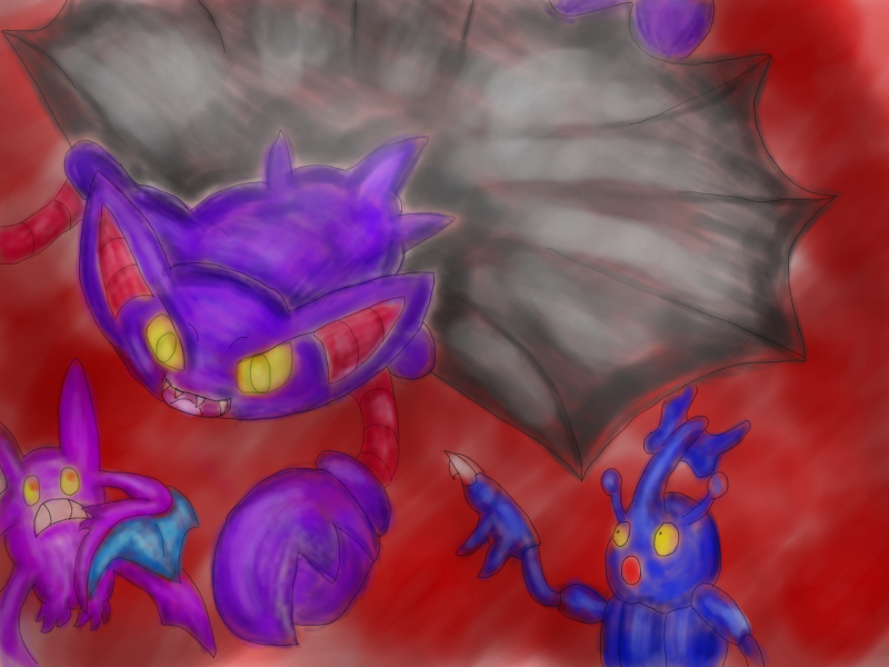
Pokemon Tournament! Bummer's designs for this tournament went unopposed, and I hereby crown him a somewhat belated champion of this tournament!

Secondly, major congrats to 
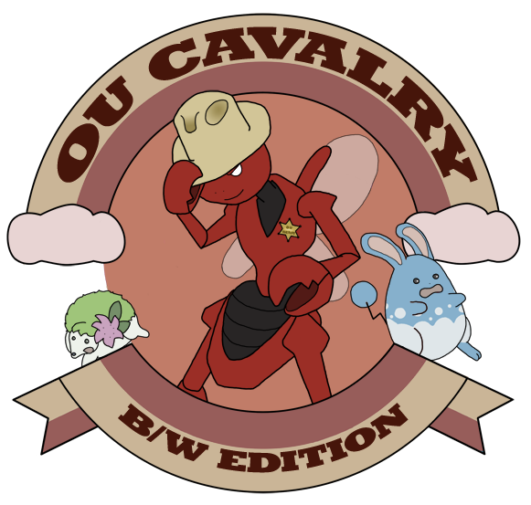
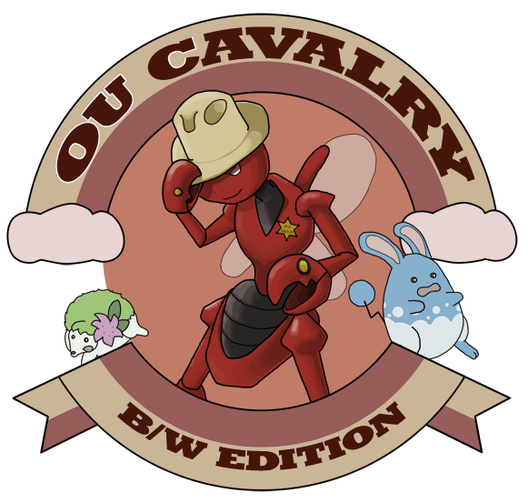
elcheeso for having his artwork selected to represent the OU Cavalry: BW Edition! elcheeso's work was selected (through a bit of miscommunication and despite being a WIP, haha) from a fray of noble combatants!

Thirdly, congrats to 
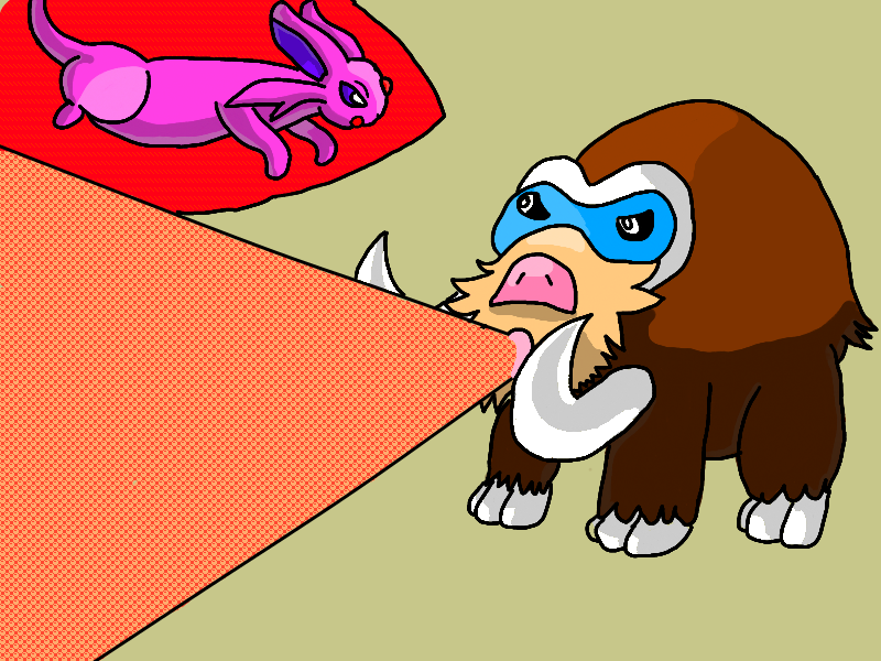
DragoniteKnight for submitting artwork to Pass the Trash II! This tournament got artwork a bit later than the rest, and the final call was close and contentious.

Steven Snype said:
I consulted with Mithril, my cohost, about which logo to use and we opted for [DragoniteKnight's submission]. While we agreed the one Rocket Grunt made was creative, we felt it was kinda hard to read, and we preferred the simplicity of the logo DragoniteKnight provided. Thus, we went with DragoniteKnight for our logo. Thank you very much for providing us the logos and thanks to DragoniteKnight and Rocket Grunt for their effort.
I was pulling hard for Rocket Grunt because I thought his submission was excellent, but I ultimately ended up yielding to the wishes of the tournament hosts. Rocket Grunt, if you'd like to revise your submission as per the feedback of the hosts, I'll push for your work to be included in the tournament.

~~~~~~~~~~~

In other news, I've revised the OP to include a re-prioritization of our current assignments, and I've also created a listing for our completed projects!

In addition, I've been wanting to keep close track of our submissions, so I've created a scoreboard for all submissions to the thread so far! I've scored everyone based on the number of submissions and winning pieces they've entered.

Since we've been at it for a few weeks so far, I'm curious for feedback on this thread so far. What do you think of how things have been going? Feel free to send me a VM or PM with your thoughts.

Many thanks to everyone who has contributed so far! I'm very grateful and happy for all of the effort and discussions that have taken place in this thread :))

Let's keep at it!
 
Status
Not open for further replies.

Users Who Are Viewing This Thread (Users: 1, Guests: 0)

Top