
-
Welcome to Smeargle's Studio! Please be sure to review the studio rules. Feel also free to check out our hub to learn more about this place!Welcome to Smogon! Take a moment to read the Introduction to Smogon for a run-down on everything Smogon, and make sure you take some time to read the global rules.Congrats to the winners of the 2023 Smog Awards!
Sticky X/Y Sprite Project
- Thread starter Layell
- Start date
Shiny Dedenne So yeah, backsprites.
Aurorus
[URL=http://s305.photobucket.com/user/XandZero2/media/Auroruswipomedits_zps33b08c13.png.html] [/URL]
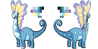
A few minor edits to the front sprite, namely to mae the eye less pronounced and correct the curve of the sails. Back sprite is also finally done now, so even more fun stuff. These things probably need color correction, as I decided to dabble with the colors again and I think I screwed it up but w/e, I'm not at a computer where I can easily fix that anyway. Besides, this guys's been made, so that's still progress from my part. Now onto some srsbzns.
Amaura
 VERSUS
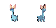
The right set is mine, the left set is the one that's currently on the chart. The one currently in use lacks good shading, looks dopey, has a head that's way longer than it should be, and just generally bad proportions/lineart. This needs to be fixed. However, apparently my first draft wasn't good enough to replace it somehow, which leads me to my question: what do you guys want to see from a tiny amargasaurus that has the bodily consistency of a wet noodle? (No seriously, look at theSugomoriOfficial Art, this thing is painful to look at) This thing needs fixing, and since mine apparently isn't good enough, I want to hear from you guys exactly how I can make it better, even if I need to completely redo it, because this is the one sprite on the spreadsheet I am still unable to imagine alongside Gen V's sprites.
I have a few ideas as to what I did wrong on my initial sprite, so I'll start by listing them here.
- The neck looks too straight, even though it is based off of in-game shots from that angle. Need to scratch the neck over to account for this and make it less rigid more fluid.
- colors are bad, needs fixing as shades are too hard and look like candy.
- find more room for the mouth perhaps, possibly by making the head a pixel bigger both vertically and horizontally.
Aside from these issues, throw literally anything you can think of my way, as I want to knock this guy out by tomorrow if at all possible. Again, if this thing needs re-scratching, tell me you think so and I will throw something together with more force than Johnny Quinn trapped in a bathroom.
also here are some minor as hell edits to Meowstic F to fix the eyes. Literally changed the color of two pixels, should be ok now.
for some quickie comments:
Legitimate Username If you need someone to pick up the reins on Xerneas, I'd be willing to fix the issues PoM had and apply them to the backsprite. (stealth pun alert)
RedRooster those edits look really, really good. I think there might be a few things that may still need work on Hawlucha, but they're a lot of minor nitpicky things like the eyes still looking off to me and and the beak pointing a bit too far to the left, but it looks great all-in-all. Noibat also looks better now, which is interesting because I never saw the feet as being a problem until I saw what it looked like with the editted feet, and then it dawned on me how ridiculous they looked. Great work man. +)
Sláinte!Updated the Mega Pinsir back sprite to better match the new front:
 [URL=http://s959.photobucket.com/user/icebem/media/PinsirB-4.png.html]
 [/URL]
Any more improvements to be made, just let me know.
EDIT:
Changed the back sprite...
The arm outline connected to the body a bit awkwardly so I literally erased one pixel.Last edited: Since they weren't updated last time, I made some minor colour changes to Trevenant's sprites, and I'll just leave those in this box:


LET US OUT
no u stay there
Someone mentioned fixing Trevenant's arms, which is a future possibility but not high priority. I don't really mind them the way they are now.
I want to mention that since Swirlix has been banned, Spritzee is now the top Fairy of LC, meaning that you chose a wise thing to animate based on usage stats. it's A-rank chyyeaaI was going to do xerneas but since it is being edited, I decided to animate spritzee instead.
View attachment 9364 View attachment 9363
She was fairly easy to do. She didnt even need a ton of frames to look good. Anyway, think I'll do mega banette next.
I'm impressed and excited partially since this was a sprite I worked on. My one critique of this animation is the fact that she's standing. Obviously, sleet's sprites were based on the Sugimori art, and my interpretation of it is that Spritzee is in flight. Even in the in-game model, Spritzee is constantly flying. I suggest that you fix the animation so that she flies during the regular movements and zips even higher for the rare as you have it now.
aXl First things first, I'm still not fully satisfied with your Aurorus, but even as it is, I personally prefer it over the current sprites. I'll talk to the boss about it. As for Amaura, it would be difficult for me to articulate the weaknesses of your sprite without some kind of point of reference, so I'm bringing up something you might have seen before, "jadeVelocity"
 <--noobiess/aXl-->
For those who don't know, the sprites on the left are by noobiess from the Serebii sprite project, which I've been following very casually. Based on this comparison, here are a few points I think you could improve on:
- The eyes take up far too much space on the face.
- The neck needs to be more fluid, as you mentioned yourself.
- Consider making the body slightly larger, the feet less square, and the tail a bit less stubby.
- Colours: The blue body is too cyan. You could probably try making the inside sail colours lighter as well.
EDIT: chesnaught did you quote me twice just to prove how fat i am ):<Since they weren't updated last time, I made some minor colour changes to Trevenant's sprites, and I'll just leave those in this box:
LET US OUT
no u stay there
Someone mentioned fixing Trevenant's arms, which is a future possibility but not high priority. I don't really mind them the way they are now.
I want to mention that since Swirlix has been banned, Spritzee is now the top Fairy of LC, meaning that you chose a wise thing to animate based on usage stats. it's A-rank chyyeaaI was going to do xerneas but since it is being edited, I decided to animate spritzee instead.
View attachment 9364 View attachment 9363
She was fairly easy to do. She didnt even need a ton of frames to look good. Anyway, think I'll do mega banette next.
I'm impressed and excited partially since this was a sprite I worked on. My one critique of this animation is the fact that she's standing. Obviously, sleet's sprites were based on the Sugimori art, and my interpretation of it is that Spritzee is in flight. Even in the in-game model, Spritzee is constantly flying. I suggest that you fix the animation so that she flies during the regular movements and zips even higher for the rare as you have it now.
aXl First things first, I'm still not fully satisfied with your Aurorus, but even as it is, I personally prefer it over the current sprites. I'll talk to the boss about it. As for Amaura, it would be difficult for me to articulate the weaknesses of your sprite without some kind of point of reference, so I'm bringing up something you might have seen before, "jadeVelocity"
<--noobiess/aXl-->
For those who don't know, the sprites on the left are by noobiess from the Serebii sprite project, which I've been following very casually. Based on this comparison, here are a few points I think you could improve on:
- The eyes take up far too much space on the face.
- The neck needs to be more fluid, as you mentioned yourself.
- Consider making the body slightly larger, the feet less square, and the tail a bit less stubby.
- Colours: The blue body is too cyan. You could probably try making the inside sail colours lighter as well.
Honestly, I like the colors of noobiess' more, but aXl's postiting is far better imo. I prefer the right, but the colors need to be fixed.
You say my Serebii forum name like it's something toxic lol.aXl First things first, I'm still not fully satisfied with your Aurorus, but even as it is, I personally prefer it over the current sprites. I'll talk to the boss about it. As for Amaura, it would be difficult for me to articulate the weaknesses of your sprite without some kind of point of reference, so I'm bringing up something you might have seen before, "jadeVelocity"
<--noobiess/aXl-->
For those who don't know, the sprites on the left are by noobiess from the Serebii sprite project, which I've been following very casually. Based on this comparison, here are a few points I think you could improve on:
- The eyes take up far too much space on the face.
- The neck needs to be more fluid, as you mentioned yourself.
- Consider making the body slightly larger, the feet less square, and the tail a bit less stubby.
- Colours: The blue body is too cyan. You could probably try making the inside sail colours lighter as well.
Anyways, I'll look into it. I may have seen noobies's sprite before, but I haven't checked in on the Serebii thread in several months so I've since lost track of it. I will say that in defense of my original sprite, it is based heavily off of the in-game model, and as such I do feel the Official Art may be a little too wobbly to be a hard base, but I'll see if I can strike a balance between noodle-neck and freezy-pop. Might make a few quick variants tomorrow if I have time just to see what looks best.
Feel free to do what you will with Aurorus, btw. I know you've tried to voice your issues with him before only to have me not understand them, so I'd be fine with that. Granted I still think his proportions are spot-on, but I trust you'll do whatever looks best. +)
Anyways, off to bed for me. G'night all.I recoloured one of these sprites to make it shiny. The Carbink. Should i post it? It's my icon BTWI think we should talk Yveltal The current sprite needs some work, but we need a completely different pose to animate.
This is the most common sprite that people do for it because it's the artwork pose. HOWEVER! This pose is not a real flying pose for it.
This sprite depicts around what it would look like animated in that pose, but that's not at all how Yveltal flies. Honestly, I don't see how anything could fly like that. It's pretty much impossible! We really should reference other pictures and resources for it. It should look maybe like the 3D Model Sprite with its wings up high or low like this sprite if it had them at the wings in a low position.
Obviously this sprite when it was made was too big for our sizes, but it gives a good idea.This sprite has the right pose for animating, and Animation Frames CAN surpass the 96x96 dimensions. Our biggest challenge now is getting it to a pose like that or having its wings up instead of down.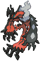
Also what is our most current Chespin Sprite? We also should try to finish the sprites for the starters:
Froakie and Fennekin are good. Chespin don't know. Braixen's great. Frogadier could use some edits. Quiladdin needs a reboot.
Actually, the pose is fine thanks to wyv's early animation of yveltal. Also, take look at zapdos. It shares the same pose so think it would be fine.I think we should talk Yveltal The current sprite needs some work, but we need a completely different pose to animate.
This is the most common sprite that people do for it because it's the artwork pose. HOWEVER! This pose is not a real flying pose for it.
This sprite depicts around what it would look like animated in that pose, but that's not at all how Yveltal flies. Honestly, I don't see how anything could fly like that. It's pretty much impossible! We really should reference other pictures and resources for it. It should look maybe like the 3D Model Sprite with its wings up high or low like this sprite if it had them at the wings in a low position.
Obviously this sprite when it was made was too big for our sizes, but it gives a good idea.This sprite has the right pose for animating, and Animation Frames CAN surpass the 96x96 dimensions. Our biggest challenge now is getting it to a pose like that or having its wings up instead of down.
Also what is our most current Chespin Sprite? We also should try to finish the sprites for the starters:
Froakie and Fennekin are good. Chespin don't know. Braixen's great. Frogadier could use some edits. Quiladdin needs a reboot.


I do plan on getting around to finish what wyv started though. Just didnt get very far yet since its still a hard pokemon to animate even with those extra frames but its all good.
princessofmusic Lol I didnt know spritzee was constantly flying so sure I'll fix it up. Probably can get around to do that later today.
At least two sets of shiny Carbinks have showed up in the past while, but I inb4'd all of you on January 10th: http://www.smogon.com/forums/thread...st-pixel-perfect.3486712/page-77#post-5141122
Typh covered most of it, and I feel that Wyv's sprite and animation work fine.Honestly, I don't see how anything could fly like that. It's pretty much impossible!
OK, informal poll to help motivate me eventually: Who thinks I should reboot the master list? less talk more sprites.
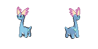
This is the latest version of the Mega Lai@s that Quanyails made.
I have a keen interest in perfecting it and getting it ready for animation (this will be one of the few sprites we don't get model renders of for a while)
I am busy for the next 24 hours, so I'll begin doing that then, but if someone wants to do some edits in the mean time go forth and sprite.
We can keep the size the same, and change the eye colours. I know that Latias is apparently smaller but we can cross that bridge if it appears to be very much smaller in-game as opposed to stats (also sprite height is relative)
I think the perspective on the body feels awkward, almost like it's a side view which also clashes with the direction it's looking towards, compared to official sprites of quadrupedal Pokémon:


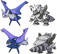
About Amaura (so I'm not the only one who finds the current one very weird), I made a sprite a while ago: anyone who thinks it could serve as a base is welcome to use it (I realize the head is way too big).
christ axlAmaura
VERSUS
The right set is mine, the left set is the one that's currently on the chart. The one currently in use lacks good shading, looks dopey, has a head that's way longer than it should be, and just generally bad proportions/lineart. This needs to be fixed. However, apparently my first draft wasn't good enough to replace it somehow, which leads me to my question: what do you guys want to see from a tiny amargasaurus that has the bodily consistency of a wet noodle? (No seriously, look at theSugomoriOfficial Art, this thing is painful to look at) This thing needs fixing, and since mine apparently isn't good enough, I want to hear from you guys exactly how I can make it better, even if I need to completely redo it, because this is the one sprite on the spreadsheet I am still unable to imagine alongside Gen V's sprites.
I have a few ideas as to what I did wrong on my initial sprite, so I'll start by listing them here.
- The neck looks too straight, even though it is based off of in-game shots from that angle. Need to scratch the neck over to account for this and make it less rigid more fluid.
- colors are bad, needs fixing as shades are too hard and look like candy.
- find more room for the mouth perhaps, possibly by making the head a pixel bigger both vertically and horizontally.
Aside from these issues, throw literally anything you can think of my way, as I want to knock this guy out by tomorrow if at all possible. Again, if this thing needs re-scratching, tell me you think so and I will throw something together with more force than Johnny Quinn trapped in a bathroom.
that amaura is the worst excuse for a sprite ive ever seen
here let me help you out there since your eyes obviously need to get checked
no like seriously your eyes are atrocious both in this sprite and irl
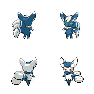
VERSUS
VERSUS
the right set is MINE, the left set is the spreadsheet and the middle set is your horrible excuse for a sprite
In all seriousness, it's amazing what coming back to a sprite after three months can do to change your perspective on it. Like damn, my old one was pretty fugly. Thankfully, I wasn't suffering from the migraine headache I had when I first made this dino (true story) and it looks a lot better for it. List of edits include:
- color correcting like a BOSS
- facial reconstructive surgery
- visit to the chiropractor for that strained neck
- visit to the wrack for that strained tail
- visit to the Keeper to put that optimism in check
I think it shows that I was out of my mind when making this thing, I really do. Like seriously, these are the kind of edits I'd normally do to other people's sprites, seems odd doing it to my own. w/e. If anything, this should be a good first draft of edits, so tell me if you guys think I can still improve on anything and I'll hop to it.
Menshay I thought long and hard before deciding on the pose I used, and I do have my reasons for it. Basically, I wanted to showcase two things in the sprite:
- double sails
- long body
Herein lay the problem: If I want to show off the length of the body, I'd need a side view. But if I had a side view, one of the sails would be very hard to see and mostly obscured by the other one. So, I opted for an artistic compromise. I understand that the pose is a little odd, but I felt it was the best way to show off Aurorus's design. Also, I did try to incorporate the turning of its neck into the design, as normally the underbelly pattern would shrink down more going upward, yet I instead kept it at a relatively average width the whole way up. But yeah, if I see it becomes an issue for anyone down the line, I might be willing to remake it, but for now I feel it does Aurorus some justice that a weird angled straight-ahead vantage point would have made awkward.
Also, I totally missed your old Amaura until I was ten minutes from completing this version, so yeah. +/
Layell I might do a few edits if I have the time to, as there are a few things that stick out at me offhand. I'll see what I can manage.Also, godamnit Mega Aggron, seeing you in any form triggers my innate ptsd.
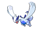
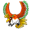
Snivy101 (Chris White) I see your point, but I don't think it warrants remaking the sprite. I think we can still make it work as long as the wings have a slight downward angle to their beating, as Gamefreak has made some awkward animations in the past in order to getHo-Ohsome sprites to work. Also I don't think anyone wants another Lugia sprite.
Anyway, I'll betyping anarchy into Twitch chatdoinghomeworksome quickie edits to Mega Lati@s in the mean time if anyone needs me.
EDIT Typhlito I thought you knew about Lugia?If not, read what I said above the Snivy101, because Lugia has a 149 pixel frame like damn.Last edited:
What about gliscor? Although he can make that pose in the air, hes not really able to fly anywhere like that either. Like yveltal, its just a pose.

I see what you mean though. The way it flaps makes it look like its trying to slow down. But yveltal bearly fits in its 96x96 cubical as is and Im pretty sure that even though animations can break that limit, we would want to keep it as small as possible. So if we make his wings flap up and down it would easily exceed the 96x96 limit even more so than kyruem white; the only pokemon (i think) that breaks the limit.
Anyway, heres the fixed spritzee animation. No more standing on tippy-toes for this bird :P
EDIT: oh wow thats alot of frames. Poor guy who had to animate him. O.OLast edited:


So here are some things that were supposed to be done.
In the beginning, I edited Wyv's Fletching heavily but recently decided that the originals were more accurate, and I also redid the legs. On a different note, the old sprites weren't really a shiny swap, and the present shiny versions are wrong. The white sections of the wings turn yellow, while the other white sections are meant to stay white. Anyhow, Fletchling joins the ranks of Aegislash and Carbink with two different shades of white.
All this time, no one told me that the second stripe on Fletchinder's tail was missing. Out of all things, I realized that Talonflame also wasn't a shiny swap.
aXl The new Amaura sprites are great. Also, Menshay pretty much channeled my thoughts on Aurorus. The main problem is that the head is forward-facing while the body faces sideways. Showing off the design is nice, but imo it's worse to "cheat" by screwing up something's anatomy. The crystals would be better if diamond-shaped like on Amaura. Right now, the neck looks like it connects directly to the bottom of the jaw whereas it should be closer to the back of the head, with the neck itself in more of a graceful arch.
I can't even watch that thing for more than 15 seconds, but I bet you're responsible every time DigRat screws up the planAnyway, I'll betyping anarchy into Twitch chatdoinghomeworksome quickie edits to Mega Lati@s in the mean time if anyone needs me.
We can see how it turns out but I think we should have a second sprite in the different pose just in case. Also, the reason for that is because Gliscor Glides and so doesn't Emolga. To be specific to get my point across, No flying type Pokemon with wings can fly in such a way.What about gliscor? Although he can make that pose in the air, hes not really able to fly anywhere like that either. Like yveltal, its just a pose.
I see what you mean though. The way it flaps makes it look like its trying to slow down. But yveltal bearly fits in its 96x96 cubical as is and Im pretty sure that even though animations can break that limit, we would want to keep it as small as possible. So if we make his wings flap up and down it would easily exceed the 96x96 limit even more so than kyruem white; the only pokemon (i think) that breaks the limit.
Anyway, heres the fixed spritzee animation. No more standing on tippy-toes for this bird :P
View attachment 9490 View attachment 9489
EDIT: oh wow thats alot of frames. Poor guy who had to animate him. O.O
Tornadus in its Therian Form actually breaks the most I believe, just showing how much space we can cross, and with a flying legendary with giant wings, it only would make sense to have it move its wings up and down in a different pose.
Also, Moltres does too. And Lugia and Ho-oh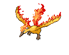
Especially with Lugia, it just goes to show that we can surpass these dimensions in the animation AND still have it fit in the dimensions for the sprite. I mean, all go outside the dimensions for a brief time (long if you compare it to the duration of the idle.http://fc00.deviantart.net/fs70/f/2014/051/5/8/shiny_legendaries_by_ganbarimasuu-d77c39p.png
Just a heads-up on the official Shiny Xerneas, Yveltal and Zygarde, obtained by a hacker. I forgot how to put the image in a tag, so here's the link.
EDIT: If anyone wants to see more images for a better view on the Shiny Circle of Life, I can provide a few more links.Last edited: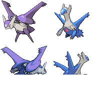
Started work on the frontsprite but didn't have much time to work on it before Layell planned on beginning his edits, so yeah. Homework sucks. Also the paint program I use at school has a weird pixel limit so excuse the cutoffs; the front sprite is the only thing I've gotten to anyway so it doesn't affect much.
First off, Layell , use this video wisely:
Secondly, I wanted to leave you with the main issues I was working on before needing to post this up.
- Colors on the mega need to match base Lati@s on the whites and reds
- Shading should probably emulate what Gamefreak did on the base Lati@s as well (such as the dithering I began adding on the left wing on the front)
- Purple was too blue so I added some red to it
- Outline is very jagged, needs fixing
- several proportional issues I imagine were what you were looking to fix, such as the tops of the eyes meeting the purple section of the head, head whiskers shouldn't share the same line as the purple section, etc etc.
So yeah, this was what progress I had done by now, so I just figured I'd post it up now so you could have it as a reference. I might pick it up again after you've made your edits, but I'll let you take the reins on this for the time being.
Ok, I see what you mean about the neck, finally, after having reworked Amaura. You just want the face to stick out a bit more and have the neck be more curvy. I can do that. Granted, it shouldn't be bent around too much, as its actually pretty straight in the ingame, but Amaura looks better that way and has the same counterargument, so I'll roll with it and see what I can make. As for the diamonds, I think it's safe to say that I did a better job on the backsprite's diamonds, so I'll see if I can do something more like that on the front.aXl The new Amaura sprites are great. Also, Menshay pretty much channeled my thoughts on Aurorus. The main problem is that the head is forward-facing while the body faces sideways. Showing off the design is nice, but imo it's worse to "cheat" by screwing up something's anatomy. The crystals would be better if diamond-shaped like on Amaura. Right now, the neck looks like it connects directly to the bottom of the jaw whereas it should be closer to the back of the head, with the neck itself in more of a graceful arch.
As for the angling of the head, I would like to make a rebuttal.


Not all pokemon face in the same direction as their body. We know that their necks can bend, and in Aurorus's case, I feel that the angling of its head is wholly plausible. After all, its neck is long for the sole purpose of eating leaves. It wouldn't make much sense to me if it couldn't turn its head. Interestingly enough, Aurorus is still a bit of an odd case, as most pokemon tend to face more left than their body, likely because it's easier to convey only one side of a face rather than the front, but as shown above, there are several exceptions already existent in the game.
You'd actually be surprised. I'm fairly neutral when I need to be (voted Democracy during the whole Safari Zone debocle) but I do tend to stray towards anarchy as it produces funnier results. I actually was absent from the stream during the Silph Scope experience as well lol. I don't think I've actually been around on Live to watch a digsaster occur.I can't even watch that thing for more than 15 seconds, but I bet you're responsible every time DigRat screws up the plan
Snivy101 (Chris White) It's true we can break the 96x96 barrier, but if possible, I think we should try to stay as close to it as we can while making the animation look good, because it looks ridiculously silly when TTornadus wing-slaps its allies in a double battle. If we do decide to rework Yveltal's sprite, I think the main thing I could see us doing is just angling the wings downward a bit more, as the rest of the sprite looks fairly solid imo.
Darkhuaza517 god those things are ugly as sin.


I guess I'll just leave these here. c:


So many frames per second went into the making of this sprite. Specifically, twenty.
I can already see the complaints regarding the lack of motion on the body and the legs. In my defense, it only takes one look at those legs to see that they're REALLY not meant for moving. Besides, Mega Scizor's overall motions are pretty calm in the XY model, considering that its body is bulkier and its stance is firmer. Moving the head gives a good enough sense of fluidity without overdoing it.
Anyways, I actually have some pretty strong opinions on what should be done about Mega Latios and Latias, but I'll save that for later. One of the things is that I think the poses should actually be distinct rather than use the exact same sprite, given that the BW sprites have differing poses from each other. I'll share the rest another time when I get the chance.
Now I need to finish making backsprites for Diancie and Zygarde. At least that won't need to be at 20 FPS. More likeFPS. Last edited:More minor edits to Mega Pinsir:

Just the back. Criticize me. Please.
I want to take a crack at animating these when they're deemed ready.
EDIT:
This is a WIP but-

I'll probably have the 'idle' animation loop once or twice more before doing the 'rare animation.' Plus, the tail could move during the idle animation and more smoothly during the rare one. Still working on the back. Feedback is appreciated.Last edited:
Looks great legit! I love how you made the claws open up. Nice job. :) One thing I could recommend you trying though is maybe adding some time between each moving claw. Like a claw moves after the second head turn instead on each head turn. (If that makes sense) It would make the movement less busy and give it room for a rare animation.
So many frames per second went into the making of this sprite. Specifically, twenty.
I can already see the complaints regarding the lack of motion on the body and the legs. In my defense, it only takes one look at those legs to see that they're REALLY not meant for moving. Besides, Mega Scizor's overall motions are pretty calm in the XY model, considering that its body is bulkier and its stance is firmer. Moving the head gives a good enough sense of fluidity without overdoing it.
Anyways, I actually have some pretty strong opinions on what should be done about Mega Latios and Latias, but I'll save that for later. One of the things is that I think the poses should actually be distinct rather than use the exact same sprite, given that the BW sprites have differing poses from each other. I'll share the rest another time when I get the chance.
Now I need to finish making backsprites for Diancie and Zygarde. At least that won't need to be at 20 FPS. More likeFPS.
TeraVolt I think he looks great. Maybe adjust the shading on its leg but thats all I could notice off with it. Great job.
EDIT: TeraVolt houndoom looks pretty good so far. Thats a pretty good rare animation with the growl. I think it could use 1 or 2 frames though just to slow it down slightly. As for the regular animation, consider adding some tail movement and maybe some slight neck movement since it could use some slowing down. keep it up!Last edited:Users Who Are Viewing This Thread (Users: 1, Guests: 4)
- ... and 1 more.


 [URL=http://s959.photobucket.com/user/icebem/media/PinsirB-4.png.html]


