-
Welcome to Smeargle's Studio! Please be sure to review the studio rules. Feel also free to check out our hub to learn more about this place!Welcome to Smogon! Take a moment to read the Introduction to Smogon for a run-down on everything Smogon, and make sure you take some time to read the global rules.Congrats to the winners of the 2023 Smog Awards!
Yilx first place artist
- Thread starter Yilx
- Start date
I love the warmth of the red shading on Sawk, a nice contrasting touch. I think the piece would have an overall more professional feel to it if there was more of a back ground, showing the source of the light. You've worked a lot recently on backgrounds. The discrepancies in the stance and pose have been highlighted already. If you developed the shadows a little more then it would have a more professional feel to it definitely. The shadows currently don't make sense unless the red isn't a light it's just to highlight the shadowed part of Sawk. Still, the shadows on the ground could be more developed. A good piece and I've always loved your work but still there are areas you could improve on. Just like everyone. Hope this helps and isn't complete nonsense :)
Fishy
tits McGee (๑˃̵ᴗ˂̵)
yilx, your art is absolutely exquisite.
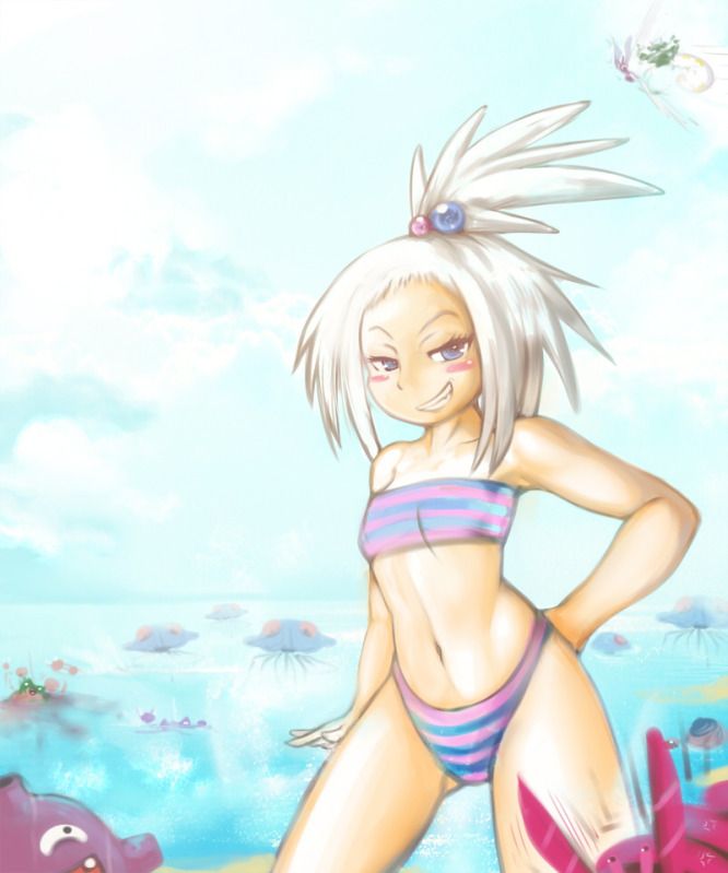
of course this is a pokemon forum, but i am constantly enamored with your humans and girls that you constantly draw. you're very adept with minute details, and their hands are never, ever awkward! everything is in its rightful place, doubly so when adapting to a pokemon design and still retaining your own flare in its creation.
also can you tell me how to just draw myself some abs like iroha uta, thanks~ WOW, that's incredible, Yilx. I love that you've been breaking out of your shell as of late artistically (not that there was anything bad with your old style). I adore the faded colors and soft strokes of the above painting. The expressions are fantastic too. Please keep on developing new styles of drawing; they'll help you to become an even more versatile artist in the future.
Keep it up <3 Yilx draws cutemons! Yay ^_^ that's a cuddly Heatran!I love that piece Yilx. The gentle brushstrokes are masterful, and enhance the humour, I think (Please don't challenge that odd statement).
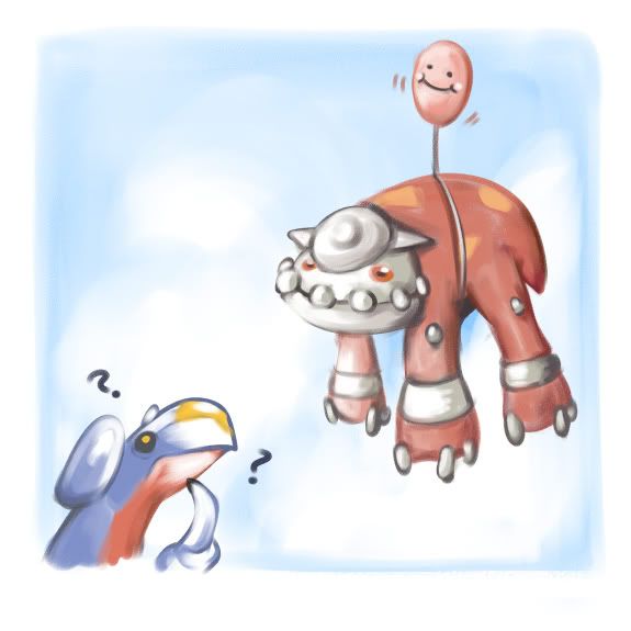
Your new art style is great, and I love the expressions. However, I feel that Garchomp doesn't need those question marks, it takes away the focus of the pokemon, a little. And if anybody disagrees with these comments... I don't blame you.
SO CUTE OH MY GOD That is ridiculous. Wow.
Sick.
That is ridiculous. Wow.
Sick.
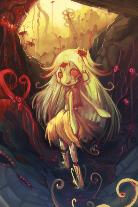
As much as I like the main character in that picture, it's your background art that I fell in love with. It has such a dynamic color range and the rocks jutting out into the sun at that angle looks incredible. Every single red line looks like it's clinging to the stone. Awesome work, Yilx =)Wow Yilx
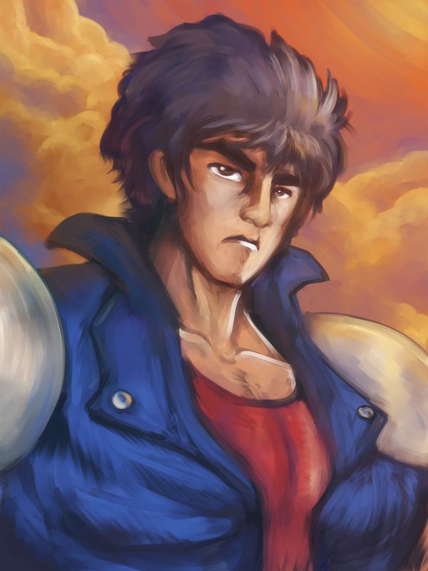
That Face looks really good. Practice makes perfect?. I love the contrast of the blue with the Orange sky. The lighting and the details and the shading. One of your best pieces in my opinion. Sort of new style too. Really really good jobUsers Who Are Viewing This Thread (Users: 1, Guests: 0)
- ... and 1 more.