So an interesting thing to talk about with Pokémon designs. Namely, how designs and what goes into them has changed over the generations as the technology behind each generation's games has advanced and the fidelity has changed. At the basic level, 2D sprites vs 3D models is one thing, but 2D sprites are designed to look best in a static pose as you show expression in a drawn pose, and a sprite can be drawn in a variety of ways. The Pokemon from the older generations are designed with this strength in mind. Meanwhile 3D models shine best in animation, as you have a model that's designed to move around, such as when attacking or when moving around, same with facial expressions. And thus, many of the newer generation Pokemon look best in a 3D model and have design aspects that truly shine when the Pokemon is properly in action or moving around.
But how that's changed also changed over each generation, and the designs of the Pokemon from each generation really reflect what the particular generation was capable of, what had advanced, and thus each generation's Pokemon shine best in their debut game since they were designed with the advancements and capabilities of the tech on the platform at the time.
Going to use fully evolved starters, pseudo-legendaries, and boxart legendaries as my guinea pigs, but running down the list.
For Gen 1, aka Red and Green, the Game Boy was an 8 bit machine and monochrome, and the designs are in 2D sprites. The designs shine with 2D sprites in poses, but most of all compared to everything afterwards, the designs are fairly simple with not a lot of detail and relatively little variation in color. Mostly everything has just one prominent color scheme that stands out.


As you can see the designs are fairly simple, Charizard for instance doesn't have a whole lot of detail to its design, and Mewtwo and Dragonite are dominantly one color scheme.
Meanwhile for Gen 2, with Gold and Silver, the games were enhanced on Game Boy Color which has a color display...to a limited degree. This shows in the designs, which while still relatively simple, have a bit more variation in their color, often having a binary color scheme that contrasts in addition to use of black and white. They also seemed to experiment with a wider variety of dynamic poses in the sprites, as these designs can look good in multiple poses, with almost everyone having a different sprite for Gold and another for Silver.


As you can see, the color variation is a bit more diverse with these Pokemon than with their predecessors. Meganium, Typhlosion, and Feraligatr have a distinct color dichotomy and variation that really pops out compared to Venusaur, Charizard, and Blastoise. Tyranitar also has a green-blue contrast in its design, compared to Dragonite being almost entirely yellow.
Meanwhile, with Gen 3, Ruby and Sapphire was on the Game Boy Advance, which was a more advanced system capable of more color and better graphics than the Game Boy, but nonetheless still fairly primitive. Designs are still fairly simple, but there's now even more color variation than ever, and designs can be as many colors as they want.


It really shows with the starters and the legendaries in particular: Sceptile, Blaziken, and Swampert are fairly simple designs, but have more color variation, particularly with subtler contrasts in the variety of color schemes in their designs. Kyogre and Groudon also have more present colors in their designs than any previous "major legendary".
And then we get to Gen 4, with Diamond and Pearl, on the DS. The DS was capable of much greater graphical fidelity than ever before, with the DS capable of bringing the capabilities of 2D designs to its full potential that the Game Boy line of hardware could never reach. The result with Gen 4 in particular is that the designs became much more complex and full of small details everywhere, making these designs more intricate and complex.


The starters and legendaries in particular have much busier, complicated designs with a lot of small details here and there compared to what came before. Torterra, Infernape, and Empoleon have a lot of little bits of details across their entire designs, same with Dialga and Palkia.
Next we have Gen 5, a unique case and the last of the 2D sprites, with Black and White. These sprites are fully animated sprites with the sprites in constant motion. I think many of Gen 5's Pokemon accordingly have design features that truly shine when the Pokemon is in constant motion.


With Gen 5, a lot of aspects shine in constant motion and animation. Hydreigon is a simple case where its constant biting at something with its "puppet" hands is a design aspect that truly shines with an animated model, or something like Reshiram and Zekrom, where their glowing tails lighting up and turning on and off is something a static sprite cannot do.
That ended the 2D era, but then come the 3D era with Gen 6, and we moved on from sprites to 3D models on the 3DS. The 3D models are an interesting thing to talk about, but as I said, a model looks best in animation. Gen 6's new Pokemon shine with this, but not necessarily when walking or running, but they all have unique attack animations that show off different design aspects.
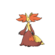
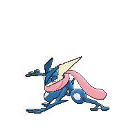


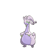
Above are the three starters in particular, who have design aspects that shine in a 3D model, like Chesnaught having a shield it can conjure with its arms when using Spiky Shield, or Delphox pulling out its stick wand at a whim when using Mystical Fire, and Greninja is just very dynamic and animable especially when firing Water Shuriken or doing a flip. Meanwhile something like Goodra shines in 3D with goo dripping from its hands, or doing attacks such as flipping its horns to throw a punch like with Power Whip, or swinging its tail like with Aqua Tail. Not to mention its incredibly dynamic and expressive face capable of expressing a variety of emotions both in and outside of battle, even moreso in Pokemon Amie.
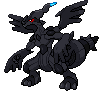
Xerneas and Yveltal show their strength best in the cutscene in game, where they have ways to glow and move around and show off X and Y poses.
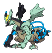
Then we get to Gen 7. The models are pretty much the same as in X and Y, but they started adding on fuller motion, namely full blown movement, not just movement in place like in Gen 6. Sun and Moon introduced walking and running animations for every Pokemon, and Z-Moves in particular invoke full blown movement sequences, especially signature ones. It really shows with the signature moves of the Gen 7 starters, Kommo-o, and the box legendaries.
A lot of videos to show it, but yeah. When in full motion, Alola's Pokemon look super clean. Especially when walking or running: something like Kommo-o or Incineroar looks really good when walking or running, meanwhile something like Tyranitar would look quite clumsy when walking or running, because it was designed to look good in a static pose.
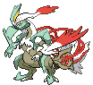
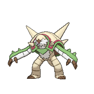
Next we get to...Gen 8, with Sword and Shield. With the Switch being stronger than the 3DS, the fidelity of the designs has gone up again, to where multiple designs have more detail again but now visible from different angles instead of just up front. There's also more personalized attack animations for signature moves that show off different design aspects, like with the starters, Dragapult, and the wolves.
A lot of personalized signature moves that show off different details of different designs, and Dragapult's invisible tail or the wolves' designs shine a lot with more detail from various angles, not to mention certain aspects shine with their signature moves. Especially with the starters, even moreso when they Gigantamax and use their G-Max moves.
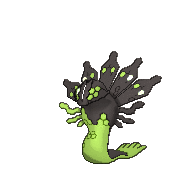
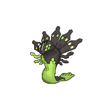
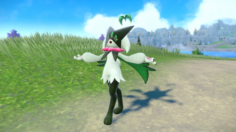
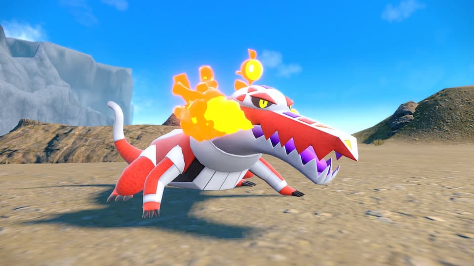
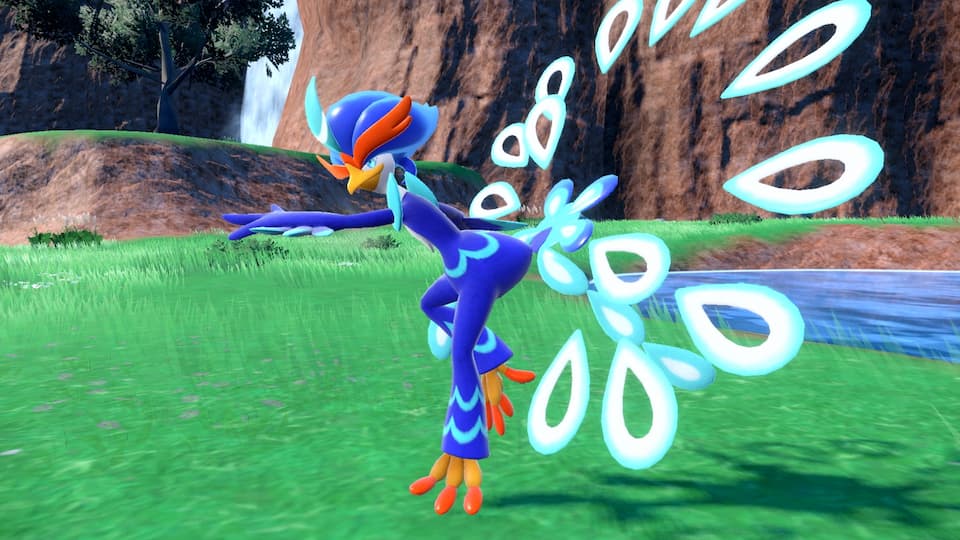
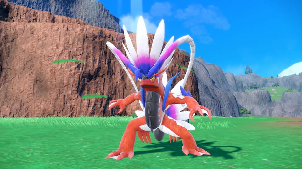
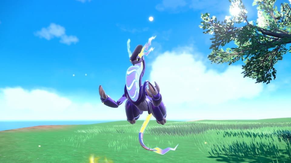
And finally, so far our latest generation is Gen 9, with Scarlet and Violet. For the models, we get new models with new textures. There's less focus on the animation part of a 3D model and more focus on the actual textures.
It's a bit subtle but a lot of Gen 9's design look at their best with SV's new models and textures, especially with in-game lighting to highlight it. Baxcalibur's icy "helmet" and body shines with the textures and lighting to make it really look like ice. The Raidons look really good with those textures, with Koraidon really looking "ancient" and Miraidon looking "futuristic" with lighting and proper metallic textures.
---
A long rundown but you get the point with each generation.
Now the interesting "mystery and conspiracy" of all this is...what's next? Granted it'll be a while until the next generation especially since Legends Z-A is seemingly so far off and Gen 10 will have to wait until after LZA is all said and done, but after this I wonder what the next advancement will be, and how will the next generation's roster be designed in such a way that shows off the next level of fidelity for Gen 10's Pokemon games. Presumably it'll be on the Switch's successor at this rate, with that being even more capable than the Switch is. I wonder what's next for the advancements of Pokemon models, and how Gen 10's Pokemon designs will evolve in accordance with that to show it off. It'll be interesting to find out.


 Lansat is a Legendary Berry that brings great joy. For their to be "joy" life needs to develop emotions (to have them) and intelligence (to understand them).
 Starf is a Berry thought to be a mirage, so strong it was abandoned at the edge of the world. Intrigue & denial, awe & fear, reverence & rejection; it's the emergence of belief, belief of a greater power that no mere mortal can control.
 Enigma is completely unknown and has the power of the stars. Space, the final frontier, the greatest unknown; intelligent life has long looked up to the stars and wondered what was "up" there, wanting to "go" there, leave the familiar for something seen as greater.